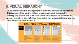
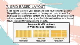
1. PRINCIPLES & ELEMENTS OF
GOOD WEBSITE DESIGN USING
ONLINE CREATIVE TOOLS
RAY JOHN B. SANTIAGO
ETECH Teacher
2nd Quarter Lesson 6.2
CS_ICT11/12-ICTPT-Ie-f-6
2. 1. Identify and explain the Basic Principles of Graphics and Layout
2. Explain the vital use of the Basic Principles of Graphics and
Layout in communication and industry.
3. Assess the effectiveness of the graphic design in a given layout
example
4. Evaluate existing websites and online resources based on the
principles of layout, graphic, and visual message design.
OBJECTIVES
3. REVIEW
1. Monochromatic uses one color in a design. Its advantage is to create balance and to match the color in an
artwork. However, this may lack energy and may look monotonous. How will you use the monochromatic
scheme to create variations?
A. Use complementary colors C. Change the hue of the artwork or every element
B. Adjust the saturation and value D. Choose a design that is more suitable for the color scheme used
2. What is the purpose of creating a hierarchy in your design?
A. It gives consistency. C. To add beauty to the design.
B. It adds visual weight. D. Make the detail to stand out.
3. Which of the following refers to the plan of creating an idea through a combination of texts, images, and
other elements that are placed together artistically?
A. Design C. Layout
B. Graphic D. Message
4. Which principle of design is when a designer arranges the elements or text according to its context?
A. Balance C. Harmony
B. Emphasis D. Hierarchy
5. Which type of balance gives a mirror-like design that is proportionally equal to the other side?
A. Asymmetrical C. Semi-Balance
B. Symmetrical D. Semi-Proportion
4. 9 BASIC PRINCIPLES & ELEMENTS
OF GOOD WEBSITE DESIGN USING
ONLINE CREATIVE TOOLS
5. • An effective website design should fulfil its intended function by
conveying its particular message whilst simultaneously engaging
the visitor. Several factors such as consistency, colors,
typography, imagery, simplicity, and functionality contribute to
good website design.
• When designing a website there are many key factors that will
contribute to how it is perceived. A well-designed website can
help build trust and guide visitors to take action. Creating a great
user experience involves making sure your website design is
optimized for usability (form and aesthetics) and how easy is it
to use (functionality).
6. 1. WEBSITE PURPOSE
Your website needs to accommodate the needs of the user. Having a
simple clear intention on all pages will help the user interact with
what you have to offer. What is the purpose of your website? Are
you imparting practical information like a ‘How to guide’? Is it an
entertainment website like sports coverage or are you selling a
product to the user?
There are many different purposes that websites may have but there
are core purposes common to all websites;
• Describing Expertise
• Building Your Reputation
• Generating Leads
• Sales and After Care
7. Simplicity is the best way to go when considering the user experience and the usability
of your website. Below are ways to achieve simplicity through design.
2. SIMPLICITY
COLOR
Color has the power to communicate messages and evoke
emotional responses. Finding a color palette that fits your
brand will allow you to influence your customer’s behavior
towards your brand. Keep the color selection limited to less
than 5 colors. Complementary colors work very well.
Pleasing color combinations increase customer engagement
and make the user feel good.
TYPE
Typography has an important role to play on
your website. It commands attention and
works as the visual interpretation of the brand
voice. Typefaces should be legible and only
use a maximum of 3 different fonts on the
website.
IMAGERY
Imagery is every visual aspect used within
communications. This includes still photography,
illustration, video and all forms of graphics. All
imagery should be expressive and capture the
spirit of the company and act as the
embodiment of their brand personality.
Most of the initial information we consume on
websites is visual and as a first impression, it is
important that high-quality images are used to
form an impression of professionalism and
credibility in the visitors’ minds.
8. Navigation is the wayfinding system used on websites where visitors
interact and find what they are looking for. Website navigation is key to
retaining visitors. If the website navigation is confusing visitors will give
up and find what they need elsewhere. Keeping navigation simple,
intuitive and consistent on every page is key.
3. NAVIGATION
9. 4. F-SHAPED PATTERN READING
• The F- based pattern is the most common
way visitors scan text on a website. Eye-
tracking studies have found that most of what
people see is in the top and left areas of the
screen. The F shaped layout mimics our
natural pattern of reading in the West (left to
right and top to bottom). An effectively
designed website will work with a reader’s
natural pattern of scanning the page.
10. 5. VISUAL HIERARCHY
Visual hierarchy is the arrangement of elements in order of importance.
This is done either by size, colour, imagery, contrast, typography,
whitespace, texture and style. One of the most important functions of
visual hierarchy is to establish a focal point; this shows visitors where the
most important information is.
11. 6. CONTENT
An effective website has both great design and great
content. Using compelling language great content can
attract and influence visitors by converting them into
customers.
12. 7. GRID BASED LAYOUT
Grids help to structure your design and keep your content organised.
The grid helps to align elements on the page and keep it clean. The
grid-based layout arranges content into a clean rigid grid structure with
columns, sections that line up and feel balanced and impose order and
results in an aesthetically pleasing website.
13. 8. LOAD TIME
Waiting for a website to load will lose visitors. Nearly half
of web visitors expect a site to load in 2 seconds or less
and they will potentially leave a site that isn’t loaded
within 3 seconds. Optimizing image sizes will help load
your site faster.
14. The way we visit websites has changed over the
years. We found that now, 68.2% of website visits
come from mobile devices, with desktop visits
making up only 29.5% of traffic. Tablets have the
lowest number of sessions, with 4,024,346 sessions
year-on-year coming from these devices.
Desktop vs Mobile: web visits statistics
We found that desktop searching resulted in the
highest average pages per session, with nearly 31%
more than on a mobile. Mobile sessions also had the
highest bounce rate, at 35.9% compared to desktop
at 31.6%
This shows that people are using devices differently –
simple queries tend to be answered through quick
mobile searches. Whereas computers better facilitate
in depth browsing.
15. 9. MOBILE FRIENDLY
More people are using their phones or
other devices to browse the web. It is
important to consider building your
website with a responsive layout
where your website can adjust to
different screens
16. FORMATIVE ASSESSMENT:
1. Why do we need to evaluate existing
websites and online resources?
2. How can you differentiate a good and
effective website?
3. How do users interact with the
websites they visit?