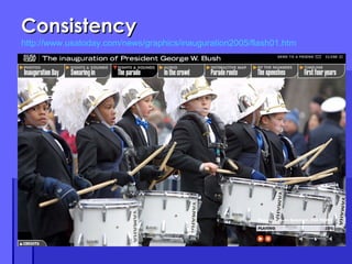
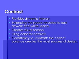
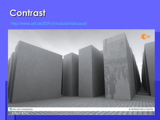
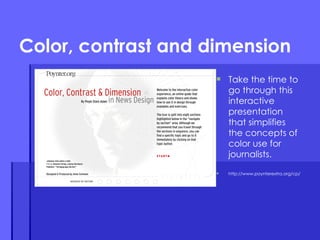
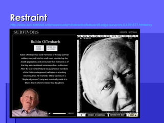
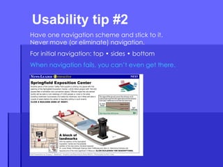
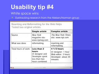
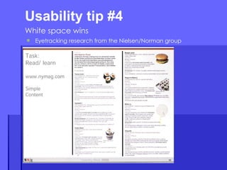
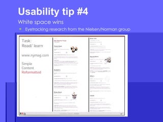
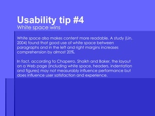
Basic Web design Preliminary information you should know about online presentation and usability Laura Ruel Associate Professor, UNC-Chapel Hill [email_address]
Good design is good design True or false? Are there significant differences in how a presentation should be designed for online consumption?
The answer Basic principles of good aesthetic design do not go away in a multimedia environment. However, they must be adapted. First we must learn these principles. Then we must understand how they apply specifically to the Web.
What we will cover today Design principles Know the basics before starting your work Research in usability Eyetracking and other tests that can guide you SEO What it is Basic things you should do
Principle #1: Relevance Each graphic element must fulfill a specific function. Design elements should be judged on their ability to help the reader understand your message. Never ask… What CAN I do?  Rather ask… What SHOULD I do? Clarity, organization and simplicity are as critical to design as they are to writing.
Relevance http://www.msnbc.msn.com/id/34623505/ns/us_news-security/
Principle #2: Proportion The size of a graphic element should be determined by its relative importance and environment. How well does each piece of the puzzle relate to the pieces around it? How does this effect use of rules, photos, graphic elements, white space? Dominance is also important. Give the user a visual focal point.
Proportion
Direction Effective graphic design guides the reader through your site. We can learn a lot from game developers. Understand “typical” patterns. Realize what interrupts, impacts the flow. Be in touch with the reader’s own concept of direction –  in  rather than  down .
Direction
Direction http://dsc.discovery.com/convergence/pompeii/interactive/interactive.html
Consistency Style must be integrated. It is a matter of detail. Understand the conflict between consistency and variety. Keep consistent, but avoid symmetry and predictability. Areas to consider: Margins Typefaces Intents Repeating elements
Consistency http://www.usatoday.com/news/graphics/inauguration2005/flash01.htm
Contrast Provides dynamic interest Balancing the space devoted to text, artwork and white space. Creates visual tension. Using color for contrast. Consistency vs. contrast: the correct balance creates the most successful design.
Contrast http://www.zdf.de/ZDFxt/module/holocaust/
Color, contrast and dimension Take the time to go through this interactive presentation that simplifies the concepts of color use for journalists. http://www.poynterextra.org/cp/
A little history…. 216 Web “Safe” Colors http://www.websitetips.com/color/colourchart.html
Kuler
Restraint Strive for simplicity without boredom. Straightforwardness is a virtue. Good graphic design should be invisible to the user. Emphasis can only be effective within a stable framework.  It is important to use a grid to keep spacing and other visual elements consistent.
Restraint http://www.sun-sentinel.com/news/custom/interactivefeature/sfl-edge-survivors,0,4391577.htmlstory
Attention to detail Control what you can, prepare for what you can’t. The devil is in the details Align, lock and keep spacing consistent. Good design keeps in mind the big picture concepts. Excellent design sweats the small stuff.
Attention to detail http://www.newsobserver.com/sports/golf/usopen/multimedia/?course
The total picture Graphic design is the visual equivalent of a jigsaw puzzle Your job is to assemble a total picture from a series of parts. Design your presentation as so the parts fit together.  Remember, two pages may look beautiful separately, but do not go together. Think about what is behind, around…
5 Usability Tips to know
Start with a storyboard. Usability tip #1
Usability tip #2  Have one navigation scheme and stick to it. Never move (or eliminate) navigation. For initial navigation: top • sides • bottom When navigation fails, you can’t even get there.
Usability tip #4  White space wins Eyetracking research from the Nielsen/Norman group
Usability tip #4  White space wins White space also makes content more readable. A study (Lin, 2004) found that good use of white space between paragraphs and in the left and right margins increases comprehension by almost 20%.  In fact, according to Chaperro, Shaikh and Baker, the layout on a Web page (including white space, headers, indentation and figures) may not measurably influence performance but does influence user satisfaction and experience.
Usability tip #5 Feature faces
Two factors to discuss: Page titles Keywords SEO introduction
In design view or code view of Dreamweaver, you always should complete the title tag. Page titles
Search engines put the most weight on page titles. Pages must have distinct titles. Whatever is at the beginning of the title tag is considered most relevant. Words that are in your site URL are BOLD in search engine results.  Page titles
Location of code for these is important.  They always should be at the top of your page.  Best to put them below to the title tag.  In Dreamweaver:  Insert • HTML • Head Tags • Keywords Put most specific, descriptive words first. Based on the search engine,  a certain number of words can be used – if you go beyond that number, search engines will truncate (…)the text.  This number is usually between 10 and 12 words.  Keyword tags
For keyword tags, use: http://freekeywords.wordtracker.com Again, it is best to put most descriptive word first. FYI: There is some talk that keyword tags are ineffective. Keyword tags

Design & Usability Basics

  • 1.
    Basic Web designPreliminary information you should know about online presentation and usability Laura Ruel Associate Professor, UNC-Chapel Hill [email_address]
  • 2.
    Good design isgood design True or false? Are there significant differences in how a presentation should be designed for online consumption?
  • 3.
    The answer Basicprinciples of good aesthetic design do not go away in a multimedia environment. However, they must be adapted. First we must learn these principles. Then we must understand how they apply specifically to the Web.
  • 4.
    What we willcover today Design principles Know the basics before starting your work Research in usability Eyetracking and other tests that can guide you SEO What it is Basic things you should do
  • 5.
    Principle #1: RelevanceEach graphic element must fulfill a specific function. Design elements should be judged on their ability to help the reader understand your message. Never ask… What CAN I do? Rather ask… What SHOULD I do? Clarity, organization and simplicity are as critical to design as they are to writing.
  • 6.
  • 7.
    Principle #2: ProportionThe size of a graphic element should be determined by its relative importance and environment. How well does each piece of the puzzle relate to the pieces around it? How does this effect use of rules, photos, graphic elements, white space? Dominance is also important. Give the user a visual focal point.
  • 8.
  • 9.
    Direction Effective graphicdesign guides the reader through your site. We can learn a lot from game developers. Understand “typical” patterns. Realize what interrupts, impacts the flow. Be in touch with the reader’s own concept of direction – in rather than down .
  • 10.
  • 11.
  • 12.
    Consistency Style mustbe integrated. It is a matter of detail. Understand the conflict between consistency and variety. Keep consistent, but avoid symmetry and predictability. Areas to consider: Margins Typefaces Intents Repeating elements
  • 13.
  • 14.
    Contrast Provides dynamicinterest Balancing the space devoted to text, artwork and white space. Creates visual tension. Using color for contrast. Consistency vs. contrast: the correct balance creates the most successful design.
  • 15.
  • 16.
    Color, contrast anddimension Take the time to go through this interactive presentation that simplifies the concepts of color use for journalists. http://www.poynterextra.org/cp/
  • 17.
    A little history….216 Web “Safe” Colors http://www.websitetips.com/color/colourchart.html
  • 18.
  • 19.
    Restraint Strive forsimplicity without boredom. Straightforwardness is a virtue. Good graphic design should be invisible to the user. Emphasis can only be effective within a stable framework. It is important to use a grid to keep spacing and other visual elements consistent.
  • 20.
  • 21.
    Attention to detailControl what you can, prepare for what you can’t. The devil is in the details Align, lock and keep spacing consistent. Good design keeps in mind the big picture concepts. Excellent design sweats the small stuff.
  • 22.
    Attention to detailhttp://www.newsobserver.com/sports/golf/usopen/multimedia/?course
  • 23.
    The total pictureGraphic design is the visual equivalent of a jigsaw puzzle Your job is to assemble a total picture from a series of parts. Design your presentation as so the parts fit together. Remember, two pages may look beautiful separately, but do not go together. Think about what is behind, around…
  • 24.
  • 25.
    Start with astoryboard. Usability tip #1
  • 26.
    Usability tip #2 Have one navigation scheme and stick to it. Never move (or eliminate) navigation. For initial navigation: top • sides • bottom When navigation fails, you can’t even get there.
  • 27.
    Usability tip #4 White space wins Eyetracking research from the Nielsen/Norman group
  • 28.
    Usability tip #4 White space wins Eyetracking research from the Nielsen/Norman group
  • 29.
    Usability tip #4 White space wins Eyetracking research from the Nielsen/Norman group
  • 30.
    Usability tip #4 White space wins Eyetracking research from the Nielsen/Norman group
  • 31.
    Usability tip #4 White space wins Eyetracking research from the Nielsen/Norman group
  • 32.
    Usability tip #4 White space wins White space also makes content more readable. A study (Lin, 2004) found that good use of white space between paragraphs and in the left and right margins increases comprehension by almost 20%. In fact, according to Chaperro, Shaikh and Baker, the layout on a Web page (including white space, headers, indentation and figures) may not measurably influence performance but does influence user satisfaction and experience.
  • 33.
    Usability tip #5Feature faces
  • 34.
    Two factors todiscuss: Page titles Keywords SEO introduction
  • 35.
    In design viewor code view of Dreamweaver, you always should complete the title tag. Page titles
  • 36.
    Search engines putthe most weight on page titles. Pages must have distinct titles. Whatever is at the beginning of the title tag is considered most relevant. Words that are in your site URL are BOLD in search engine results. Page titles
  • 37.
    Location of codefor these is important. They always should be at the top of your page. Best to put them below to the title tag. In Dreamweaver: Insert • HTML • Head Tags • Keywords Put most specific, descriptive words first. Based on the search engine, a certain number of words can be used – if you go beyond that number, search engines will truncate (…)the text. This number is usually between 10 and 12 words. Keyword tags
  • 38.
    For keyword tags,use: http://freekeywords.wordtracker.com Again, it is best to put most descriptive word first. FYI: There is some talk that keyword tags are ineffective. Keyword tags