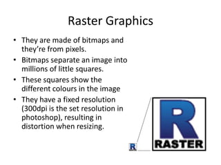
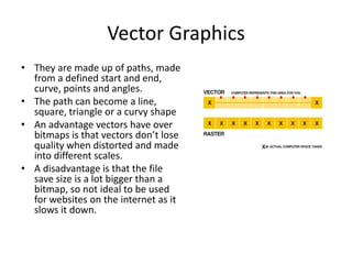
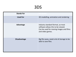
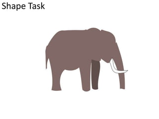
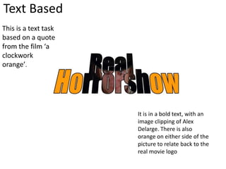
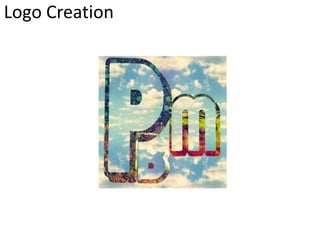
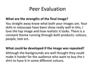
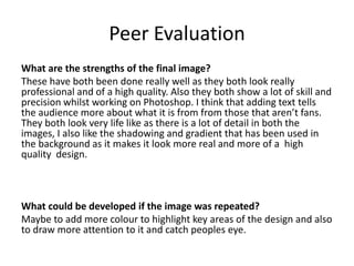
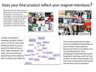
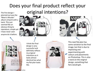
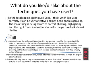
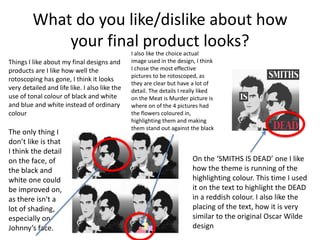
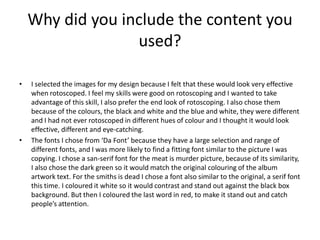
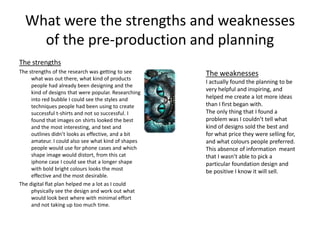
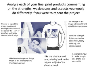
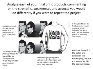
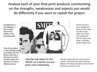
Digital Graphics
Hannah Mizen
File Formats
Raster Graphics
• They are made of bitmaps and
they’re from pixels.
• Bitmaps separate an image into
millions of little squares.
• These squares show the
different colours in the image
• They have a fixed resolution
(300dpi is the set resolution in
photoshop), resulting in
distortion when resizing.
Vector Graphics
• They are made up of paths, made
from a defined start and end,
curve, points and angles.
• The path can become a line,
square, triangle or a curvy shape
• An advantage vectors have over
bitmaps is that vectors don’t lose
quality when distorted and made
into different scales.
• A disadvantage is that the file
save size is a lot bigger than a
bitmap, so not ideal to be used
for websites on the internet as it
slows it down.
JPEG
Stands For Joint Photographic Expert Group
Used For Photographs and web formats
Advantage It’s a small file, takes up less space.
Ideal to use for websites and the internet
as the small file means it doesn’t slow the
internet down.
Disadvantage Loses quality with multiple edits due to
compression and recompression every
time it is opened and closed.
TIFF
Stands For Tagged image file format
Used For Desk top publishing, Adobe InDesign saved
as TIFF
Advantage Doesn’t lose quality when opened and
closed, unlike a JPEG.
Disadvantage Big files, need lots of storage space, will
slow computers, software and internet
down.
PSD
Stands For Photoshop document
Used For Image manipulation
Advantage Saves layers and page formatting
It also supports transparency
Disadvantage Big files, need lots of storage space.
Only useful in photoshop so it won’t open
in any other format, so people who don’t
own photoshop cannot access the image.
AI
Stands For Adobe illustrator
Used For Logo creation, graphics to represent
company logo.
Advantage Can be scaled big and small without the
image becoming pixelated.
Disadvantage Limited software, files can only be opened
in certain software. So if someone doesn’t
own the correct software they cannot
open the image.
3DS
Stands For 3D Studio
Used For 3D modelling, animation and rendering
Advantage Industry standard format, so most
software allows this to be viewed.
Can be used for moving images and films
and video games.
Disadvantage Big file saves, need a lot of storage to be
able to save files.
Digital Graphics
Images
Shape Task
Evaluation
What did you like about your image?
I like the general shape and outline of the image.
How you can tell what animal it is.
I also like the choice of colour.
What would you improve if you did it again?
I would do more shading and add more detail, to
make the elephant look more life like.
I would also be more careful when connecting the
parts of the shapes together.
Rotoscope
Evaluation
What did you like about your image?
On the first image I liked the use of black as a back
ground, leaving the hair to look most effective using the
highlight colours.
What would you improve if you did it again?
I would improve the eyes, because when you look closely
the insides don’t look even and they are not facing in
exactly the same direction. I would also add shading to
the face to give it some more shape and features.
Text Based
This is a text task
based on a quote
from the film ‘a
clockwork
orange’.
It is in a bold text, with an
image clipping of Alex
Delarge. There is also
orange on either side of the
picture to relate back to the
real movie logo
Evaluation
What did you like about your image?
In this image I like the picture clipping into the text and how
the eyes of the character fit perfectly in with the shape of the
words. I also like the use of orange around the edges to be in
keeping with the theme of the film. I also like how the text is
slanted upwards, making it more interesting than if it was just
straight.
What would you improve if you did it again?
I would probably make the text font more interesting, or find
a different font, one that is more similar to the original from
the film poster.
Logo Creation
Evaluation
What did you like about your image?
I like the use of colours and art that has been used to
make the text stand out against the sky background. I like
how the font clipped the images into the outline of the
text, making it see through, instead having the text filled
in. The pattern is interesting, but not too busy.
What would you improve if you did it again?
The thing I would improve on is the top half of the B has
quite a light pattern on it, making that part a bit hard to
read.
T-Shirt Designs
T-shirt design research
Idea Generation
Mood board of chosen idea
Proposal
Dimensions
2400x3200 pixels
Content
On the t-shirt there will be a iconic picture of the band (or just Johnny and Morrissey if
the whole band take too much time to do) but rotoscoped. The rotoscoped image will
be in black and white and the text will be in a colour that is associated with the band,
like orange, green or blue. The style of the text will be sans serif, as this is mainly how
the band displayed their name, just in a simple font. Then I will copy the rotoscoped
image 4 times and put it into a square, then have the text facing vertically down the
left side. Just like the ‘Meat is Murder’ album artwork.
Export Format
PNG
Advantages; Can be transparent and this format can be used on red bubble
Disadvantages; Big file size, will take up lots of storage space.
Proposal
Deadline
1st of October
Tuesday Wednesday Monday
Finish off mood board
Write proposal
Do a digital flat plan
Rotoscope image to be
used for real t-shirt design
Start new design
Schedule
Audience
The target audience will be Smiths fans, which come in quite a few different ages,
the main ages from 15+ to adults in their 50s.
Digital Flat Plan
Here I have got 2 different pictures but
duplicated them 4 times, to make it
similar to the meat is murder album
cover, this is a thing fans are familiar
with and will understand
Meat Is Murder album artwork
I decided to go with
this picture because I
thought it look most
effective to rotoscope
Final design
Proposal 2
Dimensions
2400x3200 pixels
Content
On the t-shirt there will be a iconic picture of the band (or just Johnny and Morrissey if
the whole band take too much time to do) but rotoscoped. The rotoscoped image will
be in black and white and the text will be in grey, black or white, similar to the original
picture of Oscar Wilde. The style of the text will be serif, as this is mainly how the band
displayed their name on the original picture, just in a simple font. I will put the text of
‘smiths is dead’ in separate blocks on the picture.
Export Format
PNG
Advantages; Can be transparent and this format can be used on red bubble
Disadvantages; Big file size, will take up lots of storage space.
Proposal 2
Deadline
1st of October
Tuesday Wednesday Monday
Finish off mood board
Write proposal
Do a digital flat plan
Rotoscope image to be
used for real t-shirt
design. Start and finish a
quick new design
Start and finish a new
design
Schedule
Audience
The target audience will be Smiths fans, which come in quite a few different ages,
the main ages from 15+ to adults in their 50s.
Digital flat planBecause the last design took
a lot of time and effort I
decided to do something
else with it, so I got this
design of Oscar Wilde which
was originally official
smiths merchandise and
Morrissey was pictured
wearing it after the band
broke up.
So I decided to do a twist on
this design, using pictures of
the band mates, instead of
Oscar Wilde. This looks
simple but an effective
design.
Final Design
Proposal 3
Dimensions
2400x3200 pixels
Content
On this shirt and phone there will be a picture of Morrissey wearing ‘I don’t eat my
friends’ shirt. I think fans will like this design because Morrissey was often seen
wearing t-shirts with people wearing a statement t-shirt on it.
Export Format
PNG
Advantages; Can be transparent and this format can be used on red bubble
Disadvantages; Big file size, will take up lots of storage space.
Proposal 3
Deadline
1st of October
Audience
The target audience will be Smiths fans, which come in quite a few different ages,
the main ages from 15+ to adults in their 50s.
Tuesday Wednesday Monday
Finish off mood board
Write proposal
Do a digital flat plan
Rotoscope image to be
used for real t-shirt
design. Start and finish a
quick new design
Start and finish a new
design
Flat digital Plan
This design is mainly
for the target
audience of
vegetarian Smiths
fans. Because
Morrissey
influenced a lot of
people to become
vegetarian and
made people aware
of how animals were
murdered. I thought
that this specific
target audience
would appreciate
this design. I also
haven’t seen this
design out there, so
it is a bit of a
different option.
I also chose this particular
design because of how
Morrissey is laying down, means
it would also look effective and
wouldn’t distort on a phone
case
Final design
Peer Evaluation
What are the strengths of the final image?
• They all have a common theme running throughout (the people in each
design).
• They look very life-like (especially the blue hued one) which shows attention
to detail & it paid off!
• A niche audience has been considered & produced for. It shows through the
final images.
What could be developed if the image was
repeated?
• The backgrounds on some the images may prevent it from being printed on
certain colours of t-shirts. If developed further, there could have been a design
with and without the background, to give the consumer a choice (but this would
take time).
• An individual design for the other member of ‘The Smiths’ would also have been
good, but again, this would have taken time to do.
Peer Evaluation
What are the strengths of the final image?
You straight away know what both your images are. Your
skills in rotoscope have been show really well in this, I
love the top image and how realistic it looks. There is a
constant theme running through both products: colours,
people, text ect.
What could be developed if the image was repeated?
Although the backgrounds are well thought they could
make it harder for the audience who want to buy the t-
shirt to have it in some different colours.
Peer Evaluation
What are the strengths of the final image?
These have both been done really well as they both look really
professional and of a high quality. Also they both show a lot of skill and
precision whilst working on Photoshop. I think that adding text tells
the audience more about what it is from from those that aren’t fans.
They both look very life like as there is a lot of detail in both the
images, I also like the shadowing and gradient that has been used in
the background as it makes it look more real and more of a high
quality design.
What could be developed if the image was repeated?
Maybe to add more colour to highlight key areas of the design and also
to draw more attention to it and catch peoples eye.
T-Shirt Evaluation
Does your final product reflect your original intentions?
My original intention was to base my
design upon the music or films I like a
lot and have a vast amount of
knowledge in, and something I would
enjoy making. I chose this because I
knew things to design that could
relate to fans. I looked for ideas on
red bubble for inspiration, to see
what people would be likely to buy.
I made a brainstorm
showing my ideas I could
use on a t-shirt, now I was
starting to base it just on
bands, the kind of music
they make, the genre, the
style, the iconic pictures
or/and lyrics that relate to
them and fans can relate to.
Then I really condensed my ideas
from lots of different bands down to
just one band. Choosing them
because of all the iconic photos and
many dedicated fans. Their
photographs looked like they would
be good to rotoscope and I had a lot
of ideas on what I would design. The
fonts seen in the bands name would
also be fairly easy to reproduce.
Does your final product reflect your
original intentions?The first design I
planned out was the
‘Meat is Murder’
album artwork with a
twist. This just
seemed like an
obvious thing to
reproduce, simple yet
I have never seen
anyone do it before.
I think the final
design is very
successful and
definitely reflects
my original
intentions as it
looks almost
identical too what
my flat plan looks
like.
This next flat plan has
some variation to the final
image, but that is due to
improving and
experimenting with
colours and placements
on Photoshop. This is also
a twist on the original
design, something that
fans would get.
Does your final product reflect your
original intentions?
This product I had originally
designed with the Iphone case
shape in mind. I needed the
design to be long, so the picture
didn’t distort. I also wanted it to
look good and desirable buy on a
t-shirt as well. I also wanted it to
appeal to a certain selection of
the fans, because of the
vegetarian statement.
I think my final product definitely shows my
original intentions, what I wanted to portray in
my design in the start. I think it worked
especially well as a phone case, because the
picture is positioned in a way so everything fits
into the space of the case. I have changed the
background slightly to occupy the background,
so instead of being white it is a pleasant gradient
of blue and white.
Is your product suitable for your
audience?
• I think my product is very suitable for my audience, because of the different choice of designs, and how
they all suit a variety of colours to be worn on. The designs are of iconic pictures, but they are not over
used (especially the blue one), and have not been used before, so people would want buy them because
there is nothing out there on the market designed like that.
• My target audience is a typical smiths fan. Because of them being a band in the 80’s, there are two types of fans.
The first type is from the older generation, the people who went to their concerts as teens when the band was still
together. They are very die-hard fans and are still as big fans now as they were back in the 80’s. This kind of
audience will now be in their 40s/50, both consisting equally of male and females. I have to design something that
isn’t too ‘out there’, something they would want to be seen in and also I have to make sure my images are
accurate, e.g. not choosing an image of Morrissey when he was in his solo career and slapping THE SMITHS in big
letters. Because the audience would be offended and take it personally, and they don’t want to buy inaccurate
clothing. The second audience is the children of the first audience, because they would be into their music, they
would want to influence their children. These children would also be influenced to be very strong fans and would
also want accuracy. These children would actually be around a the teenage age of 15-20. So I had to design
something that they would want to buy, something not boring, conservative and what their parents would wear.
Also designing an Iphone case appeals to the younger generation as well.
What do you like/dislike about the
techniques you have used?
I like the rotoscoping technique I used, I think when it is used
correctly it can be very affective and has been on this occasion.
The main thing is being aware of correct shading, highlighting
and the right tones and colours to make the picture look almost
life-like.
To rotoscope I used the polygonal lasso tool, this is main tool I used for the majority of the
picture. I went around the outline of the part of the picture I wanted to changed and
rotoscope, then used the colour overlay and opacity tool to create my own version of the
original picture. The opacity tool I used was especially helpful to assist with shading and
blending, so the shadows didn’t just look like odd blocks of colour, so that they actually
looked effective.
The next tool I used was the text tool, I used it to create the similar fonts used on the original
album artwork.
I also used the crop tool to crop out white areas, or areas that I didn’t want to include in the
picture, or that wouldn’t fit on to the template of the shirt or phone case.
What do you like/dislike about how
your final product looks?
Things I like about my final designs and
products are I like how well the
rotoscoping has gone, I think it looks
very detailed and life like. I also like the
use of tonal colour of black and white
and blue and white instead of ordinary
colour
I also like the choice actual
image used in the design, I think
I chose the most effective
pictures to be rotoscoped, as
they are clear but have a lot of
detail. The details I really liked
on the Meat is Murder picture is
where on of the 4 pictures had
the flowers coloured in,
highlighting them and making
them stand out against the black
and white.
On the ‘SMITHS IS DEAD’ one I like
how the theme is running of the
highlighting colour. This time I used
it on the text to highlight the DEAD
in a reddish colour. I also like the
placing of the text, how it is very
similar to the original Oscar Wilde
design
The only thing I
don’t like is that
I think the detail
on the face, of
the black and
white one could
be improved on,
as there isn't a
lot of shading,
especially on
Johnny’s face.
Why did you include the content you
used?
• I selected the images for my design because I felt that these would look very effective
when rotoscoped. I feel my skills were good on rotoscoping and I wanted to take
advantage of this skill, I also prefer the end look of rotoscoping. I also chose them
because of the colours, the black and white and the blue and white, they were different
and I had not ever rotoscoped in different hues of colour and I thought it would look
effective, different and eye-catching.
• The fonts I chose from ‘Da Font’ because they have a large selection and range of
different fonts, and I was more likely to find a fitting font similar to the picture I was
copying. I chose a san-serif font for the meat is murder picture, because of its similarity,
I also chose the dark green so it would match the original colouring of the album
artwork text. For the smiths is dead I chose a font also similar to the original, a serif font
this time. I coloured it white so it would contrast and stand out against the black box
background. But then I coloured the last word in red, to make it stand out and catch
people’s attention.
What style have you employed in your
products?
• My influences are mainly the style and whole persona of the band, the kind of feel they gave
with their music and the style of their album artwork. The album artwork has a very vintage
feel to it, always using iconic pictures of famous movie, soap or music stars, e.g. Elvis Prestly.
• The artwork was always in tonal hues, that be in black and white or pink and white. And they
name would always contrast over this. The artwork would have simple colours and yet have
detailed pictures, this is what made it stand out and this is the kind of feel I was trying to
portray in my work
• So the visual style I chose would described as a vintage feel, I wanted it to have the feel of
The Smiths album artwork and I feel I succeeded with that because I twisted the orginal
artwork and gave my separate version of it. The feel of the first 2 designs was insiped by the
‘hatful of hollow’ album art work, the side profile in the black and white colours with the
different gradient in the background.
What were the strengths and weaknesses
of the pre-production and planning
The strengths
The strengths of the research was getting to see
what was out there, what kind of products
people had already been designing and the
kind of designs that were popular. Researching
into red bubble I could see the styles and
techniques people had been using to create
successful t-shirts and not so successful. I
found that images on shirts looked the best
and the most interesting, and text and
outlines didn’t looks as effective, and a bit
amateur. I could also see what kind of shapes
people would use for phone cases and which
shape image would distort, from this cat
iphone case I could see that a longer shape
with bold bright colours looks the most
effective and the most desirable.
The digital flat plan helped me a lot as I could
physically see the design and work out what
would look best where with minimal effort
and not taking up too much time.
The weaknesses
I actually found the planning to be
very helpful and inspiring, and
helped me create a lot more ideas
than I first began with.
The only thing that I found a
problem was I couldn’t tell what
kind of designs sold the best and
for what price they were selling for,
and what colours people preferred.
This absence of information meant
that I wasn’t able to pick a
particular foundation design and
be positive I know it will sell.
Analyse each of your final print products commenting
on the strengths, weaknesses and aspects you would
do differently if you were to repeat the project
The strength of this
image is the quality and
detail in the rotoscoping
Another strength
is the vegetarian
statement, really
catering to a
niche market
I like the blue hue and
tone, relating back to the
original subject of the
album artwork
I like how the image and design
fits on to the phone and how
the shape is perfect
If I were to repeat the
project, next time I
would get the outline of
the box on the t-shirt to
be softer, and not to
have such harsh edges
A strength is how
it can be bought
as a phone case
or a t-shirt
Analyse each of your final print products commenting
on the strengths, weaknesses and aspects you would
do differently if you were to repeat the project
A strength of this is the
link back to the meat is
murder artwork,
instead of the world
war 1 boy it is an iconic
picture of Morrissey
and Johnny
Another strength is
the detail and
quality of the
rotoscoping, becaus
e it looks a lot like
the original image.
I like the highlighting of the
colours on the flowers on just
on the pictures. I think this
looks very effective.
A weakness is that
this was my first
design so it
doesn’t look as
good as the other
two
The image on the t-
shirt is a PNG so the
text will be see
through so the
image may not look
good on darker
shirts
Analyse each of your final print products commenting
on the strengths, weaknesses and aspects you would
do differently if you were to repeat the project
On this version I
put a vintage feel
effect on the image
to make it look
older, and I think
this worked will
with the black and
white, and broke
up the image more
I like the similar text font on this to the
original. I also think the colour contrast
between the black and white work well and
will show up on any t-shirt
A weakness in
this design is I
thin it could
have more
detail on the
actual people.
I like the gradient
on the background
so it fades into the
white t-shirt but a
bad point is that it
wouldn’t fade into
the shirt if it was a
different colour
I like the red colour on the
‘DEAD’ as it stands out and
looks more interesting.
Peer Feedback
• Summarise peer feedback and discuss
– Responses you agree with
Over-all I think the feed back I got was very positive and there was a lot of compliments
about the amount of detail and effort that I had put into it. I do agree with this as I feel I
did put a very large amount of effort into the subject matter and the amount of detail
that I included in the rotoscoping.
– Responses you disagree with
I have to say I can’t really see anything I disagree with, all that comments made
were very constructive and helpful, and there wasn’t really anything negative
said.

Digital graphics pro forma-1

  • 1.
  • 2.
  • 3.
    Raster Graphics • Theyare made of bitmaps and they’re from pixels. • Bitmaps separate an image into millions of little squares. • These squares show the different colours in the image • They have a fixed resolution (300dpi is the set resolution in photoshop), resulting in distortion when resizing.
  • 4.
    Vector Graphics • Theyare made up of paths, made from a defined start and end, curve, points and angles. • The path can become a line, square, triangle or a curvy shape • An advantage vectors have over bitmaps is that vectors don’t lose quality when distorted and made into different scales. • A disadvantage is that the file save size is a lot bigger than a bitmap, so not ideal to be used for websites on the internet as it slows it down.
  • 5.
    JPEG Stands For JointPhotographic Expert Group Used For Photographs and web formats Advantage It’s a small file, takes up less space. Ideal to use for websites and the internet as the small file means it doesn’t slow the internet down. Disadvantage Loses quality with multiple edits due to compression and recompression every time it is opened and closed.
  • 6.
    TIFF Stands For Taggedimage file format Used For Desk top publishing, Adobe InDesign saved as TIFF Advantage Doesn’t lose quality when opened and closed, unlike a JPEG. Disadvantage Big files, need lots of storage space, will slow computers, software and internet down.
  • 7.
    PSD Stands For Photoshopdocument Used For Image manipulation Advantage Saves layers and page formatting It also supports transparency Disadvantage Big files, need lots of storage space. Only useful in photoshop so it won’t open in any other format, so people who don’t own photoshop cannot access the image.
  • 8.
    AI Stands For Adobeillustrator Used For Logo creation, graphics to represent company logo. Advantage Can be scaled big and small without the image becoming pixelated. Disadvantage Limited software, files can only be opened in certain software. So if someone doesn’t own the correct software they cannot open the image.
  • 9.
    3DS Stands For 3DStudio Used For 3D modelling, animation and rendering Advantage Industry standard format, so most software allows this to be viewed. Can be used for moving images and films and video games. Disadvantage Big file saves, need a lot of storage to be able to save files.
  • 10.
  • 11.
  • 12.
    Evaluation What did youlike about your image? I like the general shape and outline of the image. How you can tell what animal it is. I also like the choice of colour. What would you improve if you did it again? I would do more shading and add more detail, to make the elephant look more life like. I would also be more careful when connecting the parts of the shapes together.
  • 13.
  • 14.
    Evaluation What did youlike about your image? On the first image I liked the use of black as a back ground, leaving the hair to look most effective using the highlight colours. What would you improve if you did it again? I would improve the eyes, because when you look closely the insides don’t look even and they are not facing in exactly the same direction. I would also add shading to the face to give it some more shape and features.
  • 15.
    Text Based This isa text task based on a quote from the film ‘a clockwork orange’. It is in a bold text, with an image clipping of Alex Delarge. There is also orange on either side of the picture to relate back to the real movie logo
  • 16.
    Evaluation What did youlike about your image? In this image I like the picture clipping into the text and how the eyes of the character fit perfectly in with the shape of the words. I also like the use of orange around the edges to be in keeping with the theme of the film. I also like how the text is slanted upwards, making it more interesting than if it was just straight. What would you improve if you did it again? I would probably make the text font more interesting, or find a different font, one that is more similar to the original from the film poster.
  • 17.
  • 18.
    Evaluation What did youlike about your image? I like the use of colours and art that has been used to make the text stand out against the sky background. I like how the font clipped the images into the outline of the text, making it see through, instead having the text filled in. The pattern is interesting, but not too busy. What would you improve if you did it again? The thing I would improve on is the top half of the B has quite a light pattern on it, making that part a bit hard to read.
  • 19.
  • 20.
  • 21.
  • 22.
    Mood board ofchosen idea
  • 23.
    Proposal Dimensions 2400x3200 pixels Content On thet-shirt there will be a iconic picture of the band (or just Johnny and Morrissey if the whole band take too much time to do) but rotoscoped. The rotoscoped image will be in black and white and the text will be in a colour that is associated with the band, like orange, green or blue. The style of the text will be sans serif, as this is mainly how the band displayed their name, just in a simple font. Then I will copy the rotoscoped image 4 times and put it into a square, then have the text facing vertically down the left side. Just like the ‘Meat is Murder’ album artwork. Export Format PNG Advantages; Can be transparent and this format can be used on red bubble Disadvantages; Big file size, will take up lots of storage space.
  • 24.
    Proposal Deadline 1st of October TuesdayWednesday Monday Finish off mood board Write proposal Do a digital flat plan Rotoscope image to be used for real t-shirt design Start new design Schedule Audience The target audience will be Smiths fans, which come in quite a few different ages, the main ages from 15+ to adults in their 50s.
  • 25.
    Digital Flat Plan HereI have got 2 different pictures but duplicated them 4 times, to make it similar to the meat is murder album cover, this is a thing fans are familiar with and will understand Meat Is Murder album artwork I decided to go with this picture because I thought it look most effective to rotoscope
  • 26.
  • 27.
    Proposal 2 Dimensions 2400x3200 pixels Content Onthe t-shirt there will be a iconic picture of the band (or just Johnny and Morrissey if the whole band take too much time to do) but rotoscoped. The rotoscoped image will be in black and white and the text will be in grey, black or white, similar to the original picture of Oscar Wilde. The style of the text will be serif, as this is mainly how the band displayed their name on the original picture, just in a simple font. I will put the text of ‘smiths is dead’ in separate blocks on the picture. Export Format PNG Advantages; Can be transparent and this format can be used on red bubble Disadvantages; Big file size, will take up lots of storage space.
  • 28.
    Proposal 2 Deadline 1st ofOctober Tuesday Wednesday Monday Finish off mood board Write proposal Do a digital flat plan Rotoscope image to be used for real t-shirt design. Start and finish a quick new design Start and finish a new design Schedule Audience The target audience will be Smiths fans, which come in quite a few different ages, the main ages from 15+ to adults in their 50s.
  • 29.
    Digital flat planBecausethe last design took a lot of time and effort I decided to do something else with it, so I got this design of Oscar Wilde which was originally official smiths merchandise and Morrissey was pictured wearing it after the band broke up. So I decided to do a twist on this design, using pictures of the band mates, instead of Oscar Wilde. This looks simple but an effective design.
  • 30.
  • 31.
    Proposal 3 Dimensions 2400x3200 pixels Content Onthis shirt and phone there will be a picture of Morrissey wearing ‘I don’t eat my friends’ shirt. I think fans will like this design because Morrissey was often seen wearing t-shirts with people wearing a statement t-shirt on it. Export Format PNG Advantages; Can be transparent and this format can be used on red bubble Disadvantages; Big file size, will take up lots of storage space.
  • 32.
    Proposal 3 Deadline 1st ofOctober Audience The target audience will be Smiths fans, which come in quite a few different ages, the main ages from 15+ to adults in their 50s. Tuesday Wednesday Monday Finish off mood board Write proposal Do a digital flat plan Rotoscope image to be used for real t-shirt design. Start and finish a quick new design Start and finish a new design
  • 33.
    Flat digital Plan Thisdesign is mainly for the target audience of vegetarian Smiths fans. Because Morrissey influenced a lot of people to become vegetarian and made people aware of how animals were murdered. I thought that this specific target audience would appreciate this design. I also haven’t seen this design out there, so it is a bit of a different option. I also chose this particular design because of how Morrissey is laying down, means it would also look effective and wouldn’t distort on a phone case
  • 34.
  • 35.
    Peer Evaluation What arethe strengths of the final image? • They all have a common theme running throughout (the people in each design). • They look very life-like (especially the blue hued one) which shows attention to detail & it paid off! • A niche audience has been considered & produced for. It shows through the final images. What could be developed if the image was repeated? • The backgrounds on some the images may prevent it from being printed on certain colours of t-shirts. If developed further, there could have been a design with and without the background, to give the consumer a choice (but this would take time). • An individual design for the other member of ‘The Smiths’ would also have been good, but again, this would have taken time to do.
  • 36.
    Peer Evaluation What arethe strengths of the final image? You straight away know what both your images are. Your skills in rotoscope have been show really well in this, I love the top image and how realistic it looks. There is a constant theme running through both products: colours, people, text ect. What could be developed if the image was repeated? Although the backgrounds are well thought they could make it harder for the audience who want to buy the t- shirt to have it in some different colours.
  • 37.
    Peer Evaluation What arethe strengths of the final image? These have both been done really well as they both look really professional and of a high quality. Also they both show a lot of skill and precision whilst working on Photoshop. I think that adding text tells the audience more about what it is from from those that aren’t fans. They both look very life like as there is a lot of detail in both the images, I also like the shadowing and gradient that has been used in the background as it makes it look more real and more of a high quality design. What could be developed if the image was repeated? Maybe to add more colour to highlight key areas of the design and also to draw more attention to it and catch peoples eye.
  • 38.
  • 39.
    Does your finalproduct reflect your original intentions? My original intention was to base my design upon the music or films I like a lot and have a vast amount of knowledge in, and something I would enjoy making. I chose this because I knew things to design that could relate to fans. I looked for ideas on red bubble for inspiration, to see what people would be likely to buy. I made a brainstorm showing my ideas I could use on a t-shirt, now I was starting to base it just on bands, the kind of music they make, the genre, the style, the iconic pictures or/and lyrics that relate to them and fans can relate to. Then I really condensed my ideas from lots of different bands down to just one band. Choosing them because of all the iconic photos and many dedicated fans. Their photographs looked like they would be good to rotoscope and I had a lot of ideas on what I would design. The fonts seen in the bands name would also be fairly easy to reproduce.
  • 40.
    Does your finalproduct reflect your original intentions?The first design I planned out was the ‘Meat is Murder’ album artwork with a twist. This just seemed like an obvious thing to reproduce, simple yet I have never seen anyone do it before. I think the final design is very successful and definitely reflects my original intentions as it looks almost identical too what my flat plan looks like. This next flat plan has some variation to the final image, but that is due to improving and experimenting with colours and placements on Photoshop. This is also a twist on the original design, something that fans would get.
  • 41.
    Does your finalproduct reflect your original intentions? This product I had originally designed with the Iphone case shape in mind. I needed the design to be long, so the picture didn’t distort. I also wanted it to look good and desirable buy on a t-shirt as well. I also wanted it to appeal to a certain selection of the fans, because of the vegetarian statement. I think my final product definitely shows my original intentions, what I wanted to portray in my design in the start. I think it worked especially well as a phone case, because the picture is positioned in a way so everything fits into the space of the case. I have changed the background slightly to occupy the background, so instead of being white it is a pleasant gradient of blue and white.
  • 42.
    Is your productsuitable for your audience? • I think my product is very suitable for my audience, because of the different choice of designs, and how they all suit a variety of colours to be worn on. The designs are of iconic pictures, but they are not over used (especially the blue one), and have not been used before, so people would want buy them because there is nothing out there on the market designed like that. • My target audience is a typical smiths fan. Because of them being a band in the 80’s, there are two types of fans. The first type is from the older generation, the people who went to their concerts as teens when the band was still together. They are very die-hard fans and are still as big fans now as they were back in the 80’s. This kind of audience will now be in their 40s/50, both consisting equally of male and females. I have to design something that isn’t too ‘out there’, something they would want to be seen in and also I have to make sure my images are accurate, e.g. not choosing an image of Morrissey when he was in his solo career and slapping THE SMITHS in big letters. Because the audience would be offended and take it personally, and they don’t want to buy inaccurate clothing. The second audience is the children of the first audience, because they would be into their music, they would want to influence their children. These children would also be influenced to be very strong fans and would also want accuracy. These children would actually be around a the teenage age of 15-20. So I had to design something that they would want to buy, something not boring, conservative and what their parents would wear. Also designing an Iphone case appeals to the younger generation as well.
  • 43.
    What do youlike/dislike about the techniques you have used? I like the rotoscoping technique I used, I think when it is used correctly it can be very affective and has been on this occasion. The main thing is being aware of correct shading, highlighting and the right tones and colours to make the picture look almost life-like. To rotoscope I used the polygonal lasso tool, this is main tool I used for the majority of the picture. I went around the outline of the part of the picture I wanted to changed and rotoscope, then used the colour overlay and opacity tool to create my own version of the original picture. The opacity tool I used was especially helpful to assist with shading and blending, so the shadows didn’t just look like odd blocks of colour, so that they actually looked effective. The next tool I used was the text tool, I used it to create the similar fonts used on the original album artwork. I also used the crop tool to crop out white areas, or areas that I didn’t want to include in the picture, or that wouldn’t fit on to the template of the shirt or phone case.
  • 44.
    What do youlike/dislike about how your final product looks? Things I like about my final designs and products are I like how well the rotoscoping has gone, I think it looks very detailed and life like. I also like the use of tonal colour of black and white and blue and white instead of ordinary colour I also like the choice actual image used in the design, I think I chose the most effective pictures to be rotoscoped, as they are clear but have a lot of detail. The details I really liked on the Meat is Murder picture is where on of the 4 pictures had the flowers coloured in, highlighting them and making them stand out against the black and white. On the ‘SMITHS IS DEAD’ one I like how the theme is running of the highlighting colour. This time I used it on the text to highlight the DEAD in a reddish colour. I also like the placing of the text, how it is very similar to the original Oscar Wilde design The only thing I don’t like is that I think the detail on the face, of the black and white one could be improved on, as there isn't a lot of shading, especially on Johnny’s face.
  • 45.
    Why did youinclude the content you used? • I selected the images for my design because I felt that these would look very effective when rotoscoped. I feel my skills were good on rotoscoping and I wanted to take advantage of this skill, I also prefer the end look of rotoscoping. I also chose them because of the colours, the black and white and the blue and white, they were different and I had not ever rotoscoped in different hues of colour and I thought it would look effective, different and eye-catching. • The fonts I chose from ‘Da Font’ because they have a large selection and range of different fonts, and I was more likely to find a fitting font similar to the picture I was copying. I chose a san-serif font for the meat is murder picture, because of its similarity, I also chose the dark green so it would match the original colouring of the album artwork text. For the smiths is dead I chose a font also similar to the original, a serif font this time. I coloured it white so it would contrast and stand out against the black box background. But then I coloured the last word in red, to make it stand out and catch people’s attention.
  • 46.
    What style haveyou employed in your products? • My influences are mainly the style and whole persona of the band, the kind of feel they gave with their music and the style of their album artwork. The album artwork has a very vintage feel to it, always using iconic pictures of famous movie, soap or music stars, e.g. Elvis Prestly. • The artwork was always in tonal hues, that be in black and white or pink and white. And they name would always contrast over this. The artwork would have simple colours and yet have detailed pictures, this is what made it stand out and this is the kind of feel I was trying to portray in my work • So the visual style I chose would described as a vintage feel, I wanted it to have the feel of The Smiths album artwork and I feel I succeeded with that because I twisted the orginal artwork and gave my separate version of it. The feel of the first 2 designs was insiped by the ‘hatful of hollow’ album art work, the side profile in the black and white colours with the different gradient in the background.
  • 47.
    What were thestrengths and weaknesses of the pre-production and planning The strengths The strengths of the research was getting to see what was out there, what kind of products people had already been designing and the kind of designs that were popular. Researching into red bubble I could see the styles and techniques people had been using to create successful t-shirts and not so successful. I found that images on shirts looked the best and the most interesting, and text and outlines didn’t looks as effective, and a bit amateur. I could also see what kind of shapes people would use for phone cases and which shape image would distort, from this cat iphone case I could see that a longer shape with bold bright colours looks the most effective and the most desirable. The digital flat plan helped me a lot as I could physically see the design and work out what would look best where with minimal effort and not taking up too much time. The weaknesses I actually found the planning to be very helpful and inspiring, and helped me create a lot more ideas than I first began with. The only thing that I found a problem was I couldn’t tell what kind of designs sold the best and for what price they were selling for, and what colours people preferred. This absence of information meant that I wasn’t able to pick a particular foundation design and be positive I know it will sell.
  • 48.
    Analyse each ofyour final print products commenting on the strengths, weaknesses and aspects you would do differently if you were to repeat the project The strength of this image is the quality and detail in the rotoscoping Another strength is the vegetarian statement, really catering to a niche market I like the blue hue and tone, relating back to the original subject of the album artwork I like how the image and design fits on to the phone and how the shape is perfect If I were to repeat the project, next time I would get the outline of the box on the t-shirt to be softer, and not to have such harsh edges A strength is how it can be bought as a phone case or a t-shirt
  • 49.
    Analyse each ofyour final print products commenting on the strengths, weaknesses and aspects you would do differently if you were to repeat the project A strength of this is the link back to the meat is murder artwork, instead of the world war 1 boy it is an iconic picture of Morrissey and Johnny Another strength is the detail and quality of the rotoscoping, becaus e it looks a lot like the original image. I like the highlighting of the colours on the flowers on just on the pictures. I think this looks very effective. A weakness is that this was my first design so it doesn’t look as good as the other two The image on the t- shirt is a PNG so the text will be see through so the image may not look good on darker shirts
  • 50.
    Analyse each ofyour final print products commenting on the strengths, weaknesses and aspects you would do differently if you were to repeat the project On this version I put a vintage feel effect on the image to make it look older, and I think this worked will with the black and white, and broke up the image more I like the similar text font on this to the original. I also think the colour contrast between the black and white work well and will show up on any t-shirt A weakness in this design is I thin it could have more detail on the actual people. I like the gradient on the background so it fades into the white t-shirt but a bad point is that it wouldn’t fade into the shirt if it was a different colour I like the red colour on the ‘DEAD’ as it stands out and looks more interesting.
  • 51.
    Peer Feedback • Summarisepeer feedback and discuss – Responses you agree with Over-all I think the feed back I got was very positive and there was a lot of compliments about the amount of detail and effort that I had put into it. I do agree with this as I feel I did put a very large amount of effort into the subject matter and the amount of detail that I included in the rotoscoping. – Responses you disagree with I have to say I can’t really see anything I disagree with, all that comments made were very constructive and helpful, and there wasn’t really anything negative said.