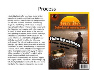
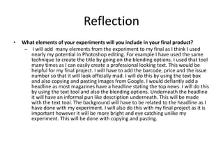
The document summarizes the process the author took to create a magazine cover design experiment. They started by finding a base photo of a man fishing that would work well with the "sunrise" theme. They created a border and shifted the colors. For the title, they chose a simple font and experimented with blending options to make it look more professional. Additional elements like a semi-circle behind the title, a headline about fishing season, a description, subheading about the biggest fish caught, and a barcode and price were added. In reflecting, the author notes they will include many elements from the experiment like the title blending technique, adding a barcode, price and issue number, including a headline and description, and making the background


![3. production experiments(3) (1) [autosaved]](https://cdn.slidesharecdn.com/ss_thumbnails/3-190702151700-thumbnail.jpg?width=640&height=640&fit=bounds)


