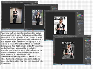
1. To develop my front cover, I originally used the picture
of my model. But I thought the background did not look
professional or suit my genre. At first I thought to add a
train track in the background to make it look industrial. I
had feedback that it did not look like hip-hop at all. I
decided to use another picture in black and white of
buildings and I feel that it suited it better. My cover lines
are bold and I used a colour picker to make the
magazine have a colour scheme. I also had to resize my
model as the overall magazine looked better with a
close up instead of a medium long shot.
At the start, I found using Photoshop difficult as I had
ideas that I could not recreate because I lacked skills.
After using it and getting help I feel more confident with
the program.
2. Creating a contents page was slightly easier for me. I
had to change one of my images because they did
not suit the genre. I made the background darker
and added a border later on to show alignment
within the page. I made the cover lines glow and put
them in different fonts to make it look more
interesting. I figured out that font makes a
difference within the page because it looks
unappealing without the variety. At the end of the
contents production, I added outer shadows to
make each feature stand out-especially the main
cover line.