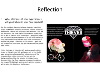
Experiments
Carter smith
Front Cover Process
The main tools I have used for this production is mainly the cutting tool and
also edit images and changing the colours to suit what I am aiming for in the
product. I also have placed some of my other productions that I have created in
my spare time, for example the bottom left image of the lamp with the image
of me Is from some of my work from home, this image is from my new song
coming out. The cartoon style of image has been used for my past work when I
needed a image for my sound cloud cover for my horror audio that I have
produced in a past product. It went very well for my previous project and it fits
very well within this practice of my front cover for the production experiment.
The large band name with logo in the centre of the page has been taken from
online and is free of use because it has been produced by a wireless user and
uploading for free with out any loyalty behind it. I have also changes this image
by adding the grey to the central to make it stand out more because of the text
in front that can be seen easily. For the text on the right hand side I had clipped
it from a custom made magazine, I feel that this works well with the product I
have made for my experiment.
Reflection
• What elements of your experiments will you
include in your final product?
I like the way the image to text ratio works very well for this product and I like
that the colours all match and makes the images and also the text standout. I
will include the type of colour scheme because it works very well for the
image style I have editing and produced myself. For my final product I will
change the location of the bar code but it will be difficult because I feel that
the barcode ruins the front cover slightly. I will include the style of text I will
use because I feel it works well with the images and the way I have laid out
the front cover.
I like that I have used custom images that I have produced and that I have also
taken myself with my cameras. I also will want this to be in my work so I can
have a unique and different style of work compared to other people and truly
make it my own. I also want to include the mix or style of image I have
included into my final product because I feel that t works well with the type of
image I like to make and how different all of them can be.
Double Page Process
The main process of this double page spread will be the
image editing because I had to use the cutting tool and
also the magic tool to remove the background from both
of the images included and also the large title in the
centre of both of the pages. I have also made the text
with in the double page spread copied from the website
Lorem ipsum, this is because it will show where some of
the text will be going. For my final product I will be
including more information.
I used some of my new images that have been taken in
new york and used in the studio. I used these because I
feel they fit the black and white imagery that I will be
going for in the product. It also fits the colour scheme
very well. I like the way the main logo of the band is in the
central of the page because it will look good for the final
product, I may put this into my final design if it fits good
for my final design and product idea.
Reflection
• What elements of your experiments
will you include in your final product?
For this I will keep the colour scheme the way it is and feel
that it fits well with my design techniques from my producing
experiment. I like the mix of the black and white but I also like
the red colours that show slightly that make the images pop
out as well as the text. In my final product I will want to make
the font better because this seems to be too small and hard to
read even though I may have you been using Lorem Ipsum. I
also like the images I have used for this product. I really like
the image of the band name that is in the centre of the double
page spread.
I think the image of me on the left works very well and the
image on the right hand side works very well for the double
page spread, this is because of the colour scheme of the
images and the colour scheme of the text with the
background layer. I like the location of the band name
because I think that if the magazine print was released that
the image of THIEVES will work perfectly with the location. I
will be using this idea for my final product.

3. production experiments

  • 1.
  • 2.
    Front Cover Process Themain tools I have used for this production is mainly the cutting tool and also edit images and changing the colours to suit what I am aiming for in the product. I also have placed some of my other productions that I have created in my spare time, for example the bottom left image of the lamp with the image of me Is from some of my work from home, this image is from my new song coming out. The cartoon style of image has been used for my past work when I needed a image for my sound cloud cover for my horror audio that I have produced in a past product. It went very well for my previous project and it fits very well within this practice of my front cover for the production experiment. The large band name with logo in the centre of the page has been taken from online and is free of use because it has been produced by a wireless user and uploading for free with out any loyalty behind it. I have also changes this image by adding the grey to the central to make it stand out more because of the text in front that can be seen easily. For the text on the right hand side I had clipped it from a custom made magazine, I feel that this works well with the product I have made for my experiment.
  • 3.
    Reflection • What elementsof your experiments will you include in your final product? I like the way the image to text ratio works very well for this product and I like that the colours all match and makes the images and also the text standout. I will include the type of colour scheme because it works very well for the image style I have editing and produced myself. For my final product I will change the location of the bar code but it will be difficult because I feel that the barcode ruins the front cover slightly. I will include the style of text I will use because I feel it works well with the images and the way I have laid out the front cover. I like that I have used custom images that I have produced and that I have also taken myself with my cameras. I also will want this to be in my work so I can have a unique and different style of work compared to other people and truly make it my own. I also want to include the mix or style of image I have included into my final product because I feel that t works well with the type of image I like to make and how different all of them can be.
  • 4.
    Double Page Process Themain process of this double page spread will be the image editing because I had to use the cutting tool and also the magic tool to remove the background from both of the images included and also the large title in the centre of both of the pages. I have also made the text with in the double page spread copied from the website Lorem ipsum, this is because it will show where some of the text will be going. For my final product I will be including more information. I used some of my new images that have been taken in new york and used in the studio. I used these because I feel they fit the black and white imagery that I will be going for in the product. It also fits the colour scheme very well. I like the way the main logo of the band is in the central of the page because it will look good for the final product, I may put this into my final design if it fits good for my final design and product idea.
  • 5.
    Reflection • What elementsof your experiments will you include in your final product? For this I will keep the colour scheme the way it is and feel that it fits well with my design techniques from my producing experiment. I like the mix of the black and white but I also like the red colours that show slightly that make the images pop out as well as the text. In my final product I will want to make the font better because this seems to be too small and hard to read even though I may have you been using Lorem Ipsum. I also like the images I have used for this product. I really like the image of the band name that is in the centre of the double page spread. I think the image of me on the left works very well and the image on the right hand side works very well for the double page spread, this is because of the colour scheme of the images and the colour scheme of the text with the background layer. I like the location of the band name because I think that if the magazine print was released that the image of THIEVES will work perfectly with the location. I will be using this idea for my final product.

Editor's Notes

  • #3 Discuss the tools and processes used in your experiments
  • #5 Discuss the tools and processes used in your experiments