Media College Magazine
Evaluation
Q: In what way does your media product use, develop or
challenge forms and conventions of real media products
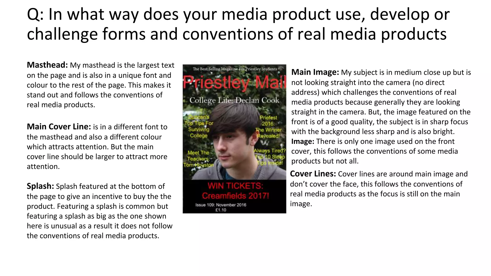
Masthead: My masthead is the largest text
on the page and is also in a unique font and
colour to the rest of the page. This makes it
stand out and follows the conventions of
real media products.
Main Image: My subject is in medium close up but is
not looking straight into the camera (no direct
address) which challenges the conventions of real
media products because generally they are looking
straight in the camera. But, the image featured on the
front is of a good quality, the subject is in sharp focus
with the background less sharp and is also bright.
Image: There is only one image used on the front
cover, this follows the conventions of some media
products but not all.
Cover Lines: Cover lines are around main image and
don’t cover the face, this follows the conventions of
real media products as the focus is still on the main
image.
Main Cover Line: is in a different font to
the masthead and also a different colour
which attracts attention. But the main
cover line should be larger to attract more
attention.
Splash: Splash featured at the bottom of
the page to give an incentive to buy the the
product. Featuring a splash is common but
featuring a splash as big as the one shown
here is unusual as a result it does not follow
the conventions of real media products.
Q: How did I use new technologies in the
construction of my media product
Adobe Photoshop 2015
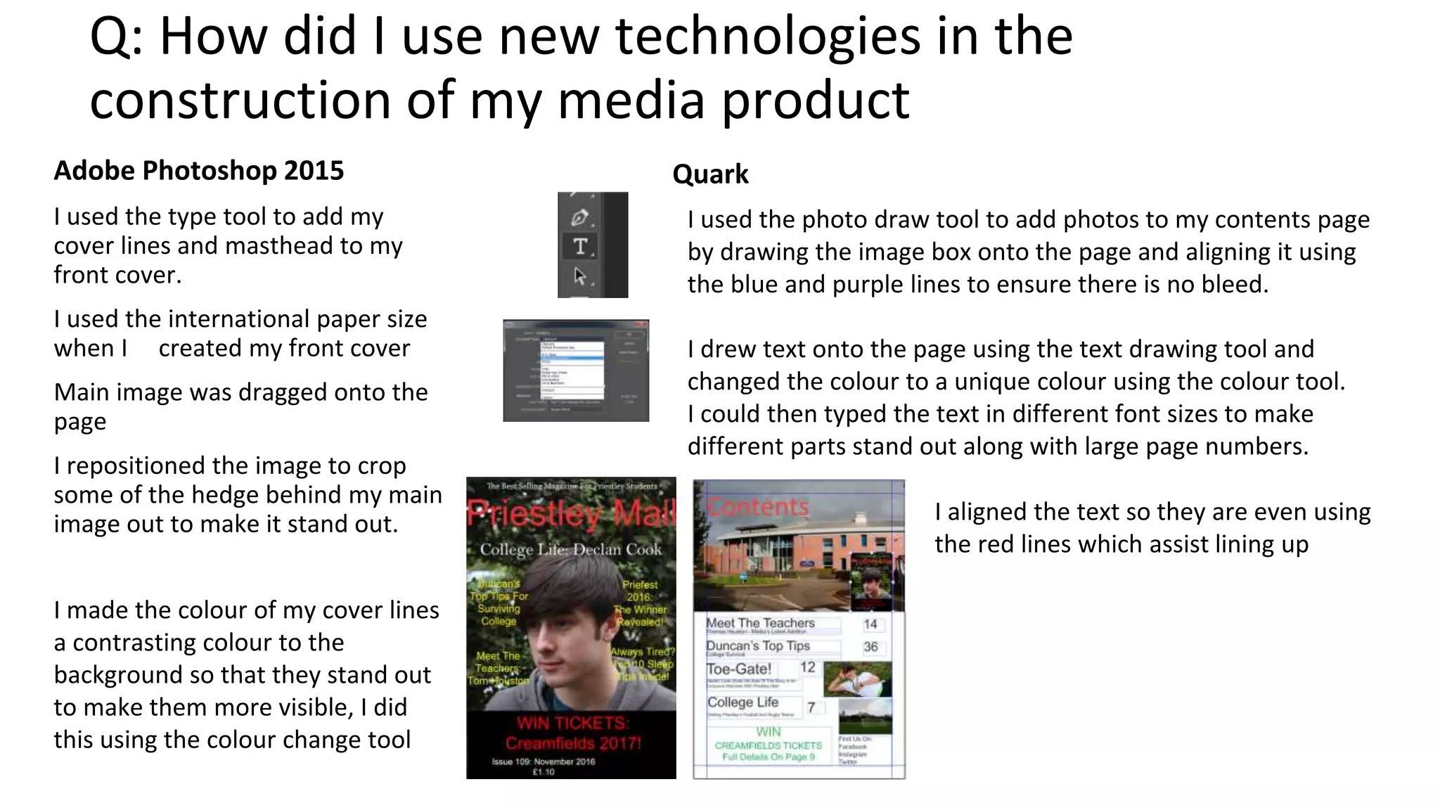
I used the type tool to add my
cover lines and masthead to my
front cover.
I used the international paper size
when I created my front cover
Main image was dragged onto the
page
I repositioned the image to crop
some of the hedge behind my main
image out to make it stand out.
Quark
I made the colour of my cover lines
a contrasting colour to the
background so that they stand out
to make them more visible, I did
this using the colour change tool
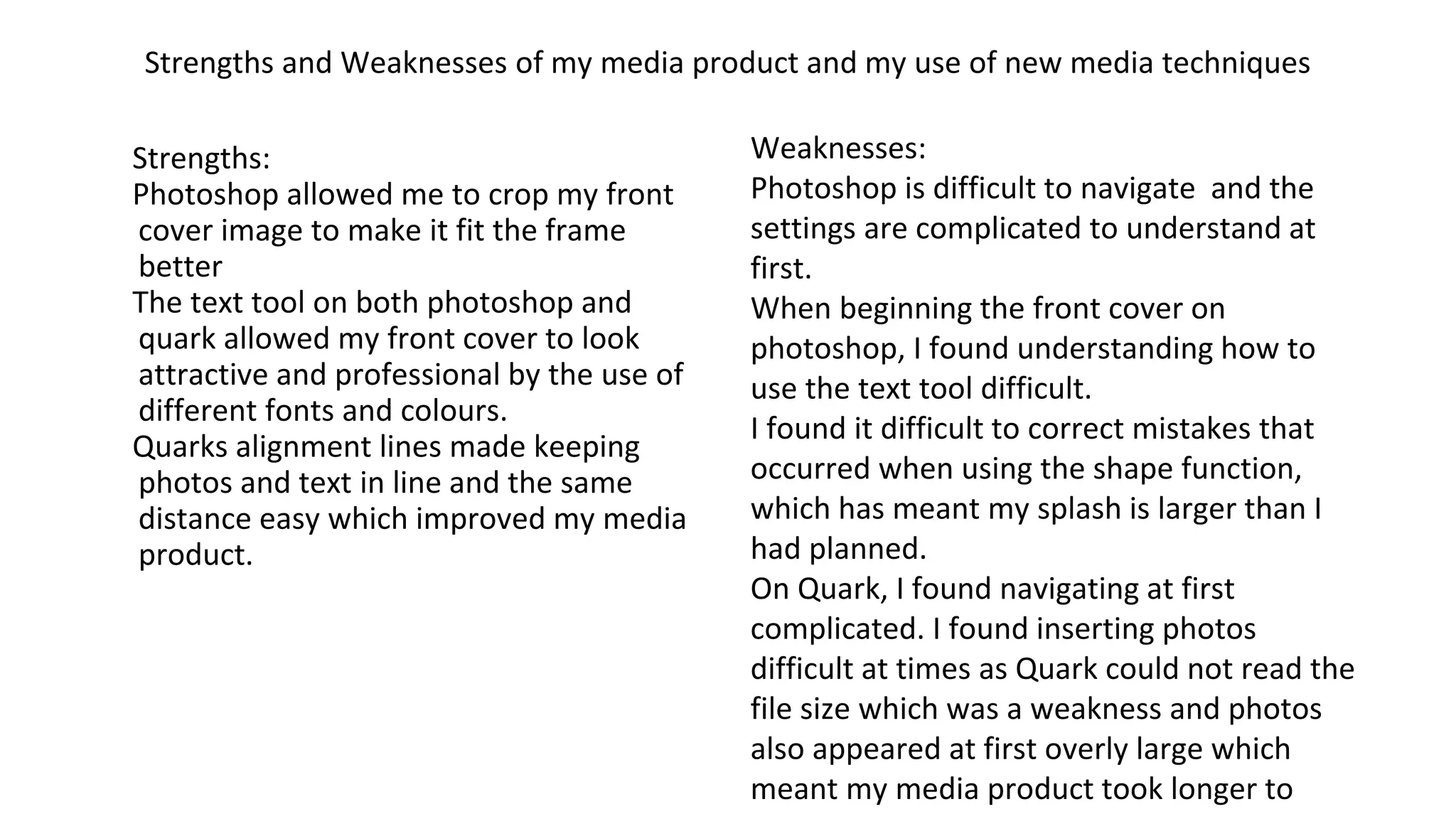
I used the photo draw tool to add photos to my contents page
by drawing the image box onto the page and aligning it using
the blue and purple lines to ensure there is no bleed.
I drew text onto the page using the text drawing tool and
changed the colour to a unique colour using the colour tool.
I could then typed the text in different font sizes to make
different parts stand out along with large page numbers.
I aligned the text so they are even using
the red lines which assist lining up
Strengths and Weaknesses of my media product and my use of new media techniques
Strengths:
Photoshop allowed me to crop my front
cover image to make it fit the frame
better
The text tool on both photoshop and
quark allowed my front cover to look
attractive and professional by the use of
different fonts and colours.
Quarks alignment lines made keeping
photos and text in line and the same
distance easy which improved my media
product.
Weaknesses:
Photoshop is difficult to navigate and the
settings are complicated to understand at
first.
When beginning the front cover on
photoshop, I found understanding how to
use the text tool difficult.
I found it difficult to correct mistakes that
occurred when using the shape function,
which has meant my splash is larger than I
had planned.
On Quark, I found navigating at first
complicated. I found inserting photos
difficult at times as Quark could not read the
file size which was a weakness and photos
also appeared at first overly large which
meant my media product took longer to

Media college magazine evaluation.pptx

  • 1.
  • 2.
    Q: In whatway does your media product use, develop or challenge forms and conventions of real media products Masthead: My masthead is the largest text on the page and is also in a unique font and colour to the rest of the page. This makes it stand out and follows the conventions of real media products. Main Image: My subject is in medium close up but is not looking straight into the camera (no direct address) which challenges the conventions of real media products because generally they are looking straight in the camera. But, the image featured on the front is of a good quality, the subject is in sharp focus with the background less sharp and is also bright. Image: There is only one image used on the front cover, this follows the conventions of some media products but not all. Cover Lines: Cover lines are around main image and don’t cover the face, this follows the conventions of real media products as the focus is still on the main image. Main Cover Line: is in a different font to the masthead and also a different colour which attracts attention. But the main cover line should be larger to attract more attention. Splash: Splash featured at the bottom of the page to give an incentive to buy the the product. Featuring a splash is common but featuring a splash as big as the one shown here is unusual as a result it does not follow the conventions of real media products.
  • 3.
    Q: How didI use new technologies in the construction of my media product Adobe Photoshop 2015 I used the type tool to add my cover lines and masthead to my front cover. I used the international paper size when I created my front cover Main image was dragged onto the page I repositioned the image to crop some of the hedge behind my main image out to make it stand out. Quark I made the colour of my cover lines a contrasting colour to the background so that they stand out to make them more visible, I did this using the colour change tool I used the photo draw tool to add photos to my contents page by drawing the image box onto the page and aligning it using the blue and purple lines to ensure there is no bleed. I drew text onto the page using the text drawing tool and changed the colour to a unique colour using the colour tool. I could then typed the text in different font sizes to make different parts stand out along with large page numbers. I aligned the text so they are even using the red lines which assist lining up
  • 4.
    Strengths and Weaknessesof my media product and my use of new media techniques Strengths: Photoshop allowed me to crop my front cover image to make it fit the frame better The text tool on both photoshop and quark allowed my front cover to look attractive and professional by the use of different fonts and colours. Quarks alignment lines made keeping photos and text in line and the same distance easy which improved my media product. Weaknesses: Photoshop is difficult to navigate and the settings are complicated to understand at first. When beginning the front cover on photoshop, I found understanding how to use the text tool difficult. I found it difficult to correct mistakes that occurred when using the shape function, which has meant my splash is larger than I had planned. On Quark, I found navigating at first complicated. I found inserting photos difficult at times as Quark could not read the file size which was a weakness and photos also appeared at first overly large which meant my media product took longer to