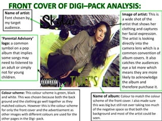
1. Name of artist:
Font chosen by
my target
audience.
‘Parental Advisory’
logo: a common
symbol on a pop
album that implies
some songs may
need to listened to
an adult or simply
not for young
children.
Name of album: Colour to match the colour
scheme of the front cover. I also made sure
this was big but still not over taking too much
of the negative space so that both the
background and most of the artist could be
seen.
Image of artist: This is
a wide shot of the
artist that shows her
clothing and captures
her facial expression.
The artist is looking
directly into the
camera lens which is a
common convention of
album covers. It also
catches the audiences
eye a lot more which
means they are more
likely to acknowledge
the album and
therefore purchase it.
Colour scheme: This colour scheme is green, black
and white. This was chosen because both the back
ground and the clothing go well together as they
matched colours. However this is the colour scheme
for only the front cover and the advertisement as
other images with different colours are used for the
other pages in the Digi- pack.