SlideShare a Scribd company logo
1 of 3
Colour scheme – The colour scheme used in this album poster is black,
white and gold. Gold connotes royalty and it is often used as a symbol
of Jessie.J’s music, and even though the colour black goes against the
conventional pop colour scheme, it relates Nick Lacey’s repertoire of
elements theory as this colour is well known as one of the most
dominant colours that is associated with her as a singer. The artist has
also been made to match her conventional colour scheme as it suits
the ethos she is trying to portray and keeps a high consistency
throughout the poster.
Position of text – The text has been placed at the bottom half of this
advert, which is conventional of music album posters. Her name as
well as the album title is the dominant contrast out of all of the text as
the colours, size and placement have been manipulated so the
audience are attracted to it. Her name is the selling point of the album
so this technique is stereotypical of album adverts. The text above the
black box also stands out as it has been placed above a contrasting
colour to make it clear for the spectator.

Position of images – Only one image has been used on this poster and
it has been sized to take up the majority of the page. Due to the
images placement on the poster, the use of direct address is very
affective to the audience, the usage of this supports Nick Lacey’s
repertoire of elements theory as it is stereotypical of posters and
album covers from all genres. The image is central to create a sense of
symmetry; these appeal to the audience and also attract a new
audience of males as people are commonly attracted to people with
very symmetrical faces. Similar to most album posters, the record
labels have been placed in the corners of the page out of the primary
optical area of the audience.

Rule of thirds – This poster uses the rule of thirds successfully as her
lips, which are one of the many fetishized areas of a female body have
been placed in the centre box. The rule of thirds is supported as the
lips have been made black not only to match the colour scheme of the
poster and to attract the audience, but to keep that area of the poster
the first place the audience sees. Both of the J’s in her name have been
enlarged so they cross the intersecting lines of the rule of thirds, this
creates audience familiarity as her logo is consistent throughout her
work.

Typography design–The font used for the album logo is
script; this makes the poster seem like it has been signed by
her making it seem more personal towards the audience.
The rest of the typography, uses sans serif font, because of
this the audience know that this album will be stereotypical
and will follow the informal conventions that pop albums
usually share, this is an example of Neale’s mental
machinery as the industry have recycled factors that make
pop videos so popular.
Guttenberg principle – Conventional techniques that are
common with album posters have been followed in this
Jessie J Poster. The Lava record label has been placed in the
dead zone of the page as more people know about
universal, and her logo as well as the artist herself has been
placed in the primary optical area as they are the main
selling points of the album.

Photography lighting – High key lighting has been placed
on the artists face and hands to make her stand out to the
audience, this is stereotypical of music posters as the artist
has usually been manipulated to make them seem like the
ideal person. To emphasise the design that she has on her
lips, her bottom lip has also made use of high key lighting to
create dominant contrast.
Colour scheme – The colour scheme follows the stereotypical 4 colour
limit that most album posters follow, the use of green and black is
conventional of the rock genre and also creates a contrast with the
white font. The ‘Out Now’ has been made the colour red, which makes
the poster a lot more effective as despite the size of the out now, due
to it being the only use of red on the poster the audience is drawn to
that area.
Position of text – The position of text uses Nick Lacey’s repertoire of
elements theory as the audience expect for the text to be placed
around the image rather than across it, this is exactly what this poster
has done. The logo is placed at the top area of the page, and the album
information is placed at the bottom, due to the logo being placed at
the top of the primary optical area, it causes the audiences to view the
entire poster rather than the bottom half that it the usual way that
posters are laid out.

Positions of images – 4 Images have been used on this poster, all have
been merged into one to create a sense of dysfunction, and the images
take up the majority of the page. Even though each image contains a
different band member, they have been rearranged to create an image
of an owl in the centre; this relates to the album name ‘Only by the
Night’ and attracts the audience into examining the poster more.
Conventions are followed on this poster as the distributor logo has
been placed in the bottom corner, in this case the Play.com logo.

Rule of thirds – I believe that this poster doesn’t make good use of the
rule of thirds, the usual way, especially in the rock genre, that the rule
of thirds is used is by placing the album information across the
intersecting lines, however this poster goes against stereotype and
doesn’t use this, the main focus of the rule of thirds is the intersecting
lines being placed over the Owl eyes, which relates to the album name.

Typography design–The font is consistent throughout the
poster, sans serif font is used to create an informal feel
which is stereotypical of the rock genre. The logo and
album title however have been given underscores between
each word which is unusual. The use of this makes the text
stand out from others of the same genre as with Neale’s
mental machinery they have changed the layout slightly but
kept it consistent with stereotypical posters to keep
audience familiarity.

Guttenberg principle – The logo has been placed above the
primary optical area, as well as the image and the album
name. Similar to most album posters the information about
the record label and distributer has been placed in the dead
zone as they are the least relevant information on the
poster. This follows Nick Lacey’s repertoire of elements
theory as this is conventional and the audience expect it.

Photography lighting – There isn’t a lot of use of the
photographic lighting in this poster, like most band images
the faces have been made the dominant contrast to stand
out with the use of high key lighting. The photography
lighting doesn’t really have much of an effect on this piece
as the image is in a green tone rather than the usual full
colour image, but the way green is used makes the image
seem like night vision, which would go with the theme of
the album which are ‘owls’ and ‘night’.
Colour scheme – This music magazine poster uses the colours, white
and Red like pink, the colours are conventional of the genre of music
and of her gender, this works in relation to Nick Lacey’s repertoire of
elements theory. The entire colour scheme is consistent throughout
the poster which is maintaining the design and defines the pop music
genre for girls. This also makes use of Neale’s mental machinery as the
target audience have previously shown an interest in these
conventions for the pop genre, so the record label has made use of
this. .

Position of text – The text placement on this poster is conventional to
most posters; it appears around the picture of the artist and all of the
important information such as the album name, artist and date of
album release is placed within the primary optical area. However the
size of the text goes against Nick Lacey’s repertoire of elements theory,
because in the pop genre it is unusual for the album name to be larger
than the artist’s name.

Position of images – This poster once again goes against conventions
as the iTunes logo is placed close to the centre of the poster compared
to the usual placement in the bottom corner. The main image takes up
the majority of the page with her lips being placed in the primary
optical area in terms of the Guttenberg design principle, they have
been made quite large and the dominant contrast of the image, this
also creates audience familiarity as Taylor Swift is well known for her
lips.

Rule of thirds – Her logo, her song image and the release date have all
been placed over the intersecting lines to make them one of the first
areas that the viewer. However the most obvious use of rule of thirds,
which is assisted by the dominant contrast of the area, is the lips. The
lips are one of the many fetishized areas of the female body; this is to
attract a male audience as well as female to expand her popularity. The
use of red lips also creates audience familiarity as it keeps with the red
theme she is trying to keep in this album.

Typography design – The typography design is pretty
consistent throughout the entire poster, the font is
consistent and with the use of sans serif font it connotes
being informal which is consistent with the genre pop, this
is another example of Neale’s mental machinery theory.
The use of this just one font rather than many makes the
poster seem more professional to the people who view this
poster.
Guttenberg principle –The Guttenberg principle in this
poster is stereotypical of most posters of every genre, her
lips have been placed in the primary optical area, as well as
other important information about the album, including the
artists name, the release date and the album’s title. In the
dead zones, conventional of most posters the information
that isn’t essential to the album is placed in them. This
poster in terms of the Guttenberg design principle makes
use Nick Lacey’s repertoire of elements theory and Neale’s
mental machinery as the industry have kept their posters
using this design as it is very popular and the audience
expect this layout.

Photography lighting – A lot of techniques have been used
on this poster to make Taylor Swift’s lips the first area that
the viewer looks at, whether it uses dominant contrast or
the rule of thirds. Photography lighting has been used in a
clever way on the photograph of Taylor Swift to exaggerate
her lips to the target audience. Her hat has been made to
cast a shadow over her face to make the object of desire
(the lips) stand out from the rest of her face, her faced
hasn’t been completely blacked out however it is clear that
the record label wanted to focus on the colour red to
promote this album rather than the artist herself. I believe
that her face being darkened makes the audience focus
more on different parts of the poster, making the audience
examine the poster more.

More Related Content

What's hot

Following/Challenging Conventions: Digipak
Following/Challenging Conventions: DigipakFollowing/Challenging Conventions: Digipak
Following/Challenging Conventions: Digipaktalitha-roberts
 
Posters, websites themes, merchandise
Posters, websites themes, merchandisePosters, websites themes, merchandise
Posters, websites themes, merchandisejennypinchbeck
 
Analysis Of Magazine Adverts
Analysis Of Magazine AdvertsAnalysis Of Magazine Adverts
Analysis Of Magazine AdvertsHannahLenane
 
Music album advert analysis
Music album advert analysisMusic album advert analysis
Music album advert analysisshaziaj
 
Initial Advertisement Planning
Initial Advertisement PlanningInitial Advertisement Planning
Initial Advertisement Planningtashaay27
 
Mag advert research
Mag advert researchMag advert research
Mag advert researcharfa4739
 
Advertisement research
Advertisement researchAdvertisement research
Advertisement researchTia5133
 
Photography planning
Photography planningPhotography planning
Photography planningtashaay27
 
How effective is the combination of your main product and acillary texts
How effective is the combination of your main product and acillary textsHow effective is the combination of your main product and acillary texts
How effective is the combination of your main product and acillary textstashaay27
 
Analysis of previous digipak’s
Analysis of previous digipak’sAnalysis of previous digipak’s
Analysis of previous digipak’slaurenbutton16
 
Digipak & Advert Process
Digipak & Advert ProcessDigipak & Advert Process
Digipak & Advert ProcessEmMaskell
 
Digipak and magazine advert analysis
Digipak and magazine advert analysis Digipak and magazine advert analysis
Digipak and magazine advert analysis godsell1999
 
Inital digipak planning
Inital digipak planningInital digipak planning
Inital digipak planningtashaay27
 
Analysis Of 3 CD Digipak
Analysis Of 3 CD DigipakAnalysis Of 3 CD Digipak
Analysis Of 3 CD DigipakFrankParnell123
 

What's hot (20)

Following/Challenging Conventions: Digipak
Following/Challenging Conventions: DigipakFollowing/Challenging Conventions: Digipak
Following/Challenging Conventions: Digipak
 
Eval 2
Eval 2Eval 2
Eval 2
 
Posters, websites themes, merchandise
Posters, websites themes, merchandisePosters, websites themes, merchandise
Posters, websites themes, merchandise
 
Analysis Of Magazine Adverts
Analysis Of Magazine AdvertsAnalysis Of Magazine Adverts
Analysis Of Magazine Adverts
 
Music album advert analysis
Music album advert analysisMusic album advert analysis
Music album advert analysis
 
Digipak anil
Digipak anilDigipak anil
Digipak anil
 
Initial Advertisement Planning
Initial Advertisement PlanningInitial Advertisement Planning
Initial Advertisement Planning
 
Poster Research
Poster ResearchPoster Research
Poster Research
 
Mag advert research
Mag advert researchMag advert research
Mag advert research
 
Advert Analysis
Advert AnalysisAdvert Analysis
Advert Analysis
 
Magazine Adverts
Magazine AdvertsMagazine Adverts
Magazine Adverts
 
Advertisement research
Advertisement researchAdvertisement research
Advertisement research
 
Photography planning
Photography planningPhotography planning
Photography planning
 
Existing CD Covers
Existing CD CoversExisting CD Covers
Existing CD Covers
 
How effective is the combination of your main product and acillary texts
How effective is the combination of your main product and acillary textsHow effective is the combination of your main product and acillary texts
How effective is the combination of your main product and acillary texts
 
Analysis of previous digipak’s
Analysis of previous digipak’sAnalysis of previous digipak’s
Analysis of previous digipak’s
 
Digipak & Advert Process
Digipak & Advert ProcessDigipak & Advert Process
Digipak & Advert Process
 
Digipak and magazine advert analysis
Digipak and magazine advert analysis Digipak and magazine advert analysis
Digipak and magazine advert analysis
 
Inital digipak planning
Inital digipak planningInital digipak planning
Inital digipak planning
 
Analysis Of 3 CD Digipak
Analysis Of 3 CD DigipakAnalysis Of 3 CD Digipak
Analysis Of 3 CD Digipak
 

Similar to Album posters research

Music Digipak Research
Music Digipak ResearchMusic Digipak Research
Music Digipak ResearchJoshRobinson12
 
Generic Conventions of Pop Digipaks
Generic Conventions of Pop DigipaksGeneric Conventions of Pop Digipaks
Generic Conventions of Pop DigipaksSam Benzie
 
Magazine ads
Magazine ads Magazine ads
Magazine ads hanaa_m
 
Album Poster Analysis 3 - The Strypes 'Snapshot'
Album Poster Analysis 3 - The Strypes 'Snapshot' Album Poster Analysis 3 - The Strypes 'Snapshot'
Album Poster Analysis 3 - The Strypes 'Snapshot' amybrackenridge
 
Ancillary Research Task - Analysis of Advertisements and Digipaks
Ancillary Research Task - Analysis of Advertisements and DigipaksAncillary Research Task - Analysis of Advertisements and Digipaks
Ancillary Research Task - Analysis of Advertisements and DigipaksJerard Ocitti
 
Ancillary tasks digi- packs
Ancillary tasks  digi- packsAncillary tasks  digi- packs
Ancillary tasks digi- packsrhsmediastudies
 
Student Album cover and Magazine advert analysis
Student Album cover and Magazine advert analysisStudent Album cover and Magazine advert analysis
Student Album cover and Magazine advert analysisharrisoncattell123
 
Album poster analysis
Album poster analysisAlbum poster analysis
Album poster analysissophieb17
 
Digipak and poster analysis
Digipak and poster analysisDigipak and poster analysis
Digipak and poster analysisUpsonm
 
The verve poster analysis
The verve poster analysisThe verve poster analysis
The verve poster analysislilywilkinson
 
Digipak adverts analysis
Digipak adverts analysisDigipak adverts analysis
Digipak adverts analysisAmy Tompkins
 
Question 2 by Rishi Ghetia
Question 2 by Rishi GhetiaQuestion 2 by Rishi Ghetia
Question 2 by Rishi GhetiaRishi Ghetia
 
Analysis of digipak’s gor
Analysis of digipak’s  gorAnalysis of digipak’s  gor
Analysis of digipak’s gorMaria Bennett
 
Digipak research
Digipak research Digipak research
Digipak research Cara Wilson
 

Similar to Album posters research (20)

Music Digipak Research
Music Digipak ResearchMusic Digipak Research
Music Digipak Research
 
Album Poster Analysis
Album Poster AnalysisAlbum Poster Analysis
Album Poster Analysis
 
Anclilary products
Anclilary products Anclilary products
Anclilary products
 
Generic Conventions of Pop Digipaks
Generic Conventions of Pop DigipaksGeneric Conventions of Pop Digipaks
Generic Conventions of Pop Digipaks
 
Magazine ads
Magazine ads Magazine ads
Magazine ads
 
Album Poster Analysis 3 - The Strypes 'Snapshot'
Album Poster Analysis 3 - The Strypes 'Snapshot' Album Poster Analysis 3 - The Strypes 'Snapshot'
Album Poster Analysis 3 - The Strypes 'Snapshot'
 
Album release
Album releaseAlbum release
Album release
 
Ancillary Research Task - Analysis of Advertisements and Digipaks
Ancillary Research Task - Analysis of Advertisements and DigipaksAncillary Research Task - Analysis of Advertisements and Digipaks
Ancillary Research Task - Analysis of Advertisements and Digipaks
 
Ancillary tasks digi- packs
Ancillary tasks  digi- packsAncillary tasks  digi- packs
Ancillary tasks digi- packs
 
Advert analysis
Advert analysisAdvert analysis
Advert analysis
 
Student Album cover and Magazine advert analysis
Student Album cover and Magazine advert analysisStudent Album cover and Magazine advert analysis
Student Album cover and Magazine advert analysis
 
Student Digipak Analysis
Student Digipak AnalysisStudent Digipak Analysis
Student Digipak Analysis
 
Album poster analysis
Album poster analysisAlbum poster analysis
Album poster analysis
 
Digipak and poster analysis
Digipak and poster analysisDigipak and poster analysis
Digipak and poster analysis
 
The verve poster analysis
The verve poster analysisThe verve poster analysis
The verve poster analysis
 
Digipak adverts analysis
Digipak adverts analysisDigipak adverts analysis
Digipak adverts analysis
 
Question 2 by Rishi Ghetia
Question 2 by Rishi GhetiaQuestion 2 by Rishi Ghetia
Question 2 by Rishi Ghetia
 
Analysis of digipak’s gor
Analysis of digipak’s  gorAnalysis of digipak’s  gor
Analysis of digipak’s gor
 
Digipak Research
Digipak Research Digipak Research
Digipak Research
 
Digipak research
Digipak research Digipak research
Digipak research
 

More from JoshRobinson12

Question 1 Evaluation
Question 1 Evaluation Question 1 Evaluation
Question 1 Evaluation JoshRobinson12
 
Question 2 Evaluation
Question 2 Evaluation Question 2 Evaluation
Question 2 Evaluation JoshRobinson12
 
Question 1 Evaluation
Question 1 Evaluation Question 1 Evaluation
Question 1 Evaluation JoshRobinson12
 
A2 advanced portfolio_production_diary Josh Robinson
A2 advanced portfolio_production_diary Josh RobinsonA2 advanced portfolio_production_diary Josh Robinson
A2 advanced portfolio_production_diary Josh RobinsonJoshRobinson12
 
Music video script template a2 media adv portfolio
Music video script template a2 media adv portfolioMusic video script template a2 media adv portfolio
Music video script template a2 media adv portfolioJoshRobinson12
 
Music video script template a2 media adv portfolio1
Music video script template a2 media adv portfolio1Music video script template a2 media adv portfolio1
Music video script template a2 media adv portfolio1JoshRobinson12
 
Music video report121312
Music video report121312Music video report121312
Music video report121312JoshRobinson12
 
Music video analysis 3 version
Music video analysis 3 versionMusic video analysis 3 version
Music video analysis 3 versionJoshRobinson12
 
Music video analysis 2 version 2
Music video analysis 2 version 2Music video analysis 2 version 2
Music video analysis 2 version 2JoshRobinson12
 
Music video analysis 1 new version
Music video analysis 1 new versionMusic video analysis 1 new version
Music video analysis 1 new versionJoshRobinson12
 
Music Video Analysis 1
Music Video Analysis 1Music Video Analysis 1
Music Video Analysis 1JoshRobinson12
 

More from JoshRobinson12 (16)

Evaluation Q4
Evaluation Q4Evaluation Q4
Evaluation Q4
 
Evaluation Question 4
Evaluation Question 4Evaluation Question 4
Evaluation Question 4
 
Question 1 Evaluation
Question 1 Evaluation Question 1 Evaluation
Question 1 Evaluation
 
Evaluation Question 4
Evaluation Question 4Evaluation Question 4
Evaluation Question 4
 
Evaluation complete 4
Evaluation complete 4Evaluation complete 4
Evaluation complete 4
 
Question 2 Evaluation
Question 2 Evaluation Question 2 Evaluation
Question 2 Evaluation
 
Question 1 Evaluation
Question 1 Evaluation Question 1 Evaluation
Question 1 Evaluation
 
A2 advanced portfolio_production_diary Josh Robinson
A2 advanced portfolio_production_diary Josh RobinsonA2 advanced portfolio_production_diary Josh Robinson
A2 advanced portfolio_production_diary Josh Robinson
 
Music video script template a2 media adv portfolio
Music video script template a2 media adv portfolioMusic video script template a2 media adv portfolio
Music video script template a2 media adv portfolio
 
Music video script template a2 media adv portfolio1
Music video script template a2 media adv portfolio1Music video script template a2 media adv portfolio1
Music video script template a2 media adv portfolio1
 
Music video report121312
Music video report121312Music video report121312
Music video report121312
 
Survey analysis
Survey analysisSurvey analysis
Survey analysis
 
Music video analysis 3 version
Music video analysis 3 versionMusic video analysis 3 version
Music video analysis 3 version
 
Music video analysis 2 version 2
Music video analysis 2 version 2Music video analysis 2 version 2
Music video analysis 2 version 2
 
Music video analysis 1 new version
Music video analysis 1 new versionMusic video analysis 1 new version
Music video analysis 1 new version
 
Music Video Analysis 1
Music Video Analysis 1Music Video Analysis 1
Music Video Analysis 1
 

Album posters research

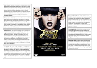
  • 1. Colour scheme – The colour scheme used in this album poster is black, white and gold. Gold connotes royalty and it is often used as a symbol of Jessie.J’s music, and even though the colour black goes against the conventional pop colour scheme, it relates Nick Lacey’s repertoire of elements theory as this colour is well known as one of the most dominant colours that is associated with her as a singer. The artist has also been made to match her conventional colour scheme as it suits the ethos she is trying to portray and keeps a high consistency throughout the poster. Position of text – The text has been placed at the bottom half of this advert, which is conventional of music album posters. Her name as well as the album title is the dominant contrast out of all of the text as the colours, size and placement have been manipulated so the audience are attracted to it. Her name is the selling point of the album so this technique is stereotypical of album adverts. The text above the black box also stands out as it has been placed above a contrasting colour to make it clear for the spectator. Position of images – Only one image has been used on this poster and it has been sized to take up the majority of the page. Due to the images placement on the poster, the use of direct address is very affective to the audience, the usage of this supports Nick Lacey’s repertoire of elements theory as it is stereotypical of posters and album covers from all genres. The image is central to create a sense of symmetry; these appeal to the audience and also attract a new audience of males as people are commonly attracted to people with very symmetrical faces. Similar to most album posters, the record labels have been placed in the corners of the page out of the primary optical area of the audience. Rule of thirds – This poster uses the rule of thirds successfully as her lips, which are one of the many fetishized areas of a female body have been placed in the centre box. The rule of thirds is supported as the lips have been made black not only to match the colour scheme of the poster and to attract the audience, but to keep that area of the poster the first place the audience sees. Both of the J’s in her name have been enlarged so they cross the intersecting lines of the rule of thirds, this creates audience familiarity as her logo is consistent throughout her work. Typography design–The font used for the album logo is script; this makes the poster seem like it has been signed by her making it seem more personal towards the audience. The rest of the typography, uses sans serif font, because of this the audience know that this album will be stereotypical and will follow the informal conventions that pop albums usually share, this is an example of Neale’s mental machinery as the industry have recycled factors that make pop videos so popular. Guttenberg principle – Conventional techniques that are common with album posters have been followed in this Jessie J Poster. The Lava record label has been placed in the dead zone of the page as more people know about universal, and her logo as well as the artist herself has been placed in the primary optical area as they are the main selling points of the album. Photography lighting – High key lighting has been placed on the artists face and hands to make her stand out to the audience, this is stereotypical of music posters as the artist has usually been manipulated to make them seem like the ideal person. To emphasise the design that she has on her lips, her bottom lip has also made use of high key lighting to create dominant contrast.
  • 2. Colour scheme – The colour scheme follows the stereotypical 4 colour limit that most album posters follow, the use of green and black is conventional of the rock genre and also creates a contrast with the white font. The ‘Out Now’ has been made the colour red, which makes the poster a lot more effective as despite the size of the out now, due to it being the only use of red on the poster the audience is drawn to that area. Position of text – The position of text uses Nick Lacey’s repertoire of elements theory as the audience expect for the text to be placed around the image rather than across it, this is exactly what this poster has done. The logo is placed at the top area of the page, and the album information is placed at the bottom, due to the logo being placed at the top of the primary optical area, it causes the audiences to view the entire poster rather than the bottom half that it the usual way that posters are laid out. Positions of images – 4 Images have been used on this poster, all have been merged into one to create a sense of dysfunction, and the images take up the majority of the page. Even though each image contains a different band member, they have been rearranged to create an image of an owl in the centre; this relates to the album name ‘Only by the Night’ and attracts the audience into examining the poster more. Conventions are followed on this poster as the distributor logo has been placed in the bottom corner, in this case the Play.com logo. Rule of thirds – I believe that this poster doesn’t make good use of the rule of thirds, the usual way, especially in the rock genre, that the rule of thirds is used is by placing the album information across the intersecting lines, however this poster goes against stereotype and doesn’t use this, the main focus of the rule of thirds is the intersecting lines being placed over the Owl eyes, which relates to the album name. Typography design–The font is consistent throughout the poster, sans serif font is used to create an informal feel which is stereotypical of the rock genre. The logo and album title however have been given underscores between each word which is unusual. The use of this makes the text stand out from others of the same genre as with Neale’s mental machinery they have changed the layout slightly but kept it consistent with stereotypical posters to keep audience familiarity. Guttenberg principle – The logo has been placed above the primary optical area, as well as the image and the album name. Similar to most album posters the information about the record label and distributer has been placed in the dead zone as they are the least relevant information on the poster. This follows Nick Lacey’s repertoire of elements theory as this is conventional and the audience expect it. Photography lighting – There isn’t a lot of use of the photographic lighting in this poster, like most band images the faces have been made the dominant contrast to stand out with the use of high key lighting. The photography lighting doesn’t really have much of an effect on this piece as the image is in a green tone rather than the usual full colour image, but the way green is used makes the image seem like night vision, which would go with the theme of the album which are ‘owls’ and ‘night’.
  • 3. Colour scheme – This music magazine poster uses the colours, white and Red like pink, the colours are conventional of the genre of music and of her gender, this works in relation to Nick Lacey’s repertoire of elements theory. The entire colour scheme is consistent throughout the poster which is maintaining the design and defines the pop music genre for girls. This also makes use of Neale’s mental machinery as the target audience have previously shown an interest in these conventions for the pop genre, so the record label has made use of this. . Position of text – The text placement on this poster is conventional to most posters; it appears around the picture of the artist and all of the important information such as the album name, artist and date of album release is placed within the primary optical area. However the size of the text goes against Nick Lacey’s repertoire of elements theory, because in the pop genre it is unusual for the album name to be larger than the artist’s name. Position of images – This poster once again goes against conventions as the iTunes logo is placed close to the centre of the poster compared to the usual placement in the bottom corner. The main image takes up the majority of the page with her lips being placed in the primary optical area in terms of the Guttenberg design principle, they have been made quite large and the dominant contrast of the image, this also creates audience familiarity as Taylor Swift is well known for her lips. Rule of thirds – Her logo, her song image and the release date have all been placed over the intersecting lines to make them one of the first areas that the viewer. However the most obvious use of rule of thirds, which is assisted by the dominant contrast of the area, is the lips. The lips are one of the many fetishized areas of the female body; this is to attract a male audience as well as female to expand her popularity. The use of red lips also creates audience familiarity as it keeps with the red theme she is trying to keep in this album. Typography design – The typography design is pretty consistent throughout the entire poster, the font is consistent and with the use of sans serif font it connotes being informal which is consistent with the genre pop, this is another example of Neale’s mental machinery theory. The use of this just one font rather than many makes the poster seem more professional to the people who view this poster. Guttenberg principle –The Guttenberg principle in this poster is stereotypical of most posters of every genre, her lips have been placed in the primary optical area, as well as other important information about the album, including the artists name, the release date and the album’s title. In the dead zones, conventional of most posters the information that isn’t essential to the album is placed in them. This poster in terms of the Guttenberg design principle makes use Nick Lacey’s repertoire of elements theory and Neale’s mental machinery as the industry have kept their posters using this design as it is very popular and the audience expect this layout. Photography lighting – A lot of techniques have been used on this poster to make Taylor Swift’s lips the first area that the viewer looks at, whether it uses dominant contrast or the rule of thirds. Photography lighting has been used in a clever way on the photograph of Taylor Swift to exaggerate her lips to the target audience. Her hat has been made to cast a shadow over her face to make the object of desire (the lips) stand out from the rest of her face, her faced hasn’t been completely blacked out however it is clear that the record label wanted to focus on the colour red to promote this album rather than the artist herself. I believe that her face being darkened makes the audience focus more on different parts of the poster, making the audience examine the poster more.