1. In what ways does your media product use, develop or challenge forms and conventions of real
media products?
My mediaproductusesconventionsof real mediaproductslike musicmagazinesbyincludingfree
itemswithinthe magazine toentice the readerintopurchasingit.Italsousestag phrasessuchas
“FinallyInterviewed!”Whichsuggestsit’sabigthingthat thisartistisbeinginterviewedinthis
magazine.Inmymagazine,explicitlanguageisused like inissuesof NMEthat feature rapperslike
Tyler,The Creator:
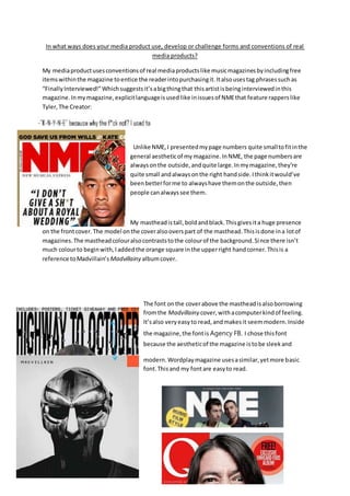
Unlike NME,I presentedmypage numbers quite smalltofitinthe
general aestheticof my magazine.InNME, the page numbersare
alwaysonthe outside,andquite large.Inmymagazine,they’re
quite small andalwaysonthe right handside.Ithinkitwould’ve
beenbetterforme to alwayshave themonthe outside,then
people canalwayssee them.
My mastheadistall,boldandblack.Thisgivesita huge presence
on the frontcover.The model onthe coveralsooverspart of the masthead.Thisisdone ina lotof
magazines.The mastheadcolouralsocontraststothe colourof the background.Since there isn’t
much colourto beginwith,Iaddedthe orange square inthe upperright handcorner.Thisis a
reference toMadvillain’s Madvillainy albumcover.
The font onthe coverabove the mastheadisalsoborrowing
fromthe Madvillainy cover,withacomputerkindof feeling.
It’salso veryeasyto read,andmakesit seemmodern.Inside
the magazine,the fontis Agency FB. I chose thisfont
because the aestheticof the magazine istobe sleekand
modern.Wordplaymagazine usesasimilar,yetmore basic
font.Thisand my fontare easyto read.
2. The colour scheme borrowsaLOT fromMadvillain’salbumcover,fromthe colour(andshape) of the
mask,the lightgreybackground,the orange square and the colourof the text.KnightSix onthe
coveris mostlyinblackand white justlike DOOMonhiscover.Since it’smostlya hip-hopmagazine,
I thoughtthiswouldbe a cool thingto do. The orange square is alsoon everypage inthe magazine,
inthe upperrighthandcorner.
The style of photographyreferencesJoey BADA$$onthe
coverof Wordplay,withKnight’shandsuptohistemples,
like Joey.The photosare all/mostlyblackandwhite.Iedited
all of Knight’sskintobe blackand white.Ididthisbecause
it blendedwell withthe white/greybackground.
3. The writingstyle I’ve usedisas if someone istalking,notincrediblyformal,butnotinformal either.
It’sa hip-hopmagazine,sothere’sswearinginvolved(censoredinthisedition).Readersof this
magazine wouldbe intheirlaterteens(16-18),soobviouslynone of themwouldmindseeing
expletives.If the magazine wasforanolderaudience,itwouldbe toneddownabit.
I’ve useda pull quote fromthe interview withKnightSix togive the audience animpressionof who
he reallyiswithoutreadingthe whole article,like
whatNME has done here withLilyAllen.
The cover linesI’ve usedare all fake artistsandbands,andare listeddownatthe bottominside a
blackbanner.You can see NME has listedtheminthe opendownthe side,vertically. They’ve written
theirnamesinred, whichcontrastswell,andmatchesthe colourscheme of that issue.