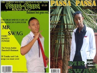
4. The first version of my magazine seemed is simplistic and the artist did not come
across as confident in the attire I set. Nor did my magazine show any relation to
‘Bashment’ the genre. So I decided to re shoot with a different artist in a different
mise-en-scene for example taking the front cover image in front of a tree just by
doing this it has allowed the image to have a relation to the genre. Before in my first
draft the front cover had too much going on and the image looked like it was badly
photoshop. I changed my colour scheme and made it merge with the image I took
which I used through out my entire music magazine which displays professionalism
as it links in with how an actual magazine colour scheme would be.
My contents page is massively different in comparison to my first draft, the layout of
my current magazine looks readable and engaging, the sub-headings stand out
more, instead of just using a stroke like I done in my first draft, I created two shapes
around it, so it stands out and looks like a sub-headings.
In my pervious draft of my double paged spread the images were all over the place,
was not edited, however in my current magazine my image blends well with the text
and looks professional.
Since I received my feedback from my peer groups I have made a lot of changes to
my magazine and have shown off my skills a lot more than I did in my first draft. I
have used more effects on my images and concentrated a lot on the layout and how
the colour scheme would relate to my genre.