08448380779 Call Girls In Civil Lines Women Seeking Men
Media. question 7
1. Evaluation Question 7 –
Looking back at your
preliminary task what do you
feel you have learnt in the
progression from it to the
main task?
2. Research
In my preliminary task, I did very limited research, I just looked at 2 front covers and 2 contents pages and
analysis them and got inspiration. This was because research was time consuming.
However my research for my final product was very thorough as I did research in all areas of the
magazine. I did audience, magazine, font, article, and photography research to ensure my magazine
looked highly professional and fitted the genre of music I aimed for and appealed to my target audience.
I used the internet to collect secondary data about my audience – what their interests were, how other
media producers produced magazines and what the genre of music represents.
The research was time consuming, but was crucial. Because of this I was able to gain knowledge, skills,
and inspiration to create a professional product.
3. Planning
Planning my final product was carried out over a number of weeks, and included important aspects to ensure I kept
to a production schedule and met deadlines.
Process of planning final product:
Construct flat plans – photography test shots - flat plan pitch and feedback – model costume and make up
research – location recce – photo shoot plans – article draft – photo shoot – model release forms – model call
sheets – location hazard and risk assessments – CONSTRUCTION BEGINS OF PRODUCT.
My preliminary task production and planning took half tie time. It was a smaller and quicker process.
Process of planning preliminary task:
Covers and contents inspiration – photography – compositions – flat plans – photography – CONSTRUCTUON.
The skills I have learnt and progressed over the production process of my final product
has allowed me to create a product which looks professional and fits the pop/R&B genre
whist conforming to stereotypes of its target audience.
I really benefited from taking loner to plan as I was able to trial and error which meant
improvements could be make ensuring the best quality for my product.
4. Time Management
In my preliminary task I was given around 3 weeks
to construct a front cover and contents page.
Because I hadn't constructed a product like this
before time management wasn’t my strong point. I
hadn't created a production schedule which would
have benefited me as I would have a clear guide to
follow. However because this was only a small quick
task I found it easy to catch up with.
For my final product we produced a production
schedule so time management was essential whilst
keeping to it. It allowed me to follow the
production process like a professional would.
However because this was a much bigger task I had
to do much more work out of lessons to keep on
track.
5. Construction
I have used different fonts and texts when making my final product to enhance its look and it makes it look more
professional compared to my preliminary school magazine. I research different fonts using dafont.com to fine one best
to suit instead of sticking to the fonts provided by InDesgin and Photoshop. For example for my masthead I chose a
font which looks fun, fresh and current which goes with my genre, whilst giving it a popR&B name of ‘Rythmix’.
For the images I rook in to consideration the genre I was representing so thought about costume, make up, and poses.
I have also learnt new skills and techniques such as the rule of thirds which allowed me to get a professional shot. For
example I chose to have my front cover model as an attractive female to attract both male and female readers. I also
chose her to have her eye line direct and in the upper third to make it personal and to make her look powerful and
dominant.
For my layout I took time to research other magazines to see how they had constructed theirs and see how I could
reciprocate a real media product. I looked at mastheads and main sell lines to get an idea of where they are on the
page, and followed this threw all aspects of a magazine to reciprocate. For my final product.
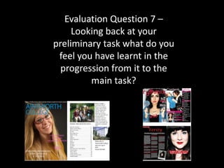
6. Comparison
Prelim Magazine Final Magazine
Photography- During this task my photography was Photography – for this task I had a wider range of
simple and basic and I didn’t take in to consideration models and planned photo shoot days and got models to
poses, lighting, or mise on scene. fit my genre. I planned and researched mise on scene in
depth.
Graphics – I applied many different graphic techniques
to this task. I researched fonts and found the perfect
Graphics – I didn’t use any graphics on this magazine fonts to fit my genre on dafont.com. I thought about
and only used fonts available on InDesign and how to display sell lines and used circle graphics. I also
Photoshop. used the stroke and shadow tool to make photos and
fonts stand out form the page and look 3D.
Layout – not very organized at all, Very basic. Layout- is very professional and thought out and
reciprocates real media products well.
House of style – not followed through the magazine House of style – present through out, colours even tie in
and random. with images.