Organic Name Reactions for the students and aspirants of Chemistry12th.pptx
Prelim progression compressed
1. Looking back at your preliminary task, what do you
feel you have learnt in the progression from it to the
full product?
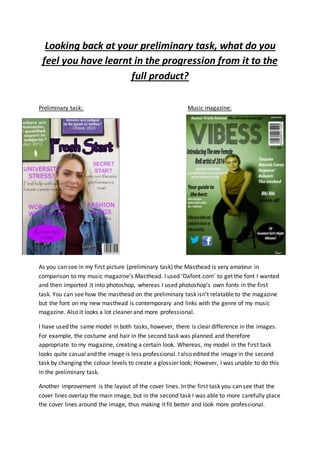
Preliminary task: Music magazine:
As you can see in my first picture (preliminary task) the Masthead is very amateur in
comparison to my music magazine’s Masthead. I used ‘Dafont.com’ to get the font I wanted
and then imported it into photoshop, whereas I used photoshop’s own fonts in the first
task. You can see how the masthead on the preliminary task isn’t relatable to the magazine
but the font on my new masthead is contemporary and links with the genre of my music
magazine. Also it looks a lot cleaner and more professional.
I have used the same model in both tasks, however, there is clear difference in the images.
For example, the costume and hair in the second task was planned and therefore
appropriate to my magazine, creating a certain look. Whereas, my model in the first task
looks quite casual and the image is less professional. I also edited the image in the second
task by changing the colour levels to create a glossier look; However, I was unable to do this
in the preliminary task.
Another improvement is the layout of the cover lines. In the first task you can see that the
cover lines overlap the main image, but in the second task I was able to more carefully place
the cover lines around the image, thus making it fit better and look more professional.
2. I was also able to add in new magazine conventions to my second task. For example, the sky
scraper at the top of the page and the social media links. I also added the price of the
magazine, again making it more professional. However some things that I learnt in my first
task I continued into the second task. For example, the use of the puff.
As you can see, in my second task I have used the pen tool to create lines which format my
page and give it a clear layout, unlike in my first task. I have also used subheadings to create
a more professional and cleaner look to organise the articles into sections.
Also the use of different font colours and text sizes again makes the magazine look glossier
and full.