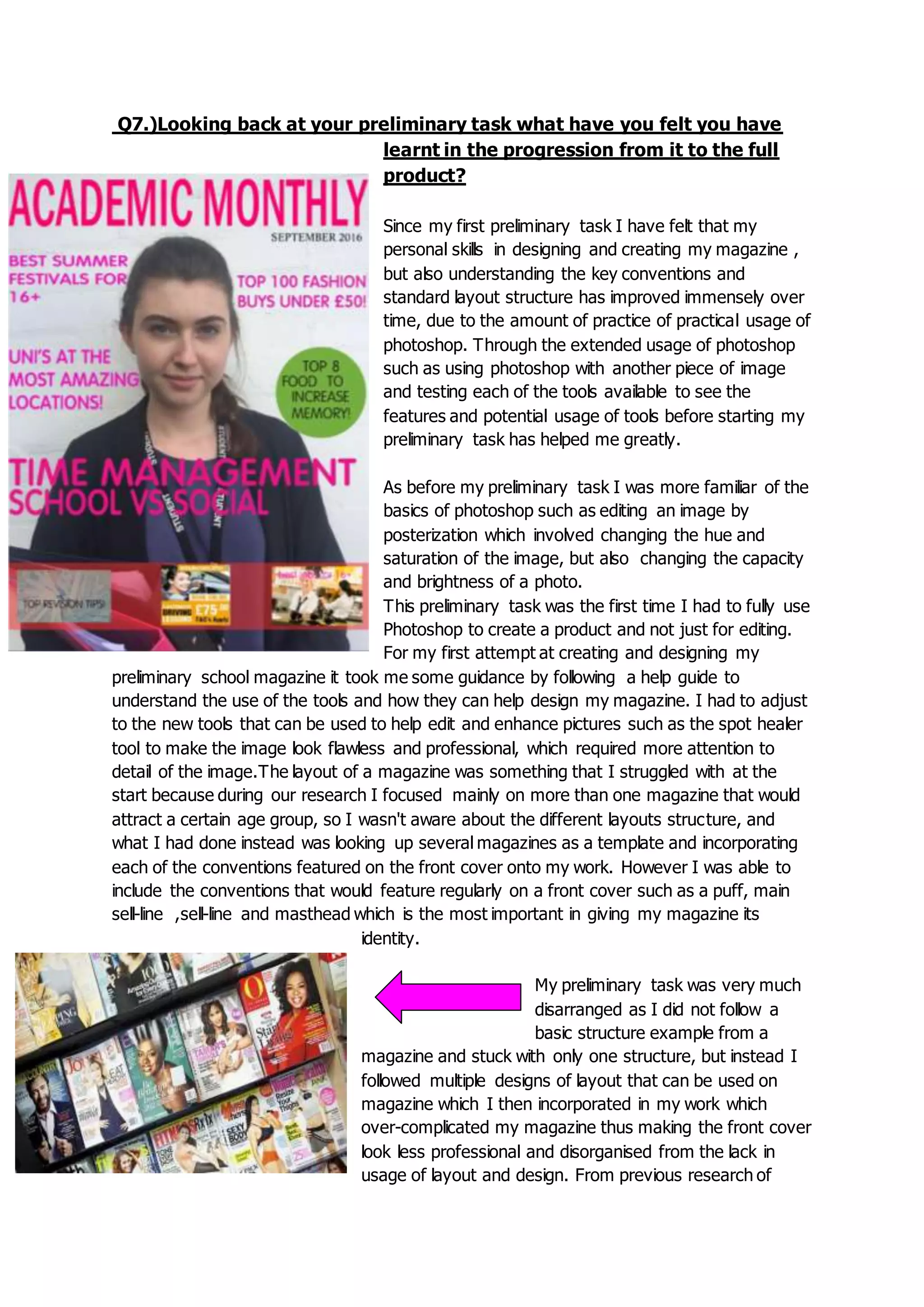
Q7.)Looking back at your preliminary task what have you felt you have
learnt in the progression from it to the full
product?
Since my first preliminary task I have felt that my
personal skills in designing and creating my magazine ,
but also understanding the key conventions and
standard layout structure has improved immensely over
time, due to the amount of practice of practical usage of
photoshop. Through the extended usage of photoshop
such as using photoshop with another piece of image
and testing each of the tools available to see the
features and potential usage of tools before starting my
preliminary task has helped me greatly.
As before my preliminary task I was more familiar of the
basics of photoshop such as editing an image by
posterization which involved changing the hue and
saturation of the image, but also changing the capacity
and brightness of a photo.
This preliminary task was the first time I had to fully use
Photoshop to create a product and not just for editing.
For my first attempt at creating and designing my
preliminary school magazine it took me some guidance by following a help guide to
understand the use of the tools and how they can help design my magazine. I had to adjust
to the new tools that can be used to help edit and enhance pictures such as the spot healer
tool to make the image look flawless and professional, which required more attention to
detail of the image.The layout of a magazine was something that I struggled with at the
start because during our research I focused mainly on more than one magazine that would
attract a certain age group, so I wasn't aware about the different layouts structure, and
what I had done instead was looking up several magazines as a template and incorporating
each of the conventions featured on the front cover onto my work. However I was able to
include the conventions that would feature regularly on a front cover such as a puff, main
sell-line ,sell-line and masthead which is the most important in giving my magazine its
identity.
My preliminary task was very much
disarranged as I did not follow a
basic structure example from a
magazine and stuck with only one structure, but instead I
followed multiple designs of layout that can be used on
magazine which I then incorporated in my work which
over-complicated my magazine thus making the front cover
look less professional and disorganised from the lack in
usage of layout and design. From previous research of
magazines I was only familiar to judging the appearance of magazines by analyzing how
this magazine would attract and specific target audience, without properly interpreting the
conventional layout of the pages and the different conventions that are more frequently
featured.
After completing my preliminary task I am more aware in the usage of layout structure and
conventions featured and I feel that I now have more knowledge in designing a magazine
and understanding of a magazine and how it has to follow the same continuous similar
structure and layout design in every issue in order to give the magazine its brand identity.
After starting my own media product where I had to design and create a front cover,
contents page and a double page spread I was able to learn from my previous mistakes and
from that I was able to incorporate a simple design and layout structure by using just one
magazine as a template. Through analysing multiple magazine front covers and analysing
the conventions that follow with it I was able to understand the importance in the common
feature of each issue and how each conventions has a specific impact on the readers,such
as the masthead should stand out and be bold which would make the reader notice and
familiarize themselves with it until they can associated the contents of a front cover to that
specific magazine giving a magazine its brand identity.Through the understanding of
featuring the same conventional colour that is associated with that specific genre of music
for a magazine I knew which colours would be primarily dominate on my front cover of a
indie music magazine which is red as the colour is associated with the genre through the
connotations of energy,power,strength , determination and passion, which says plenty about
the indie genre. By looking at NME as a template I was able to construct my magazine
through different features of the magazine such as a determining a specific colour scheme
that links to the genre of music I am trying to portray in my magazine but also placement
and structure of conventions on a page.
Aesthetic wise I was able to stick to my colour scheme of red,blue,black and yellow the
colours predominantly associated with the indie genre throughout in order to make the
conventions more easily identifiable. The masthead is in a bold font and coloured red to
emphasize the genre of the magazine using a sans serif font to keep the text looking
professional. I knew that by analysing the different fonts used in a magazine would be
helpful in helping me determine the different fonts that would be featured in my magazine,
in indie music magazine predominantly Sans serif are the most used font such as
ARIAL,TAHOMA and VERDANA followed by a little use of serif fonts such as TIMES and
CENTURY. The positioning of each convention is vital as the positioning
could alter the visual effect on the reader. By learning from my previous
mistakes and acting on them I feel as though I have produced a well
designed and professional Indie magazine.
Q7 evaluation

Q7 evaluation

  • 1.
    Q7.)Looking back atyour preliminary task what have you felt you have learnt in the progression from it to the full product? Since my first preliminary task I have felt that my personal skills in designing and creating my magazine , but also understanding the key conventions and standard layout structure has improved immensely over time, due to the amount of practice of practical usage of photoshop. Through the extended usage of photoshop such as using photoshop with another piece of image and testing each of the tools available to see the features and potential usage of tools before starting my preliminary task has helped me greatly. As before my preliminary task I was more familiar of the basics of photoshop such as editing an image by posterization which involved changing the hue and saturation of the image, but also changing the capacity and brightness of a photo. This preliminary task was the first time I had to fully use Photoshop to create a product and not just for editing. For my first attempt at creating and designing my preliminary school magazine it took me some guidance by following a help guide to understand the use of the tools and how they can help design my magazine. I had to adjust to the new tools that can be used to help edit and enhance pictures such as the spot healer tool to make the image look flawless and professional, which required more attention to detail of the image.The layout of a magazine was something that I struggled with at the start because during our research I focused mainly on more than one magazine that would attract a certain age group, so I wasn't aware about the different layouts structure, and what I had done instead was looking up several magazines as a template and incorporating each of the conventions featured on the front cover onto my work. However I was able to include the conventions that would feature regularly on a front cover such as a puff, main sell-line ,sell-line and masthead which is the most important in giving my magazine its identity. My preliminary task was very much disarranged as I did not follow a basic structure example from a magazine and stuck with only one structure, but instead I followed multiple designs of layout that can be used on magazine which I then incorporated in my work which over-complicated my magazine thus making the front cover look less professional and disorganised from the lack in usage of layout and design. From previous research of
  • 2.
    magazines I wasonly familiar to judging the appearance of magazines by analyzing how this magazine would attract and specific target audience, without properly interpreting the conventional layout of the pages and the different conventions that are more frequently featured. After completing my preliminary task I am more aware in the usage of layout structure and conventions featured and I feel that I now have more knowledge in designing a magazine and understanding of a magazine and how it has to follow the same continuous similar structure and layout design in every issue in order to give the magazine its brand identity. After starting my own media product where I had to design and create a front cover, contents page and a double page spread I was able to learn from my previous mistakes and from that I was able to incorporate a simple design and layout structure by using just one magazine as a template. Through analysing multiple magazine front covers and analysing the conventions that follow with it I was able to understand the importance in the common feature of each issue and how each conventions has a specific impact on the readers,such as the masthead should stand out and be bold which would make the reader notice and familiarize themselves with it until they can associated the contents of a front cover to that specific magazine giving a magazine its brand identity.Through the understanding of featuring the same conventional colour that is associated with that specific genre of music for a magazine I knew which colours would be primarily dominate on my front cover of a indie music magazine which is red as the colour is associated with the genre through the connotations of energy,power,strength , determination and passion, which says plenty about the indie genre. By looking at NME as a template I was able to construct my magazine
  • 3.
    through different featuresof the magazine such as a determining a specific colour scheme that links to the genre of music I am trying to portray in my magazine but also placement and structure of conventions on a page. Aesthetic wise I was able to stick to my colour scheme of red,blue,black and yellow the colours predominantly associated with the indie genre throughout in order to make the conventions more easily identifiable. The masthead is in a bold font and coloured red to emphasize the genre of the magazine using a sans serif font to keep the text looking professional. I knew that by analysing the different fonts used in a magazine would be helpful in helping me determine the different fonts that would be featured in my magazine, in indie music magazine predominantly Sans serif are the most used font such as ARIAL,TAHOMA and VERDANA followed by a little use of serif fonts such as TIMES and CENTURY. The positioning of each convention is vital as the positioning could alter the visual effect on the reader. By learning from my previous mistakes and acting on them I feel as though I have produced a well designed and professional Indie magazine.