How to Troubleshoot Apps for the Modern Connected Worker
Q 7
1. Looking back at your preliminary task, what do you feel you have learnt in the progression
from it to the full product?
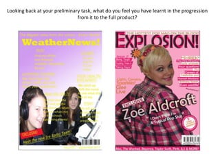
2. I think that I have improved a lot from my preliminary task to my final task. I have learnt a lot more about
what is expected when you are making a magazine and the codes and conventions of real magazines. I
also have learnt a lot about how to use the software quark and Photoshop so I know how to make my
magazine look more professional. In my preliminary task, for example, I put words so they were across
the faces of the people in the image and the colour scheme did not work well because it was hard to
read the writing, were as when I created my music magazine I learnt how to have colour schemes that
worked together, and that less is more when it comes to making the magazine. By looking at professional
magazines I realised what style I wanted my magazine to have and could try to interpret this into my
magazine, rather than in my preliminary task when I did not really have a real style. I think both my skills
and my knowledge of magazines have improved during the course of creating both of my media pieces,
and that I can now use the software more effectively. In my preliminary task the bar code on the
magazine looks extremely unprofessional and the text used to show the issue number and date was far
too large. I think that on my second piece it looks a lot more professional. The use of banner and boxes in
my second piece is a lot more effective and helps the overall look of the magazine, whereas in my first
piece they were random and looked messy. The cutting out on my main image was a lot neater on my
second piece, which is probably due to time. I had a lot more time to construct my second piece than I
did our first which meant that I had more time to be specific about cutting out. On my first piece I only
used one font and it did not make my magazine look very professional, because normally there is
different fonts for headings and subheadings, and on my second piece I used different fonts which helped
a lot.