Music Magazine; Front cover, Contents page and Double paged spread
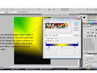
1. h my contents page I didn't want it
ok the same as my front cover but
nt to change my colour scheme so
d the gradient editor and picked
ree colour I wanted to use and
t style.
2. When I placed the numbers
the picture I grouped them
together so that if I was to c
where I’ve placed the pictur
could and the page number
also stay with it in the same
position I placed it in.
Text is ‘young sook’ I used
this typography on my
front cover and also
double paged spread
Before adding my pictures I
placed them in power point
and then changed the
shape of the picture and
made the edges of the
photograph blurry/smooth
3.
4. I used two layers for
my background the
reason why is because
the black, green and
yellow represent the
genre that I'm doing
my music magazine on
5. I added the image I wanted to the canv
and the cropped out the back ground
using the ‘magnetic lasso tool’ and the
afterwards I zoomed in on my picture
and used the ‘eraser tool’ to get rid of
the small pieces that were left from the
back ground
6.
7. Overall I used range of technical skills by
using a variety of different tools I was able to
complete my music magazine
I would say that all my colours worked well
together and also the layout