CNIC Information System with Pakdata Cf In Pakistan
Question1 Media Evaluation
1. In what way does your media product use, develop or challenges forms
and conventions?
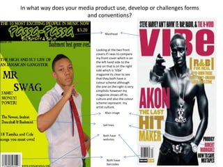
Masthead
Looking at the two front
covers if I was to compare
my front cover which is on
the left hand side to the
one on that is on the right
side which is ‘Vibe’
magazine its clear to see
that they both have a
colour scheme although
the one on the right is very
simplistic however my
magazine shows off its
culture and also the colour
scheme represent my
artist culture.
Main image
Sell lines
Both have
websites
Both have
barcodes
2. With my contents page I have additional images and text, most of the backgrounds that I’ve seen on
content pages have been either colourless, plain or cluttered so I decided to use the same colour that
I used on my front cover on my contents page. The reason why I never done a colourless contents
page is because I wanted my magazine to stand out more to my target audience. Most magazine’s
would have a picture of their main artist and also other artist on their contents page but I’ve decided
to just use pictures of the featured artist in my magazine first of all I didn't want my contents page to
look cluttered so I only used two pictures and also only have a few pages listed.
3. In my double page spread I decided to use a natural black and white background so that the simplicity of it reflects on my artist, I decided not
to make my double paged spread look stereotypical by this I mean by making my double paged spread have a big fat image of the artist
either in the middle of the page or on one whole page. I also used a pull quote as my heading on this page so that when my audience looks at
the page they straight away get a rough idea to what the story is about.
Page
numbers
Pull quote