More Related Content


Similar to AM advert analysis


AM advert analysis
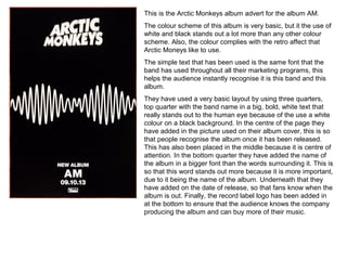
- 1. This is theArctic Monkeys album advert for the album AM. The colour scheme of this album is very basic, but it the use of white and black stands out a lot more than any other colour scheme. Also, the colour complies with the retro affect that Arctic Moneys like to use. The simple text that has been used is the same font that the band has used throughout all their marketing programs, this helps the audience instantly recognise it is this band and this album. They have used a very basic layout by using three quarters, top quarter with the band name in a big, bold, white text that really stands out to the human eye because of the use a white colour on a black background. In the centre of the page they have added in the picture used on their album cover, this is so that people recognise the album once it has been released. This has also been placed in the middle because it is centre of attention. In the bottom quarter they have added the name of the album in a bigger font than the words surrounding it. This is so that this word stands out more because it is more important, due to it being the name of the album. Underneath that they have added on the date of release, so that fans know when the album is out. Finally, the record label logo has been added in at the bottom to ensure that the audience knows the company producing the album and can buy more of their music.