SlideShare a Scribd company logo
1 of 4
The masthead of NME is always placed in the top left hand
corner, where it is visible. The main colour used is a bold
red with white outlines. The font is bold and in
capitals,which is straightforward suggesting that the brand
is very bold yet simplistic. As it always positioned in the
same region continuously it is maintaining its brand identity.
The name of the magazine and the acronym ‘NME'-which
stands for NEW MUSICAL EXPRESS suggests that the
magazine is modern and up- to-date portraying that the
magazine is always in style to suit the period.
The main sell line is always positioned in the 3rd left on
the magazine, where the font is in bold colours and in
large size, in order to catch the attention of the readers.
As we instinctively inspect writings with a larger font as it
is more eye catching. The main sell line uses a statement
to allure the readers to really ponder on the statement
and makes us curious to thinking how did they conquer
the world, effectively influencing the readers to wanting
more knowledge on the statement.
The band featured signifies that the magazines also
highlights alternative-rock music and bands. The
main image itself suggests that they belong to a rock
category based on the neutral facial expression also
represents the strong sense of masculinity. The
members are staring right at the camera giving direct
address to the audience. The positioning of the band
shows the leader singer at the front and rest of the
band are aligned based after the lead singer. The
dark costumes highlights that the band is all about
rock music as rock music uses dark and dull colours,
and the singer with the grey/white toned hair
emphasis that the genre is all about experimenting
with music and their image, to show that they are not
afraid of standing out rather than blending in. The
mode of address is formal which can suggest an
older target audience.
The layout is very simple and spread out, it's not
busy or heavy on the eyes allowing the readers to
take in every feature visually, this can also suggest
that the target audience are not fussed on fancy
covers but something more straightforward.
The font used for the main sell-line is a serif font, which is
specific to the band rather than NME and this has been
done to give the band a sense of identity in this issue and
how this issue of NME focuses on MCR. It is also used to
make it recognisable for MCR fans.Black text with white
highlighted is specific to the band as the colours are
associated with the bands so it gives the band their own
identity.
The image composition is unusual and the band has
been positioned this way to show importance of each
of the band members, as it shows hierarchy as the
lead singer is at the front but it also pays attention to
rest of the members indicating that the fans of the
bands like different members and not just the lead
singer, so the image then visually attracts the reader.
The lead singer at the front is wearing a military style jacket, and the connotations of this is that
perhaps it is suggesting that they are militant in their expression of music?Or that they feel like are at
the top of their game. Another could be that they are on a mission to produce good music like going to
war with other bands and competing with the rivals for the attentions of fans worldwide in recognition of
their music. They are all wearing black so it suggest the dark angst genre of rock. Their makeup is very
subtle and natural and their hairstyles are very casual. One of the members has a lip-piercing which
can indicate mixing of two genres
The main sell-line is always positioned in the ⅔ of the
page and the rest of the sell-lines are placed on the left
and right hand sides of the page.
As the masthead is so well-known it is given
brand identity, which can relate to Blumler and
Katz theory as it is based on identity, so the fans
of My Chemical Romance are able to recognise
that they are on the main image, and for most
people MCR are looked at as role models, who
reflect similar values and aspiration as the
reader so the TA can identify with the brand.
This sell line uses the phrase”WAR ON EMO”
to initiate a spark of debate or conversation
between the readers. As the sell-line features
a well-known celebrity who always features
on gossip columns this would entice readers
to read further on as it makes them very
curious. Linking to Blumler and Katz theory of
social interaction.
Other artists are also featured, which is a
common convention to lure the audience as
having on listed names would draw curiosity
from the readers, as they would feel that
they are receiving more for their money.
The barcode and price is a common convention
that is always positioned in the bottom left, as
the TA would have to search for the price
Another sell line to capture the interest of the
audience is the new release of an album, as more
reader would be curious to know the inspiration
behind the album. Using a quote from the interview
attracts the readers as the words used are
“...drugs, getting drunk and dancing all night” this
capture the sense that the band is very lively and
fun on a night out so it's something most of the
readers can identify with.
The highlighted lines are placed under the
masthead so it is easily seen by the reader, it
used to promote an article inside the
magazine so readers already have an idea of
what will be featured. The colours used are
also bold and contrasting emphasizing the
visibility of the sell-line.
The colours featured in the background is
predominately a pale blue almost a greyish tone.
This reflect the genre of the band, which is
alternative rock so colours are less bright, but more
dull. The colour scheme of NME suggests a
celebration of British bands and British music
heritage.
The colour gives of a blue tone which represents
masculinity and makes the group more serious as
portraying them as a macho group. The black is seen
as dominate inside the magazine which helps
indicate that the band is alternative rock genre. The
colours represent the connotation we would assume
for the genre of music so it links in with the
stereotype readers have in place for alternative rock
genre.
The content in the skyline is used to attract the
readership by promoting the freebies of free
posters that would attract the audience as they
love getting free items. The colour contrasts
against the masthead so it stands out and the
colours of the text stand out against the dark
background, making it visually pleasing to look at.
In addition the images of the posters enhances the
visual of the front cover.The freebies will tempt the
readers as they getting more for their money with
‘MASSIVE POSTERS’ emphasising that it would
be worth the money in terms of quality of the
poster.
The layout of the front cover is very simple
following conventions that can be found in
other magazines. As the masthead is always
positioned on the top left corner where the
readers will first notice the magazine.
As the magazine
has a very dull grey
colour as the
background the puff
contrasts and stand
out making it more
noticeable to the
reader.
A small banner is used to entice readers as it
provides a source of information inside the
magazine. The position is placed near the
masthead so it is visible.
The main sell line is placed in the middle third of the
page and is capitalized and bold to make the sell-line
stand out. The pink shade emphasizes that the band
has a female leader, making more of an impact on the
readers that are female as their eyes will immediately
set on the vivid colour. The use of alliteration “GUNS,
GODS” make the sell-line seem more interesting and
en-captures the reader's attention. The band is giving
direct address to the audience meaning that they are
enticing the audience to pick up the magazine. The
usage of the words guns and god could be metaphoric
as to how guns are the music that is the ammunition
competing with other albums to reach the top, so the
reference is much more meaningful. God could link to
to their religion and how that has contributed into the
production of the music and how they prayed to god for
constant music sales.
The masthead of NME is always placed in the top
left hand corner, where it is visible. The main colour
used is a bold red with white outlines. The font is
bold and in capital that is straightforward suggesting
that the brand is very bold yet simplistic. As it
always positioned in the same region continuously it
is maintaining its brand identity.
The barcode and price is
convention that is always
positioned the same
region of bottom right
where the readers would
be less likely to look.The main sell-line is drawing the reader in sub-
consciously based on the word play and statement
featured such as “Everyone else has fallen for them. Will
you?” this would make readers curious as why do
people enjoy this band making them more intrigued to
find out, as it is an indicator that there will be an
interview inside based on the sell-line so readers and
fans of PARAMORE are more drawn to find out what's
inside the magazine. The colour pink is emphasized to
show that the band is led by a female so it connotes that
band holds a sense of feminism showing that females
can be leaders as well which in lure in more female
readers as they would feel more comfortable with a
female leader of a band. The fact the colour of the main
sell line has been colour picked from her lipstick – this is
a symbiotic link. Paramore are an American band, the
question ‘everyone has fallen for them, will you?' is an
indirect reference to this. Indie rock music and NME tend
to feature British bands, by using an American band on
the cover, they are taking a risk. This is also reflected in
the way that every other band and artist featured on the
front cover is British.
The puff indicates that an article inside is talking about
Mumfords and Sons and comparing them to Muse, this
done to lure readers as this leads to Blumler and Katz
theory of social interaction as the quote sparks
debates.
The placement of the main sell line is that it is
centralised rather than left to right. The purpose of
this is the fact that a feminine colour is positioned in
front of Hayley – the lead singer, which makes it
stand out more, and to show her role of importance
in the band that she is at the top
of the hierarchy. The colour pink shows how the
band is centralised around her.
The masthead of this typical design is a convention
that always occurs indicating brand identity. The bold
colours is also symbolic to the genre of music they
represent the indie-rock and alternative rock genre as
the colour red connotes, strength, leadership,
willpower, rage, action, vibrancy, radiance, and
determination. Which we can definitely see based on
the main image of the group PARAMORE as the
colour signifies rock as rock is way most musicians
release their frustration and rage.
The sell-line uses a daring quotation or statement
most likely from interview of a band to draw readers
in as to knowing what the articles inside would be
about, it always sparks curiosity as to 'how did the
group conquer America' so the readers are intrigued
to find out.
A list of artists and bands are featured is a common
convention used in the magazine to make readers
feel as if they are receiving their money's worth of
entertainment and news. It will also attract fans of
followings artists to read.
Dull grey toned colours indicating that the genre
of this band is indie-rock or alternative rock as
dull colours are associated with the genre of
music.
The iconography of the costume is dark black
clothes that is symbolic to the genre as it
represents alternative rock.
The main image uses a triangle formation the rule
of thirds is visible in this image. Hayley is at the
front and the rest of the band are positioned more
or less symmetrically behind her this is to show
the lead singer at the front to show the hierarchy
in the band. But also to show that as she is the
most important in the band she has to stand out
the most so positioning her at the front would
draw the reader’s eyes directly to her.
The neutral and fierce expressions portrays that
they are in a rock band, as the lead singer also
represents femininity she positioned in the front
as eye candy because she is attractive, so it
attracts female readers to want to read the
magazine. The vivid hued hair also indicates the
rock genre as they are up for experimenting with
their image and looks and that's the impression
we receive while looking at Haley's profile.
This sell-line, highlights the articles featured inside the magazine and
describes who the artist that would be featured based on the
capitalisation of the name. As it lists his profession its sparks reader's
interest as to how he managed to change his profession so successfully
tempting readers to find out.
A skyline is used and positioned above the
masthead using bold black using a sans
serif font. The sell-line is also added ‘Rock
star,label boss,actor...now lecturer’ the
sell-line is used to promote an article
feature inside the magazine and the
positioning of the skyline gives and
advantage as the readers eyes are
immediately focused on the bold dark text
that contrast against the colour of the
masthead and are then therefore drawn in.

More Related Content

What's hot

Music magazine annabel lucey
Music magazine annabel luceyMusic magazine annabel lucey
Music magazine annabel luceybell101
 
Media cw music magazine reaserch and ideas annabel lucey
Media cw music magazine reaserch and ideas annabel luceyMedia cw music magazine reaserch and ideas annabel lucey
Media cw music magazine reaserch and ideas annabel luceybell101
 
Final media music magazine annabel lucey
Final media music magazine annabel luceyFinal media music magazine annabel lucey
Final media music magazine annabel luceybell101
 
Music magazine reaserch and ideas annabel lucey
Music magazine reaserch and ideas annabel luceyMusic magazine reaserch and ideas annabel lucey
Music magazine reaserch and ideas annabel luceybell101
 
Music magazine reaserch and ideas annabel lucey
Music magazine reaserch and ideas annabel luceyMusic magazine reaserch and ideas annabel lucey
Music magazine reaserch and ideas annabel luceybell101
 
Task 5 – deciding which genre and style
Task 5 – deciding which genre and styleTask 5 – deciding which genre and style
Task 5 – deciding which genre and styleAS Media Column D
 
Big Cheese front cover analysis
Big Cheese front cover analysisBig Cheese front cover analysis
Big Cheese front cover analysisKieran Hadfield
 
Mojo magazine analysis
Mojo magazine analysisMojo magazine analysis
Mojo magazine analysisLittlePainter
 
Final powerpiont
Final powerpiontFinal powerpiont
Final powerpiontbell101
 
Task 3 music magazine analysis, Front cover and Contents pages
Task 3  music magazine analysis, Front cover and Contents pagesTask 3  music magazine analysis, Front cover and Contents pages
Task 3 music magazine analysis, Front cover and Contents pageseleanorwardmedia
 
Uk magazine market
Uk magazine marketUk magazine market
Uk magazine marketsara ali
 
Radial Analysis
Radial  AnalysisRadial  Analysis
Radial AnalysisMFJ
 
Music Magazine Evaluation
Music Magazine EvaluationMusic Magazine Evaluation
Music Magazine EvaluationLaurenTaylor8
 
Portfolio research
Portfolio researchPortfolio research
Portfolio researchFrancoisAli
 

What's hot (16)

Music magazine annabel lucey
Music magazine annabel luceyMusic magazine annabel lucey
Music magazine annabel lucey
 
Media cw music magazine reaserch and ideas annabel lucey
Media cw music magazine reaserch and ideas annabel luceyMedia cw music magazine reaserch and ideas annabel lucey
Media cw music magazine reaserch and ideas annabel lucey
 
Final media music magazine annabel lucey
Final media music magazine annabel luceyFinal media music magazine annabel lucey
Final media music magazine annabel lucey
 
Music magazine reaserch and ideas annabel lucey
Music magazine reaserch and ideas annabel luceyMusic magazine reaserch and ideas annabel lucey
Music magazine reaserch and ideas annabel lucey
 
Music magazine reaserch and ideas annabel lucey
Music magazine reaserch and ideas annabel luceyMusic magazine reaserch and ideas annabel lucey
Music magazine reaserch and ideas annabel lucey
 
Task 5 – deciding which genre and style
Task 5 – deciding which genre and styleTask 5 – deciding which genre and style
Task 5 – deciding which genre and style
 
Big Cheese front cover analysis
Big Cheese front cover analysisBig Cheese front cover analysis
Big Cheese front cover analysis
 
Mojo magazine analysis
Mojo magazine analysisMojo magazine analysis
Mojo magazine analysis
 
Final powerpiont
Final powerpiontFinal powerpiont
Final powerpiont
 
Task 3 music magazine analysis, Front cover and Contents pages
Task 3  music magazine analysis, Front cover and Contents pagesTask 3  music magazine analysis, Front cover and Contents pages
Task 3 music magazine analysis, Front cover and Contents pages
 
Uk magazine market
Uk magazine marketUk magazine market
Uk magazine market
 
Radial Analysis
Radial AnalysisRadial Analysis
Radial Analysis
 
Analysis of chosen magazine
Analysis of chosen magazineAnalysis of chosen magazine
Analysis of chosen magazine
 
Radial Analysis
Radial  AnalysisRadial  Analysis
Radial Analysis
 
Music Magazine Evaluation
Music Magazine EvaluationMusic Magazine Evaluation
Music Magazine Evaluation
 
Portfolio research
Portfolio researchPortfolio research
Portfolio research
 

Similar to Front cover analysis

Magazine anaylisis
Magazine anaylisisMagazine anaylisis
Magazine anaylisissineadjen
 
Magazine anaylisis
Magazine anaylisisMagazine anaylisis
Magazine anaylisissineadjen
 
Existing Magazine Radial Analysis
Existing Magazine Radial AnalysisExisting Magazine Radial Analysis
Existing Magazine Radial Analysisgueste1a4506
 
My magazine analysis
My magazine analysisMy magazine analysis
My magazine analysisguest74e80a
 
Masthead anaylsis
Masthead anaylsisMasthead anaylsis
Masthead anaylsiseilisbell
 
Front Cover Annotations
Front Cover AnnotationsFront Cover Annotations
Front Cover AnnotationsStevenSibiya
 
Kerrang! cover deconstruction
Kerrang! cover deconstructionKerrang! cover deconstruction
Kerrang! cover deconstructionFallon Young
 
Magazine analysis real
Magazine analysis realMagazine analysis real
Magazine analysis realmadelainegee
 
Analysis of existing titles
Analysis of existing titlesAnalysis of existing titles
Analysis of existing titlesMsiscar76
 
Front cover overview
Front cover overviewFront cover overview
Front cover overviewNattayaday11
 
Analysis of existing titles
Analysis of existing titlesAnalysis of existing titles
Analysis of existing titlesMsiscar76
 
Magazine Double Page Spread Research
Magazine Double Page Spread ResearchMagazine Double Page Spread Research
Magazine Double Page Spread ResearchLynley Sykes
 
Deconstructions of rock magazines
Deconstructions of rock magazinesDeconstructions of rock magazines
Deconstructions of rock magazinesShahEman
 
Analysing Music Magazines
Analysing Music MagazinesAnalysing Music Magazines
Analysing Music Magazinesemmadickson15
 
Genres of music magazines
Genres of music magazinesGenres of music magazines
Genres of music magazinesShahEman
 
Nme magazine alaysis
Nme magazine alaysisNme magazine alaysis
Nme magazine alaysisamyflint5477
 

Similar to Front cover analysis (20)

Front cover analysis
Front cover analysisFront cover analysis
Front cover analysis
 
Magazine anaylisis
Magazine anaylisisMagazine anaylisis
Magazine anaylisis
 
Magazine anaylisis
Magazine anaylisisMagazine anaylisis
Magazine anaylisis
 
Existing Magazine Radial Analysis
Existing Magazine Radial AnalysisExisting Magazine Radial Analysis
Existing Magazine Radial Analysis
 
My magazine analysis
My magazine analysisMy magazine analysis
My magazine analysis
 
Masthead anaylsis
Masthead anaylsisMasthead anaylsis
Masthead anaylsis
 
Front Cover Annotations
Front Cover AnnotationsFront Cover Annotations
Front Cover Annotations
 
Kerrang! cover deconstruction
Kerrang! cover deconstructionKerrang! cover deconstruction
Kerrang! cover deconstruction
 
Magazine analysis real
Magazine analysis realMagazine analysis real
Magazine analysis real
 
Magazine Analysis
Magazine AnalysisMagazine Analysis
Magazine Analysis
 
Analysis of existing titles
Analysis of existing titlesAnalysis of existing titles
Analysis of existing titles
 
Front cover overview
Front cover overviewFront cover overview
Front cover overview
 
Radial Analysis
Radial AnalysisRadial Analysis
Radial Analysis
 
Analysis of existing titles
Analysis of existing titlesAnalysis of existing titles
Analysis of existing titles
 
Magazine analysis
Magazine analysisMagazine analysis
Magazine analysis
 
Magazine Double Page Spread Research
Magazine Double Page Spread ResearchMagazine Double Page Spread Research
Magazine Double Page Spread Research
 
Deconstructions of rock magazines
Deconstructions of rock magazinesDeconstructions of rock magazines
Deconstructions of rock magazines
 
Analysing Music Magazines
Analysing Music MagazinesAnalysing Music Magazines
Analysing Music Magazines
 
Genres of music magazines
Genres of music magazinesGenres of music magazines
Genres of music magazines
 
Nme magazine alaysis
Nme magazine alaysisNme magazine alaysis
Nme magazine alaysis
 

More from Nattayaday11

More from Nattayaday11 (20)

Film trailer conventions
Film trailer conventionsFilm trailer conventions
Film trailer conventions
 
Horror sub genres
Horror sub genresHorror sub genres
Horror sub genres
 
Focus group
Focus groupFocus group
Focus group
 
Wes craven
Wes cravenWes craven
Wes craven
 
Horror movie history timeline
Horror movie history timelineHorror movie history timeline
Horror movie history timeline
 
Questionnaire analysis
Questionnaire analysisQuestionnaire analysis
Questionnaire analysis
 
Pitch
PitchPitch
Pitch
 
The pitch
The pitchThe pitch
The pitch
 
Horror final girl
Horror final girlHorror final girl
Horror final girl
 
Codes and coneventions
Codes and coneventionsCodes and coneventions
Codes and coneventions
 
Q7 evaluation
Q7 evaluationQ7 evaluation
Q7 evaluation
 
Q3 evaluation
Q3 evaluation Q3 evaluation
Q3 evaluation
 
Q4 evaluation
Q4 evaluationQ4 evaluation
Q4 evaluation
 
Double page spread analysis
Double page spread analysisDouble page spread analysis
Double page spread analysis
 
Nme casestudy
Nme casestudyNme casestudy
Nme casestudy
 
Costume ideas & mise- en-scene analysis
Costume ideas & mise- en-scene analysisCostume ideas & mise- en-scene analysis
Costume ideas & mise- en-scene analysis
 
Front cover mock ups
Front cover mock upsFront cover mock ups
Front cover mock ups
 
Contents page mockups
Contents page mockupsContents page mockups
Contents page mockups
 
Dps mockups
Dps mockupsDps mockups
Dps mockups
 
Group presentation
Group presentationGroup presentation
Group presentation
 

Recently uploaded

Call Girls in Islamabad | 03274100048 | Call Girl Service
Call Girls in Islamabad | 03274100048 | Call Girl ServiceCall Girls in Islamabad | 03274100048 | Call Girl Service
Call Girls in Islamabad | 03274100048 | Call Girl ServiceAyesha Khan
 
9654467111 Call Girls In Noida Sector 62 Short 1500 Night 6000
9654467111 Call Girls In Noida Sector 62 Short 1500 Night 60009654467111 Call Girls In Noida Sector 62 Short 1500 Night 6000
9654467111 Call Girls In Noida Sector 62 Short 1500 Night 6000Sapana Sha
 
Jagat Puri Call Girls : ☎ 8527673949, Low rate Call Girls
Jagat Puri Call Girls : ☎ 8527673949, Low rate Call GirlsJagat Puri Call Girls : ☎ 8527673949, Low rate Call Girls
Jagat Puri Call Girls : ☎ 8527673949, Low rate Call Girlsashishs7044
 
Bare And Wild Creation, Curio Shop, Tucumcari NM
Bare And Wild Creation, Curio Shop, Tucumcari NMBare And Wild Creation, Curio Shop, Tucumcari NM
Bare And Wild Creation, Curio Shop, Tucumcari NMroute66connected
 
Laxmi Nagar Call Girls : ☎ 8527673949, Low rate Call Girls
Laxmi Nagar Call Girls : ☎ 8527673949, Low rate Call GirlsLaxmi Nagar Call Girls : ☎ 8527673949, Low rate Call Girls
Laxmi Nagar Call Girls : ☎ 8527673949, Low rate Call Girlsashishs7044
 
Karol Bagh Call Girls : ☎ 8527673949, Low rate Call Girls
Karol Bagh Call Girls : ☎ 8527673949, Low rate Call GirlsKarol Bagh Call Girls : ☎ 8527673949, Low rate Call Girls
Karol Bagh Call Girls : ☎ 8527673949, Low rate Call Girlsashishs7044
 
Govindpuri Call Girls : ☎ 8527673949, Low rate Call Girls
Govindpuri Call Girls : ☎ 8527673949, Low rate Call GirlsGovindpuri Call Girls : ☎ 8527673949, Low rate Call Girls
Govindpuri Call Girls : ☎ 8527673949, Low rate Call Girlsashishs7044
 
SHIVNA SAHITYIKI APRIL JUNE 2024 Magazine
SHIVNA SAHITYIKI APRIL JUNE 2024 MagazineSHIVNA SAHITYIKI APRIL JUNE 2024 Magazine
SHIVNA SAHITYIKI APRIL JUNE 2024 MagazineShivna Prakashan
 
Olivia Cox. intertextual references.pptx
Olivia Cox. intertextual references.pptxOlivia Cox. intertextual references.pptx
Olivia Cox. intertextual references.pptxLauraFagan6
 
Zagor VČ OP 055 - Oluja nad Haitijem.pdf
Zagor VČ OP 055 - Oluja nad Haitijem.pdfZagor VČ OP 055 - Oluja nad Haitijem.pdf
Zagor VČ OP 055 - Oluja nad Haitijem.pdfStripovizijacom
 
Low Rate Call Girls in Laxmi Nagar Delhi Call 9990771857
Low Rate Call Girls in Laxmi Nagar Delhi Call 9990771857Low Rate Call Girls in Laxmi Nagar Delhi Call 9990771857
Low Rate Call Girls in Laxmi Nagar Delhi Call 9990771857delhimodel235
 
Faridabad Call Girls : ☎ 8527673949, Low rate Call Girls
Faridabad Call Girls : ☎ 8527673949, Low rate Call GirlsFaridabad Call Girls : ☎ 8527673949, Low rate Call Girls
Faridabad Call Girls : ☎ 8527673949, Low rate Call Girlsashishs7044
 
Aiims Call Girls : ☎ 8527673949, Low rate Call Girls
Aiims Call Girls : ☎ 8527673949, Low rate Call GirlsAiims Call Girls : ☎ 8527673949, Low rate Call Girls
Aiims Call Girls : ☎ 8527673949, Low rate Call Girlsashishs7044
 
Russian⚡ Call Girls In Sector 39 Noida✨8375860717⚡Escorts Service
Russian⚡ Call Girls In Sector 39 Noida✨8375860717⚡Escorts ServiceRussian⚡ Call Girls In Sector 39 Noida✨8375860717⚡Escorts Service
Russian⚡ Call Girls In Sector 39 Noida✨8375860717⚡Escorts Servicedoor45step
 
Roadrunner Lodge, Motel/Residence, Tucumcari NM
Roadrunner Lodge, Motel/Residence, Tucumcari NMRoadrunner Lodge, Motel/Residence, Tucumcari NM
Roadrunner Lodge, Motel/Residence, Tucumcari NMroute66connected
 
Bur Dubai Call Girls O58993O4O2 Call Girls in Bur Dubai
Bur Dubai Call Girls O58993O4O2 Call Girls in Bur DubaiBur Dubai Call Girls O58993O4O2 Call Girls in Bur Dubai
Bur Dubai Call Girls O58993O4O2 Call Girls in Bur Dubaidajasot375
 
FULL ENJOY - 9953040155 Call Girls in Gandhi Vihar | Delhi
FULL ENJOY - 9953040155 Call Girls in Gandhi Vihar | DelhiFULL ENJOY - 9953040155 Call Girls in Gandhi Vihar | Delhi
FULL ENJOY - 9953040155 Call Girls in Gandhi Vihar | DelhiMalviyaNagarCallGirl
 
Khanpur Call Girls : ☎ 8527673949, Low rate Call Girls
Khanpur Call Girls : ☎ 8527673949, Low rate Call GirlsKhanpur Call Girls : ☎ 8527673949, Low rate Call Girls
Khanpur Call Girls : ☎ 8527673949, Low rate Call Girlsashishs7044
 
Indian High Profile Call Girls In Sector 18 Noida 8375860717 Escorts Service
Indian High Profile Call Girls In Sector 18 Noida 8375860717 Escorts ServiceIndian High Profile Call Girls In Sector 18 Noida 8375860717 Escorts Service
Indian High Profile Call Girls In Sector 18 Noida 8375860717 Escorts Servicedoor45step
 

Recently uploaded (20)

Call Girls in Islamabad | 03274100048 | Call Girl Service
Call Girls in Islamabad | 03274100048 | Call Girl ServiceCall Girls in Islamabad | 03274100048 | Call Girl Service
Call Girls in Islamabad | 03274100048 | Call Girl Service
 
9654467111 Call Girls In Noida Sector 62 Short 1500 Night 6000
9654467111 Call Girls In Noida Sector 62 Short 1500 Night 60009654467111 Call Girls In Noida Sector 62 Short 1500 Night 6000
9654467111 Call Girls In Noida Sector 62 Short 1500 Night 6000
 
Jagat Puri Call Girls : ☎ 8527673949, Low rate Call Girls
Jagat Puri Call Girls : ☎ 8527673949, Low rate Call GirlsJagat Puri Call Girls : ☎ 8527673949, Low rate Call Girls
Jagat Puri Call Girls : ☎ 8527673949, Low rate Call Girls
 
Bare And Wild Creation, Curio Shop, Tucumcari NM
Bare And Wild Creation, Curio Shop, Tucumcari NMBare And Wild Creation, Curio Shop, Tucumcari NM
Bare And Wild Creation, Curio Shop, Tucumcari NM
 
Laxmi Nagar Call Girls : ☎ 8527673949, Low rate Call Girls
Laxmi Nagar Call Girls : ☎ 8527673949, Low rate Call GirlsLaxmi Nagar Call Girls : ☎ 8527673949, Low rate Call Girls
Laxmi Nagar Call Girls : ☎ 8527673949, Low rate Call Girls
 
Karol Bagh Call Girls : ☎ 8527673949, Low rate Call Girls
Karol Bagh Call Girls : ☎ 8527673949, Low rate Call GirlsKarol Bagh Call Girls : ☎ 8527673949, Low rate Call Girls
Karol Bagh Call Girls : ☎ 8527673949, Low rate Call Girls
 
Govindpuri Call Girls : ☎ 8527673949, Low rate Call Girls
Govindpuri Call Girls : ☎ 8527673949, Low rate Call GirlsGovindpuri Call Girls : ☎ 8527673949, Low rate Call Girls
Govindpuri Call Girls : ☎ 8527673949, Low rate Call Girls
 
SHIVNA SAHITYIKI APRIL JUNE 2024 Magazine
SHIVNA SAHITYIKI APRIL JUNE 2024 MagazineSHIVNA SAHITYIKI APRIL JUNE 2024 Magazine
SHIVNA SAHITYIKI APRIL JUNE 2024 Magazine
 
Olivia Cox. intertextual references.pptx
Olivia Cox. intertextual references.pptxOlivia Cox. intertextual references.pptx
Olivia Cox. intertextual references.pptx
 
Zagor VČ OP 055 - Oluja nad Haitijem.pdf
Zagor VČ OP 055 - Oluja nad Haitijem.pdfZagor VČ OP 055 - Oluja nad Haitijem.pdf
Zagor VČ OP 055 - Oluja nad Haitijem.pdf
 
Low Rate Call Girls in Laxmi Nagar Delhi Call 9990771857
Low Rate Call Girls in Laxmi Nagar Delhi Call 9990771857Low Rate Call Girls in Laxmi Nagar Delhi Call 9990771857
Low Rate Call Girls in Laxmi Nagar Delhi Call 9990771857
 
Faridabad Call Girls : ☎ 8527673949, Low rate Call Girls
Faridabad Call Girls : ☎ 8527673949, Low rate Call GirlsFaridabad Call Girls : ☎ 8527673949, Low rate Call Girls
Faridabad Call Girls : ☎ 8527673949, Low rate Call Girls
 
Aiims Call Girls : ☎ 8527673949, Low rate Call Girls
Aiims Call Girls : ☎ 8527673949, Low rate Call GirlsAiims Call Girls : ☎ 8527673949, Low rate Call Girls
Aiims Call Girls : ☎ 8527673949, Low rate Call Girls
 
Russian⚡ Call Girls In Sector 39 Noida✨8375860717⚡Escorts Service
Russian⚡ Call Girls In Sector 39 Noida✨8375860717⚡Escorts ServiceRussian⚡ Call Girls In Sector 39 Noida✨8375860717⚡Escorts Service
Russian⚡ Call Girls In Sector 39 Noida✨8375860717⚡Escorts Service
 
Roadrunner Lodge, Motel/Residence, Tucumcari NM
Roadrunner Lodge, Motel/Residence, Tucumcari NMRoadrunner Lodge, Motel/Residence, Tucumcari NM
Roadrunner Lodge, Motel/Residence, Tucumcari NM
 
Bur Dubai Call Girls O58993O4O2 Call Girls in Bur Dubai
Bur Dubai Call Girls O58993O4O2 Call Girls in Bur DubaiBur Dubai Call Girls O58993O4O2 Call Girls in Bur Dubai
Bur Dubai Call Girls O58993O4O2 Call Girls in Bur Dubai
 
FULL ENJOY - 9953040155 Call Girls in Gandhi Vihar | Delhi
FULL ENJOY - 9953040155 Call Girls in Gandhi Vihar | DelhiFULL ENJOY - 9953040155 Call Girls in Gandhi Vihar | Delhi
FULL ENJOY - 9953040155 Call Girls in Gandhi Vihar | Delhi
 
Khanpur Call Girls : ☎ 8527673949, Low rate Call Girls
Khanpur Call Girls : ☎ 8527673949, Low rate Call GirlsKhanpur Call Girls : ☎ 8527673949, Low rate Call Girls
Khanpur Call Girls : ☎ 8527673949, Low rate Call Girls
 
call girls in Noida New Ashok Nagar 🔝 >༒8448380779 🔝 genuine Escort Service 🔝...
call girls in Noida New Ashok Nagar 🔝 >༒8448380779 🔝 genuine Escort Service 🔝...call girls in Noida New Ashok Nagar 🔝 >༒8448380779 🔝 genuine Escort Service 🔝...
call girls in Noida New Ashok Nagar 🔝 >༒8448380779 🔝 genuine Escort Service 🔝...
 
Indian High Profile Call Girls In Sector 18 Noida 8375860717 Escorts Service
Indian High Profile Call Girls In Sector 18 Noida 8375860717 Escorts ServiceIndian High Profile Call Girls In Sector 18 Noida 8375860717 Escorts Service
Indian High Profile Call Girls In Sector 18 Noida 8375860717 Escorts Service
 

Front cover analysis

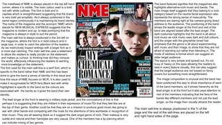
  • 1. The masthead of NME is always placed in the top left hand corner, where it is visible. The main colour used is a bold red with white outlines. The font is bold and in capitals,which is straightforward suggesting that the brand is very bold yet simplistic. As it always positioned in the same region continuously it is maintaining its brand identity. The name of the magazine and the acronym ‘NME'-which stands for NEW MUSICAL EXPRESS suggests that the magazine is modern and up- to-date portraying that the magazine is always in style to suit the period. The main sell line is always positioned in the 3rd left on the magazine, where the font is in bold colours and in large size, in order to catch the attention of the readers. As we instinctively inspect writings with a larger font as it is more eye catching. The main sell line uses a statement to allure the readers to really ponder on the statement and makes us curious to thinking how did they conquer the world, effectively influencing the readers to wanting more knowledge on the statement. The band featured signifies that the magazines also highlights alternative-rock music and bands. The main image itself suggests that they belong to a rock category based on the neutral facial expression also represents the strong sense of masculinity. The members are staring right at the camera giving direct address to the audience. The positioning of the band shows the leader singer at the front and rest of the band are aligned based after the lead singer. The dark costumes highlights that the band is all about rock music as rock music uses dark and dull colours, and the singer with the grey/white toned hair emphasis that the genre is all about experimenting with music and their image, to show that they are not afraid of standing out rather than blending in. The mode of address is formal which can suggest an older target audience. The layout is very simple and spread out, it's not busy or heavy on the eyes allowing the readers to take in every feature visually, this can also suggest that the target audience are not fussed on fancy covers but something more straightforward. The font used for the main sell-line is a serif font, which is specific to the band rather than NME and this has been done to give the band a sense of identity in this issue and how this issue of NME focuses on MCR. It is also used to make it recognisable for MCR fans.Black text with white highlighted is specific to the band as the colours are associated with the bands so it gives the band their own identity. The image composition is unusual and the band has been positioned this way to show importance of each of the band members, as it shows hierarchy as the lead singer is at the front but it also pays attention to rest of the members indicating that the fans of the bands like different members and not just the lead singer, so the image then visually attracts the reader. The lead singer at the front is wearing a military style jacket, and the connotations of this is that perhaps it is suggesting that they are militant in their expression of music?Or that they feel like are at the top of their game. Another could be that they are on a mission to produce good music like going to war with other bands and competing with the rivals for the attentions of fans worldwide in recognition of their music. They are all wearing black so it suggest the dark angst genre of rock. Their makeup is very subtle and natural and their hairstyles are very casual. One of the members has a lip-piercing which can indicate mixing of two genres The main sell-line is always positioned in the ⅔ of the page and the rest of the sell-lines are placed on the left and right hand sides of the page.
  • 2. As the masthead is so well-known it is given brand identity, which can relate to Blumler and Katz theory as it is based on identity, so the fans of My Chemical Romance are able to recognise that they are on the main image, and for most people MCR are looked at as role models, who reflect similar values and aspiration as the reader so the TA can identify with the brand. This sell line uses the phrase”WAR ON EMO” to initiate a spark of debate or conversation between the readers. As the sell-line features a well-known celebrity who always features on gossip columns this would entice readers to read further on as it makes them very curious. Linking to Blumler and Katz theory of social interaction. Other artists are also featured, which is a common convention to lure the audience as having on listed names would draw curiosity from the readers, as they would feel that they are receiving more for their money. The barcode and price is a common convention that is always positioned in the bottom left, as the TA would have to search for the price Another sell line to capture the interest of the audience is the new release of an album, as more reader would be curious to know the inspiration behind the album. Using a quote from the interview attracts the readers as the words used are “...drugs, getting drunk and dancing all night” this capture the sense that the band is very lively and fun on a night out so it's something most of the readers can identify with. The highlighted lines are placed under the masthead so it is easily seen by the reader, it used to promote an article inside the magazine so readers already have an idea of what will be featured. The colours used are also bold and contrasting emphasizing the visibility of the sell-line. The colours featured in the background is predominately a pale blue almost a greyish tone. This reflect the genre of the band, which is alternative rock so colours are less bright, but more dull. The colour scheme of NME suggests a celebration of British bands and British music heritage. The colour gives of a blue tone which represents masculinity and makes the group more serious as portraying them as a macho group. The black is seen as dominate inside the magazine which helps indicate that the band is alternative rock genre. The colours represent the connotation we would assume for the genre of music so it links in with the stereotype readers have in place for alternative rock genre. The content in the skyline is used to attract the readership by promoting the freebies of free posters that would attract the audience as they love getting free items. The colour contrasts against the masthead so it stands out and the colours of the text stand out against the dark background, making it visually pleasing to look at. In addition the images of the posters enhances the visual of the front cover.The freebies will tempt the readers as they getting more for their money with ‘MASSIVE POSTERS’ emphasising that it would be worth the money in terms of quality of the poster. The layout of the front cover is very simple following conventions that can be found in other magazines. As the masthead is always positioned on the top left corner where the readers will first notice the magazine.
  • 3. As the magazine has a very dull grey colour as the background the puff contrasts and stand out making it more noticeable to the reader. A small banner is used to entice readers as it provides a source of information inside the magazine. The position is placed near the masthead so it is visible. The main sell line is placed in the middle third of the page and is capitalized and bold to make the sell-line stand out. The pink shade emphasizes that the band has a female leader, making more of an impact on the readers that are female as their eyes will immediately set on the vivid colour. The use of alliteration “GUNS, GODS” make the sell-line seem more interesting and en-captures the reader's attention. The band is giving direct address to the audience meaning that they are enticing the audience to pick up the magazine. The usage of the words guns and god could be metaphoric as to how guns are the music that is the ammunition competing with other albums to reach the top, so the reference is much more meaningful. God could link to to their religion and how that has contributed into the production of the music and how they prayed to god for constant music sales. The masthead of NME is always placed in the top left hand corner, where it is visible. The main colour used is a bold red with white outlines. The font is bold and in capital that is straightforward suggesting that the brand is very bold yet simplistic. As it always positioned in the same region continuously it is maintaining its brand identity. The barcode and price is convention that is always positioned the same region of bottom right where the readers would be less likely to look.The main sell-line is drawing the reader in sub- consciously based on the word play and statement featured such as “Everyone else has fallen for them. Will you?” this would make readers curious as why do people enjoy this band making them more intrigued to find out, as it is an indicator that there will be an interview inside based on the sell-line so readers and fans of PARAMORE are more drawn to find out what's inside the magazine. The colour pink is emphasized to show that the band is led by a female so it connotes that band holds a sense of feminism showing that females can be leaders as well which in lure in more female readers as they would feel more comfortable with a female leader of a band. The fact the colour of the main sell line has been colour picked from her lipstick – this is a symbiotic link. Paramore are an American band, the question ‘everyone has fallen for them, will you?' is an indirect reference to this. Indie rock music and NME tend to feature British bands, by using an American band on the cover, they are taking a risk. This is also reflected in the way that every other band and artist featured on the front cover is British. The puff indicates that an article inside is talking about Mumfords and Sons and comparing them to Muse, this done to lure readers as this leads to Blumler and Katz theory of social interaction as the quote sparks debates. The placement of the main sell line is that it is centralised rather than left to right. The purpose of this is the fact that a feminine colour is positioned in front of Hayley – the lead singer, which makes it stand out more, and to show her role of importance in the band that she is at the top of the hierarchy. The colour pink shows how the band is centralised around her.
  • 4. The masthead of this typical design is a convention that always occurs indicating brand identity. The bold colours is also symbolic to the genre of music they represent the indie-rock and alternative rock genre as the colour red connotes, strength, leadership, willpower, rage, action, vibrancy, radiance, and determination. Which we can definitely see based on the main image of the group PARAMORE as the colour signifies rock as rock is way most musicians release their frustration and rage. The sell-line uses a daring quotation or statement most likely from interview of a band to draw readers in as to knowing what the articles inside would be about, it always sparks curiosity as to 'how did the group conquer America' so the readers are intrigued to find out. A list of artists and bands are featured is a common convention used in the magazine to make readers feel as if they are receiving their money's worth of entertainment and news. It will also attract fans of followings artists to read. Dull grey toned colours indicating that the genre of this band is indie-rock or alternative rock as dull colours are associated with the genre of music. The iconography of the costume is dark black clothes that is symbolic to the genre as it represents alternative rock. The main image uses a triangle formation the rule of thirds is visible in this image. Hayley is at the front and the rest of the band are positioned more or less symmetrically behind her this is to show the lead singer at the front to show the hierarchy in the band. But also to show that as she is the most important in the band she has to stand out the most so positioning her at the front would draw the reader’s eyes directly to her. The neutral and fierce expressions portrays that they are in a rock band, as the lead singer also represents femininity she positioned in the front as eye candy because she is attractive, so it attracts female readers to want to read the magazine. The vivid hued hair also indicates the rock genre as they are up for experimenting with their image and looks and that's the impression we receive while looking at Haley's profile. This sell-line, highlights the articles featured inside the magazine and describes who the artist that would be featured based on the capitalisation of the name. As it lists his profession its sparks reader's interest as to how he managed to change his profession so successfully tempting readers to find out. A skyline is used and positioned above the masthead using bold black using a sans serif font. The sell-line is also added ‘Rock star,label boss,actor...now lecturer’ the sell-line is used to promote an article feature inside the magazine and the positioning of the skyline gives and advantage as the readers eyes are immediately focused on the bold dark text that contrast against the colour of the masthead and are then therefore drawn in.