
Recommended
More Related Content
What's hot
What's hot (20)
Viewers also liked
Viewers also liked (18)
Similar to Mixmag all
Similar to Mixmag all (20)
More from Emma Kelly
Recently uploaded
Recently uploaded (20)
Mixmag all
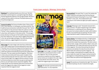
- 1. Front cover analysis- Mixmag- Emma Kelly Masthead The mastheadstandsouton thisissue.The font and colourusedbringacross a young/teenagevibe.We get the feelingthatthe audience isforyoungerpeople.The fontis a black serif font-whichisinformal.The blackstandsouton the yellowbackground. Buzzword/Puff The word“free”is used.Thiscatchesthe reader’sattentionandmakesthemfeellike theyare gettingsomethingoutof buyingthisissue.A puff “biggest and best”is also used. Thisemphasiseditsown importance inthe marketand againpersuadesreadersto buyit. Feauture headline The feature headline states“Partyordie!” Thisis nota question,Itistellingyou,youhave todo this.The headline hasanexclamationmarkafterthe word “die!”which putsemphasisonthe wordand makesthe audience notice it. “Or die!”isalso a differentcolourtothe wordparty. It isthe colourblue,whilstpartyisinthe colourwhite. Thisyetagain drawsattentiontothat part of the headline becausewe notice the colourdifference.The colourwhite suggeststhatpartying isfun,you will be brightandhappy.The colourblue brings abouta darkness,suggestinggloomandsadness. Language Rhymingisused.“Screwthe recessionlet’s have a session!”Thiswhenreadwill stayinthe readers headbecause itiscatching and funny.Rhymingisa persuasive tool andpersuadesthe readersubliminallyto buythe issue andthengoout partying.Thistextisalso underlinedwhichmakesitstandoutevenmore. Colour scheme The backgroundcolouris brightyellow. The colour yellowhasconnotationsof happiness.This linkswiththe modelsface expressions.The othercolours usedare black,orange,white andblue.Blackisonlyused as the Masthead.This makesthatstand outfrom the rest of the magazine.The colourblue portraysthe ideaof smartnessandradiatesthe ideaof securityandtrust. Whichmakesthe audience trustthismagazine. The colourorange is associatedwithenergeticvibes,the colourmakesthe readerfeel happierandwelcomedto the magazine.Finallywhite hasapositive connotation whichmakesthe audience feelhappy/positive. Main image The mainimage isthe mainfocus of the front cover.Both modelshave asimilarexpressionontheirface. Theyboth seemlike theyare happyandshoutingthe lyricsto a song.They seemtobe havinga great time partying.This makesthe audience feelliketheytoowill be thishappywhen theyparty.The twomodelsalsoblendtogether.Theywear similarcolouredclothesbothhave purple includedintheir outfitsandtheyhave the same hair colourwhichisboth the same/similarlength.Thissuggeststhatyouandyour friends will bondandbecome closerwhenyougoout partyingwith themas youwill make newfunmemoriestogether.Their headsalsogo overthe masthead.We cannot see the whole word,thissuggeststhe subject of the magazine ismore importantthanthe magazine itself. Sub-image A sub-image isincluded.Thisgives the audience asneakpeakof whatisinside the magazine.Thisis so the consumer continuestoreadthe rest of the magazine. Certainartistsare includedonthissub-image. Thisalsoattracts fansof the artists.This makesthe magazine gainmore readers. Layout The wordsare all slantedtothe right.This linksto the ideaof partying.Youdon’treallythinkstraight. Barcode The barcode isprintedsmall onthe righthand corner- itis not important.
- 2. Mixmag-Contents page analysis-Emma Kelly Masthead The mastheadhasthe word“contents”written ina large boldfont.The colourused“white”standsouton the black background.Thismakesthe readerfocusonthe mastheadfirstbefore anythingelse.Lettingthemknow that thisisthe contentspage. Nexttothe mastheadwe have otherkeyinformation- The issueandthe magazine logo. These 3 thingsare all writtenindifferentfonts.This may have beendone inordertostand out to the reader. Colour scheme The backgroundcolouris blackthisportrays the atmosphere ina club/concert.Usuallyyouare inthe dark until flashinglightsappear.The backgroundsymbolises the darknessbefore the lights.However,onthe lefthand side we see a range of colourful lightsthe blacktakesour focusstraightto the colour sowe focusonthe mainimage instead.The textiswrittenIna white fontbecause white standsout the beston a blackbackgroundand the page numbersare writteninyellow.Theylooklike theyglowin the dark. The coloursusedcreate a clubvibe. Main image The main image takesupmostof the contentspage.Sowe focus onit. It isa realisticinthe momentshot.Thismakesthe audience connectwiththe image,itisn’tsetup itis somethingthe audience can relate too.We see people close togetherinaconcert/club withtheirhandsinthe air signifying theyare listeningto music.The people blendinwiththe backgroundwe can’t reallysee theirfacesonlytheirhands.We focusontheir bodymovementandthe confetti flyinginthe air.This image linkstowhatthe magazine isabout- Clubmusicand alsoto the article beneathwe knowthisasthe coloursin the image blendinwiththe posterinsertedbelowthe image.Thisiswhywe don’tsee theirfaces,we are meant to focuson the colours. FeaturesThe featuresare printedonthe righthandside of the page.The word“VIP”is addedabove them. Thistitle is underlinedandincapitalssowe notice iteasily.The word “VIP”has beenusedtoshowthat thismagazine includes importantinformation.Itmakesthe magazine looklikea better/higherclassmagazine (itisfarbetterthanthe other magazines).Thispersuadesthe audience thatthismagazine shouldbe frequentlyboughtasitisa betterstandard.The featurestitlesare writteninaboldbrightwhite font.This standsout above the smallertextunderneath,itisclearto see the featureswithinthe magazine soitiseasyfor the audience toread. Language Repetitionisusedforthe title “Kissysell out” itis writtenina yellowfontasa title andona posterand itis alsomentionedagaininabright white boldfontinfeatures.Because thisisrepeated we can see that it isclearlyanimportantsubject.The title isrepeatedaroundthe page sothe readersees it at all sectionsof the page.Repetitionmakesthis subjectstayinthe readershead. Sub-image A sub-image isaddedonthe top righthand corner.It includesaVIPpage,itlookslike another magazine butitis not.This highlightsthe importance and the ideathat itis VIP,because itlookslike we are gettinga magazine withinamagazine.Thismakesthe magazine lookbetter. Anchor Anchorsare usedon the mainimage.The anchor providesasmall sentence describingthe image inafew words.Thisis sothe readergainsa largerunderstanding of whatisgoingon.
- 3. Mixmag-double page spread analysis-Emma Kelly Colour scheme The coloursusedare pink,white,orange ,blackandyellow. These are all neonstyle colourswhich linktothe genre of the magazine.The whole page isverycolourful withthe colourspinkandyellowmainlyusedfor the article banners. White isusedas the backgroundcolourthisis bright and standsout butisn’tbusyso it doesn’tdistract.White givesthe magazine a cleanmodernlook.This linkstothe audience- the younger generation.The colourblackisusedfor the textand at the top of the pages, the mainimage isplacednear the top of the page and the colourblack blends inwiththisimage.Givingita night time clubvibe. Orange appearsat the corner of twoimagesbringinginthe feel of warmthandhappiness. Images There are 5 imagesincludedinthis article.The mainimage sitsonthe leftpage and takesuphalf of the article.Thisisso whena readerflicks throughtheywill automaticallysee thisimage andthenread the article as it catchestheirattention. The 5 imagesare all shotin action.Theyare realisticandshowthe readerwhateach clubis exactlylike.Havingarange of images makesthe article interesting.The readeris more likelytoreadthe article whenthere are imagesinvolved.AsItisn’tboringand justfull of small text. Mise-en-scene Propssuchasalcohol are heldinthe people’shands.Thislinksto the ideaof partying,drinksare oftenassociatedwithdance musicwhichthis magazine promotes.The lightingusedonthese imagesare all highkeylighting,the imageshave beentakenin the dark.The highkeylightingmakesthe peoplelook veryvisible sowe cansee everyaspectof the image.E.g:we see theirclothes clearly,whattheyare holdingetc.The people inthe imagesalsowearbright differentcolouredclothingwhichlinkswhichhowtheyfeel-brightandhappy. Language Words suchas “scouse house” use rhyming.Thiscatchesthe reader’s attentionandmakesthe article look interesting(itenticesthem).Thisiswhyitis usedas the title ina boldblackfontbecause we can see thistitle immediately.Other headingsuse the words“partymaison”and “readyfor the floor”these twoheadingslink to the genre of musicwhichis dance music. The words inparticular,“party” and“floor” linktogetheraspeople dance onthe dance floor.Alsoinan anchorit states“thumping bass” thislinkstothe dance music. “thumping”makesthe musicsound exciting,youheartthumpswhenyouhave an adrenaline rush,sothisimpliesdance musicisreallyfun. Anchor Anchorsare usedon each image.Forexample,“Come 1am thumpingbassandbodyheat radiate…”Theysummarise whatis happeningineachimage.Justincase the imagesaren’tentirelycleartoo make out.This makesiteasierforthe audience tounderstand. Font/text size The fontusedthroughoutthistextisverymodernlooking.Thislinks to the audience of the magazine whoare infact the youngermoderngeneration. The font sizesvary,becominglargerforheadings(whentheyare more important) and smallerforthe articlesfull text.Thisissoitdoesn’tstandoutand distractthe audience fromthe restof the page suchas the images.
- 4. Mixmag questions- Emma Kelly Who isthe target audience? From the issue Ihave analysedI wouldsuggestthatthe audience isaimedatyounger,partyloversof bothgenders. Theylove togoto clubsand are fashionable. UnderneathIhave anexcerptof whomixmagsaytheiraudience are- musiclovers,engagaed,passionate,influential.Theyspenttheirmoney goingout etc. How doesthe magazine appeal tothem? The magazine appealstothembecause itincludesinformationaboutthe latestgigs/clubs.The wholemagazine workstowardstheirinterests,the coloursusedare brightwhichcatchtheir attentionandthe articlesinsidetalk aboutfashion/music/technologyandtravel all of whichthe audience love. Tothe right ismagazine content.
- 5. How doesthe magazine pitchitself?(missionstatement) The magazine statesthattheyhave 13 officesaroundthe worldandconnectwitheveryoneastheyproduce the magazine in8differentlanguagesacross5 continents.Theythengoonand give some statistics(underneath).
- 6. Demographics/Readership We can see thatmixmaghas a higherpercentage of male readersthanwomen.Male readersaccountfor77% and womenonly23%.The average age of a readerisage 24. Most of the readersare from the UK witha percentage of 31%. The magazine readershipis246,000. Circulation/Readerprofile The audience 16 timesmore interestedintechnology, 95 timesmore interestedinmusic.19 timeslikelyto readand share fashioncontentwithinsocial ecosystem and theyare the number 1 forinterestsoutsideof music.It alsogoeson to tell uswhothe audience is, whichI have alreadymentioned. Circulation=reachedacirculationof upto 70,000 copies duringthe heightof the popularityof acidhouse inthe 90’s. 16,000 is the average circulation.