
Recommended
More Related Content
What's hot
What's hot (17)
Similar to Contents 1
Similar to Contents 1 (20)
Recently uploaded
Recently uploaded (20)
Contents 1
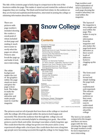
- 1. The title of the contents page is fairly large in comparison to the rest of the feautures within the page. This makes it stand out and remind the audience of what magazine they are reading. The black and formal font relates to the audience as they are formal and sophisticated themselves, interested in joining the college or obtaining information about the college. The layout of the magazine is very simple and neat within the page. This makes it easy to obtain information from the magazine and also makes the page look more attractive as there aren’t loads of different features clogging up the page. There are pictures with page numbers included showing the readers a sneak peak of whats included on that page and making it much more easier to verify what the pages are about. Pictures also break the page up and make it look more interesting. Page numbers and brief explanations of what is included on each page showing the readers what they can read within the magazine The fonts used are very formal and simple making the page look very sophisticated and organized. This attracts the target audience as they want simple and easy to understand information about the college The white background makes the rest of the graphics within the page stand out more and gives the page a clean look. This helps to make the page more attractive and make people want to read the magazine The pictures used are all of people that have been at the college or involved with the college. All of the people within the pictures look happy and successful. This shows the audience that through this college you can achieve a lot and its extremely helpful in obtaining your goals. One of the pictures used is black and white showing it was taken a fairly long time ago. This could show that the college has grown over the years and is a very experienced college with a lot of past. Also could show that even a long time ago people were becoming successful through the college to live happy lives. The text is a lot smaller compared to the images and there are more pages with the text, showing the images with the page numbers could be more important or more interesting