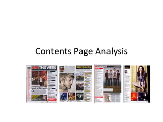
2. Big and bold masthead allows the readers to easily find the
contents page, ‘this week’ shows people new to the magazine
that it is weekly. NME is also the main part, centring what is
happening around THEM rather than the bands.
Allows the readers
to quickly find what
bands have been
mentioned in this
weeks issue. If they
are looking for
information on a
specific band they
can easily find it
using the index.
Small extract from the main
article of the magazine,
gives people a taster and
encourages them to read on
and find out the full story.
Subheadings allow people
to quickly see what is
going on and makes it
easier for them to find
what they are looking for.
Even more specific
subheadings allow them to
find information at a much
more specific level.
The part of the magazine
which the editors will
believe their readers will
interested in is
highlighted by a big red
arrow and thus it allows
them to quickly skip to it
instead of searching
through the magazine for
it.
Very packed, not much wasted
space, very neat and orderly.
3. Picture of the magazine with an editor’s note. Allows
people to see if there is something special about the
magazine. The quote is related to Metallica, the
featured band, allows people to see something about
the band in a very concise manner.
Use subheading in order
to help people find
information easily.
Subheadings following
the black and yellow
house style that we can
see present in the
‘contents’, ‘this week’ as
well as the other
subheadings.
Pictures related to the different stories in the magazine,
allow people to see what is featured without actually
having to rely on reading. They can just see the picture
and know if something they are interested in is featured.
A larger picture for
the main feature of
the magazine, shows
that they are
important as their
picture is bigger
than the rest.
Very packed and
neat
format, allows
them to fill lots of
space without it
looking messy.
4. Dateline, allows people to see
how current the magazine and
the events listed in it are.
Subheadings allow people to
search for a specific story that
they are looking for. Labelled
with the page number too.
Consistent house style
is present throughout
the contents page.
Red, Black and White
contrast well.
Large picture of the
main feature.
White on black masthead, easily readable.
Shows what type of magazine
it is and what people can
expect to find within it’s
pages.
Reviews of what is going on,
allows people to see the opinions
of an editor that they may like.
Allows people to see things that
may be of interest to them such as
upcoming bands or a review of a
large gig.
Picture takes up a lot of space but aside from
that there is not much wasted space on the
page, filled with information about the
magazine.
5. Big picture of the main story in the
magazine. Shows that it is an
important part of the magazine, will
draw the reader towards it.
Other, less important
stories but the editor's still
believe that it is important.
Easily readable, black on white.
Contrasting house style, uses
colours yellow, pink, black and
white.
Smaller masthead of contents, girl
is much more of the focus.
Magazine is aimed much more
towards young men.
Contents is vertically arranged, split up
into different sections using subheads
that stand out from the regular text.
Page number of the stories
are shown so that readers
can easily know where to
find the story that interests
them.
Shows the magazine and who
the photographer is, gives
the reader some information
that they might be interested
in looking at.