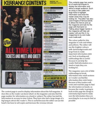
1. The magazine uses a lot of little
subheadings to break
information into small sections
so I reader can find the
information they wish faster.
Because of this readers will
come and read this page to find
the information on bands. so
because the reader is going to
look on this page the design is
extremely important to make
sure the information they are
searching for is as easy to find as
possible
This contents page has used a
lot of useful techniques to
display the information and
attract a target audience. Such
as using a color pallet and
large fonts to highlight
information and show the
reader areas they may be
looking for. The editor has also
used images of famous bands
to attract the fans to pick up
the magazine and look for the
page with that band on.
Talking about bigger bands in
the magazine will help sell
copies i will use this in my
magazines to try and make
sure it sells well.
The context page is used to display information about the full magazine. It
does this so the reader can know what’s in the magazine and also find the
page number for information on a band or subject. The editor has laid the
information in an easy to view Colom. They have also laid a large image of a
big bang to attract the reader's. This is useful because the editor can use the
band's fan base to sell copies and increase the revenue stream
The colour pallet for this
magazine is reds and whites
and yellows. The editor will
use the brighter colours
with dark backgrounds and
large fonts to make
important information stick
out. Such as heading and
subheadings this is useful
because it can help the
reader find information on a
band or topic they are
looking for.