
Recommended
More Related Content
What's hot
What's hot (20)
Viewers also liked
Viewers also liked (20)
Similar to How NME magazine cover follows conventions to attract indie music fans
Similar to How NME magazine cover follows conventions to attract indie music fans (20)
Recently uploaded
Recently uploaded (20)
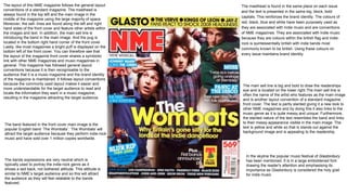
How NME magazine cover follows conventions to attract indie music fans
- 1. The main sell line is big and bold to draw the readerships eye and is located on the lower right.The main sell line is often the name of the artist who features as the main image and is another layout convention of a standard magazine front cover. The text is partly slanted giving it a new look to other NME magazines and by doing this it also links to the music genre as it is quite messy and unique. Furthermore, the slanted nature of the text resembles the band and links to their messy appearance visible in the main image. The text is yellow and white so that is stands out against the background image and is appealing to the readership. The masthead is found in the same place on each issue and the text is presented in the same big, block, bold capitals. This reinforces the brand identity. The colours of red, black, blue and white have been purposely used as they are associated with Indie music and are conventions of NME magazines. They are associated with Indie music because they are colours within the british flag and indie- rock is quintessentially british with indie bands most commonly known to be british. Using these colours on every issue maintains brand identity. The band featured in the front cover main image is the popular English band ‘The Wombats’. ‘The Wombats’ will attract the target audience because they perform indie-rock music and have sold over 1 million copies worldwide. In the skyline the popular music festival of Glastonbury has been mentioned. It is in a large emboldened font drawing the reader's attention and emphasising its importance as Glastonbury is considered the holy grail for indie music The layout of this NME magazine follows the general layout conventions of a standard magazine. The masthead is always found in the top left and the main image in the middle of the magazine using the large majority of space. Moreover, the sell- lines are found along the left and right hand sides of the front cover and feature other artists within the images and text. In addition, the main sell line is introducing the band in the main image. And the pug is located in the bottom right hand corner of the front cover. Lastly, like most magazines a bright puff is displayed on the bottom left of the front cover. You can therefore see that the layout of the magazine front cover shares a symbiotic link with other NME magazines and music magazines in general. This magazine has followed general layout conventions because it is then recognisable to the audience that it is a music magazine and the brand identity of the magazine is maintained. It follows layout conventions because the commonly used layout makes it easier and more understandable for the target audience to read and locate the information they want in a music magazine, resulting in the magazine attracting the target audience. The bands expressions are very neutral which is typically used to portray the indie-rock genre as it shows a laid back, not bothered attitude. This attitude is similar to NME’s target audience and so this will attract the audience as they will feel relatable to the bands featured.
- 2. Introducing other bands in feature article photographs will attract the target audience and make them curious as to what the article is about. The band in this image makes the sell-lines more effective by using mode of address to draw the readership's attention and make them feel that the band are connecting with them. Artists featuring are often presented in a list formation, vertically or horizontally. In this case the artists names are featured horizontally in the magazines skyline. The mise-en-scene of costume is quite casual which draws the attention of the target audience because they feel they can relate to their bands fashion through their fashion. ’The Wombats’ are wearing t-shirts, plaid shirts, hoodies and jeans which are all casual attire that represents their laid back approach. One of the band members is also wearing bracelets which makes their costume more intriguing and bold which also reflects the indie-rock genre. In addition, the bands hairstyles are purposely long and messy to resemble their indie-rock lifestyle and the target audiences easy going lifestyles. This also links back to the reflection upon the hippie lifestyle that is common in indie music and is so part of the representation of indie-rock. Lastly, the bands are all white and very pale resembling the english weather and the british theme throughout the indie-rock genre. The bands are all male on the front cover which is conventional in the music industry as it targets the male reader Other artists featured are listed at the bottom of the magazine. This is a common layout convention of music magazines and makes the audience feel they are getting more for their money. It also attracts fans of the music and artists to read the magazine and entices them to buy it. NME is an acronym for New Musical Express showing its link to the music industry through the name. New Musical Express is also written beneath the NME masthead so that the reader can be sure that the magazine is based around music. As the brand becomes more developed and their brand identity grows they will not need the lengthened title to be presented as NME will be immediately recognised as a music magazine. This may be why other NME magazines do not have the long brand name written beneath the text ‘NME’ making it unique to this magazine. The puff is bright blue making it eye-catching and blue is also recognised as a colour regularly used in Indie magazines due to its relation with the British flag. Furthermore, the puff also introduces another artist through a featured image. Involving another band will entice the readership to read the magazine. Using the phrase ‘RIP’ will make the reader question the situation of the band and urge them to find out the current information that the magazine knows about them. Blur have been chosen to feature in the puff because they have a high status in the indie-rock music industry and are a British band. Blur gained massive popularity in the UK after establishing the BritPop genre and have battled for the charts against other successful bands such as Oasis. Blur stopped making music together after 2003 which is what this puff is indicating. The band then reunited in 2009, and in 2012 won a Brit Award for Outstanding Contribution to Music. They have therefore been chosen to feature in this NME magazine because the bands are very popular music icons and the target audience want to read about them. Pugs contain the barcode, price and date of the magazine and are placed in the same position as other magazines. They are usually hidden away from direct view. This pug also has some added information about the contents of the magazine to draw the reader into purchasing and reading it.
- 3. Two of the music artists in the main image are direct address to connect with the reader and entice them to read the magazine. Another convention includes the composition of the image through the use of the rule of thirds. The rule of thirds is the way in which the aspects of the front cover, such as the masthead and the main sell-line, are arranged within a grid of three rows and three columns. From looking at this front cover I think that it follows conventions as the masthead is in the top left hand corner, the skyline is found at the very top, The main sell-line is positioned in between the second and third rows and the sell-lines are found in the first and third columns. In addition, the barcode is found in the third row and column and the puff is not conventionally found in one specific area. The positioning of these aspects of the magazine are all in the conventional positions following the rule of thirds. The actions of the band ‘The Wombats’ in the main image is what is expected of a lively, young indie band and reflects the genre of music. One of the sell-lines features a quote. This will attract the target audience as it gives them the information that an interview with the band is featured within the magazine. Interviews are conventionally used in music magazines because the target audience like to hear first hand information about their favourite bands. The sell-lines introduce other artists such as ‘Muse’ and ‘Panic At The Disco’ to the reader, making the magazine more appealing. They are presented in big, bold writing to express the importance of their names and make them easily visible for the reader to view. These sell-lines are also presented differently to the other sell-lines in terms of their boldness, this is to make them grab the reader’s attention. The pull quote is used to give the reader some intriguing information about ‘The Wombats’ and make them want to find out more and educate them on why the band have become so popular in Britain. The label ‘Britain’s gone silly for the lords of the indie dance floor’ will likely influence the target audience's opinion of the band and make them think more highly of them as they are being compared to ‘lords’. It also informs them of who’s currently popular. In addition this pull quote has used the word ‘Britain’ to show the link the indie-rock music shares with the British culture. The magazine has used buzzwords such as ‘lords’, ‘silly’ and ‘dancefloor’ to excite and attract the reader. The target audience is urged to turn to page 5 making the readership intrigued to find out what bands have been announced to play at the very popular music festival T in the park. Mentioning this festival will also interest the readership. Some of the sell-lines have been highlighted blue to make the text more visible and show its importance to the reader. Having the sell lines highlighted is a common layout convention of magazines and is used to present the bands names. The font of all the text is very clear and understandable to read. This has been done to make the reader find the magazine easy to read and therefore enjoy reading it. The pull quote will usually present sub-information relating to the artist as this is another layout convention of a music magazine.
- 4. The front cover follows the general conventions and layout conventions of a standard magazine front cover in many ways. For instance, the heading is found in the top left hand corner of each NME issue, maintaining brand identity, and this is also a convention of other magazines. Furthermore, The main sell-line is located in the bottom half of the front cover and introduces the band featuring on the front cover. Moreover, the main image is in the centre of the magazine cover and is very eye-catching to attract an audience. Furthermore, the pug is located in the bottom right hand corner and is another layout convention of a magazine front cover. Lastly, another layout convention of this magazine includes the location of the sell-lines as they are usually found along the left or right hand side of the cover. This technique of rule of thirds is visible through the layout of the magazine. The main image is of a band related to the indie- rock music genre called ‘Paramore’ and this image has been used to attract fans of this band and music genre. The colour of the female band members hair, makeup and eyes draws the reader's attention to the magazine. The colour of pink/purple used for Hayley’s makeup has also been chosen to form the colour of the main sell line . NME is an acronym for New Musical Express showing its link to the music industry through the name. Some NME magazines consist of the lengthened title being placed under the masthead but this magazine may be a newer edition as there is no need for the lengthened title due to the magazine company being very successful and having a recognisable brand identity. The colour scheme of the front cover includes the colours, red, white, black and pink. Red, white and black reflects the indie-rock genre and so makes the magazine more appealing to the audience. A triangular formation is used, with the lead singer, Hayley, at the front of the frame and the rest of the band positioned more or less symmetrically behind her. to reflect the hierarchy or the band members. The colour scheme is reflected through the costume of the band as the only colour used on the band's clothing is black and a bit of grey. These colours are used because they are dark and grungy reflecting the genre of indie and rock and emphasising the merging of these to genres to form indie-rock. The Iconography of black clothing and its link to the music genre and the band appeals to the target audience. Piercings and tattoos link to the rock genre and are visible in the image as three of the artists have piercings. These accessories are also black to represent the genre of music. The layout has a minimalist, simple approach. This is so that it is easy and clear to read and attracts the target audience of men who stereotypically like things to be simple and easy to follow.
- 5. The main sell-line is pink making this magazine more appealing to the a female target audience in addition to the common NME target audience of males. Making the main sell-line pink also links with the female band members lipstick adding to the colour scheme. The use of a question ‘Everyone has fallen for them Will you?’ in the main sell-line is using direct mode of address to make the magazine communicate with the audience and makes them think more deeply about the band featuring on the front cover. The question will also spike curiosity in the readerships mind and entice them to read the magazine. The question is an indirect reference to the fact that Paramore are an American band and NME are taking a risk as they usually have British bands on the front cover as indie is a British genre. The question is referring to whether the british public will ‘fall’ for them like the rest of the world has. This is further reflected as every other band and artist on the front cover is British. Using the word ‘Plus’ makes the reader feel they are getting more in the magazine then they payed for ‘4 million albums sold’ highlights the success of the band ‘Paramore’ and is likely to influence the readerships view of them and make them want to read about them. The sell-lines are all white or red so that they stand out against the dark, black background and this makes it clearer and more effective at grabbing the reader’s attention. Furthermore, some of the sell-lines are red which is another colour that stands out against the background and this is used to highlight small, key information that the rest of the sell-line in white explains. Using the recognisable bands ‘Mumford & Sons’ and ‘Muse’ will appeal to the target audience and make them intrigued to read the article about them. The text in the puff has also compared these two bands by saying that ‘Mumford & sons’ are ‘bigger’ than the iconic band of ‘muse’ This is a big statement to make and will surprise the audience and attract them to read the magazine The two sell-lines on the front cover have underlined the last words of ‘America’ and ‘The cribs’ this is to make it apparent to the reader that these words are important and also makes the layout neater and more interesting. Introducing the band of ‘The Cribs’ also appeals to the target audience. The text is written in block capitals making it appear big and clearer. Having the text in capital letters highlights the importance of the writing and makes the audience intrigued. ‘Guns, God’ GET OPINIONS The skyline is used to reveal to the reader that ‘Jack White’ is partaking in lecturing and is also an indirect suggestion that he is also a professor of music. This is again making the point that the artists featured in NME are the cream of the crop A way this NME magazine is unique to others includes where the puff is located and its colour. The puff is usually found on the left of the bottom half of the front cover, however in this case it is placed in the top right hand corner. Furthermore, the puff is usually very bright and eye-catching, whereas in this front cover the colours blend in with the background and do not ‘pop’ out of the page. This may have been done to make the main sell- line the centre of attention as it is introducing the band that is featuring and is therefore important.