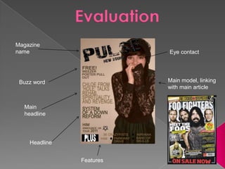
EvaluationMagazine nameEye contactMain model, linking with main articleBuzz wordMain headlineHeadlineFeatures
Consistent house styleMain imageHeaderEffective spaceMagazine contentSmaller imageCaption
Direct link of communication between artist and audience to seem bubbly, chatty and interestingHeadline punMain image same model as front cover, linking them togetherConsistent Alignment
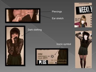
PiercingsEar stretchDark clothingIconic symbol
My target audience Female
Teenagers aged 15-early 20’s
Working class background derived from the grunge rock aspect
Rock/metal music fans

Media presentation

Editor's Notes

  • #2 My magazine has obeyed the following conventions........ most magazines choose place the image in the centre, I have placed my main image to the side so that it gets cut off looking more interesting and diverse. I have chosen the beige and dark colour scheme so it appeals to a female audience which is unconventional so that it stands out amongst other magazines. The font I have used is simple and bold in order to look neat and easy to read. However I have matched this simple font with a torn looking, destroyed looking font in order to link with the messy connotations with rock music.
  • #3 On my contents page In have used a lot of free space which isn’t often found on contents pages, however I used it in order to draw attention to the largest main image as it is heavily edited. The image has been placed on the page almost messily overlapping the page in order to replicate the messy style of magazines such as Kerrang! Magazine. I have used the Vibe magazine contents page above as inspiration for my contents because I liked its use of free space and a strong edited image. This accentuates the female based magazine’s idea of strong, independent female role models whilst incorporating a grungy music style.
  • #4 My double page spread follows a familiar Question and Answer convention often seen in Kerrang! magazine. Also the magazine language appeals to a bubbly audience by giving the reader a direct link to the artist by being able to ask the artist questions. The columns are aligned neatly and all have the same spacing in order to make my magazine look more professional. The image on this page is very engaging for the reader as it looks as though the model is almost reaching out of the page to the audience, enticing them into the article and her world.
  • #5 My model’s appearance attracts the particular audience of grunge rock/metal music listeners by the model’s and dark clothing and piercings as these two elements are often associated with the rock and metal music scene. I have also used an iconic symbol for a band within my target music scene to illustrate the social group my magazine is intended for. Also to represent this alternative social group, models are found doing more outrageous poses to imply the ‘uncaring attitude’ that is assosiciatedwith this genre.
  • #6 Initially I didn’t know what specific genre to base my magazine on and so I used my audience research in order to find out what rock bands girls most preferred and based my genre on my findings.
  • #9 Improved photo shop skills as i found it really confusing to begin with and also how to quality of the photograph like angles and [placement can make a huge effect on the magazine.