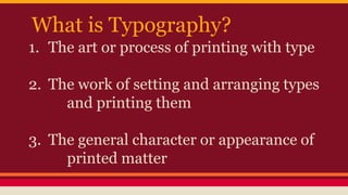
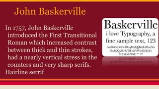
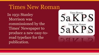
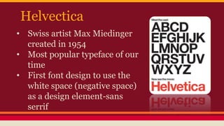
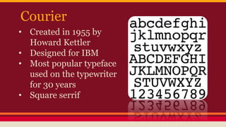
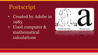
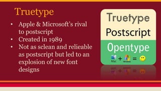
1. Typography is the art and technique of arranging type. It is concerned with the selection, design, and arrangement of letterforms and text.
2. The document provides a history of typography beginning in the 1400s with the invention of the printing press and movable type by Johannes Gutenberg. It discusses important figures like Claude Garamond, John Baskerville, and the development of typefaces like Times New Roman, Helvetica, Courier, and digital fonts.
3. The lesson teaches about typographic terminology like cap height, x-height, baseline, ascenders, descenders, and serifs. It provides an assignment for students to create an 8x10 picture using only fonts
3. What is Typography?
1. The art or process of printing with type
2. The work of setting and arranging types
and printing them
3. The general character or appearance of
printed matter
4. Graphic Design Uses
• Stylistic Characteristics
• Readability- what is it being used for?
Website, newspaper, poster, packaging…
6. • Cap Height-refers to the height of a capital letter
above the baseline for a particular typeface
• X Height/Midline-The height of lowercase letters; does
not include ascenders or descenders
• Baseline-The invisible line where all characters sit.
• Ascender-the upward vertical stem on some lowercase
letters, such as h and b, that extends above the x-height
• Descender-the part of the letters that extends below the
baseline
• Serrif- is the little extra stroke found at the end of main
vertical and horizontal strokes of some letterforms
7. A History of Typography
• In the 14oos Guttenberg invented a
system of movable type that
revolutionized the world and allowed for
dramatic mass printing of materials.
• The Printing Press, which is still used
today.
8. Claude Garamond
• In 1490 Garamond was the first to
develop a typeface not designed to
imitate handwriting but on rigid
geometric principles.
• He also began the tradition of
naming the font after himself.
• His font was dominently used for
200 years.
9. John Baskerville
In 1757, John Baskerville
introduced the First Transitional
Roman which increased contrast
between thick and thin strokes,
had a nearly vertical stress in the
counters and very sharp serifs.
Hairline serrif
10. Times New Roman
In 1931 Stanley
Morrison was
commissioned by the
Times’ Newspaper to
produce a new easy-to-
read typeface for the
publication.
11. Helvectica
• Swiss artist Max Miedinger
created in 1954
• Most popular typeface of our
time
• First font design to use the
white space (negative space)
as a design element-sans
serrif
12. Courier
• Created in 1955 by
Howard Kettler
• Designed for IBM
• Most popular typeface
used on the typewriter
for 30 years
• Square serrif
13. Digiset
• 1964 by Rudolf Hell
• First digital font created
• Based off of pixels/bitmaps
15. Truetype
• Apple & Microsoft’s rival
to postscript
• Created in 1989
• Not as sclean and relieable
as postscript but led to an
explosion of new font
designs
17. Opentype
• Is a cross-platform font file format
• Mixing of Adobe & Microsoft
• Compatible with Mac and Windows
• Expanded layouts and design features
• Font boom-Easily find free fonts online
18. Assignment:
Create an interesting picture using only
fonts. You may change the size, color,
direction of the text.
The final picture should be 8x10, 200 ppi
with a solid color background.
19.
20.
21.
22.
23.
24. Let’s get staerted!
1. Find a reference photo from your
collection of photos or the internet.
2. Open and resize in photoshop.
3. Follow the pen tool demonstration.
4. Adjust layers, blending options, try out
some new filters…include previously
learned skills.