
Recommended
More Related Content
What's hot
What's hot (18)
Viewers also liked
Similar to Question 5 final
Similar to Question 5 final (20)
Recently uploaded
Recently uploaded (20)
Question 5 final
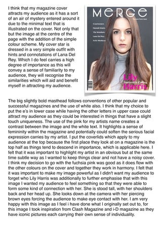
- 1. I think that my magazine cover attracts my audience as it has a sort of an air of mystery entered around it due to the minimal text that is illustrated on the cover. Not only that but the image at the centre of the page with the addition of the simple colour scheme. My cover star is dressed in a very simple outfit with hints and connotations of Lana Del Rey. Which I do feel carries a high degree of importance as this will convey a sense of familiarity to my audience, they will recognise the similarities which will aid and benefit myself in attracting my audience. The big slightly bold masthead follows conventions of other popular and successful magazines and the use of white also. I think that my choice to put the e’s in lower case while having the other letters in upper case could attract my audience as they could be interested in things that have a slight touch uniqueness. The use of the pink for my artists name creates a contrast between the image and the white text. It highlights a sense of femininity within the magazine and potentially could soften the serious facial expression carries by my artist. I put the coverlids which apply to my audience at the top because the first place they look at on a magazine is the top half as things tend to descend in importance, which is applicable here. I felt that it was important to highlight my artist in an obvious but at the same time subtle way as I wanted to keep things clear and not have a noisy cover. I think my decision to go with the fuchsia pink was good as it does flow with the other colours on the cover and together they work in harmony. I felt that it was important to make my image powerful as I didn't want my audience to forget who Lily Harris was additionally to further emphasise that with this image I wanted my audience to feel something so that they were able to form some kind of connection with her. She is stood tall, with her shoulders back and her head up. She looks down at the camera with her piercing brown eyes forcing the audience to make eye contact with her. I am very happy with this image as I feel i have done what I originally set out to, for this image I took inspiration from Clash Magazine and i-D magazine as they have iconic pictures each carrying their own sense of individuality.
- 2. My contents page attracts my audience because it contains a detailed description of subjects that there are interested in that they would need or want to know. Because of the difference in font size or boldness etc the audience is able to quickly pick out pieces of information without having to go through everything just to get to the part that they wanted. Although I kept some continuity from my cover page such as some of the fonts and in particular the colour scheme, something I did change however was the font of the masthead. I had been contemplating keeping the one that had been used for “merge” on the cover. But I deemed it necessary to keep that exclusive to the cover and to mix things up a bit for the contents page. For my contents page I was inspired purely by clash. I just really loved the simplicity with their contents page, for some reason or other it really grabbed me, so in an attempt to emulate their work I created my own. Having look at it now I am happy with it, however my only regret is that the femininity that began in my contents page seems to have faded somewhat in my contents page, I definitely think that if I had another chance to make any changes I would rectify this. As since my aim is to reach my audience and with the majority of my audience being female then this is necessary.
- 3. My double page spread was inspired by Rolling Stone. I remember when I was in the stage of researching and planning that I was hung up on Lana Del Rey and how I wanted to create my artist very closely to her. Which was when I came across the double page spread about her, very similar text, similarly set out. She had numerous pictures of herself on their featuring one in particular with was her sat on the floor with her cat. I really liked it as it was a little unconventional you don't really tend to see people jumping at the thought of having their picture taken when sitting on the floor, but she did. I also felt that within that there are a couple of hidden connotations that she is a regular person and she doesn't feel as if she is above everyone else. My aim was to really make people feel that they could relate to Lily. On my cover page I had the subtitle of “New girl on the block” which I eventually decided that I would use that to name my article. I did keep some continuity as I used the same font which was used for the masthead of my contents page as I did for the name of my article, which gives the audience some familiarity as I didn't want each page to feel totally different. Not only that but the continuity of the mise en scene was carried from the cover page to here as if it hasn't been noted already Lily is wearing exactly the same clothes in the cover page as she is on the double page spread. I felt that the cover page was all about her face and her features, the double page spread is still but not as much as I wanted my audience to connect with her here, see her style and have an insight to what she is about. I decided to have an interview based article as since she is a new artist I wanted to give my audience a chance to get to know her a bit before they made a judgement. I followed the alignment of Rolling Stone as I think it has a really transparent look which is easy for the eyes to follow. I feel that because my double page spread keeps the relaxed look, it really demonstrates the style of music in which I am trying to portray which in turn will attract my audience as my audience is all about new things then they will see this as an opportunity to look at Lily who is new and unique. I feel that because some conventions within the magazine have been challenged then once again this will aid the process of trying to attract my audience since it is a breath of fresh air. Lily’s style really connotes the genre so when referring to the music it all works together. Not all indie music is chilled out that isn't the main focus, the focuses are finding new and up coming artist’s and looking at people with a real talent and ultimately the reason why it is so powerful is because the audience is able to make a connection. Which is what I have tried to achieve here. There isn't such a hierarchy in this genre which compared to other genres you find one. In terms of the huge difference between the stars and the public so my aim was to make sue that my audience was able to relate with lily.