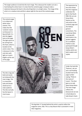
1. The target audience is lured into the main image. This is because the readers can see a The expression by
hand taking the artists heart. It is clear that the contents page is trying to make a the artist shows
statement because the heart is the only thing that is in a bright colour. The image of the that this magazine
artist is in a medium shot and this is about right for the size of this contents page. celebrates the
genre Hip-Hop &
RNB. We can see
Kanye West
The contents page
feature as the
is in a black and
only artist on the
white colour
contents page and
scheme. This
this follows
makes the title
general
‘contents’ stand
conventions. The
out because it is
way Kanye West
big and bold. It is
is posing with
also the biggest
both hands in his
text on this page.
pocket suggests
The light seems to
he is confident.
be coming from
Fashion is also
the heart, which is
portrayed through
located on the
Kanye West’s
artist’s chest. This
clothes which are
is because it is the
both modern and
only item with
stylish.
light on it and it
brights up the rest
of the page.
Under the Sub-title
‘features’, we can
see a sub heading
The title is big and located next to the
bold and stands page number
out along with the saying, ‘Pride on
main image. This the name of
is a masculine Lovers’. This then
look and should goes on to talk
stand out to a about Kanye West.
male audience. The main image
The title normally reflects this
has the layout in because we can see
most issues. a hand about to
take Kanye’s heart.
The big letter ‘V’ located behind the artist is used to reflect the
magazine name, Vibe. This is a key feature that is consistent in most
Vibe magazines.
2. The font of the title ‘Contents’ is big and bold which makes it stand out, catching the
reader’s attention. It is in the colour white and this makes it even more effective
because it perfectly blends in with the red background. It also has a symbolic link with
the sub-titles because they are also white. This makes it eye catching and reflective.
The readers are lured into one chain that is around the artist’s neck and this chain
stands out because it has a face on it. It is worn by the artist, to make him and the
chain stand out.
The main and
only image fills
the whole On the top right
frame. It is big corner we can see
and we can see the date of the
the artist posing magazine along with
in a medium the magazine logo.
shot. From what The logo is a key
we can see the convention and is
artist does not always located on
have a top on, the content pages of
and we can see Vibe. The date can
his tattoos. It is help readers keep on
a key track with what
convention for a magazine issue they
RNB artist to are on.
have a tattoo on
his body.
On the left side of
the page we have
the following
headings, features
and fashion.
These are the key
subjects inside the
magazine.
The background is in a light red. However we can see a big letter ‘V’ in a dark red located
above the artists head. The use of the ‘V’ brands the magazine and enables the reader to
identify which magazine they are reading by just one letter instead of writing out the whole
word. The font of the text is white and this clashes with the colour of the background, which
makes the magazine more appealing to the reader.