
Recommended
More Related Content
What's hot
What's hot (20)
Similar to How my media product uses, develops and challenges conventions
Similar to How my media product uses, develops and challenges conventions (20)
Recently uploaded
Recently uploaded (20)
How my media product uses, develops and challenges conventions
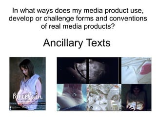
- 1. In what ways does my media product use, develop or challenge forms and conventions of real media products? Ancillary Texts
- 2. Magazine advert Conventions I used ● Central aligned layout ● Main image ● Consistent font use ● Album name in large font ● Information provided is similar to that on a real product; release date, songs on album, social media details
- 3. Magazine advert Conventions I developed & challenged ● The use of a main image to promote the album. However, instead of an image of the band/artist I used one of the character of the music video. This is to promote the CD and music video as a full package ● The main image is similar, rather than the same as the album cover. This has been done before, for example there are different images used to promote Ellie Goulding's and King Of Leon's albums (see magazine advert research)
- 4. Comparison of images for ancillary texts The images are both of the character in the music video looking down at her 'moon' but they are composed slightly differently and have different lighting. They are similar enough to obviously be promoting the same product but different enough to be suitable for their purposes.
- 5. Digipak
- 6. ● Image is stretched across two panels where the disks are slotted ● The spine is very conventional; it has the basic information required ● The images used in the digipak relate to the video and create a consistent look throughout all the promotional package ● The tracks are listed on the back cover as well as the label information Conventions I used
- 7. Conventions I developed ● Often, the digipak has a very consistent theme colour. My theme colour is not highly consistent but I did this to make it match the music video. For instance, there are light scenes and darker scenes, and the images used on the panels of the digipak are either very light or very dark. This defies the convention of a consistent theme colour in order to make the digipak more cohesive with the music video, therefore making a more effective promotional package. ● Not only did I use similar tones and colours, I also used stills taken while I was filming the music video. This type of consistency makes a lasting image on the audience's mind as they associate images in the video, digipak and advertisments with the song and the band.
- 8. Conventions I challenged ● There is often a consistent colour scheme running through the front cover, spine and back cover of the digipak ● However I chose to defy this convention by having a dark image on the front and a light colour scheme on the spine and the back cover. The colours are similar (neutral tones with green and pink hues); it's the tones that contrast. ● This was a by-product of choosing light and dark images for the digipak, discussed in the previous slide. I feel like defying this convention doesn't make the product any less effective as the consistency of the product isn't hindered. The front cover and back cover don't necessarily contradict one another because they are back to back therefore the contradiction isn't very obvious.