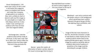
1. Masthead – uses red to contrast with
the darker colours in the background
which would have been used to
represent the genre being a thriller –
low lighting, blues and blacks, cold
colours.
Image of the two main characters in
the film, the female character is made
to look dead to create mystery for the
audience which relates back to the
mystery/thriller genre again. From this
image the audience would be able to
establish what kind of audience it
would be as the image could be
disturbing for younger children.
Anchorage text – tells the
audience what will be inside of
the issue. In this case it says ‘Did
he or didn’t he?’ which makes the
audience think that they might
find out if they purchase the
magazine.
Banner – gives the readers all
information of what is written about in
the issue to encourage them to buy it.
House style/graphics – the
same main colour of red is used
in all Empire film magazine
covers to establish their theme
and make their company
recognisable to an audience.
Also, red is unlikely to clash or
blend in with any film image as
it is very bright so it makes the
title always stand out. It also
makes it eye catching to an
audience who may not have
seen the magazine before.
Barcode/date/issue number –
all used on every magazine, in
this case shown at the top of
the magazine.
2. Masthead – uses red to contrast with the darker
colours in the background which would have
been used to represent the genre being a thriller
– low lighting, blues and blacks, cold colours. This
is similar to the first magazine too.
Image of the main character of the film looking
into the audiences eyes wherever they look to
intrigue them into the film. He is holding a gun
which creates a sense of mystery and danger
before they even know what the film is about.
The genre is established here as they would know
it’s likely to be an action thriller. This is also
reinforced through ‘action packed’ written at the
top.
Anchorage text – tells the
audience what will be inside of
the issue. ‘Bigger Better Badder’
the use of alliteration is used to
catch the audiences attention and
excites them as to what’s in the
magazine.
Banner – gives the readers all information of what is written about in the issue
to encourage them to buy it. ‘Our most action packed issue ever’ the use of
the determiner ‘most’ is used to persuade the audience to read the magazine
as it’s the best one yet. This in turn will mean more people will hear about the
film and encourage them to watch it because of the text used on the front
cover.
House style/graphics – similarly
to the previous magazine, the
same main colour of red is used
to establish their theme and
make their company
recognisable to an audience.
Three colours of red, black and
white are used to emphasise
danger which often takes place
in a thriller. This represents the
genre to the audience so they
know what kind of film it is, this
is helped through the image
and text around it.
3. Masthead – uses white to contrast with the
darker colours in the background which would
have been used to represent the genre being a
thriller – low lighting, blues and blacks, cold
colours.
Image of the main character coming
out of smoke/water with an
intimidating face. Colours used on the
character are fairly dull and dark
which contrast with the blues for the
rest of the background although these
seem fairly cold colours. They
compliment the title which says
‘Island’ which we would picture water
however it isn’t the luxurious island
you would automatically think of. This
is helped by the image of the main
character representing the danger and
mystery.Anchorage text – tells the
audience what will be inside of
the issue. ‘Leo takes over the
asylum.’ This gives a slight
narrative as to what the film is
about and also helps give away
the thriller genre to the audience.
A short sentence is used so not
too much information is given
away.
Banner – gives the readers all information of what is written
about in the issue to encourage them to buy it. ‘Greatest movie
art ever’ is written at the top. The superlative ‘greatest’
emphasises how amazing the contents of the magazine is. It also
separates the magazine from other companies such as Empire as
it persuades the audiences that there isn’t any better.
House style/graphics – although
this is Total Film Magazine
rather than Empire, the same
main colour of red is used
which proves that red and
white must be attractive
colour's to catch the audiences
eye. It helps connect the image
to the text as they compliment
each other by both
representing danger.
Barcode/date/issue number –
all used on every magazine, in
this case shown at the top of
the magazine.