
Recommended
More Related Content
What's hot
What's hot (20)
Viewers also liked
Viewers also liked (20)
Similar to Poster progress
Similar to Poster progress (20)
Recently uploaded
Recently uploaded (20)
Poster progress
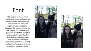
- 1. Font We wanted to chose a font similar to the one we have used in the teaser trailer which was fairly simple and plain. We experimented using spaces between the letters to make the text spaced out however as a group we decided on using the slimmer, taller text. We also added in the cinema release date into the bottom right corner in a small font as having looked at other poster designs, the date is often very small.
- 2. Colours We played around with using different colours for the title that stood out but also fitted in with the colour scheme we have used in the magazine and teaser trailer so far. This consisted of reds, whites and blues however in the end we decided to go for red as it was a contrast to the blue, fairly dull background which has been seen in other film posters. We added in a slogan underneath the title saying ‘she saw her’ which is what we use in the teaser trailer to build suspense.
- 3. Names We decided to feature our actresses names at the top of the film poster. This was partly because having researched other posters, they usually featured well known actors names, but also because we had a fairly large gap at the top of the poster and felt as though it would look effective to fill this. Again, we played around with the font and colour however we couldn’t find a colour that stood out more so had to stick with black which is still visible, but could have been clearer!
- 4. Final Design We downloaded the font ‘steel tongs’ to use for the credits at the bottom of the poster which we wrote our names in. Also, throughout the process we moved the date around a few times until we were happy with the placing. We do still need to add in our production and distribution company ident’s into the corners of the poster however, we were happy with the progress of the poster and the final look.