A Critique of the Proposed National Education Policy Reform
Doc1
1. I usedQuark tomake mycontentspage and althoughIusedit forthe preliminarytask,IonlybrieflyuseditandI still
had to do a lotof playingaroundandadjustingthingstomake themfitandlookrighton the page.
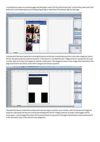
I startedwiththe basiclayoutby insertingthe banneratthe top inpurple because thisisthe mainmagazine colour,
whichI decidedusingmyaudience research.Inthe bannerIincludedthe title ‘indigocontents’alongwiththe issue
number,date of release andmagazine website underneath.Ithenbegantoinserta few imagesthatIwantedon the
page and triedto see where some of the categorytextboxeswouldfit.
I decidedthe bannerlookedtooemptyanditwastoo bigso I putthe issue number,date of releaseandmagazine
website underneaththe bannerinsteadandchangedthe fontof ‘indigocontents’tomake itlookbiggerandfill
more space. I alsochangedthe placesof the picture boxestoa positionIthoughtlookedbetterandwouldeasilyfit
inthe textwhenIput inthe columnsand categories.
2. I made quite a lotof adjustmentstoreachthispointbychangingthe colourof the textbox to greyand the textto
purple,aswell aschangingthe fontof ‘indigo’tomatchthe fontof the mastheadas the fontof the mastheadisalso
the same as the fontof the magazine name inthe contentspage.Iput the issue number,date andwebsite backin
the banneras I thinkit makesthe page lookmore organisedandfitsbetterwiththe waythe bannerisnowlayed
out.I chose the picuresIwas goingto use andinstertedthemintothe boxesto make sure theylookedrightand
startedto put inthe categorytitlesinto boxesandinsertsome of the text.
I made a fewmore adjustmentsthatmade quite abigdifference tothe page andstartedto make it looka lotmore
professional.Ichangedthe colourof the box to a darkerpurple andthe fontto white whichlookalot more
sophisticatedandmature andunderlinedthe categorytitlesratherthanputtingtheminboxes.Ithenmade
‘contents’abit biggerthan‘indigo’because the contentstitle isalwaysthe biggesttextonthe page.Ialsoincluded
more informationinthe text,sothateach page title includesashortdescription.Ialsomade the texta lotsmallerso
it doesn’ttake upas muchspace so I can include more information,anditalsolooksmore professional.
3. I changedthe categorytitlesagainsotheyare back inboxesratherthan beingunderlinedwhichlooksbetter.Ialso
changedthe bannerso that ‘contents’comesbefore ‘indigo,sothatthe twotitlesare obviouslyseparateratherthan
being‘indigocontents.’ Furthermore Iputthe issue date andnumberandthe website backunderthe bannerwhichI
thinklookslotsbetterbecause itmeansI can make the fontinside fill the whole box.AllIhave todo to finishthe
page now isinsertmypicturesinto the boxes.
I decidedthiswasgoingtobe the image usedformycover image because itfitswell andthe model onthe front
looksindie as she haslongdiedhair,piercingsandiswearingacheckedshirt.Furthermore she isstandinginfrontof
a rusty lockerwhichisa typicallyindiesetting.
4. I croppedthe image and adjustedit’splace onthe page sojust the model’sheadandshoulders canbe seenasthisis
typical of the professional indiemagazinesIlookedat.
I decidedonthe fontof the mastheadinorderto reflectthe magazine aswell asfollowingmydecisioninthe
productionplan.Ihad alreadydecidedthe maincolourwouldbe purple,soI thoughtthistype of purple wasbestas
it’squite deepand sophisticated.Ialsoaddedthe barcode asthisis a vital part inmakingprofessionalmusic
magazines.
5. I nextaddedthe maincoverline whichIplayedaroundwithabitto findthe colourand size that made itlook
recognisable and make sure itdidn’tblendin tothe backgroundsoit couldn’tbe seen.
I includedall of the coverlineswhichtookawhile becauseIhadto put eachline init’sowntextbox to make sure
there wasn’tbiggaps betweeneachlineandmake sure all of the textfitnicelyaroundthe model’sface.Once Ihad
includedall of the coverlinesitmade the page come togetheralotbetterand lookedmore professional.