SlideShare a Scribd company logo
1 of 40
OCR –
Level 3 Cambridge Introductory Diploma in
Media
Unit 13:
Planning and Pitching a Print based Media
Product
P1 Evidence
Name: Lewis Manning
Candidate Number: 3073
Center Name: St. Andrew’s Catholic School
Center Number: 64135
Set Brief - Print
Project/Brief –
Music Magazine & Promotion
Contents page
Kerrang! Magazine slides
• 4- deconstruction of the front cover
• 5- content of the magazine
• 6- magazine contents page analysis
• 7- frequency
• 8- purpose
• 9- genre
• 10,11- target audience
• 12- deconstructing a double page spread
• 13- publisher of Kerrang! magazine
• 14- form and style
• 15- website deconstruction
• 16- email to the publisher about
production
• 17,18,19- production process
Q Magazine slides
• 20- start to Q magazine
• 21- form and style
• 22,23- target audience
• 24- genre
• 25- purpose
• 26- publisher of Q magazine
• 27- deconstruction of the front cover
• 28- deconstructing a double page spread
• 29- magazine contents page analysis
• 30- website deconstruction
• 31- email to the publisher about
production
• 32,33,34- production process
Masthead: It contains the whole
magazine name rather than a
letter or an acronym. This helps to
convey its superiority on the
magazine rather then be blocked
out by the main image like in
other magazines. It is also set as
white writing on black
background which helps to
portray how bold the masthead is
as they are very contradicting
colours, where in some magazines
the masthead blends with the
background.
Strapline: Kerrang!’s brand slogan is ‘Where life is loud’,
this is not on the magazine. This may be because they
believe it will not provide much to the success of selling
the magazine at local convenience stores. Instead of
putting their magazines slogan they put additional
information such as exclusive content or new weekly rock
hits.
Main image: In this case the
magazines main image is of Jared
Leto from 30 Seconds Of Mars.
The main image is behind the
masthead which conveys how
the main image is not that
superior to it however it is over.
Main Headline: The main
headline is located across the
centre of the page indicating it is
an important part of this issue.
The style of font is also very bold
and it is all in capital letters so it
is trying to catch the readers eye
and make them drawn to it as it
stands out from the rest of the
writing.
Cover lines: In this issue of Kerrang!
The cover lines are located underneath
the main headline and in a much
smaller format. This is to convey how
they are not that significant in this issue
but are still recommended to the
reader.
Price tag/issue: The price
is £2.20 and the issue is
unknown
Content
• The content of Kerrang! magazine was originally focused on the new wave of
British heavy metal phenomenon and on the rise of other hard rock acts during
the 1980’s in England. It usually contains the top airing rock music for that week
and ranks them in a chart consisting of 20 tracks. Now it is considered the best UK
rock magazine with its own radio and TV station.
• It also contains a featured rock band in every issue. This is to not only promote the
band that is being featured but to also appeal to all types of rock fans. With this it
discusses all the bands recent successes as well as what is happening with them
whether they are going on tour or are they going to be featured in any upcoming
Magazine contents page
Within Kerrang! Magazine
there is only one contents
page. This connotes how
the magazine does not
want to branch of on to
unrelated topics but rather
wants to get straight to the
point. It also contains
some colours that are not
of the house style on the
front page such as blue
which goes to show that
the editors want us to
realise this and make us
want to look through it
due to it not looking like
the rest of the magazine.
The main image that is
being used in the
contents page is very
eye catching due to the
girl reaching out to us.
This could be
interpreted as the girl
trying to stop us from
flicking to the other
page and make us read
the text surrounding it
as it contains
information on all the
subjects being covered
by the magazine.
The information surrounding are all the topics being covered by this issue of the magazine. As
you can see it is separated into 9 sections with it being highlighted in yellow. This helps us as
the reader to see what's being covered and whether or not we would like to go to those
specific topics within the magazine
Frequency
• Kerrang! releases a new magazine every week allowing readers to be updated on
newest rock tracks that have been popular around the globe the past week and be
able to read more about them as well as discover new music artists.
• with each new issue of the magazine a new band is featured and other contents
that is recommended. Every week is different but when the same band comes up
again, that is mainly due to them having another recent success.
• Each issue costs £2.20 and this is mainly due to the fact its sold weekly. If the price
was any higher then £3 it would lose readers due to it being to expensive due to it
being a weekly magazine rather then a monthly magazine which costs more.
Purpose
• The purpose of Kerrang! magazine is to inform new readers about the latest
modern rock bands that have created new singles or those who have recently
shown up in the world of rock music .
• They also aim for us to subscribe to the magazine so that they can continue
creating new articles on bands and further their chance of survival in the music
industry. However in order to do this the magazine and publishers have to
continue adding new content to their magazine to appeal to their readers requests
and desires.
• The magazine publishers also sell concert tickets to the readers of the magazine for
any rock band that would be covered in the issue of magazine. This further
promotes the magazine which would lead to more subscriptions to the magazine
and gain more money that can further the companies cause of spreading rock
music to the world.
Genre
• Kerrang! is a modern rock music magazine that features the latest rock
bands and all there newest singles. This is mainly attracted to the those of
the age 17 – 24 due to more popular rock music being released during the
time they were alive.
As you can see from this chart
rock music is not very high on the
overall favourite music genre list
and I believe magazines such as
Kerrang! Are trying to increase
this by including new content
every week that may appeal to
the readers.
https://aliceroundmediastudiesas.wordpress.com/main-task/
Target audience
Hartley:
Age- Kerrang! magazine is aimed for people who are between the ages of 15- 24 years old. This is due to the fact that the newer
generation of todays society would like to keep in touch with the newest bands that are being featured on today’s social network.
Gender- the gender the magazines is aimed for is male because it is stereotypically believed that men like rock more than women.
Class- the class Kerrang! magazine is mainly aimed at people who are manual workers or those who are not very high in the class
ranking system in todays society. This is because the magazines has a very dangerous and grunge look to it which is typically
associated to the rock theme and those who work in construction can relate to danger and therefore would appeal to them.
Katz:
Personal identification- Kerrang! Magazine helps the audience to relate to the character they are featuring by including all their
struggles that they have faced in order to get to the place they are now. This helps the audience relate to their troubles and
believe in themselves to achieve great things like the characters in the magazine have.
Personal relationship- Kerrang! Magazine helps to create a personal relationship between the reader and character through
including what they normally do on a daily basis. This makes the reader relate to the characters as they may be doing things that
the characters themselves do.
Informed and educated- the magazines educates and informs readers because they are expected to give information about
recent bands and singles that would eventually stick to the minds of the young so they can use later when they tell others about
what they have learned in the magazine.
Diversion- the magazine helps to divert readers from reality due to them wanting to live the lives the characters the magazine is
covering . They do this through going into a lot of detail when describing the characters lives so the reader can immerse
themselves into the text and imagine that they were living a similar life
Target Audience
According to the socio-economic needs the
target readership for Kerrang! Would be
placed at D. This is because it mainly
contains content that is not suited for
those who are high in society and rather at
those who use slang and enjoy rock music.
Maslow's hierarchy of needs- the magazine is aimed for those who are social climbers in
society. This is because the magazine usually covers characters who have gone through a lot to
go against others expectations of them whether they were thought to achieve a lot or nothing
at all. This helps to indicate that the magazine is trying to promote this and that we should be
able to do anything we want in life and not just follow what people want us to do.
Deconstructing a double page spread
The pull quote is
the main quote
from the interview
and it is used to
get the reader
intrigued to what
kind of
conversation the
two characters are
having in order to
have arrive at
where that quote
was said.
Within the
main article
of this double
page spread a
drop capital
has been
used, this is
an effective
method of
getting the
readers
attention to
the start of
the text.
The stand first
is the
introduction to
the article
which is used
to help the
reader get the
gist of what
the interview is
about and
what to expect.
It also used to
help the reader
decide if they
want to read it
or not.
On the top left of the
double page spread
it has the magazines
website address.
This is to promote
themselves among
he readers as they
may include exclusive
information on the
band on there
website as well as
explore other various
activities on it.
This double page spread use differentiated questions and answers. This is used
effectively as we can see what type of questions were asked to the celebrity
and see what their answer was. It is also an easy layout for the reader to
understand and read as the questions are highlighted to differentiate them
from the answers. .
Publisher of Kerrang!
• Kerrang! Magazine publisher is Bauer Consumer Media
• Bauer Consumer Media is a division of the Bauer Media Group, Europe’s largest
privately owned publishing Group. The Group is a worldwide media empire
featuring over 300 magazines in 15 countries, as well as online, TV and radio
stations. The magazines they own cover a wide range of topics from fishing all the
way to parenting.
• Circulation – 48,353 (Jan- Jun ’14)
• Readership – 339,000 (Jan- Dec ‘13)
• Their slogan is ‘ the UK’s most influential media brand network and it connotes
that they are the best network concerning media in the whole of the UK.
• The magazine was founded in 1981 and the first ever issue was launched on 6th
June 1981.
Their company website is : http://www.bauermedia.co.uk
Market Position
As you can see from this par chart, bauer
media is not very high on the net worth
of publishing companies and is rather
dwarfed compared to companies such as
time inc.uk.
From the graph on the left we can see
that NME magazine has a higher
circulation rate then the other magazines
with second going to mojo who is still
dwarfed by NME. We can also see that
digital circulation is rising as the years go
by.
Form and Style.
• The masthead of the magazine itself is always located at the top of the magazine which is
likely located there so it is visible to the reader and not covered with excess information or
images such as the main image or cover lines. The main image sometimes covers the
masthead and it is typically of the a whole band or the significant member of the band. This is
to show the significance it has over the magazine cover as it will be its main feature.
• The house colours of the magazine are always constant through out the years it has been
published and that is black white yellow and red with the exception of the background
consisting some other colours .
• The masthead and the capital letters are always in bold which is to give of its dangerous and
heavy metal feeling. The bold text also gives an insight of what may be inside the magazine
therefore if the customer reads the bold text they may find that the magazine is suitable for
them and they will probably buy it.
Website annotations
The magazines website contains various links that connect the reader to other websites so you can
subscribe to them such as Facebook and twitter. These evidently help you to remain in contact
with the magazine so you can stay updated.
It contains
links that help
you search
even deeper
into the
website and
you are able to
also read
issues that
were
published
before.
The style of
font of the
website ids
the same as
the magazine
which goes to
show that
they want to
keep up the
image as
much as
possible and
not look tacky.
Email about production
I’m afraid I did not get an email back from the company about the
production process
Production process
• Date of publication – the first stage to do is to set up a date of publication. The date of
publication is the date that you want the magazine to be released as a product to the public.
Once this date has been established, you are now operating in a schedule. A schedule is the
plan on how you are going to do the production process and when each of the process’s will
happen.
• Managing the schedule – this is an important step that should not be taken for granted when
it comes to the production of a magazine. If you want your magazine to be produced well
then you must properly use the schedule you are using. Your schedule should be made in
such a way that there are solutions for any problems that can occur so that even when these
problems happen, you can always meet the deadline. This is the reason why a proper use of
the schedule is vital for the production.
• Editorial and budgetary decision – the next step that is taken during the process is the
editorial decision. The editorial decisions involve the magazine’s editorial team coming
together and deciding what topics should be covered in the next issue of the magazine. Here,
the editorial team talks about the various content that will make up the magazine. After
deciding which types of article ideas or topics, news stories, illustrations and photographs will
be used in the magazine, the team now makes the magazines budget decisions. They look at
the money that is available to them and how it will be spent towards the production of the
magazine. Once this is finished it is now time to move on to the next stage of the production
process.
Production process
• Content Acquisition – the content acquisition process is the most important step because
without the content we cannot have the magazine in the first place. There are two major
ways that content can be collected for a magazine. The first is through in-house staff writers
and the second way is through external writers that are asked to write on topics that are
what they specialize in. It is at this stage that artwork and graphics are also worked on. This
would include the main image on the title page as well as various images that would be
included inside the magazine.
• Sub-editing –Sub editing focuses on quality control. This step involves the following
important things:
-Checking of the accuracy of all the facts in the articles
-Making sure that words are spelled correctly
-Making sure that grammar and punctuation are used correctly
-Making sure that all articles follow the house-style e.g. font, colour
-Working on the page layout
• Page layout -There is a special team responsible for page layouts called the layout staff. Their
job is to typeset and layout the various pages that come together to make the magazine.
Production process
• Proofreading- The editorial department will print out a hardcopy of the magazine for the sole
purpose of reading through to find and correct any mistakes in it. It is easier to proofread a
hardcopy than it is to proofread a softcopy as it is quicker to spot mistakes .
• File emailed to printer- After proofreading , the hardcopy of the entire magazine is sent to
the printer to print the magazine. Pre-press is the process of checking all the fonts and
images that is needed for the magazine . Each copy the printer prints is the final finished
product of the magazine that readers are going to have.
• Distribution - The printing company, having finished with the printing of the magazines will
package them neatly and send them to a warehouse. From the warehouse, the magazines
are then distributed to shops around the world so then they can be sold to the public.
http://hosbeg.com/the-magazine-production-
process
Q Magazine
Form and style
• The masthead of the magazine itself is always located at the top left of the
magazine so it is visible to the reader and not covered with excess information or
images such as the main image or cover lines. The main image sometimes covers
the masthead and it is typically of the a whole band or the significant member of
the band.
• The house colours of the magazine are always constant through out the years it
has been published and that is white and red with the exception of the
background consisting some other colours .
Target audience
Hartley:
Age- Q magazine is aimed for people who are between the ages of 15- 24 years old. This is due to the fact that the newer
generation of todays society would like to keep in touch with the newest bands that are being featured on today’s social network.
Gender- the gender the magazines is aimed for is male because it is stereotypically believed that men like rock more than women.
Class- the class Q magazine is mainly aimed at people who are high in the class system for example a person who is the owner of
their own company. This is due to the magazine using sophisticated lettering as its font as well as the use of words to describe an
artist. If it were to be aimed at people whop are lower in the class system such as an unemployed person, the magazine would
include words that would be befitting for them such as using slang for their typical age group.
Katz:
Personal identification- Q Magazine helps the audience to relate to the character they are featuring by including all their
struggles that they have faced in order to get to the place they are now. This helps the audience relate to their troubles and
believe in themselves to achieve great things like the characters in the magazine have.
Personal relationship- Q Magazine helps to create a personal relationship between the reader and character through including
what they normally do on a daily basis. This makes the reader relate to the characters as they may be doing things that the
characters themselves do.
Informed and educated- the magazines educates and informs readers because they are expected to give information about
recent bands and singles that would eventually stick to the minds of the young so they can use later when they tell others about
what they have learned in the magazine.
Diversion- the magazine helps to divert readers from reality due to them wanting to live the lives the characters the magazine is
covering . They do this through going into a lot of detail when describing the characters lives so the reader can immerse
themselves into the text and imagine that they were living a similar life
Target Audience
• Maslow's Hierarchy of Needs- the magazine is aimed for those who are social climbers in
society. This is because the magazine usually covers characters who have gone through a lot
to go against others expectations of them whether they were thought to achieve a lot or
nothing at all. This helps to indicate that the magazine is trying to promote this and that we
should be able to do anything we want in life and not just follow what people want us to do.
According to the socio-economic needs the
target readership for Q Would be placed at B.
This is because it mainly contains content that is
suited for those who are quite skilled in their
line of work as well as the magazine containing
an intellectual feel to it with the use of
sophisticated words when covering a character
in an issue of the magazine.
Genre
• Q magazine does not have a specific genre of music it features, its primary interest
is to feature new music releases and upcoming artists that may go on to be
successful later on in the year . Because of it not having a set genre this can attract
all types of music fans what ever the age since it covers all types.
I believe that the fact that Q
magazine does not feature one
specific genre gives it an overall
advantage over the other
magazines due to it being able to
cover all types of genres which
appeals to most if not all
residents of the world allowing
more readership.
https://aliceroundmediastudiesas.wordpress.com/main-task/
Purpose
• The purpose of Q magazine is to inform new readers about the latest music
release from known and unknown artists from across the world. This intern will
lead to more people being drawn in as the magazine would most likely include
information or at least some facts about their favourite artists or artists that are in
their preferred type of music genre.
• They also wanting to gain more subscribers to the magazine which would allow
them to stay on top of the latest issues being released as well maintain being in
touch with the company allowing you to gain information on the publishers as well
as the magazine.
• Q magazines does not have a strapline on their magazine issues because they may
believe that it is not required due to it not really promoting it that much or bring in
more profit.
• Q magazines slogan is 'The World's Greatest Music Magazine'. This slogan is
serious and makes the magazine seem its of high quality but it is not always
featured on the magazine as seen on this issue.
Publisher
• Q Magazine publisher is Bauer Consumer Media
• Bauer Consumer Media is a division of the Bauer Media Group, Europe’s
largest privately owned publishing Group. The Group is a worldwide media
empire featuring over 300 magazines in 15 countries, as well as online, TV
and radio stations. The magazines they own cover a wide range of topics
from fishing all the way to parenting.
• Circulation of magazine – 44,050
• Q was founded in 1986 by Mark Ellen and David Hepworth, and their first
issue was in October 1986
• Their slogan is ‘ the UK’s most influential media brand network and it
connotes that they are the best network concerning media in the whole of
the UK.
• Their company website is : http://www.bauermedia.co.uk
Focus Publisher and Product
Publisher
Product
source: https://www.bauermedia.co.uk/
Meaning
Brand Ideology/Ethos
• Slogan
Bauer media group’s slogan is ‘ WE THINK POPULAR’. This suggests that Bauer is a whole community that includes us rather
than it being just a business. It also indicates that Bauer is always with the current trend and that they always report new
topics that interest us despite what it initially covers. Furthermore the use of multi colours for its background helps us to
release they are multi cultural and that they do not discriminate against each other but rather want us to all come
together.
• Connotations
The use of the colours of the background in the logo help to show its cultural diversity and that they do not aim and just one
particular culture around the world but rather spread out across the world. The use of the colours help to represent this
very clearly, as well by using the multi colour scheme it shows that they except all sexualities and trying to offend anyone
in the process.
• Values?
Bauer media have four key values – Respect, Collaborate, Create and Challenge. Each one of these help to improve diversity and
individuality among people and they hope to achieve this through the expansion of their own multi media whether it be
through magazines or T.V. and radio.
• History?
It was founded by Ludoph Bauer in Hamburg Germany. It initially was a printing plant and after time he launched his own
advertisement newspaper Rothenburgersorter Zeitung. The publishing house worked its way to the top after world war 2
with listing guides and youth magazines. Rasselbande sold 300,000 every fortnight, tv Hören und Sehen reached one
million readers.
Technological Convergence
• Definition: the coming together of technology such as social media and print media to produce and distribute
a product such as a music magazine.
• Bauer media is able to stay in communication with its subscribers through the use of social media such as
Facebook twitter and YouTube. Since Bauer media is a multi media conglomerate, they would mainly contact
their subscribers through email due to them wanting to act professional.
• However Q magazine as itself contacts its subscribers through all forms of social networking whether it be
through twitter, Facebook or even YouTube. This helps the audience feel like they can still be in touch with the
company and more people to discover them.
• Q magazine , among the music magazines, has a fairly high subscription figure compared to others but not as
high as mojo mainly because it would be the older generation who like that kind of music.
Circulation figures
Market Position
As you can see from this par chart, bauer
media is not very high on the net worth
of publishing companies and is rather
dwarfed compared to companies such as
time inc.uk.
From the graph on the left we can see
that NME magazine has a higher
circulation rate then the other magazines
with second going to mojo who is still
dwarfed by NME. We can also see that
digital circulation is rising as the years go
by.
Magazine competitors
The content of Kerrang!
magazine was originally
focused on the new wave
of British heavy
metal phenomenon and on
the rise of other hard
rock acts during the 1980’s
in England. It usually
contains the top airing rock
music for that week and
ranks them in a chart
consisting of 20 tracks. Now
it is considered the best UK
rock magazine with its own
radio and TV station.
https://en.wikipedia.org/wi
ki/Kerrang!
Vibe is a music and
entertainment magazine
was launched in 1993.
the magazine features
R&B and hip-hop music
artists, actors and other
entertainers. Vibe was
purchased by the private
company Intermedia
Partners. It is now
issued every 3 months
with double covers, with
a larger online presence,
aided by the Vibe
Lifestyle Network.
http://www.slideshare.n
et/Aaliyah195/vibe-
magazine-analysis
NME music magazine was
launched on 7th March
1952. its publisher is
Time.Inc UK with it being
released on a weekly
basis with a price of
£2.50. the current editor
for the magazine is Mike
Williams and the editor
for the website the editor
is Greg Cochrane.
https://en.wikipedia.org/
wiki/NME
Mojo magazine was first
issued on October 1993.
The publisher of the
magazine is Bauer media
which releases every
month with a cost of £4.99.
its content is about classic
rock such as the Beatles
and The Who.
https://en.wikipedia.org/wi
ki/Mojo_(magazine)
The masthead is the
biggest text on the
page with it being
one letter ‘Q’. This is
to catch the readers
eye and make them
drawn in to read
more. The red is also
very eye-catching as it
gives of an important
aura since that is
what that colour
normally represents
in todays society.
The main headline of the
page is the second biggest
text on the page because
this is what it would be
focusing on in this issue. It
is also all in capital letters
to help it stand out more
from the rest of the
magazines that would be
featured.
Cover lines: In this issue of Q, the smaller stories of this issue
is listed at the bottom of the front page which illustrates that
they are not that significant in this issue of the magazine. This
is mainly used to show the reader that these people would
also be featured but will not contain as much information as
the main band being featured.
Price tag/issue: The
price is £3.70 and the
issue is unknown
Q magazines slogan is
'The World's Greatest
Music Magazine'. This
slogan is serious and
makes the magazine
seem its of high quality
but it is not always
featured on the magazine
as seen on this issue.
Deconstruction of a front page
Double page spread
The large red ‘L’, takes up the whole page
containing al the information on the artist. The
letter is linked to the artist who is Lady Gaga.
This is to make it very eye catching and the font
of the ‘L’ is linked to the magazines style of
font.
There is no title for this
page and the only thing
that resembles a title is
that of the name of the
artist which is ‘Lady
Gaga’. This to make it
clear what the article is
being based on and
make sure that it is
clearly visible for the
reader so that if they do
not want to read this
article they can turn the
page without having to
read the article.
The article itself is divided into two columns.
This is to make it easier for the reader to read it
instead of it all being pilled up across the page
where it would be hard to distinguish each
question/fact that is being displayed.
At the bottom left the magazine logo is displayed.
This makes the article look more professional as
it is advertising the magazine that is publishing
the article on the artist
The main image on
the left is of the
artist which in this
case is Lady Gaga
who is what the
magazine is writing
about. The image is
in black and white
which gives of a
more attractive look
and the dress she is
wearing is to give of
the impression of
outrageousness
which is what her
fashion and
personality is about.
The stand first is the
introduction to the
article which is used to
help the reader get the
gist of what the interview
is about and what to
expect. It also used to
help the reader decide if
they want to read it or
not. However in this
issue of the magazine
there is not one present
which makes it hard for
the readers but the use
of the main image helps
to identify what the
article is about
Within the main article of this
double page spread a drop capital
has been used, this is an effective
method of getting the readers
attention to the start of the text.
Contents Page analysis
The information
surrounding are all the
topics being covered by this
issue of the magazine. As
you can see it is separated
into 9 sections with one
being about an oasis
special. The way you can
tell that its separated into 9
sections is through the
titles being printed in bold.
This helps us as the reader
to see what's being covered
and whether or not we
would like to go to those
specific topics within the
magazine.
Within Q Magazine there
is only one contents
page. This connotes how
the magazine does not
want to branch of on to
unrelated topics but
rather wants to get
straight to the point. It
also contains some
colours that are not of
the house style on the
front page such as light
blue which goes to show
that the editors want us
to realise this and make
us want to look through
it due to it not looking
like the rest of the
magazine.
The magazine contents page also
features an image of the band that is
being featured in this issue. This
helps us as the readers to
understand that this band is what
the magazines is currently featuring
on and allows us to see what their
general look is as a band as well as
an individual.
Website page deconstruction
The magazine logo is
clearly placed at the
top left of the web
page just like as if it
was the front page of a
magazine which seems
to be its distinguished
place. It also sticks with
its house colours of
black white and red
which are very
dominant on the
website.
It also contains links to various other pages on its website with them
all about what’s been recently featured. This is to promote
themselves so intern they will get more subscriptions to the
magazine.
The advertisements on
the website is all very
neatly laid out. This
helps readers of q
magazine to navigate
around the website
without the problem of
being piled with a lot of
tabs linking to various
parts of the website. It
also allows the reader
to see what is being
featured at the moment
and with only a few
clicks they are able to
get to the page they
want .
I’m afraid I did not get an email back from the company about the
production process.
Email about production
Production process
• Date of publication – the first stage to do is to set up a date of publication. The date of
publication is the date that you want the magazine to be released as a product to the public.
Once this date has been established, you are now operating in a schedule. A schedule is the
plan on how you are going to do the production process and when each of the process’s will
happen.
• Managing the schedule – this is an important step that should not be taken for granted when
it comes to the production of a magazine. If you want your magazine to be produced well
then you must properly use the schedule you are using. Your schedule should be made in
such a way that there are solutions for any problems that can occur so that even when these
problems happen, you can always meet the deadline. This is the reason why a proper use of
the schedule is vital for the production.
• Editorial and budgetary decision – the next step that is taken during the process is the
editorial decision. The editorial decisions involve the magazine’s editorial team coming
together and deciding what topics should be covered in the next issue of the magazine. Here,
the editorial team talks about the various content that will make up the magazine. After
deciding which types of article ideas or topics, news stories, illustrations and photographs will
be used in the magazine, the team now makes the magazines budget decisions. They look at
the money that is available to them and how it will be spent towards the production of the
magazine. Once this is finished it is now time to move on to the next stage of the production
process.
Production process
• Content Acquisition – the content acquisition process is the most important step because
without the content we cannot have the magazine in the first place. There are two major
ways that content can be collected for a magazine. The first is through in-house staff writers
and the second way is through external writers that are asked to write on topics that are
what they specialize in. It is at this stage that artwork and graphics are also worked on. This
would include the main image on the title page as well as various images that would be
included inside the magazine.
• Sub-editing –Sub editing focuses on quality control. This step involves the following
important things:
-Checking of the accuracy of all the facts in the articles
-Making sure that words are spelled correctly
-Making sure that grammar and punctuation are used correctly
-Making sure that all articles follow the house-style e.g. font, colour
-Working on the page layout
• Page layout -There is a special team responsible for page layouts called the layout staff. Their
job is to typeset and layout the various pages that come together to make the magazine.
Production process
• Proofreading- The editorial department will print out a hardcopy of the magazine for the sole
purpose of reading through to find and correct any mistakes in it. It is easier to proofread a
hardcopy than it is to proofread a softcopy as it is quicker to spot mistakes .
• File emailed to printer- After proofreading , the hardcopy of the entire magazine is sent to
the printer to print the magazine. Pre-press is the process of checking all the fonts and
images that is needed for the magazine . Each copy the printer prints is the final finished
product of the magazine that readers are going to have.
• Distribution - The printing company, having finished with the printing of the magazines will
package them neatly and send them to a warehouse. From the warehouse, the magazines
are then distributed to shops around the world so then they can be sold to the public.
http://hosbeg.com/the-magazine-production-
process

More Related Content

What's hot

Magazine powerpoint
Magazine powerpointMagazine powerpoint
Magazine powerpointjamie levine
 
Preliminary task and planning & research
Preliminary task and planning & research  Preliminary task and planning & research
Preliminary task and planning & research lkirkland123
 
Preliminary Task and Planning
Preliminary Task and Planning Preliminary Task and Planning
Preliminary Task and Planning elizabethplumb
 
Q Magazine Analysis
Q Magazine AnalysisQ Magazine Analysis
Q Magazine Analysispriasandhu
 
improved analysis presentation
improved analysis presentationimproved analysis presentation
improved analysis presentationorlabraiden
 
Magazine Case Studies
Magazine Case Studies Magazine Case Studies
Magazine Case Studies Lexshort
 
AS Media Research Assignment- Research for Music Magazines
AS Media Research Assignment- Research for Music MagazinesAS Media Research Assignment- Research for Music Magazines
AS Media Research Assignment- Research for Music MagazinesSundasBostan
 
Content analysis media[1]
Content analysis media[1]Content analysis media[1]
Content analysis media[1]sabah93
 
Music magazine research and analysis
Music magazine research and analysisMusic magazine research and analysis
Music magazine research and analysisJstan97
 
Ansewring g321 questions pp
Ansewring g321 questions ppAnsewring g321 questions pp
Ansewring g321 questions ppbankss
 
Unit1 pptx
Unit1 pptxUnit1 pptx
Unit1 pptxLdowley
 
Analysing of front cover, double page spread and contnents page
Analysing of front cover, double page spread and contnents pageAnalysing of front cover, double page spread and contnents page
Analysing of front cover, double page spread and contnents pageJessicaPethrus
 

What's hot (20)

Magazine powerpoint
Magazine powerpointMagazine powerpoint
Magazine powerpoint
 
Preliminary task and planning & research
Preliminary task and planning & research  Preliminary task and planning & research
Preliminary task and planning & research
 
Preliminary Task and Planning
Preliminary Task and Planning Preliminary Task and Planning
Preliminary Task and Planning
 
Q Magazine Analysis
Q Magazine AnalysisQ Magazine Analysis
Q Magazine Analysis
 
Evaluation
EvaluationEvaluation
Evaluation
 
improved analysis presentation
improved analysis presentationimproved analysis presentation
improved analysis presentation
 
Magazine Case Studies
Magazine Case Studies Magazine Case Studies
Magazine Case Studies
 
AS Media Research Assignment- Research for Music Magazines
AS Media Research Assignment- Research for Music MagazinesAS Media Research Assignment- Research for Music Magazines
AS Media Research Assignment- Research for Music Magazines
 
Unit 1
Unit 1Unit 1
Unit 1
 
Unit 13 - L01
Unit 13 - L01Unit 13 - L01
Unit 13 - L01
 
Nme
NmeNme
Nme
 
Content analysis media[1]
Content analysis media[1]Content analysis media[1]
Content analysis media[1]
 
Unit 13 LO1
Unit 13 LO1Unit 13 LO1
Unit 13 LO1
 
Unit 13 - LO1
Unit 13 - LO1Unit 13 - LO1
Unit 13 - LO1
 
Music magazine research and analysis
Music magazine research and analysisMusic magazine research and analysis
Music magazine research and analysis
 
Task 6!
Task 6!Task 6!
Task 6!
 
Ansewring g321 questions pp
Ansewring g321 questions ppAnsewring g321 questions pp
Ansewring g321 questions pp
 
Analysis of Q magazine
Analysis of Q  magazineAnalysis of Q  magazine
Analysis of Q magazine
 
Unit1 pptx
Unit1 pptxUnit1 pptx
Unit1 pptx
 
Analysing of front cover, double page spread and contnents page
Analysing of front cover, double page spread and contnents pageAnalysing of front cover, double page spread and contnents page
Analysing of front cover, double page spread and contnents page
 

Similar to Unit 13- LO1

Similar to Unit 13- LO1 (20)

Music Magazine Evaluation
Music Magazine EvaluationMusic Magazine Evaluation
Music Magazine Evaluation
 
UNIT 13 LO1
UNIT 13 LO1UNIT 13 LO1
UNIT 13 LO1
 
LO1
LO1LO1
LO1
 
Unit 13 - LO1
Unit 13 - LO1Unit 13 - LO1
Unit 13 - LO1
 
Kerrang
KerrangKerrang
Kerrang
 
Planning and textual analysis
Planning and textual analysisPlanning and textual analysis
Planning and textual analysis
 
Unit 30 LO2-3
Unit 30 LO2-3Unit 30 LO2-3
Unit 30 LO2-3
 
Unit 30 LO2- 3
Unit 30 LO2- 3Unit 30 LO2- 3
Unit 30 LO2- 3
 
Media
MediaMedia
Media
 
Market research1
Market research1Market research1
Market research1
 
Music magazine research and analysis
Music magazine research and analysisMusic magazine research and analysis
Music magazine research and analysis
 
Log book
Log book Log book
Log book
 
Unit 13 LO1
Unit 13 LO1Unit 13 LO1
Unit 13 LO1
 
Unit 13 LO1
Unit 13 LO1Unit 13 LO1
Unit 13 LO1
 
Unit 13 LO1
Unit 13 LO1Unit 13 LO1
Unit 13 LO1
 
Evaluation Q.3
Evaluation Q.3Evaluation Q.3
Evaluation Q.3
 
Log book
Log book Log book
Log book
 
Evaluation
EvaluationEvaluation
Evaluation
 
Liaar analysis
Liaar analysisLiaar analysis
Liaar analysis
 
LIIAR Analysis-Front Covers
LIIAR Analysis-Front CoversLIIAR Analysis-Front Covers
LIIAR Analysis-Front Covers
 

More from lewis269

Unit 35-LO2
Unit 35-LO2Unit 35-LO2
Unit 35-LO2lewis269
 
Unit 35-LO3
Unit 35-LO3Unit 35-LO3
Unit 35-LO3lewis269
 
Unit 30 LO1 part 3
Unit 30 LO1 part 3Unit 30 LO1 part 3
Unit 30 LO1 part 3lewis269
 
LO1 -Part 2
LO1 -Part 2LO1 -Part 2
LO1 -Part 2lewis269
 
Unit 30- LO5
Unit 30- LO5Unit 30- LO5
Unit 30- LO5lewis269
 
Unit 30- LO4
Unit 30- LO4Unit 30- LO4
Unit 30- LO4lewis269
 
Unit 30- LO3
Unit 30- LO3Unit 30- LO3
Unit 30- LO3lewis269
 
Unit 30- LO2
Unit 30- LO2Unit 30- LO2
Unit 30- LO2lewis269
 
unit 30: LO1- Part 1
unit 30: LO1- Part 1unit 30: LO1- Part 1
unit 30: LO1- Part 1lewis269
 
Unit 14- Lo2
Unit 14- Lo2Unit 14- Lo2
Unit 14- Lo2lewis269
 
Unit14- LO4
Unit14- LO4Unit14- LO4
Unit14- LO4lewis269
 
Unit14- LO3
Unit14- LO3Unit14- LO3
Unit14- LO3lewis269
 
Unit 14- LO2
Unit 14- LO2Unit 14- LO2
Unit 14- LO2lewis269
 
Unit 14- LO1
Unit 14- LO1Unit 14- LO1
Unit 14- LO1lewis269
 
Unit 13- LO5
Unit 13- LO5Unit 13- LO5
Unit 13- LO5lewis269
 
Unit 13- L04
Unit 13- L04 Unit 13- L04
Unit 13- L04 lewis269
 
Unit 13- LO3
Unit 13- LO3Unit 13- LO3
Unit 13- LO3lewis269
 
Unit 13- LO2
Unit 13- LO2Unit 13- LO2
Unit 13- LO2lewis269
 
Unit 01- ELE
Unit 01- ELEUnit 01- ELE
Unit 01- ELElewis269
 

More from lewis269 (19)

Unit 35-LO2
Unit 35-LO2Unit 35-LO2
Unit 35-LO2
 
Unit 35-LO3
Unit 35-LO3Unit 35-LO3
Unit 35-LO3
 
Unit 30 LO1 part 3
Unit 30 LO1 part 3Unit 30 LO1 part 3
Unit 30 LO1 part 3
 
LO1 -Part 2
LO1 -Part 2LO1 -Part 2
LO1 -Part 2
 
Unit 30- LO5
Unit 30- LO5Unit 30- LO5
Unit 30- LO5
 
Unit 30- LO4
Unit 30- LO4Unit 30- LO4
Unit 30- LO4
 
Unit 30- LO3
Unit 30- LO3Unit 30- LO3
Unit 30- LO3
 
Unit 30- LO2
Unit 30- LO2Unit 30- LO2
Unit 30- LO2
 
unit 30: LO1- Part 1
unit 30: LO1- Part 1unit 30: LO1- Part 1
unit 30: LO1- Part 1
 
Unit 14- Lo2
Unit 14- Lo2Unit 14- Lo2
Unit 14- Lo2
 
Unit14- LO4
Unit14- LO4Unit14- LO4
Unit14- LO4
 
Unit14- LO3
Unit14- LO3Unit14- LO3
Unit14- LO3
 
Unit 14- LO2
Unit 14- LO2Unit 14- LO2
Unit 14- LO2
 
Unit 14- LO1
Unit 14- LO1Unit 14- LO1
Unit 14- LO1
 
Unit 13- LO5
Unit 13- LO5Unit 13- LO5
Unit 13- LO5
 
Unit 13- L04
Unit 13- L04 Unit 13- L04
Unit 13- L04
 
Unit 13- LO3
Unit 13- LO3Unit 13- LO3
Unit 13- LO3
 
Unit 13- LO2
Unit 13- LO2Unit 13- LO2
Unit 13- LO2
 
Unit 01- ELE
Unit 01- ELEUnit 01- ELE
Unit 01- ELE
 

Recently uploaded

Concept of Vouching. B.Com(Hons) /B.Compdf
Concept of Vouching. B.Com(Hons) /B.CompdfConcept of Vouching. B.Com(Hons) /B.Compdf
Concept of Vouching. B.Com(Hons) /B.CompdfUmakantAnnand
 
Crayon Activity Handout For the Crayon A
Crayon Activity Handout For the Crayon ACrayon Activity Handout For the Crayon A
Crayon Activity Handout For the Crayon AUnboundStockton
 
Call Girls in Dwarka Mor Delhi Contact Us 9654467111
Call Girls in Dwarka Mor Delhi Contact Us 9654467111Call Girls in Dwarka Mor Delhi Contact Us 9654467111
Call Girls in Dwarka Mor Delhi Contact Us 9654467111Sapana Sha
 
Accessible design: Minimum effort, maximum impact
Accessible design: Minimum effort, maximum impactAccessible design: Minimum effort, maximum impact
Accessible design: Minimum effort, maximum impactdawncurless
 
SOCIAL AND HISTORICAL CONTEXT - LFTVD.pptx
SOCIAL AND HISTORICAL CONTEXT - LFTVD.pptxSOCIAL AND HISTORICAL CONTEXT - LFTVD.pptx
SOCIAL AND HISTORICAL CONTEXT - LFTVD.pptxiammrhaywood
 
BASLIQ CURRENT LOOKBOOK LOOKBOOK(1) (1).pdf
BASLIQ CURRENT LOOKBOOK  LOOKBOOK(1) (1).pdfBASLIQ CURRENT LOOKBOOK  LOOKBOOK(1) (1).pdf
BASLIQ CURRENT LOOKBOOK LOOKBOOK(1) (1).pdfSoniaTolstoy
 
Software Engineering Methodologies (overview)
Software Engineering Methodologies (overview)Software Engineering Methodologies (overview)
Software Engineering Methodologies (overview)eniolaolutunde
 
A Critique of the Proposed National Education Policy Reform
A Critique of the Proposed National Education Policy ReformA Critique of the Proposed National Education Policy Reform
A Critique of the Proposed National Education Policy ReformChameera Dedduwage
 
Kisan Call Centre - To harness potential of ICT in Agriculture by answer farm...
Kisan Call Centre - To harness potential of ICT in Agriculture by answer farm...Kisan Call Centre - To harness potential of ICT in Agriculture by answer farm...
Kisan Call Centre - To harness potential of ICT in Agriculture by answer farm...Krashi Coaching
 
microwave assisted reaction. General introduction
microwave assisted reaction. General introductionmicrowave assisted reaction. General introduction
microwave assisted reaction. General introductionMaksud Ahmed
 
_Math 4-Q4 Week 5.pptx Steps in Collecting Data
_Math 4-Q4 Week 5.pptx Steps in Collecting Data_Math 4-Q4 Week 5.pptx Steps in Collecting Data
_Math 4-Q4 Week 5.pptx Steps in Collecting DataJhengPantaleon
 
Introduction to ArtificiaI Intelligence in Higher Education
Introduction to ArtificiaI Intelligence in Higher EducationIntroduction to ArtificiaI Intelligence in Higher Education
Introduction to ArtificiaI Intelligence in Higher Educationpboyjonauth
 
Introduction to AI in Higher Education_draft.pptx
Introduction to AI in Higher Education_draft.pptxIntroduction to AI in Higher Education_draft.pptx
Introduction to AI in Higher Education_draft.pptxpboyjonauth
 
Class 11 Legal Studies Ch-1 Concept of State .pdf
Class 11 Legal Studies Ch-1 Concept of State .pdfClass 11 Legal Studies Ch-1 Concept of State .pdf
Class 11 Legal Studies Ch-1 Concept of State .pdfakmcokerachita
 
“Oh GOSH! Reflecting on Hackteria's Collaborative Practices in a Global Do-It...
“Oh GOSH! Reflecting on Hackteria's Collaborative Practices in a Global Do-It...“Oh GOSH! Reflecting on Hackteria's Collaborative Practices in a Global Do-It...
“Oh GOSH! Reflecting on Hackteria's Collaborative Practices in a Global Do-It...Marc Dusseiller Dusjagr
 
KSHARA STURA .pptx---KSHARA KARMA THERAPY (CAUSTIC THERAPY)————IMP.OF KSHARA ...
KSHARA STURA .pptx---KSHARA KARMA THERAPY (CAUSTIC THERAPY)————IMP.OF KSHARA ...KSHARA STURA .pptx---KSHARA KARMA THERAPY (CAUSTIC THERAPY)————IMP.OF KSHARA ...
KSHARA STURA .pptx---KSHARA KARMA THERAPY (CAUSTIC THERAPY)————IMP.OF KSHARA ...M56BOOKSTORE PRODUCT/SERVICE
 
How to Make a Pirate ship Primary Education.pptx
How to Make a Pirate ship Primary Education.pptxHow to Make a Pirate ship Primary Education.pptx
How to Make a Pirate ship Primary Education.pptxmanuelaromero2013
 
MENTAL STATUS EXAMINATION format.docx
MENTAL     STATUS EXAMINATION format.docxMENTAL     STATUS EXAMINATION format.docx
MENTAL STATUS EXAMINATION format.docxPoojaSen20
 

Recently uploaded (20)

Concept of Vouching. B.Com(Hons) /B.Compdf
Concept of Vouching. B.Com(Hons) /B.CompdfConcept of Vouching. B.Com(Hons) /B.Compdf
Concept of Vouching. B.Com(Hons) /B.Compdf
 
Crayon Activity Handout For the Crayon A
Crayon Activity Handout For the Crayon ACrayon Activity Handout For the Crayon A
Crayon Activity Handout For the Crayon A
 
Call Girls in Dwarka Mor Delhi Contact Us 9654467111
Call Girls in Dwarka Mor Delhi Contact Us 9654467111Call Girls in Dwarka Mor Delhi Contact Us 9654467111
Call Girls in Dwarka Mor Delhi Contact Us 9654467111
 
Accessible design: Minimum effort, maximum impact
Accessible design: Minimum effort, maximum impactAccessible design: Minimum effort, maximum impact
Accessible design: Minimum effort, maximum impact
 
SOCIAL AND HISTORICAL CONTEXT - LFTVD.pptx
SOCIAL AND HISTORICAL CONTEXT - LFTVD.pptxSOCIAL AND HISTORICAL CONTEXT - LFTVD.pptx
SOCIAL AND HISTORICAL CONTEXT - LFTVD.pptx
 
BASLIQ CURRENT LOOKBOOK LOOKBOOK(1) (1).pdf
BASLIQ CURRENT LOOKBOOK  LOOKBOOK(1) (1).pdfBASLIQ CURRENT LOOKBOOK  LOOKBOOK(1) (1).pdf
BASLIQ CURRENT LOOKBOOK LOOKBOOK(1) (1).pdf
 
Software Engineering Methodologies (overview)
Software Engineering Methodologies (overview)Software Engineering Methodologies (overview)
Software Engineering Methodologies (overview)
 
A Critique of the Proposed National Education Policy Reform
A Critique of the Proposed National Education Policy ReformA Critique of the Proposed National Education Policy Reform
A Critique of the Proposed National Education Policy Reform
 
Kisan Call Centre - To harness potential of ICT in Agriculture by answer farm...
Kisan Call Centre - To harness potential of ICT in Agriculture by answer farm...Kisan Call Centre - To harness potential of ICT in Agriculture by answer farm...
Kisan Call Centre - To harness potential of ICT in Agriculture by answer farm...
 
microwave assisted reaction. General introduction
microwave assisted reaction. General introductionmicrowave assisted reaction. General introduction
microwave assisted reaction. General introduction
 
_Math 4-Q4 Week 5.pptx Steps in Collecting Data
_Math 4-Q4 Week 5.pptx Steps in Collecting Data_Math 4-Q4 Week 5.pptx Steps in Collecting Data
_Math 4-Q4 Week 5.pptx Steps in Collecting Data
 
Código Creativo y Arte de Software | Unidad 1
Código Creativo y Arte de Software | Unidad 1Código Creativo y Arte de Software | Unidad 1
Código Creativo y Arte de Software | Unidad 1
 
Introduction to ArtificiaI Intelligence in Higher Education
Introduction to ArtificiaI Intelligence in Higher EducationIntroduction to ArtificiaI Intelligence in Higher Education
Introduction to ArtificiaI Intelligence in Higher Education
 
Introduction to AI in Higher Education_draft.pptx
Introduction to AI in Higher Education_draft.pptxIntroduction to AI in Higher Education_draft.pptx
Introduction to AI in Higher Education_draft.pptx
 
Class 11 Legal Studies Ch-1 Concept of State .pdf
Class 11 Legal Studies Ch-1 Concept of State .pdfClass 11 Legal Studies Ch-1 Concept of State .pdf
Class 11 Legal Studies Ch-1 Concept of State .pdf
 
“Oh GOSH! Reflecting on Hackteria's Collaborative Practices in a Global Do-It...
“Oh GOSH! Reflecting on Hackteria's Collaborative Practices in a Global Do-It...“Oh GOSH! Reflecting on Hackteria's Collaborative Practices in a Global Do-It...
“Oh GOSH! Reflecting on Hackteria's Collaborative Practices in a Global Do-It...
 
KSHARA STURA .pptx---KSHARA KARMA THERAPY (CAUSTIC THERAPY)————IMP.OF KSHARA ...
KSHARA STURA .pptx---KSHARA KARMA THERAPY (CAUSTIC THERAPY)————IMP.OF KSHARA ...KSHARA STURA .pptx---KSHARA KARMA THERAPY (CAUSTIC THERAPY)————IMP.OF KSHARA ...
KSHARA STURA .pptx---KSHARA KARMA THERAPY (CAUSTIC THERAPY)————IMP.OF KSHARA ...
 
How to Make a Pirate ship Primary Education.pptx
How to Make a Pirate ship Primary Education.pptxHow to Make a Pirate ship Primary Education.pptx
How to Make a Pirate ship Primary Education.pptx
 
MENTAL STATUS EXAMINATION format.docx
MENTAL     STATUS EXAMINATION format.docxMENTAL     STATUS EXAMINATION format.docx
MENTAL STATUS EXAMINATION format.docx
 
Model Call Girl in Tilak Nagar Delhi reach out to us at 🔝9953056974🔝
Model Call Girl in Tilak Nagar Delhi reach out to us at 🔝9953056974🔝Model Call Girl in Tilak Nagar Delhi reach out to us at 🔝9953056974🔝
Model Call Girl in Tilak Nagar Delhi reach out to us at 🔝9953056974🔝
 

Unit 13- LO1

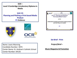
  • 1. OCR – Level 3 Cambridge Introductory Diploma in Media Unit 13: Planning and Pitching a Print based Media Product P1 Evidence Name: Lewis Manning Candidate Number: 3073 Center Name: St. Andrew’s Catholic School Center Number: 64135 Set Brief - Print Project/Brief – Music Magazine & Promotion
  • 2.
  • 3. Contents page Kerrang! Magazine slides • 4- deconstruction of the front cover • 5- content of the magazine • 6- magazine contents page analysis • 7- frequency • 8- purpose • 9- genre • 10,11- target audience • 12- deconstructing a double page spread • 13- publisher of Kerrang! magazine • 14- form and style • 15- website deconstruction • 16- email to the publisher about production • 17,18,19- production process Q Magazine slides • 20- start to Q magazine • 21- form and style • 22,23- target audience • 24- genre • 25- purpose • 26- publisher of Q magazine • 27- deconstruction of the front cover • 28- deconstructing a double page spread • 29- magazine contents page analysis • 30- website deconstruction • 31- email to the publisher about production • 32,33,34- production process
  • 4. Masthead: It contains the whole magazine name rather than a letter or an acronym. This helps to convey its superiority on the magazine rather then be blocked out by the main image like in other magazines. It is also set as white writing on black background which helps to portray how bold the masthead is as they are very contradicting colours, where in some magazines the masthead blends with the background. Strapline: Kerrang!’s brand slogan is ‘Where life is loud’, this is not on the magazine. This may be because they believe it will not provide much to the success of selling the magazine at local convenience stores. Instead of putting their magazines slogan they put additional information such as exclusive content or new weekly rock hits. Main image: In this case the magazines main image is of Jared Leto from 30 Seconds Of Mars. The main image is behind the masthead which conveys how the main image is not that superior to it however it is over. Main Headline: The main headline is located across the centre of the page indicating it is an important part of this issue. The style of font is also very bold and it is all in capital letters so it is trying to catch the readers eye and make them drawn to it as it stands out from the rest of the writing. Cover lines: In this issue of Kerrang! The cover lines are located underneath the main headline and in a much smaller format. This is to convey how they are not that significant in this issue but are still recommended to the reader. Price tag/issue: The price is £2.20 and the issue is unknown
  • 5. Content • The content of Kerrang! magazine was originally focused on the new wave of British heavy metal phenomenon and on the rise of other hard rock acts during the 1980’s in England. It usually contains the top airing rock music for that week and ranks them in a chart consisting of 20 tracks. Now it is considered the best UK rock magazine with its own radio and TV station. • It also contains a featured rock band in every issue. This is to not only promote the band that is being featured but to also appeal to all types of rock fans. With this it discusses all the bands recent successes as well as what is happening with them whether they are going on tour or are they going to be featured in any upcoming
  • 6. Magazine contents page Within Kerrang! Magazine there is only one contents page. This connotes how the magazine does not want to branch of on to unrelated topics but rather wants to get straight to the point. It also contains some colours that are not of the house style on the front page such as blue which goes to show that the editors want us to realise this and make us want to look through it due to it not looking like the rest of the magazine. The main image that is being used in the contents page is very eye catching due to the girl reaching out to us. This could be interpreted as the girl trying to stop us from flicking to the other page and make us read the text surrounding it as it contains information on all the subjects being covered by the magazine. The information surrounding are all the topics being covered by this issue of the magazine. As you can see it is separated into 9 sections with it being highlighted in yellow. This helps us as the reader to see what's being covered and whether or not we would like to go to those specific topics within the magazine
  • 7. Frequency • Kerrang! releases a new magazine every week allowing readers to be updated on newest rock tracks that have been popular around the globe the past week and be able to read more about them as well as discover new music artists. • with each new issue of the magazine a new band is featured and other contents that is recommended. Every week is different but when the same band comes up again, that is mainly due to them having another recent success. • Each issue costs £2.20 and this is mainly due to the fact its sold weekly. If the price was any higher then £3 it would lose readers due to it being to expensive due to it being a weekly magazine rather then a monthly magazine which costs more.
  • 8. Purpose • The purpose of Kerrang! magazine is to inform new readers about the latest modern rock bands that have created new singles or those who have recently shown up in the world of rock music . • They also aim for us to subscribe to the magazine so that they can continue creating new articles on bands and further their chance of survival in the music industry. However in order to do this the magazine and publishers have to continue adding new content to their magazine to appeal to their readers requests and desires. • The magazine publishers also sell concert tickets to the readers of the magazine for any rock band that would be covered in the issue of magazine. This further promotes the magazine which would lead to more subscriptions to the magazine and gain more money that can further the companies cause of spreading rock music to the world.
  • 9. Genre • Kerrang! is a modern rock music magazine that features the latest rock bands and all there newest singles. This is mainly attracted to the those of the age 17 – 24 due to more popular rock music being released during the time they were alive. As you can see from this chart rock music is not very high on the overall favourite music genre list and I believe magazines such as Kerrang! Are trying to increase this by including new content every week that may appeal to the readers. https://aliceroundmediastudiesas.wordpress.com/main-task/
  • 10. Target audience Hartley: Age- Kerrang! magazine is aimed for people who are between the ages of 15- 24 years old. This is due to the fact that the newer generation of todays society would like to keep in touch with the newest bands that are being featured on today’s social network. Gender- the gender the magazines is aimed for is male because it is stereotypically believed that men like rock more than women. Class- the class Kerrang! magazine is mainly aimed at people who are manual workers or those who are not very high in the class ranking system in todays society. This is because the magazines has a very dangerous and grunge look to it which is typically associated to the rock theme and those who work in construction can relate to danger and therefore would appeal to them. Katz: Personal identification- Kerrang! Magazine helps the audience to relate to the character they are featuring by including all their struggles that they have faced in order to get to the place they are now. This helps the audience relate to their troubles and believe in themselves to achieve great things like the characters in the magazine have. Personal relationship- Kerrang! Magazine helps to create a personal relationship between the reader and character through including what they normally do on a daily basis. This makes the reader relate to the characters as they may be doing things that the characters themselves do. Informed and educated- the magazines educates and informs readers because they are expected to give information about recent bands and singles that would eventually stick to the minds of the young so they can use later when they tell others about what they have learned in the magazine. Diversion- the magazine helps to divert readers from reality due to them wanting to live the lives the characters the magazine is covering . They do this through going into a lot of detail when describing the characters lives so the reader can immerse themselves into the text and imagine that they were living a similar life
  • 11. Target Audience According to the socio-economic needs the target readership for Kerrang! Would be placed at D. This is because it mainly contains content that is not suited for those who are high in society and rather at those who use slang and enjoy rock music. Maslow's hierarchy of needs- the magazine is aimed for those who are social climbers in society. This is because the magazine usually covers characters who have gone through a lot to go against others expectations of them whether they were thought to achieve a lot or nothing at all. This helps to indicate that the magazine is trying to promote this and that we should be able to do anything we want in life and not just follow what people want us to do.
  • 12. Deconstructing a double page spread The pull quote is the main quote from the interview and it is used to get the reader intrigued to what kind of conversation the two characters are having in order to have arrive at where that quote was said. Within the main article of this double page spread a drop capital has been used, this is an effective method of getting the readers attention to the start of the text. The stand first is the introduction to the article which is used to help the reader get the gist of what the interview is about and what to expect. It also used to help the reader decide if they want to read it or not. On the top left of the double page spread it has the magazines website address. This is to promote themselves among he readers as they may include exclusive information on the band on there website as well as explore other various activities on it. This double page spread use differentiated questions and answers. This is used effectively as we can see what type of questions were asked to the celebrity and see what their answer was. It is also an easy layout for the reader to understand and read as the questions are highlighted to differentiate them from the answers. .
  • 13. Publisher of Kerrang! • Kerrang! Magazine publisher is Bauer Consumer Media • Bauer Consumer Media is a division of the Bauer Media Group, Europe’s largest privately owned publishing Group. The Group is a worldwide media empire featuring over 300 magazines in 15 countries, as well as online, TV and radio stations. The magazines they own cover a wide range of topics from fishing all the way to parenting. • Circulation – 48,353 (Jan- Jun ’14) • Readership – 339,000 (Jan- Dec ‘13) • Their slogan is ‘ the UK’s most influential media brand network and it connotes that they are the best network concerning media in the whole of the UK. • The magazine was founded in 1981 and the first ever issue was launched on 6th June 1981. Their company website is : http://www.bauermedia.co.uk
  • 14. Market Position As you can see from this par chart, bauer media is not very high on the net worth of publishing companies and is rather dwarfed compared to companies such as time inc.uk. From the graph on the left we can see that NME magazine has a higher circulation rate then the other magazines with second going to mojo who is still dwarfed by NME. We can also see that digital circulation is rising as the years go by.
  • 15. Form and Style. • The masthead of the magazine itself is always located at the top of the magazine which is likely located there so it is visible to the reader and not covered with excess information or images such as the main image or cover lines. The main image sometimes covers the masthead and it is typically of the a whole band or the significant member of the band. This is to show the significance it has over the magazine cover as it will be its main feature. • The house colours of the magazine are always constant through out the years it has been published and that is black white yellow and red with the exception of the background consisting some other colours . • The masthead and the capital letters are always in bold which is to give of its dangerous and heavy metal feeling. The bold text also gives an insight of what may be inside the magazine therefore if the customer reads the bold text they may find that the magazine is suitable for them and they will probably buy it.
  • 16. Website annotations The magazines website contains various links that connect the reader to other websites so you can subscribe to them such as Facebook and twitter. These evidently help you to remain in contact with the magazine so you can stay updated. It contains links that help you search even deeper into the website and you are able to also read issues that were published before. The style of font of the website ids the same as the magazine which goes to show that they want to keep up the image as much as possible and not look tacky.
  • 17. Email about production I’m afraid I did not get an email back from the company about the production process
  • 18. Production process • Date of publication – the first stage to do is to set up a date of publication. The date of publication is the date that you want the magazine to be released as a product to the public. Once this date has been established, you are now operating in a schedule. A schedule is the plan on how you are going to do the production process and when each of the process’s will happen. • Managing the schedule – this is an important step that should not be taken for granted when it comes to the production of a magazine. If you want your magazine to be produced well then you must properly use the schedule you are using. Your schedule should be made in such a way that there are solutions for any problems that can occur so that even when these problems happen, you can always meet the deadline. This is the reason why a proper use of the schedule is vital for the production. • Editorial and budgetary decision – the next step that is taken during the process is the editorial decision. The editorial decisions involve the magazine’s editorial team coming together and deciding what topics should be covered in the next issue of the magazine. Here, the editorial team talks about the various content that will make up the magazine. After deciding which types of article ideas or topics, news stories, illustrations and photographs will be used in the magazine, the team now makes the magazines budget decisions. They look at the money that is available to them and how it will be spent towards the production of the magazine. Once this is finished it is now time to move on to the next stage of the production process.
  • 19. Production process • Content Acquisition – the content acquisition process is the most important step because without the content we cannot have the magazine in the first place. There are two major ways that content can be collected for a magazine. The first is through in-house staff writers and the second way is through external writers that are asked to write on topics that are what they specialize in. It is at this stage that artwork and graphics are also worked on. This would include the main image on the title page as well as various images that would be included inside the magazine. • Sub-editing –Sub editing focuses on quality control. This step involves the following important things: -Checking of the accuracy of all the facts in the articles -Making sure that words are spelled correctly -Making sure that grammar and punctuation are used correctly -Making sure that all articles follow the house-style e.g. font, colour -Working on the page layout • Page layout -There is a special team responsible for page layouts called the layout staff. Their job is to typeset and layout the various pages that come together to make the magazine.
  • 20. Production process • Proofreading- The editorial department will print out a hardcopy of the magazine for the sole purpose of reading through to find and correct any mistakes in it. It is easier to proofread a hardcopy than it is to proofread a softcopy as it is quicker to spot mistakes . • File emailed to printer- After proofreading , the hardcopy of the entire magazine is sent to the printer to print the magazine. Pre-press is the process of checking all the fonts and images that is needed for the magazine . Each copy the printer prints is the final finished product of the magazine that readers are going to have. • Distribution - The printing company, having finished with the printing of the magazines will package them neatly and send them to a warehouse. From the warehouse, the magazines are then distributed to shops around the world so then they can be sold to the public. http://hosbeg.com/the-magazine-production- process
  • 22. Form and style • The masthead of the magazine itself is always located at the top left of the magazine so it is visible to the reader and not covered with excess information or images such as the main image or cover lines. The main image sometimes covers the masthead and it is typically of the a whole band or the significant member of the band. • The house colours of the magazine are always constant through out the years it has been published and that is white and red with the exception of the background consisting some other colours .
  • 23. Target audience Hartley: Age- Q magazine is aimed for people who are between the ages of 15- 24 years old. This is due to the fact that the newer generation of todays society would like to keep in touch with the newest bands that are being featured on today’s social network. Gender- the gender the magazines is aimed for is male because it is stereotypically believed that men like rock more than women. Class- the class Q magazine is mainly aimed at people who are high in the class system for example a person who is the owner of their own company. This is due to the magazine using sophisticated lettering as its font as well as the use of words to describe an artist. If it were to be aimed at people whop are lower in the class system such as an unemployed person, the magazine would include words that would be befitting for them such as using slang for their typical age group. Katz: Personal identification- Q Magazine helps the audience to relate to the character they are featuring by including all their struggles that they have faced in order to get to the place they are now. This helps the audience relate to their troubles and believe in themselves to achieve great things like the characters in the magazine have. Personal relationship- Q Magazine helps to create a personal relationship between the reader and character through including what they normally do on a daily basis. This makes the reader relate to the characters as they may be doing things that the characters themselves do. Informed and educated- the magazines educates and informs readers because they are expected to give information about recent bands and singles that would eventually stick to the minds of the young so they can use later when they tell others about what they have learned in the magazine. Diversion- the magazine helps to divert readers from reality due to them wanting to live the lives the characters the magazine is covering . They do this through going into a lot of detail when describing the characters lives so the reader can immerse themselves into the text and imagine that they were living a similar life
  • 24. Target Audience • Maslow's Hierarchy of Needs- the magazine is aimed for those who are social climbers in society. This is because the magazine usually covers characters who have gone through a lot to go against others expectations of them whether they were thought to achieve a lot or nothing at all. This helps to indicate that the magazine is trying to promote this and that we should be able to do anything we want in life and not just follow what people want us to do. According to the socio-economic needs the target readership for Q Would be placed at B. This is because it mainly contains content that is suited for those who are quite skilled in their line of work as well as the magazine containing an intellectual feel to it with the use of sophisticated words when covering a character in an issue of the magazine.
  • 25. Genre • Q magazine does not have a specific genre of music it features, its primary interest is to feature new music releases and upcoming artists that may go on to be successful later on in the year . Because of it not having a set genre this can attract all types of music fans what ever the age since it covers all types. I believe that the fact that Q magazine does not feature one specific genre gives it an overall advantage over the other magazines due to it being able to cover all types of genres which appeals to most if not all residents of the world allowing more readership. https://aliceroundmediastudiesas.wordpress.com/main-task/
  • 26. Purpose • The purpose of Q magazine is to inform new readers about the latest music release from known and unknown artists from across the world. This intern will lead to more people being drawn in as the magazine would most likely include information or at least some facts about their favourite artists or artists that are in their preferred type of music genre. • They also wanting to gain more subscribers to the magazine which would allow them to stay on top of the latest issues being released as well maintain being in touch with the company allowing you to gain information on the publishers as well as the magazine. • Q magazines does not have a strapline on their magazine issues because they may believe that it is not required due to it not really promoting it that much or bring in more profit. • Q magazines slogan is 'The World's Greatest Music Magazine'. This slogan is serious and makes the magazine seem its of high quality but it is not always featured on the magazine as seen on this issue.
  • 27. Publisher • Q Magazine publisher is Bauer Consumer Media • Bauer Consumer Media is a division of the Bauer Media Group, Europe’s largest privately owned publishing Group. The Group is a worldwide media empire featuring over 300 magazines in 15 countries, as well as online, TV and radio stations. The magazines they own cover a wide range of topics from fishing all the way to parenting. • Circulation of magazine – 44,050 • Q was founded in 1986 by Mark Ellen and David Hepworth, and their first issue was in October 1986 • Their slogan is ‘ the UK’s most influential media brand network and it connotes that they are the best network concerning media in the whole of the UK. • Their company website is : http://www.bauermedia.co.uk
  • 28. Focus Publisher and Product Publisher Product source: https://www.bauermedia.co.uk/ Meaning
  • 29. Brand Ideology/Ethos • Slogan Bauer media group’s slogan is ‘ WE THINK POPULAR’. This suggests that Bauer is a whole community that includes us rather than it being just a business. It also indicates that Bauer is always with the current trend and that they always report new topics that interest us despite what it initially covers. Furthermore the use of multi colours for its background helps us to release they are multi cultural and that they do not discriminate against each other but rather want us to all come together. • Connotations The use of the colours of the background in the logo help to show its cultural diversity and that they do not aim and just one particular culture around the world but rather spread out across the world. The use of the colours help to represent this very clearly, as well by using the multi colour scheme it shows that they except all sexualities and trying to offend anyone in the process. • Values? Bauer media have four key values – Respect, Collaborate, Create and Challenge. Each one of these help to improve diversity and individuality among people and they hope to achieve this through the expansion of their own multi media whether it be through magazines or T.V. and radio. • History? It was founded by Ludoph Bauer in Hamburg Germany. It initially was a printing plant and after time he launched his own advertisement newspaper Rothenburgersorter Zeitung. The publishing house worked its way to the top after world war 2 with listing guides and youth magazines. Rasselbande sold 300,000 every fortnight, tv Hören und Sehen reached one million readers.
  • 30. Technological Convergence • Definition: the coming together of technology such as social media and print media to produce and distribute a product such as a music magazine. • Bauer media is able to stay in communication with its subscribers through the use of social media such as Facebook twitter and YouTube. Since Bauer media is a multi media conglomerate, they would mainly contact their subscribers through email due to them wanting to act professional. • However Q magazine as itself contacts its subscribers through all forms of social networking whether it be through twitter, Facebook or even YouTube. This helps the audience feel like they can still be in touch with the company and more people to discover them. • Q magazine , among the music magazines, has a fairly high subscription figure compared to others but not as high as mojo mainly because it would be the older generation who like that kind of music. Circulation figures
  • 31. Market Position As you can see from this par chart, bauer media is not very high on the net worth of publishing companies and is rather dwarfed compared to companies such as time inc.uk. From the graph on the left we can see that NME magazine has a higher circulation rate then the other magazines with second going to mojo who is still dwarfed by NME. We can also see that digital circulation is rising as the years go by.
  • 32. Magazine competitors The content of Kerrang! magazine was originally focused on the new wave of British heavy metal phenomenon and on the rise of other hard rock acts during the 1980’s in England. It usually contains the top airing rock music for that week and ranks them in a chart consisting of 20 tracks. Now it is considered the best UK rock magazine with its own radio and TV station. https://en.wikipedia.org/wi ki/Kerrang! Vibe is a music and entertainment magazine was launched in 1993. the magazine features R&B and hip-hop music artists, actors and other entertainers. Vibe was purchased by the private company Intermedia Partners. It is now issued every 3 months with double covers, with a larger online presence, aided by the Vibe Lifestyle Network. http://www.slideshare.n et/Aaliyah195/vibe- magazine-analysis NME music magazine was launched on 7th March 1952. its publisher is Time.Inc UK with it being released on a weekly basis with a price of £2.50. the current editor for the magazine is Mike Williams and the editor for the website the editor is Greg Cochrane. https://en.wikipedia.org/ wiki/NME Mojo magazine was first issued on October 1993. The publisher of the magazine is Bauer media which releases every month with a cost of £4.99. its content is about classic rock such as the Beatles and The Who. https://en.wikipedia.org/wi ki/Mojo_(magazine)
  • 33. The masthead is the biggest text on the page with it being one letter ‘Q’. This is to catch the readers eye and make them drawn in to read more. The red is also very eye-catching as it gives of an important aura since that is what that colour normally represents in todays society. The main headline of the page is the second biggest text on the page because this is what it would be focusing on in this issue. It is also all in capital letters to help it stand out more from the rest of the magazines that would be featured. Cover lines: In this issue of Q, the smaller stories of this issue is listed at the bottom of the front page which illustrates that they are not that significant in this issue of the magazine. This is mainly used to show the reader that these people would also be featured but will not contain as much information as the main band being featured. Price tag/issue: The price is £3.70 and the issue is unknown Q magazines slogan is 'The World's Greatest Music Magazine'. This slogan is serious and makes the magazine seem its of high quality but it is not always featured on the magazine as seen on this issue. Deconstruction of a front page
  • 34. Double page spread The large red ‘L’, takes up the whole page containing al the information on the artist. The letter is linked to the artist who is Lady Gaga. This is to make it very eye catching and the font of the ‘L’ is linked to the magazines style of font. There is no title for this page and the only thing that resembles a title is that of the name of the artist which is ‘Lady Gaga’. This to make it clear what the article is being based on and make sure that it is clearly visible for the reader so that if they do not want to read this article they can turn the page without having to read the article. The article itself is divided into two columns. This is to make it easier for the reader to read it instead of it all being pilled up across the page where it would be hard to distinguish each question/fact that is being displayed. At the bottom left the magazine logo is displayed. This makes the article look more professional as it is advertising the magazine that is publishing the article on the artist The main image on the left is of the artist which in this case is Lady Gaga who is what the magazine is writing about. The image is in black and white which gives of a more attractive look and the dress she is wearing is to give of the impression of outrageousness which is what her fashion and personality is about. The stand first is the introduction to the article which is used to help the reader get the gist of what the interview is about and what to expect. It also used to help the reader decide if they want to read it or not. However in this issue of the magazine there is not one present which makes it hard for the readers but the use of the main image helps to identify what the article is about Within the main article of this double page spread a drop capital has been used, this is an effective method of getting the readers attention to the start of the text.
  • 35. Contents Page analysis The information surrounding are all the topics being covered by this issue of the magazine. As you can see it is separated into 9 sections with one being about an oasis special. The way you can tell that its separated into 9 sections is through the titles being printed in bold. This helps us as the reader to see what's being covered and whether or not we would like to go to those specific topics within the magazine. Within Q Magazine there is only one contents page. This connotes how the magazine does not want to branch of on to unrelated topics but rather wants to get straight to the point. It also contains some colours that are not of the house style on the front page such as light blue which goes to show that the editors want us to realise this and make us want to look through it due to it not looking like the rest of the magazine. The magazine contents page also features an image of the band that is being featured in this issue. This helps us as the readers to understand that this band is what the magazines is currently featuring on and allows us to see what their general look is as a band as well as an individual.
  • 36. Website page deconstruction The magazine logo is clearly placed at the top left of the web page just like as if it was the front page of a magazine which seems to be its distinguished place. It also sticks with its house colours of black white and red which are very dominant on the website. It also contains links to various other pages on its website with them all about what’s been recently featured. This is to promote themselves so intern they will get more subscriptions to the magazine. The advertisements on the website is all very neatly laid out. This helps readers of q magazine to navigate around the website without the problem of being piled with a lot of tabs linking to various parts of the website. It also allows the reader to see what is being featured at the moment and with only a few clicks they are able to get to the page they want .
  • 37. I’m afraid I did not get an email back from the company about the production process. Email about production
  • 38. Production process • Date of publication – the first stage to do is to set up a date of publication. The date of publication is the date that you want the magazine to be released as a product to the public. Once this date has been established, you are now operating in a schedule. A schedule is the plan on how you are going to do the production process and when each of the process’s will happen. • Managing the schedule – this is an important step that should not be taken for granted when it comes to the production of a magazine. If you want your magazine to be produced well then you must properly use the schedule you are using. Your schedule should be made in such a way that there are solutions for any problems that can occur so that even when these problems happen, you can always meet the deadline. This is the reason why a proper use of the schedule is vital for the production. • Editorial and budgetary decision – the next step that is taken during the process is the editorial decision. The editorial decisions involve the magazine’s editorial team coming together and deciding what topics should be covered in the next issue of the magazine. Here, the editorial team talks about the various content that will make up the magazine. After deciding which types of article ideas or topics, news stories, illustrations and photographs will be used in the magazine, the team now makes the magazines budget decisions. They look at the money that is available to them and how it will be spent towards the production of the magazine. Once this is finished it is now time to move on to the next stage of the production process.
  • 39. Production process • Content Acquisition – the content acquisition process is the most important step because without the content we cannot have the magazine in the first place. There are two major ways that content can be collected for a magazine. The first is through in-house staff writers and the second way is through external writers that are asked to write on topics that are what they specialize in. It is at this stage that artwork and graphics are also worked on. This would include the main image on the title page as well as various images that would be included inside the magazine. • Sub-editing –Sub editing focuses on quality control. This step involves the following important things: -Checking of the accuracy of all the facts in the articles -Making sure that words are spelled correctly -Making sure that grammar and punctuation are used correctly -Making sure that all articles follow the house-style e.g. font, colour -Working on the page layout • Page layout -There is a special team responsible for page layouts called the layout staff. Their job is to typeset and layout the various pages that come together to make the magazine.
  • 40. Production process • Proofreading- The editorial department will print out a hardcopy of the magazine for the sole purpose of reading through to find and correct any mistakes in it. It is easier to proofread a hardcopy than it is to proofread a softcopy as it is quicker to spot mistakes . • File emailed to printer- After proofreading , the hardcopy of the entire magazine is sent to the printer to print the magazine. Pre-press is the process of checking all the fonts and images that is needed for the magazine . Each copy the printer prints is the final finished product of the magazine that readers are going to have. • Distribution - The printing company, having finished with the printing of the magazines will package them neatly and send them to a warehouse. From the warehouse, the magazines are then distributed to shops around the world so then they can be sold to the public. http://hosbeg.com/the-magazine-production- process

Editor's Notes

  1. Add social media numbers