
Recommended
More Related Content
What's hot
What's hot (20)
Viewers also liked
Viewers also liked (16)
Similar to Preliminary task and planning and research
Similar to Preliminary task and planning and research (20)
More from lkirkland123
More from lkirkland123 (20)
Recently uploaded
Recently uploaded (20)
Preliminary task and planning and research
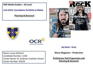
- 1. OCR Media Studies – AS Level Unit G321: Foundation Portfolio in Media Planning & Research Name: Lucas Kirkland Candidate Number: 1159 Center Name: St. Andrew’s Catholic School Center Number: 64135 Set Brief - Print Music Magazine – Production Preliminary Task Progression and Planning & Research
- 2. Section 1) – Preliminary Task
- 3. Front Cover
- 4. First off all I started out with completely blank canvas to create my page I next added a gradient to the background. I utilized the gradient tool. I added my masthead from ‘Dafont.com’ and the school banner at the top to increase brand identity I utilized the text tool to create the masthead The next step was to insert my main image into the page. This involved using the place tool and the quick selection tool. Quick selection tool
- 5. The next step was to add the cover lines and the headline. Then the barcode needed to be constructed by using the rectangle tool. The final step was to feature brand identity featured and a strapline. I have also added in a triangle page turner at the top right. This utilized an array of Photoshop features. I utilized the Layer style option and added a stroke effect
- 6. Final Design From the feedback I obtained by my teachers I have been able to sign this preliminary page off as complete. The changes I had to make were adding a puff promotion and spot healing my cover image. Furthermore all my dead space has been filled by cover lines.
- 7. Preliminary Task Progression– Evidence Contents Page Step-by-step I first started with a blank canvas. I then Added a gradient to the background and also imported St. Andrews banner to create ‘brand Identity’ The next step for me was to add in my editorial using the text tool and the pen tool, to be able to form my editorial. Adding in the masthead to the contents page was the next step. I utilized the text tool and my chosen font style to create this. Then I placed my image into the page and deleted the background using the selection tool. The next process for me was to start adding in the cover lines to my page. Furthermore I utilized the oval tool to be able to create my puff promotion
- 8. Adding in the text to the cover lines was the next step to completing my page. Final Page The final stages to my page were to add in my page web address format. Also placing a copy of my front cover reinforced my magazines brand identity.
- 9. Section 2) – Log Book
- 10. Music Magazine – Genre research • Music magazines typically include the following features: Interviews, Photo shoots, essays, concert information and the top music in the charts. • The UK is home to many music magazines, NME has been leading sales since 1952, selling 27,650 magazines in the UK • In recent times technology has been taken over many industry’s. Music magazine sales have gone down due to an increase in online websites being used • Magazine average circulation: Kerrang: 37,603, down by 6.5 percent Q: 58,980, down 8.7 percent Mojo: 79,345 down 6.8 percent http://www.bauermedia.co.uk
- 11. Established Magazine for my Research The colour black is featured in certain areas throughout this magazine. It is stereotypically a bold colour which fits in with the genre of the magazine. The cover star here is Ed Sheeran, who has a bold and defining presence on stage Lighting - the lighting professionally used on the cover star in this picture is high key which pulls all the attention onto Ed. Costume - The costume of the star is casual and laid back which fits within the pop genre. Furthermore the star is pictured with a guitar. Which is often related to the pop genre. Layout - The layout of this magazine seems to have a traditional layout. The text and conventions seem to wrap around the star which makes sheeran stand out to the reader even more. Font – Q magazine have used the same front across the whole page, which keeps the page professional. The font is also clear and simple for the reader to understand. Masthead – Having the name of the magazine just as Q is simple yet affective in engaging the audience. It is also the biggest letter on the page therefore making it stand out. Positioning – Ed Sheeran is positioned centrally and therefore is the focus of attention on the page.
- 12. Target Audience – The target audience for Q magazine can be denoted as teens who enjoy the rock and roll culture. 68.3% of males read this magazine. The category of people would fall into the 15-25 demographic. The dominant readership for the magazine is A,B and C1 because Q is released monthly for £3.99. People could find this price expensive. The readership would not be specific to any ethnicity because Q pride themselves on not targeting any ethnicity in particular and featuring artists of all ethnicity. (Hartley) Readers of Q magazine may have a ‘personal relationship’ (Katz) with the magazines choice of celebrity, this is because the magazine includes personal stories in which the reader can identify with. For example the verbal code “Neil Young family” allows readers to compare themselves to their favorite stars. Readers may also experience ‘Diversion’ (Katz) which may be because they see clothes in which they want to copy on their stars. For example the front image pictures Ed Sheeran wearing a bomber jacket jacket, some audiences may feel the desire to be like their idol and go out and buy the same outfit. http://www.bauermedia.co.uk What is the USP of this magazine? From researching the magazine Q, the USP of this media product is the fact that Q is the only rock magazine which focuses on up and coming artists. This can be seen on many of their front covers and their website. The USP of the magazine I have analyzed is the puff promotion which promotes ‘50 greatest albums of 2014.
- 13. Publisher research http://magazines.bauermediaadvertising.com/magazines/detail/Q http://www.bauermedia.co.uk/brands/q Q Magazine is published by Bauer media , a company that is hugely successful for producing magazines, digital products, radio and TV stations across the world. The target audience is anyone who enjoys rock music. Readers fit into the 15-24 age group and have enough money to buy the magazine monthly. Q magazine has a circulation of 48,353 copies distributed in 2014. This magazine has 339,000 readers.
- 14. Conventions of a Music Magazine Denotation The magazine is called “Rolling Stone”. There is a medium- long shot of the Rapper Eminem and he is dressed as he normally would be and has a prop of a boom box to emphasis he is a rapper. From the content on in the cover lines and the main article it is clear that the magazine is targeted to 20-45 year old males. The masthead consist of 3 main colours and is in a conventional position. The magazine has 3 main colours for its house style which are:- black, white and red It has a Website address, price, issue number and a dateline in the top right corner. It has cover lines going down the left hand side which bend around the image and the main cover line at the bottom right which is on top of the image. House Style The main colour scheme of the cover flows the convention of having 3 main colours. For the this cover they used black, white and red. The reason for this use of colour is that they are good contrasting colours that stand out against each other and they work well wit h the design of the cover. They have also used this colour scheme as it matches the main colours most often used in the masthead. Two of the three colours also go with what the main cover image is wearing. The colour scheme is simplistic and mature which is what the target audience want from this magazine. Target Audience The target audience for this magazine in my opinion is 20-45 year old Males. I have drawn this conclusion from the topics covered in the cover lines and from other Rolling Stone Magazine covers. Firstly they cover political content with an article on JFK by his brother which shows that the readers are mature enough to care about the political scene. Secondly they have an article on Eminem being reborn and this is to show to this age group a different image as before Eminem was very “angry” and magazines are a good way of changing image and this is clearly what Eminem is trying to do with this article. Finally it has an article about “Gaga’s Hot Mess” which shows the male audience as males tend to want to see attractive females in their reading content.
- 15. Target Audience – Katz, Maslow, Hartley The target audience for ‘Rolling stones’ magazine can be denoted as teens who enjoy the rock culture. They fit into the 15-24 age gap. The dominant readership for the magazine can be denoted as A,B and C1 because Rolling stones is released monthly. There have been a variety of celebrities from musicians to politicians featured on the cover of rolling stone so the magazine is not focusing on one specific ethnicity (Hartley). When looking at the example rolling stones magazine on the previous slide readers could experience ‘Diversion’ (Katz) when taking further reader into the cover star Eminem. Readers may want to dress the same as the artist or learn (‘Surveilance’ – Katz) about him on a more personal level, which in turn could make the magazine appeal to ‘social climbers’ (Maslow). What is the USP of this magazine? From the research completed into this media product, I feel that the USP is the wide range of artists featured on the magazines front cover. The magazine also is released monthly which is very popular with readers as then its not to expensive to afford.
- 16. Publisher research Wenner Media: Rolling Stone Magazine Wenner Media publish a few magazines. These are: Men’s Journal Us Weekly Rolling Stone This is the American publisher. The Rolling Stone magazine was founded in San Francisco in 1967 and covers music, liberal politics and popular culture. It was co-founded by Jann Wenner and published by him through his publisher house Wenner Media. The style of the magazine including the house style has mainly remained the same throughout its publication. My magazine would benefit from Wenner Media publishing it because the publisher is extremely successful and the Rolling Stone magazine is one of the most iconic magazines on the market. It is so popular that it has been running for nearly fifty years. This clearly indicates that Wenner Media is certainly has the experience and knowledge to publish my magazine. Rolling Stone has a unique house style. This means that the colour scheme and design is the same for the magazine and website. It is a white background with black lines. The masthead is in a red font known as “Royal Acidbath” which is outlined once by white and then black. The outlines give the masthead/logo a distinctive look and very recognizable, it also allows for the text to be placed onto many different colours and still be visible. "Rolling Stone is much more than a music magazine - it's about everything that makes music matter, from the political to the personal to the profound. With wit, originality and flair, Rolling Stone covers everything that's important to the leading thinkers among today's young adults.“ Matt Coyte - Editor-in-Chief The majority of the readers are men which is 59.3% of the readership with the remaining 40.7% being women. Surprisingly, the most mode age of readers is 18-20 with 27.6% and the least popular age limit is 55+ which only represents 11.9% of the magazine's readers. The median age of the readers is 34.2 years.