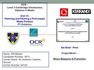
SlideShare a Scribd company logo
1 of 32
OCR –
Level 3 Cambridge Introductory
Diploma in Media
Unit 13:
Planning and Pitching a Print based
Media Product
P1 Evidence
Name: Will Bekker
Candidate Number: 3013
Center Name: St. Andrew’s Catholic
School
Center Number: 64135
Set Brief - Print
Project/Brief –
Music Magazine & Promotion
LO1 - Introduction
• We are asked to plan and pitch and print based media
product for the rock magazines. The two magazines that I
have chosen is Q and Mojo, these are two big magazines
with Q being the best music magazine in the Uk. The
magazine Q is owned by Bauer And Mojo is owned by
Phil Alexander. I will analyse the main features of the
magazine for example; the font used in the magazine,
headings and sub-headings and the general layout of the
magazine overall. This will help me to understand more
about the magazine companies and how they
communicate with the audience and provide them with as
much information as possible and in the clearest possible
way.
Purpose
The denotation of the strapline is ‘the worlds
greatest magazine’ which connotes that this
magazine is going to inform and educate
(Katz) the audience with all they need to know
about the specific artists, and up to date
information from the music industry. The word
‘greatest’ connotes it will be the best it can be
and it aims to be the most popular music
magazine.
On the website there is also a link that
enables the audience to subscribe to the
magazine and receive articles. Therefore, the
purpose is also sell as many music
magazines as possible.
Main Image: the use of the medium shot of the artist gives an impression of authority and that the person featured is
the most important in the magazine. The image takes over most of the cover and slightly overlaps the masthead this
gives Florence a sense of importance within this article but is also a common convention for music magazine front
covers. The use of this image captures the attention of the audience because Florence is looking into the lens and looks
like she is reaching out to the audience in order to pull them in to read the magazine.
Masthead: advertising the company
this is a bright red which stands out
to the audience. It is always good to
have an easy to remember logo and
in bright colours this is so the
audience can recognise the
magazine quickly when looking
through the magazines in a shop or
online. The use of the single letter
makes the masthead stand out
against competitors and also the
connotations of Q ‘Signify’ (De
Saussure) questions that the
audience may have about the
content, that the magazine is going
to answer within.
Cover lines: These are other
stories that are on the side of
the page normally right next to
the main image. This is to
show the audience a summary
of what is inside and what the
article covers. This also covers
the other aspects of the genre
of the magazine concealed
within the magazine, showing
the audience a wider view and
aspect of their chosen passion
of music.
Main headline: this is the main
story and what the magazine is
focusing on. It is in the biggest
writing and normally over the
main image to anchor it to the
page and to signal that it is the
focus of the magazine issue. The
use of a different style of font
brings a feminine aspect as the
artist is female to the magazine
and therefore appealing to a
wider audience.
Analysis of Q front cover
Strapline: This is the
magazine catchy slogan,
this entices the reader in
and creates a sense of
loyalty but also makes it
connote the fact that this
choice in magazine is the
best and what you are
receiving is only the best
information.
Genre
Q magazine is a music magazine with different genres in each
new release, therefore it is an eclectic music magazine
meaning it has a wide range of different genres such as, Indie,
Rock, and Hip Hop.. Q is produced my Bauer which is a large
media group, founded in Europe it has become widely known
as the UK’s leading music and film brand network.
Because Q covers a wide range of different genres it appeals
to more people because they provide information for
everyone. People like reading about different genres, it is
different compared to other magazines because it has more
than one genre.
https://www.theguardian.com/media/2006/aug/17/pressandpublishing.circulationfigures4
Q is a popular music magazine that publishes magazines
once a month in United Kingdom. Q was founded in 1986
by Mark Ellen and David Hepworth, who were dismayed by
the music press of the time, which they felt was ignoring a
generation of older music buyers who were buying CDs —
then still a new technology.
Target audience
Katz’ theory: according to Katz Q magazine will ‘inform and educate’ the audience. This is through using interesting language and images in
order to attract the audience into reading the text. For example within the magazine it consists of interviews with famous people that are well
known, the use of well known celebrities attracts more people that are interested in the specific celebrity. Furthermore if Q magazine use well
known people then people will enjoy reading the article more, this is how the magazine is able to inform and educate the audience. The use of
interesting images creates a diversion for the audience because it is enabling them to sit and read an interesting magazine and escape reality
for the duration of reading the magazine.
The target audience for Q magazine is a 31.7% to 68.3% female to male ratio. The target audience age range is
largely within the ages 15-24 years old and the second most popular age range is 25-34 years old. This is
because the magazine focuses on content aimed at the younger generation (15-34)
Hartley’s: Hartley's theory highlights that Q magazine should consider Age, gender, class, ethnicity, self-image, nation and family. They should make sure
that the magazine getting published is age appropriate to younger people whop read the magazine, this means no sign of gore or sexual images. It is also
very important that they consider different races before publishing the magazine this is because there might be some controversial language used that
might offend certain people because of their race or ethnicity. Another thing that it says s gender and self image. These are really important because there
might be contexts that could make people feel they are lower than other people because they are a male or female. Also people might look at their self
differently after looking at a model in an image
Maslow: Maslow's theory mentions 4 different potential outcomes for a reader after reading a magazine these are; social climbers, care givers, explorers
and survivors. Social climbers is when the audience are driven by improving their status in society. This is important because it gives the audience
confidence and a drive to do well in life. Caregivers is when the audience sympathies with the characters situation. This is important because it gives the
audience a chance to escape reality and be engrossed into a magazine. Survivors is when the audience members want security and routine. This is
important because they have security knowing that the magazine will be published on a set date.
Sources:
http://documents.mx/education/kat
z-hartley-and-maslow-theory.html
Psychographics
Q magazines audience are most likely to be
mainstreamers. This is because q magazine is
an organizes company that released magazines
every week, this therefor gives the audience a
sense of security and routine because it is
released in a set routine at a set time.
Furthermore q magazine is good value for money
because it gives the audience everything they
need to know about the music industry in the last
week.
According to the socio economic needs Q magazine
would best suit THE C1 AND C2 category. This is
because the price for the magazine is priced quite
high for a subscription and it is more of a luxury
instead of a necessary thing. people in the
unemployed category will need to spend money on
more important things instead of spending money on
things they don’t need.
Contents of the magazine
The contents of the magazine include stories or interviews
that have been conducted different music artists. It
contains reviews of albums and concerts also it will have a
main featured artists together with other bands and
musicians.
Contents pages will have the same layout as the front
cover. Layout is simple to make it easy for the readers to
navigate from the magazine. There is also a page that
includes a letter from the editor mentioning a little about the
issue and hopes that the reader will enjoy the magazine as
well as whoever is involved in the publication and their
contacts. The Q brand identity is constant on each page.
This is a page used to entice the audience in, to ‘inform
and educate’ (Katz Uses and Gratifications theory). The are
given all the key information in short snippets to make them
aware of what they receive by purchasing this issue.The Q contents page is in the standard house style of the magazine, the reiteration of 3 set
colours creates continuity throughout the magazine and reinforces the brand identity. Only
using 3 primary colours also makes the reader focus more on the content. The inclusion of
pictures relates to the audience members who refer to visual stimulation rather than verbal.
Content
The 5 images are about the
same size, this therefore
highlights that the artists in
the pictures are equal and
the same importance in the
magazine.
The magazine has kept a
consistent house style so it
highlights that Q is very
professional in the way they
lay out their magazine.
Subheadings: Down the side
of the page there are other
stories and the page number
to find them in the magazine.
The masthead is in a black
colour which stands out from
the red background.
The Publisher has also kept the
brand identity on this page.
They have added the Q logo in
bold at the top of the page. This
is important to do because it
advertises the company more
and increases the readers
recognition of the company logo
when they see it on a shelf.
The use of the variety of
images and image sizes
makes the page look overall
more appealing to the reader
and is welcoming because it
adds colour to the page instead
of just writing which can be
daunting to some readers and
might put them off of reading
the specific page
Sub lines: a short paragraph based on the subheading
Frequency
Bauer media produce a copy of Q magazine
every month. I got this information from the
website presented below.
http://www.newsstand.co.uk/195-Rock-Music-Magazines/1380-
Subscribe-to-Q-MAGAZINE-Magazine-Subscription.aspx
This picture highlights that the magazine is
released once a month on the 16th of each
month.
As you can see from the figures the circulation of Q magazine has dropped till under half in less than
four years. This may due to the current economic climate and the social context, as the price of living
increases the value of commodities such as magazine become less important.
However, this also may be due to the new technological convergence and by allowing the audience
to access this media on multiple media platforms it decrease’s the sales and revenue of print based
media. This is detrimental to this form of media but for the brand its shows it is reaching a wider
audience and therefore expanding business.
Drop capitals: The drop capitals are the large letters at the start of a piece of text. This
highlights to the audience where to start reading from and is a common convention for
magazine double page spread, the letter will be in the same font as the masthead creating
continuity.
Page number/ date of issue: this tells the reader what page this
specific article is on and it also tells them the date of issue so they
know if the magazine they are reading is the latest one out. This
creates brand loyalty with the audience and makes the magazine
simple to use.
Main image: this close
up image of Jay –Z
connotes that the
reader has a sense of
authority over Jay-Z and
it tells the audience that
he Is the main person in
this specific magazine.
The gradiented
background overlay of
the image is
unconventional
however in terms of the
magazine house style it
creates a sense of
continuity and is
connoting the magazine
is more important than
the infamous artist Jay-
Z. It also add setting and
mood to the artist
image creating a sense
of intrigue and
mysteriousness.
Pull quote: this is a quote pulled from the article to in courage
the reader to read the article. It is an interesting quote that
some people will be confused about so the reader will want to
read more about the article. This creates intrigue and therefore
‘Enigma Code’ (Roland Barthes) and anchors the article.
Brand identity:
the name of the
magazine is
placed in
certain places in
the magazine
for extra
advertisement.
It is also part of
a consistent
house style
which is always
a good aspect
to have In a
professional
magazine.
Analysis of the DPS – Double Page Spread
Background: the background of the
article is simple and plain to make the
lettering stand out. The large J is
making it
more
apparent who
the article is
about and
drawing the
audience’s
eye to it.
Publisher of Q magazine
Bauer media is Europe’s largest privately-
owned media group. Bauer media was
Founded in Hamburg in 1875 and now in
its fifth generation of ownership in the
family. the Bauer Media Group is in 19
countries including the UK, Germany,
Poland, Australia, New Zealand and the
USA and has 11,000 employees
worldwide. This conglomerate also owns
the music magazine Kerrang and over 80
over media brands across the world.
Q is a popular music magazine
that publishes newspapers once
a month in United Kingdom. Q
was founded in 1986 by Mark
Ellen and David Hepworth, who
were dismayed by the music
press of the time, which they felt
was ignoring a generation of
older music buyers who were
buying CDs — then still a new
technology.
Form and style
Throughout the magazine Q has presented a simple yet
effective layout for all the pages. The main colors they use is
red, white and black, red being the color used to highlight
important information and also for the logo. Black being the
main font color and white as a type of background to help
the colors stand out to the reader. The logo ‘Q’ is simple yet
effective this is because it is very hard to forget and people
will always know the magazine after seeing it once.
Furthermore it conveys that the magazine is simple and easy
to read just like the logo is. This will entice the reader to pick
up a copy and read it. Q has also added the logo on every
page for extra product placement. On the front cover they
usually have the main person overlapping the masthead as a
sense of authority in the specific copy of the magazine.
Furthermore the person in the picture is normally directly
addressing the reader by looking straight into the camera.
This catches peoples attention when they are looking at
magazines in the store or just walking past. The dimensions
of Q magazine is 8 3⁄8” x 10 7⁄8” There is also options to
have the magazine as a digital copy, you can select this
option on the website when you sign up for a subscription
this can be found on the Q magazine website.
https://www.greatmagazines.co.uk/q-
magazineutm_source=dynamic&utm_medium=bws&utm_co
ntent=permlefthandmpu&utm_campaign=bau_q
Website annotations
The website layout for Bauer media are
very similar to the page design in the
magazine. It is important to have a
consistent house style because people
are able to recognise the company
better. It also gives a professional look
towards the company
Like the magazine, Bauer media also
have large image with bold titles to
connote to the audience what the title
of the cover is. Furthermore there is a
few statistics shown on the front cover
to show how many people are
interested in Bauer media as a brand.
On the website, a new customer is able to
sign up to a subscription to receive a
regular copy of the magazine. They are
also have a choice to have a digital copy
or an actual magazine. It is good to be on
a multimedia platform especially if it is a
big company like Bauer media, this is
because they are open to a wider range
audience and therefore it inflates their
sales.
Email about production
Unfortunately I have
not yet got an email
back from Bauer
Media.
Production Process
Date of publication – firstly the thing to do it set up the date of publication. The date of publication is
the date that you want the magazine to be released to the public as a finished product. Once this date
has been set you have now got to have the magazine finished by then. This is also known as a
schedule which is how you are going to plan the production and when each process occurs
Managing the schedule – this is probably the most important step in the whole process. If the
schedule is managed properly the production of the magazine will be successful. The schedule should
be made in such a way that if there is a problem there should be a solution for it so the production
process runs as smoothly as possible. Also a well organized schedule will enable you to meet the
deadline set. This therefore connotes that the schedule is vital for a successful production.
Editorial and budgetary decision – The editorial decisions involve the magazine’s editorial team
assembling and deciding what topics will be covered in the next issue of the magazine. the editorial
team essentially talks about the various contents that will make up the magazine and decide what the
final copy will consist of. Also they look at the budget for the magazine and they work around it to
make it within the budget.
Content Acquisition – the content acquisition is arguably the most important step because without
the content there cannot be any magazine in the first place. Therefore content is basically the number
one priority. There are two essential ways that content can be collected for the magazine. These are
‘in-house staff’ and ‘external writers’ that are commissioned to write on topics that are specialist in
nature
Sub-editing – this is the next step to be taken. Sub editing focuses on one major thing, which is
quality control. If the media organization is big enough to have a sub-editor, then he is going to be
responsible for this job; if there is no sub-editor, then the editor does this job. This step involves the
following important things:
Page Layout – there is a team responsible for page layouts called the layout staff. Their job is to
typeset and layout the pages that make the magazine. They use very powerful Desktop Publishing
programs such as InDesign or PageMaker to get the job completed. It is at this stage that adverts from
advertisers are placed into the content.
Proofreading – once the magazine has been completed it is checked over a few times by a computer
to make sure there is no errors in the spellings of punctuation. It also checks if the layout is correctly
File emailed to printer – After the proofreading stage, the DTP file of the entire magazine is sent to
the printer whose job will be to print the magazine.
Distribution –The printing company, having finished with the printing of the magazines will package
them neatly and send them to a warehouse. From the warehouse, the magazines are then distributed
and then sold to the public.
Bauer Media. (2016). Our company . Available: https://www.bauermedia.co.uk/about/our-company.
Last accessed 23/09/2016.
Publisher
Kerrang was founded in 1981 and the magazine started publishing on 6 June
1981.Geoff Barton was the person who edited the magazine initially as a one-
time supplement in the Sounds newspaper, Kerrang was focused on the new
wave of British heavy metal phenomenon and on the rise of other hard rock
acts. Its popularity rose again with the hiring of editor Paul Rees circa 2000
when the nu metal genre, featuring bands like Slipknot were becoming more
popular. Since 1993, the magazine has held an annual awards ceremony to
mark the most successful bands in the interests of their readers. In 2000,
EMAP launched Kerrang! as a digital radio station, across the United Kingdom
and In 2001 EMAP launched Kerrang! TV.
http://www.bauermedia.co.uk/brands/kerrang
Purpose
The denotation of the words ‘the UK’s
biggest GIG guide’ connotes to the reader
that KERRANG is the best at what it does in
the UK. This is important to take note of
because the reader will only want to buy the
best for their money. This is following the
KATS theory which is to inform and educate
the reader.
On the website there is an
option to subscribe to the
magazine and receive a
certain amount of copies
Masthead: the masthead is in a distorted font and looks like it is cracked this gives
a powerful effect on the reader because it describes what the word sounds like.
Main image: the main
image blocks off half of
the mast head. This
connotes to the
audience that the
person presented in the
image has a sense of
authority in the3
magazine and is an
important person when
it comes to this specific
article.
Main headline: the main
headline is always in big
bold writing and is
normally in a bright color
to highlight to the reader
that it is the main headline.
Quote from artist: the
quote from the artist is
highlighted in a bright color
to catch the audiences
attention.
Promotion: this is used
for advertisement at the
bottom of the page.
Pull quote : this is used
to intrigue the reader into
reading the magazine.
The use of interesting
words assist the pull
factor.
Other stories: this
connotes to the
reader what other
stories are within the
magazine.
Genre
The genre that KERRANG focus on is heavy metal phenomenon and on the
rise of other hard rock acts.
As shown on the graph rock is not
very high at all in fact it is tied for
being the least popular genre for a
magazine with electronic music. This
means that the audience range for
rock is very low and there is very few
people that actually read rock
magazines.
https://aliceroundmediastudiesas.wordpres
s.com/main-task/
Target audience
Katz’ theory: according to Katz KERRANG magazine will ‘inform and educate’ the audience. This is through using interesting language
and images in order to attract the audience into reading the text. For example within the magazine it consists of interviews with famous
people that are well known, the use of well known celebrities attracts more people that are interested in the specific celebrity. Furthermore
if KERRANG magazine use well known people then people will enjoy reading the article more, this is how the magazine is able to inform
and educate the audience. The use of interesting images creates a diversion for the audience because it is enabling them to sit and read an
interesting magazine and escape reality for the duration of reading the magazine
Hartley’s: Hartley's theory highlights that kerrang magazine should consider Age, gender, class, ethnicity, self-image, nation and family.
They should make sure that the magazine getting published is age appropriate for the target audience who read the magazine, this means
that the magazine should consist of age appropriate language and images. It is also very important that they consider different races before
publishing the magazine this is because there might be some controversial language used that might offend certain people because of their
race or ethnicity. Another thing that it says s gender and self image. These are really important because there might be contexts that could
make people feel they are lower than other people because of the gender or race.
Maslow: Maslow's theory mentions 4 different potential outcomes for a reader after reading a KERRANG magazine these are; social
climbers, care givers, explorers and survivors. Social climbers is when the audience are driven by improving their status in society. This is
important because it gives the audience confidence and a drive to do well in life. Caregivers is when the audience sympathies with the
characters situation. This is important because it gives the audience a chance to escape reality and be engrossed into a magazine.
Survivors is when the audience members want security and routine. This is important because they have security knowing that the
magazine will be published on a set date.
The KERRANG reader highlights that the majority of
readers are male at 59% to 41%. Furthermore as seen on
the reader it connotes that the majority of the audience is
15-24 and as the ages increase the number of readers
decrease.
Content
The masthead is in a bold font that
stands out so the person reading
knows that it is the ‘contents’ page.
There is a large image which
highlights that it is the main article
featured in the copy. There is also
other smaller photos which are
other smaller articles in the copy.
Like the Q magazine there are
other smaller stories down the side
of the page with the page number
for each story. This makes it easier
for the person to find the story they
want.
Production Process
Date of publication – firstly the thing to do it set up the date of publication. The date of publication is
the date that you want the magazine to be released to the public as a finished product. Once this date
has been set you have now got to have the magazine finished by then. This is also known as a
schedule which is how you are going to plan the production and when each process occurs
Managing the schedule – this is probably the most important step in the whole process. If the
schedule is managed properly the production of the magazine will be successful. The schedule should
be made in such a way that if there is a problem there should be a solution for it so the production
process runs as smoothly as possible. Also a well organized schedule will enable you to meet the
deadline set. This therefore connotes that the schedule is vital for a successful production.
Editorial and budgetary decision – The editorial decisions involve the magazine’s editorial team
assembling and deciding what topics will be covered in the next issue of the magazine. the editorial
team essentially talks about the various contents that will make up the magazine and decide what the
final copy will consist of. Also they look at the budget for the magazine and they work around it to
make it within the budget.
Content Acquisition – the content acquisition is arguably the most important step because without
the content there cannot be any magazine in the first place. Therefore content is basically the number
one priority. There are two essential ways that content can be collected for the magazine. These are
‘in-house staff’ and ‘external writers’ that are commissioned to write on topics that are specialist in
nature
Sub-editing – this is the next step to be taken. Sub editing focuses on one major thing, which is
quality control. If the media organization is big enough to have a sub-editor, then he is going to be
responsible for this job; if there is no sub-editor, then the editor does this job. This step involves the
following important things:
Page Layout – there is a team responsible for page layouts called the layout staff. Their job is to
typeset and layout the pages that make the magazine. They use very powerful Desktop Publishing
programs such as InDesign or PageMaker to get the job completed. It is at this stage that adverts from
advertisers are placed into the content.
Proofreading – once the magazine has been completed it is checked over a few times by a computer
to make sure there is no errors in the spellings of punctuation. It also checks if the layout is correctly
File emailed to printer – After the proofreading stage, the DTP file of the entire magazine is sent to
the printer whose job will be to print the magazine.
Distribution –The printing company, having finished with the printing of the magazines will package
them neatly and send them to a warehouse. From the warehouse, the magazines are then distributed
and then sold to the public.
Emailing KERRANG
Unfortunately
I have still not
got an email
back from
KERRANG
Frequency.
This image that I have got from the website highlights that they release
magazines once a month but the price varies depending on the type of
magazine you get weather it is a print, digital or both.
Form and style
Throughout the magazine KERRANG has highlighted a consistent house style. They use
dark greys and blacks in the background and then all of the information is in a brighter
color like yellow or red which stands out on the dark background. This is a consistent
house style because it follows the logo which is dark color. Furthermore there is a product
placement on every page, this is normally found at the top or the bottom of a page. The
KERRANG logo itself is simple yet effective, this is because the font used describes what
the name of the magazine is like (metal music). For the front cover you normally find a
person with dark hair and tattoos which is a stereotypical person that is in the metal
music industry.
Market Position
The graph displayed denotes the
overall circulation figures for
each magazine. The red bars
highlights how much of the sales
were digital. I was only able to
find two statistics, this connotes
that digital downloads are not a
popular method of downloading
magazines.
Source:https://www.google.co.uk/search?hl=en&q=bauer+market+position&meta=&surl=1&safe=active&gws_rd=ssl#safe=strict&
hl=en&q=best+music+magazine++&spf=1497357235666
Conclusion
For LO1 I have analyzed the way Q and KERRANG,
organize their magazines and the type of images they use
for the front covers. I have also gone into depth on the type
of audience that listen to the Individual magazines.
Furthermore I have added the production process that the
publishing houses use in order to produce their copies of
the magazines each month. In addition I have researched
and analyzed other important information like how the
customers can sign up to receive copies of the magazine
and what format they wish to read it in.

More Related Content

What's hot

Evaluation Q5
Evaluation Q5Evaluation Q5
Evaluation Q5Sam Bond
 
Audience Research
Audience ResearchAudience Research
Audience ResearchSam Bond
 
Magazine proposal
Magazine proposalMagazine proposal
Magazine proposalshaniajay
 
Concepts of q magazine
Concepts of q magazineConcepts of q magazine
Concepts of q magazineshaniajay
 
Analysing survey 2
Analysing survey 2Analysing survey 2
Analysing survey 2shaniajay
 
Sub genre research
Sub  genre researchSub  genre research
Sub genre researchzoetoase
 
AS Media Research Assignment- Research for Music Magazines
AS Media Research Assignment- Research for Music MagazinesAS Media Research Assignment- Research for Music Magazines
AS Media Research Assignment- Research for Music MagazinesSundasBostan
 
Unit 13 LO2
Unit 13 LO2Unit 13 LO2
Unit 13 LO2Carmel_S
 
Presentation1.joanna embley.
Presentation1.joanna embley.Presentation1.joanna embley.
Presentation1.joanna embley.JoannaEmbley
 
Katherine%20 hulatt%20log%20bookyear%2012%20%286664%29%20%286664%29
Katherine%20 hulatt%20log%20bookyear%2012%20%286664%29%20%286664%29Katherine%20 hulatt%20log%20bookyear%2012%20%286664%29%20%286664%29
Katherine%20 hulatt%20log%20bookyear%2012%20%286664%29%20%286664%29kathulatt
 
Unit 13- LO1
Unit 13- LO1Unit 13- LO1
Unit 13- LO1lewis269
 

What's hot (18)

Evaluation Q5
Evaluation Q5Evaluation Q5
Evaluation Q5
 
Audience Research
Audience ResearchAudience Research
Audience Research
 
Magazine proposal
Magazine proposalMagazine proposal
Magazine proposal
 
Magazine pitch
Magazine pitchMagazine pitch
Magazine pitch
 
Concepts of q magazine
Concepts of q magazineConcepts of q magazine
Concepts of q magazine
 
Analysing survey 2
Analysing survey 2Analysing survey 2
Analysing survey 2
 
Question 2
Question 2Question 2
Question 2
 
Sub genre research
Sub  genre researchSub  genre research
Sub genre research
 
AS Media Research Assignment- Research for Music Magazines
AS Media Research Assignment- Research for Music MagazinesAS Media Research Assignment- Research for Music Magazines
AS Media Research Assignment- Research for Music Magazines
 
Unit 13 LO2
Unit 13 LO2Unit 13 LO2
Unit 13 LO2
 
Presentation1.joanna embley.
Presentation1.joanna embley.Presentation1.joanna embley.
Presentation1.joanna embley.
 
Question 4
Question 4Question 4
Question 4
 
Question 5
Question 5Question 5
Question 5
 
EVALUATION
EVALUATIONEVALUATION
EVALUATION
 
Unit 13 LO1
Unit 13 LO1Unit 13 LO1
Unit 13 LO1
 
Katherine%20 hulatt%20log%20bookyear%2012%20%286664%29%20%286664%29
Katherine%20 hulatt%20log%20bookyear%2012%20%286664%29%20%286664%29Katherine%20 hulatt%20log%20bookyear%2012%20%286664%29%20%286664%29
Katherine%20 hulatt%20log%20bookyear%2012%20%286664%29%20%286664%29
 
Unit 13- LO1
Unit 13- LO1Unit 13- LO1
Unit 13- LO1
 
Questions 2 - 5
Questions 2 - 5Questions 2 - 5
Questions 2 - 5
 

Similar to Unit 13 - L01

Tommy Crossley Unit 30 - UK Media Publisher
Tommy Crossley Unit 30 - UK Media PublisherTommy Crossley Unit 30 - UK Media Publisher
Tommy Crossley Unit 30 - UK Media PublisherTommyCrossley3033
 
Unit 30 LO1
Unit 30 LO1Unit 30 LO1
Unit 30 LO1Carmel_S
 
Unit 30 LO1
Unit 30 LO1Unit 30 LO1
Unit 30 LO1Carmel_S
 
Uk magazine industry
Uk magazine industryUk magazine industry
Uk magazine industrytwsycfc
 
Preliminary task and planning and research
Preliminary task and planning and researchPreliminary task and planning and research
Preliminary task and planning and researchlkirkland123
 
Preliminary task and planning and research
Preliminary task and planning and researchPreliminary task and planning and research
Preliminary task and planning and researchlkirkland123
 
Magazine Research
Magazine ResearchMagazine Research
Magazine Researchkdhcsgo
 
Unit 13 l01 l02 l03 l04 l05 updated
Unit 13 l01 l02 l03 l04 l05 updated Unit 13 l01 l02 l03 l04 l05 updated
Unit 13 l01 l02 l03 l04 l05 updated williamezectec
 

Similar to Unit 13 - L01 (20)

Unit 13
Unit 13Unit 13
Unit 13
 
Tommy Crossley Unit 30 - UK Media Publisher
Tommy Crossley Unit 30 - UK Media PublisherTommy Crossley Unit 30 - UK Media Publisher
Tommy Crossley Unit 30 - UK Media Publisher
 
Unit 13 LO1
Unit 13 LO1Unit 13 LO1
Unit 13 LO1
 
Unit 13 LO1
Unit 13 LO1Unit 13 LO1
Unit 13 LO1
 
Unit 13 - LO1
Unit 13 - LO1Unit 13 - LO1
Unit 13 - LO1
 
Unit 01 LO2
Unit 01 LO2Unit 01 LO2
Unit 01 LO2
 
Unit 30 LO1
Unit 30 LO1Unit 30 LO1
Unit 30 LO1
 
Unit 30 LO1
Unit 30 LO1Unit 30 LO1
Unit 30 LO1
 
Unit 13 LO1
Unit 13 LO1Unit 13 LO1
Unit 13 LO1
 
Uk magazine industry
Uk magazine industryUk magazine industry
Uk magazine industry
 
Logbook
LogbookLogbook
Logbook
 
Unit 1- LO2
Unit 1- LO2Unit 1- LO2
Unit 1- LO2
 
Unit 13 LO1
Unit 13 LO1Unit 13 LO1
Unit 13 LO1
 
Preliminary task and planning and research
Preliminary task and planning and researchPreliminary task and planning and research
Preliminary task and planning and research
 
Preliminary task and planning and research
Preliminary task and planning and researchPreliminary task and planning and research
Preliminary task and planning and research
 
Unit 13 LO1
Unit 13 LO1Unit 13 LO1
Unit 13 LO1
 
Magazine Research
Magazine ResearchMagazine Research
Magazine Research
 
Unit 1- LO2
Unit 1- LO2Unit 1- LO2
Unit 1- LO2
 
Unit 13 l01 l02 l03 l04 l05 updated
Unit 13 l01 l02 l03 l04 l05 updated Unit 13 l01 l02 l03 l04 l05 updated
Unit 13 l01 l02 l03 l04 l05 updated
 
Unit 13
Unit 13 Unit 13
Unit 13
 

More from willbekker3013 (20)

Unit 35 - L01 - L04
Unit 35 - L01 - L04Unit 35 - L01 - L04
Unit 35 - L01 - L04
 
Proposal unit 13
Proposal unit 13Proposal unit 13
Proposal unit 13
 
Proposal unit 13
Proposal unit 13Proposal unit 13
Proposal unit 13
 
Unit 14 - L04
Unit 14 - L04Unit 14 - L04
Unit 14 - L04
 
Unit 14 - L03
Unit 14 - L03Unit 14 - L03
Unit 14 - L03
 
Unit 14 - L02
Unit 14 - L02Unit 14 - L02
Unit 14 - L02
 
Unit 14 - L01
Unit 14 - L01Unit 14 - L01
Unit 14 - L01
 
Unit 13 - L04 - L05
Unit 13 - L04 - L05Unit 13 - L04 - L05
Unit 13 - L04 - L05
 
Unit 13 - L03
Unit 13 - L03Unit 13 - L03
Unit 13 - L03
 
Unit 13 - L02
Unit 13 - L02 Unit 13 - L02
Unit 13 - L02
 
Unit 30 - UK Media Publishing
Unit 30 - UK Media PublishingUnit 30 - UK Media Publishing
Unit 30 - UK Media Publishing
 
Unit 15 Pitch
Unit 15 Pitch Unit 15 Pitch
Unit 15 Pitch
 
Unit 15 Print Based Advertising
Unit 15 Print Based Advertising Unit 15 Print Based Advertising
Unit 15 Print Based Advertising
 
Unit 14 lo1 will bekker - bss
Unit 14   lo1 will bekker - bssUnit 14   lo1 will bekker - bss
Unit 14 lo1 will bekker - bss
 
Unit 14 lo1 will bekker - bss
Unit 14   lo1 will bekker - bssUnit 14   lo1 will bekker - bss
Unit 14 lo1 will bekker - bss
 
Pitch presentation
Pitch presentationPitch presentation
Pitch presentation
 
Unit 13 lo2
Unit 13 lo2Unit 13 lo2
Unit 13 lo2
 
Unit 01 music media will bekker
Unit 01   music media will bekkerUnit 01   music media will bekker
Unit 01 music media will bekker
 
Unit 14 L04
Unit 14 L04Unit 14 L04
Unit 14 L04
 
Unit 14 L03
Unit 14 L03Unit 14 L03
Unit 14 L03
 

Recently uploaded

MARGINALIZATION (Different learners in Marginalized Group
MARGINALIZATION (Different learners in Marginalized GroupMARGINALIZATION (Different learners in Marginalized Group
MARGINALIZATION (Different learners in Marginalized GroupJonathanParaisoCruz
 
ECONOMIC CONTEXT - PAPER 1 Q3: NEWSPAPERS.pptx
ECONOMIC CONTEXT - PAPER 1 Q3: NEWSPAPERS.pptxECONOMIC CONTEXT - PAPER 1 Q3: NEWSPAPERS.pptx
ECONOMIC CONTEXT - PAPER 1 Q3: NEWSPAPERS.pptxiammrhaywood
 
Procuring digital preservation CAN be quick and painless with our new dynamic...
Procuring digital preservation CAN be quick and painless with our new dynamic...Procuring digital preservation CAN be quick and painless with our new dynamic...
Procuring digital preservation CAN be quick and painless with our new dynamic...Jisc
 
Employee wellbeing at the workplace.pptx
Employee wellbeing at the workplace.pptxEmployee wellbeing at the workplace.pptx
Employee wellbeing at the workplace.pptxNirmalaLoungPoorunde1
 
Alper Gobel In Media Res Media Component
Alper Gobel In Media Res Media ComponentAlper Gobel In Media Res Media Component
Alper Gobel In Media Res Media ComponentInMediaRes1
 
Painted Grey Ware.pptx, PGW Culture of India
Painted Grey Ware.pptx, PGW Culture of IndiaPainted Grey Ware.pptx, PGW Culture of India
Painted Grey Ware.pptx, PGW Culture of IndiaVirag Sontakke
 
Difference Between Search & Browse Methods in Odoo 17
Difference Between Search & Browse Methods in Odoo 17Difference Between Search & Browse Methods in Odoo 17
Difference Between Search & Browse Methods in Odoo 17Celine George
 
Full Stack Web Development Course for Beginners
Full Stack Web Development Course  for BeginnersFull Stack Web Development Course  for Beginners
Full Stack Web Development Course for BeginnersSabitha Banu
 
Proudly South Africa powerpoint Thorisha.pptx
Proudly South Africa powerpoint Thorisha.pptxProudly South Africa powerpoint Thorisha.pptx
Proudly South Africa powerpoint Thorisha.pptxthorishapillay1
 
Framing an Appropriate Research Question 6b9b26d93da94caf993c038d9efcdedb.pdf
Framing an Appropriate Research Question 6b9b26d93da94caf993c038d9efcdedb.pdfFraming an Appropriate Research Question 6b9b26d93da94caf993c038d9efcdedb.pdf
Framing an Appropriate Research Question 6b9b26d93da94caf993c038d9efcdedb.pdfUjwalaBharambe
 
Capitol Tech U Doctoral Presentation - April 2024.pptx
Capitol Tech U Doctoral Presentation - April 2024.pptxCapitol Tech U Doctoral Presentation - April 2024.pptx
Capitol Tech U Doctoral Presentation - April 2024.pptxCapitolTechU
 
MICROBIOLOGY biochemical test detailed.pptx
MICROBIOLOGY biochemical test detailed.pptxMICROBIOLOGY biochemical test detailed.pptx
MICROBIOLOGY biochemical test detailed.pptxabhijeetpadhi001
 
Types of Journalistic Writing Grade 8.pptx
Types of Journalistic Writing Grade 8.pptxTypes of Journalistic Writing Grade 8.pptx
Types of Journalistic Writing Grade 8.pptxEyham Joco
 
18-04-UA_REPORT_MEDIALITERAСY_INDEX-DM_23-1-final-eng.pdf
18-04-UA_REPORT_MEDIALITERAСY_INDEX-DM_23-1-final-eng.pdf18-04-UA_REPORT_MEDIALITERAСY_INDEX-DM_23-1-final-eng.pdf
18-04-UA_REPORT_MEDIALITERAСY_INDEX-DM_23-1-final-eng.pdfssuser54595a
 
Crayon Activity Handout For the Crayon A
Crayon Activity Handout For the Crayon ACrayon Activity Handout For the Crayon A
Crayon Activity Handout For the Crayon AUnboundStockton
 
Presiding Officer Training module 2024 lok sabha elections
Presiding Officer Training module 2024 lok sabha electionsPresiding Officer Training module 2024 lok sabha elections
Presiding Officer Training module 2024 lok sabha electionsanshu789521
 
CELL CYCLE Division Science 8 quarter IV.pptx
CELL CYCLE Division Science 8 quarter IV.pptxCELL CYCLE Division Science 8 quarter IV.pptx
CELL CYCLE Division Science 8 quarter IV.pptxJiesonDelaCerna
 
ENGLISH 7_Q4_LESSON 2_ Employing a Variety of Strategies for Effective Interp...
ENGLISH 7_Q4_LESSON 2_ Employing a Variety of Strategies for Effective Interp...ENGLISH 7_Q4_LESSON 2_ Employing a Variety of Strategies for Effective Interp...
ENGLISH 7_Q4_LESSON 2_ Employing a Variety of Strategies for Effective Interp...JhezDiaz1
 
Gas measurement O2,Co2,& ph) 04/2024.pptx
Gas measurement O2,Co2,& ph) 04/2024.pptxGas measurement O2,Co2,& ph) 04/2024.pptx
Gas measurement O2,Co2,& ph) 04/2024.pptxDr.Ibrahim Hassaan
 
Roles & Responsibilities in Pharmacovigilance
Roles & Responsibilities in PharmacovigilanceRoles & Responsibilities in Pharmacovigilance
Roles & Responsibilities in PharmacovigilanceSamikshaHamane
 

Recently uploaded (20)

MARGINALIZATION (Different learners in Marginalized Group
MARGINALIZATION (Different learners in Marginalized GroupMARGINALIZATION (Different learners in Marginalized Group
MARGINALIZATION (Different learners in Marginalized Group
 
ECONOMIC CONTEXT - PAPER 1 Q3: NEWSPAPERS.pptx
ECONOMIC CONTEXT - PAPER 1 Q3: NEWSPAPERS.pptxECONOMIC CONTEXT - PAPER 1 Q3: NEWSPAPERS.pptx
ECONOMIC CONTEXT - PAPER 1 Q3: NEWSPAPERS.pptx
 
Procuring digital preservation CAN be quick and painless with our new dynamic...
Procuring digital preservation CAN be quick and painless with our new dynamic...Procuring digital preservation CAN be quick and painless with our new dynamic...
Procuring digital preservation CAN be quick and painless with our new dynamic...
 
Employee wellbeing at the workplace.pptx
Employee wellbeing at the workplace.pptxEmployee wellbeing at the workplace.pptx
Employee wellbeing at the workplace.pptx
 
Alper Gobel In Media Res Media Component
Alper Gobel In Media Res Media ComponentAlper Gobel In Media Res Media Component
Alper Gobel In Media Res Media Component
 
Painted Grey Ware.pptx, PGW Culture of India
Painted Grey Ware.pptx, PGW Culture of IndiaPainted Grey Ware.pptx, PGW Culture of India
Painted Grey Ware.pptx, PGW Culture of India
 
Difference Between Search & Browse Methods in Odoo 17
Difference Between Search & Browse Methods in Odoo 17Difference Between Search & Browse Methods in Odoo 17
Difference Between Search & Browse Methods in Odoo 17
 
Full Stack Web Development Course for Beginners
Full Stack Web Development Course  for BeginnersFull Stack Web Development Course  for Beginners
Full Stack Web Development Course for Beginners
 
Proudly South Africa powerpoint Thorisha.pptx
Proudly South Africa powerpoint Thorisha.pptxProudly South Africa powerpoint Thorisha.pptx
Proudly South Africa powerpoint Thorisha.pptx
 
Framing an Appropriate Research Question 6b9b26d93da94caf993c038d9efcdedb.pdf
Framing an Appropriate Research Question 6b9b26d93da94caf993c038d9efcdedb.pdfFraming an Appropriate Research Question 6b9b26d93da94caf993c038d9efcdedb.pdf
Framing an Appropriate Research Question 6b9b26d93da94caf993c038d9efcdedb.pdf
 
Capitol Tech U Doctoral Presentation - April 2024.pptx
Capitol Tech U Doctoral Presentation - April 2024.pptxCapitol Tech U Doctoral Presentation - April 2024.pptx
Capitol Tech U Doctoral Presentation - April 2024.pptx
 
MICROBIOLOGY biochemical test detailed.pptx
MICROBIOLOGY biochemical test detailed.pptxMICROBIOLOGY biochemical test detailed.pptx
MICROBIOLOGY biochemical test detailed.pptx
 
Types of Journalistic Writing Grade 8.pptx
Types of Journalistic Writing Grade 8.pptxTypes of Journalistic Writing Grade 8.pptx
Types of Journalistic Writing Grade 8.pptx
 
18-04-UA_REPORT_MEDIALITERAСY_INDEX-DM_23-1-final-eng.pdf
18-04-UA_REPORT_MEDIALITERAСY_INDEX-DM_23-1-final-eng.pdf18-04-UA_REPORT_MEDIALITERAСY_INDEX-DM_23-1-final-eng.pdf
18-04-UA_REPORT_MEDIALITERAСY_INDEX-DM_23-1-final-eng.pdf
 
Crayon Activity Handout For the Crayon A
Crayon Activity Handout For the Crayon ACrayon Activity Handout For the Crayon A
Crayon Activity Handout For the Crayon A
 
Presiding Officer Training module 2024 lok sabha elections
Presiding Officer Training module 2024 lok sabha electionsPresiding Officer Training module 2024 lok sabha elections
Presiding Officer Training module 2024 lok sabha elections
 
CELL CYCLE Division Science 8 quarter IV.pptx
CELL CYCLE Division Science 8 quarter IV.pptxCELL CYCLE Division Science 8 quarter IV.pptx
CELL CYCLE Division Science 8 quarter IV.pptx
 
ENGLISH 7_Q4_LESSON 2_ Employing a Variety of Strategies for Effective Interp...
ENGLISH 7_Q4_LESSON 2_ Employing a Variety of Strategies for Effective Interp...ENGLISH 7_Q4_LESSON 2_ Employing a Variety of Strategies for Effective Interp...
ENGLISH 7_Q4_LESSON 2_ Employing a Variety of Strategies for Effective Interp...
 
Gas measurement O2,Co2,& ph) 04/2024.pptx
Gas measurement O2,Co2,& ph) 04/2024.pptxGas measurement O2,Co2,& ph) 04/2024.pptx
Gas measurement O2,Co2,& ph) 04/2024.pptx
 
Roles & Responsibilities in Pharmacovigilance
Roles & Responsibilities in PharmacovigilanceRoles & Responsibilities in Pharmacovigilance
Roles & Responsibilities in Pharmacovigilance
 

Unit 13 - L01

  • 1. OCR – Level 3 Cambridge Introductory Diploma in Media Unit 13: Planning and Pitching a Print based Media Product P1 Evidence Name: Will Bekker Candidate Number: 3013 Center Name: St. Andrew’s Catholic School Center Number: 64135 Set Brief - Print Project/Brief – Music Magazine & Promotion
  • 2.
  • 3. LO1 - Introduction • We are asked to plan and pitch and print based media product for the rock magazines. The two magazines that I have chosen is Q and Mojo, these are two big magazines with Q being the best music magazine in the Uk. The magazine Q is owned by Bauer And Mojo is owned by Phil Alexander. I will analyse the main features of the magazine for example; the font used in the magazine, headings and sub-headings and the general layout of the magazine overall. This will help me to understand more about the magazine companies and how they communicate with the audience and provide them with as much information as possible and in the clearest possible way.
  • 4. Purpose The denotation of the strapline is ‘the worlds greatest magazine’ which connotes that this magazine is going to inform and educate (Katz) the audience with all they need to know about the specific artists, and up to date information from the music industry. The word ‘greatest’ connotes it will be the best it can be and it aims to be the most popular music magazine. On the website there is also a link that enables the audience to subscribe to the magazine and receive articles. Therefore, the purpose is also sell as many music magazines as possible.
  • 5. Main Image: the use of the medium shot of the artist gives an impression of authority and that the person featured is the most important in the magazine. The image takes over most of the cover and slightly overlaps the masthead this gives Florence a sense of importance within this article but is also a common convention for music magazine front covers. The use of this image captures the attention of the audience because Florence is looking into the lens and looks like she is reaching out to the audience in order to pull them in to read the magazine. Masthead: advertising the company this is a bright red which stands out to the audience. It is always good to have an easy to remember logo and in bright colours this is so the audience can recognise the magazine quickly when looking through the magazines in a shop or online. The use of the single letter makes the masthead stand out against competitors and also the connotations of Q ‘Signify’ (De Saussure) questions that the audience may have about the content, that the magazine is going to answer within. Cover lines: These are other stories that are on the side of the page normally right next to the main image. This is to show the audience a summary of what is inside and what the article covers. This also covers the other aspects of the genre of the magazine concealed within the magazine, showing the audience a wider view and aspect of their chosen passion of music. Main headline: this is the main story and what the magazine is focusing on. It is in the biggest writing and normally over the main image to anchor it to the page and to signal that it is the focus of the magazine issue. The use of a different style of font brings a feminine aspect as the artist is female to the magazine and therefore appealing to a wider audience. Analysis of Q front cover Strapline: This is the magazine catchy slogan, this entices the reader in and creates a sense of loyalty but also makes it connote the fact that this choice in magazine is the best and what you are receiving is only the best information.
  • 6. Genre Q magazine is a music magazine with different genres in each new release, therefore it is an eclectic music magazine meaning it has a wide range of different genres such as, Indie, Rock, and Hip Hop.. Q is produced my Bauer which is a large media group, founded in Europe it has become widely known as the UK’s leading music and film brand network. Because Q covers a wide range of different genres it appeals to more people because they provide information for everyone. People like reading about different genres, it is different compared to other magazines because it has more than one genre. https://www.theguardian.com/media/2006/aug/17/pressandpublishing.circulationfigures4 Q is a popular music magazine that publishes magazines once a month in United Kingdom. Q was founded in 1986 by Mark Ellen and David Hepworth, who were dismayed by the music press of the time, which they felt was ignoring a generation of older music buyers who were buying CDs — then still a new technology.
  • 7. Target audience Katz’ theory: according to Katz Q magazine will ‘inform and educate’ the audience. This is through using interesting language and images in order to attract the audience into reading the text. For example within the magazine it consists of interviews with famous people that are well known, the use of well known celebrities attracts more people that are interested in the specific celebrity. Furthermore if Q magazine use well known people then people will enjoy reading the article more, this is how the magazine is able to inform and educate the audience. The use of interesting images creates a diversion for the audience because it is enabling them to sit and read an interesting magazine and escape reality for the duration of reading the magazine. The target audience for Q magazine is a 31.7% to 68.3% female to male ratio. The target audience age range is largely within the ages 15-24 years old and the second most popular age range is 25-34 years old. This is because the magazine focuses on content aimed at the younger generation (15-34) Hartley’s: Hartley's theory highlights that Q magazine should consider Age, gender, class, ethnicity, self-image, nation and family. They should make sure that the magazine getting published is age appropriate to younger people whop read the magazine, this means no sign of gore or sexual images. It is also very important that they consider different races before publishing the magazine this is because there might be some controversial language used that might offend certain people because of their race or ethnicity. Another thing that it says s gender and self image. These are really important because there might be contexts that could make people feel they are lower than other people because they are a male or female. Also people might look at their self differently after looking at a model in an image Maslow: Maslow's theory mentions 4 different potential outcomes for a reader after reading a magazine these are; social climbers, care givers, explorers and survivors. Social climbers is when the audience are driven by improving their status in society. This is important because it gives the audience confidence and a drive to do well in life. Caregivers is when the audience sympathies with the characters situation. This is important because it gives the audience a chance to escape reality and be engrossed into a magazine. Survivors is when the audience members want security and routine. This is important because they have security knowing that the magazine will be published on a set date. Sources: http://documents.mx/education/kat z-hartley-and-maslow-theory.html
  • 8. Psychographics Q magazines audience are most likely to be mainstreamers. This is because q magazine is an organizes company that released magazines every week, this therefor gives the audience a sense of security and routine because it is released in a set routine at a set time. Furthermore q magazine is good value for money because it gives the audience everything they need to know about the music industry in the last week. According to the socio economic needs Q magazine would best suit THE C1 AND C2 category. This is because the price for the magazine is priced quite high for a subscription and it is more of a luxury instead of a necessary thing. people in the unemployed category will need to spend money on more important things instead of spending money on things they don’t need.
  • 9. Contents of the magazine The contents of the magazine include stories or interviews that have been conducted different music artists. It contains reviews of albums and concerts also it will have a main featured artists together with other bands and musicians. Contents pages will have the same layout as the front cover. Layout is simple to make it easy for the readers to navigate from the magazine. There is also a page that includes a letter from the editor mentioning a little about the issue and hopes that the reader will enjoy the magazine as well as whoever is involved in the publication and their contacts. The Q brand identity is constant on each page. This is a page used to entice the audience in, to ‘inform and educate’ (Katz Uses and Gratifications theory). The are given all the key information in short snippets to make them aware of what they receive by purchasing this issue.The Q contents page is in the standard house style of the magazine, the reiteration of 3 set colours creates continuity throughout the magazine and reinforces the brand identity. Only using 3 primary colours also makes the reader focus more on the content. The inclusion of pictures relates to the audience members who refer to visual stimulation rather than verbal.
  • 10. Content The 5 images are about the same size, this therefore highlights that the artists in the pictures are equal and the same importance in the magazine. The magazine has kept a consistent house style so it highlights that Q is very professional in the way they lay out their magazine. Subheadings: Down the side of the page there are other stories and the page number to find them in the magazine. The masthead is in a black colour which stands out from the red background. The Publisher has also kept the brand identity on this page. They have added the Q logo in bold at the top of the page. This is important to do because it advertises the company more and increases the readers recognition of the company logo when they see it on a shelf. The use of the variety of images and image sizes makes the page look overall more appealing to the reader and is welcoming because it adds colour to the page instead of just writing which can be daunting to some readers and might put them off of reading the specific page Sub lines: a short paragraph based on the subheading
  • 11. Frequency Bauer media produce a copy of Q magazine every month. I got this information from the website presented below. http://www.newsstand.co.uk/195-Rock-Music-Magazines/1380- Subscribe-to-Q-MAGAZINE-Magazine-Subscription.aspx This picture highlights that the magazine is released once a month on the 16th of each month. As you can see from the figures the circulation of Q magazine has dropped till under half in less than four years. This may due to the current economic climate and the social context, as the price of living increases the value of commodities such as magazine become less important. However, this also may be due to the new technological convergence and by allowing the audience to access this media on multiple media platforms it decrease’s the sales and revenue of print based media. This is detrimental to this form of media but for the brand its shows it is reaching a wider audience and therefore expanding business.
  • 12. Drop capitals: The drop capitals are the large letters at the start of a piece of text. This highlights to the audience where to start reading from and is a common convention for magazine double page spread, the letter will be in the same font as the masthead creating continuity. Page number/ date of issue: this tells the reader what page this specific article is on and it also tells them the date of issue so they know if the magazine they are reading is the latest one out. This creates brand loyalty with the audience and makes the magazine simple to use. Main image: this close up image of Jay –Z connotes that the reader has a sense of authority over Jay-Z and it tells the audience that he Is the main person in this specific magazine. The gradiented background overlay of the image is unconventional however in terms of the magazine house style it creates a sense of continuity and is connoting the magazine is more important than the infamous artist Jay- Z. It also add setting and mood to the artist image creating a sense of intrigue and mysteriousness. Pull quote: this is a quote pulled from the article to in courage the reader to read the article. It is an interesting quote that some people will be confused about so the reader will want to read more about the article. This creates intrigue and therefore ‘Enigma Code’ (Roland Barthes) and anchors the article. Brand identity: the name of the magazine is placed in certain places in the magazine for extra advertisement. It is also part of a consistent house style which is always a good aspect to have In a professional magazine. Analysis of the DPS – Double Page Spread Background: the background of the article is simple and plain to make the lettering stand out. The large J is making it more apparent who the article is about and drawing the audience’s eye to it.
  • 13. Publisher of Q magazine Bauer media is Europe’s largest privately- owned media group. Bauer media was Founded in Hamburg in 1875 and now in its fifth generation of ownership in the family. the Bauer Media Group is in 19 countries including the UK, Germany, Poland, Australia, New Zealand and the USA and has 11,000 employees worldwide. This conglomerate also owns the music magazine Kerrang and over 80 over media brands across the world. Q is a popular music magazine that publishes newspapers once a month in United Kingdom. Q was founded in 1986 by Mark Ellen and David Hepworth, who were dismayed by the music press of the time, which they felt was ignoring a generation of older music buyers who were buying CDs — then still a new technology.
  • 14. Form and style Throughout the magazine Q has presented a simple yet effective layout for all the pages. The main colors they use is red, white and black, red being the color used to highlight important information and also for the logo. Black being the main font color and white as a type of background to help the colors stand out to the reader. The logo ‘Q’ is simple yet effective this is because it is very hard to forget and people will always know the magazine after seeing it once. Furthermore it conveys that the magazine is simple and easy to read just like the logo is. This will entice the reader to pick up a copy and read it. Q has also added the logo on every page for extra product placement. On the front cover they usually have the main person overlapping the masthead as a sense of authority in the specific copy of the magazine. Furthermore the person in the picture is normally directly addressing the reader by looking straight into the camera. This catches peoples attention when they are looking at magazines in the store or just walking past. The dimensions of Q magazine is 8 3⁄8” x 10 7⁄8” There is also options to have the magazine as a digital copy, you can select this option on the website when you sign up for a subscription this can be found on the Q magazine website. https://www.greatmagazines.co.uk/q- magazineutm_source=dynamic&utm_medium=bws&utm_co ntent=permlefthandmpu&utm_campaign=bau_q
  • 15. Website annotations The website layout for Bauer media are very similar to the page design in the magazine. It is important to have a consistent house style because people are able to recognise the company better. It also gives a professional look towards the company Like the magazine, Bauer media also have large image with bold titles to connote to the audience what the title of the cover is. Furthermore there is a few statistics shown on the front cover to show how many people are interested in Bauer media as a brand. On the website, a new customer is able to sign up to a subscription to receive a regular copy of the magazine. They are also have a choice to have a digital copy or an actual magazine. It is good to be on a multimedia platform especially if it is a big company like Bauer media, this is because they are open to a wider range audience and therefore it inflates their sales.
  • 16. Email about production Unfortunately I have not yet got an email back from Bauer Media.
  • 17. Production Process Date of publication – firstly the thing to do it set up the date of publication. The date of publication is the date that you want the magazine to be released to the public as a finished product. Once this date has been set you have now got to have the magazine finished by then. This is also known as a schedule which is how you are going to plan the production and when each process occurs Managing the schedule – this is probably the most important step in the whole process. If the schedule is managed properly the production of the magazine will be successful. The schedule should be made in such a way that if there is a problem there should be a solution for it so the production process runs as smoothly as possible. Also a well organized schedule will enable you to meet the deadline set. This therefore connotes that the schedule is vital for a successful production. Editorial and budgetary decision – The editorial decisions involve the magazine’s editorial team assembling and deciding what topics will be covered in the next issue of the magazine. the editorial team essentially talks about the various contents that will make up the magazine and decide what the final copy will consist of. Also they look at the budget for the magazine and they work around it to make it within the budget. Content Acquisition – the content acquisition is arguably the most important step because without the content there cannot be any magazine in the first place. Therefore content is basically the number one priority. There are two essential ways that content can be collected for the magazine. These are ‘in-house staff’ and ‘external writers’ that are commissioned to write on topics that are specialist in nature
  • 18. Sub-editing – this is the next step to be taken. Sub editing focuses on one major thing, which is quality control. If the media organization is big enough to have a sub-editor, then he is going to be responsible for this job; if there is no sub-editor, then the editor does this job. This step involves the following important things: Page Layout – there is a team responsible for page layouts called the layout staff. Their job is to typeset and layout the pages that make the magazine. They use very powerful Desktop Publishing programs such as InDesign or PageMaker to get the job completed. It is at this stage that adverts from advertisers are placed into the content. Proofreading – once the magazine has been completed it is checked over a few times by a computer to make sure there is no errors in the spellings of punctuation. It also checks if the layout is correctly File emailed to printer – After the proofreading stage, the DTP file of the entire magazine is sent to the printer whose job will be to print the magazine. Distribution –The printing company, having finished with the printing of the magazines will package them neatly and send them to a warehouse. From the warehouse, the magazines are then distributed and then sold to the public. Bauer Media. (2016). Our company . Available: https://www.bauermedia.co.uk/about/our-company. Last accessed 23/09/2016.
  • 19.
  • 20. Publisher Kerrang was founded in 1981 and the magazine started publishing on 6 June 1981.Geoff Barton was the person who edited the magazine initially as a one- time supplement in the Sounds newspaper, Kerrang was focused on the new wave of British heavy metal phenomenon and on the rise of other hard rock acts. Its popularity rose again with the hiring of editor Paul Rees circa 2000 when the nu metal genre, featuring bands like Slipknot were becoming more popular. Since 1993, the magazine has held an annual awards ceremony to mark the most successful bands in the interests of their readers. In 2000, EMAP launched Kerrang! as a digital radio station, across the United Kingdom and In 2001 EMAP launched Kerrang! TV. http://www.bauermedia.co.uk/brands/kerrang
  • 21. Purpose The denotation of the words ‘the UK’s biggest GIG guide’ connotes to the reader that KERRANG is the best at what it does in the UK. This is important to take note of because the reader will only want to buy the best for their money. This is following the KATS theory which is to inform and educate the reader. On the website there is an option to subscribe to the magazine and receive a certain amount of copies
  • 22. Masthead: the masthead is in a distorted font and looks like it is cracked this gives a powerful effect on the reader because it describes what the word sounds like. Main image: the main image blocks off half of the mast head. This connotes to the audience that the person presented in the image has a sense of authority in the3 magazine and is an important person when it comes to this specific article. Main headline: the main headline is always in big bold writing and is normally in a bright color to highlight to the reader that it is the main headline. Quote from artist: the quote from the artist is highlighted in a bright color to catch the audiences attention. Promotion: this is used for advertisement at the bottom of the page. Pull quote : this is used to intrigue the reader into reading the magazine. The use of interesting words assist the pull factor. Other stories: this connotes to the reader what other stories are within the magazine.
  • 23. Genre The genre that KERRANG focus on is heavy metal phenomenon and on the rise of other hard rock acts. As shown on the graph rock is not very high at all in fact it is tied for being the least popular genre for a magazine with electronic music. This means that the audience range for rock is very low and there is very few people that actually read rock magazines. https://aliceroundmediastudiesas.wordpres s.com/main-task/
  • 24. Target audience Katz’ theory: according to Katz KERRANG magazine will ‘inform and educate’ the audience. This is through using interesting language and images in order to attract the audience into reading the text. For example within the magazine it consists of interviews with famous people that are well known, the use of well known celebrities attracts more people that are interested in the specific celebrity. Furthermore if KERRANG magazine use well known people then people will enjoy reading the article more, this is how the magazine is able to inform and educate the audience. The use of interesting images creates a diversion for the audience because it is enabling them to sit and read an interesting magazine and escape reality for the duration of reading the magazine Hartley’s: Hartley's theory highlights that kerrang magazine should consider Age, gender, class, ethnicity, self-image, nation and family. They should make sure that the magazine getting published is age appropriate for the target audience who read the magazine, this means that the magazine should consist of age appropriate language and images. It is also very important that they consider different races before publishing the magazine this is because there might be some controversial language used that might offend certain people because of their race or ethnicity. Another thing that it says s gender and self image. These are really important because there might be contexts that could make people feel they are lower than other people because of the gender or race. Maslow: Maslow's theory mentions 4 different potential outcomes for a reader after reading a KERRANG magazine these are; social climbers, care givers, explorers and survivors. Social climbers is when the audience are driven by improving their status in society. This is important because it gives the audience confidence and a drive to do well in life. Caregivers is when the audience sympathies with the characters situation. This is important because it gives the audience a chance to escape reality and be engrossed into a magazine. Survivors is when the audience members want security and routine. This is important because they have security knowing that the magazine will be published on a set date. The KERRANG reader highlights that the majority of readers are male at 59% to 41%. Furthermore as seen on the reader it connotes that the majority of the audience is 15-24 and as the ages increase the number of readers decrease.
  • 25. Content The masthead is in a bold font that stands out so the person reading knows that it is the ‘contents’ page. There is a large image which highlights that it is the main article featured in the copy. There is also other smaller photos which are other smaller articles in the copy. Like the Q magazine there are other smaller stories down the side of the page with the page number for each story. This makes it easier for the person to find the story they want.
  • 26. Production Process Date of publication – firstly the thing to do it set up the date of publication. The date of publication is the date that you want the magazine to be released to the public as a finished product. Once this date has been set you have now got to have the magazine finished by then. This is also known as a schedule which is how you are going to plan the production and when each process occurs Managing the schedule – this is probably the most important step in the whole process. If the schedule is managed properly the production of the magazine will be successful. The schedule should be made in such a way that if there is a problem there should be a solution for it so the production process runs as smoothly as possible. Also a well organized schedule will enable you to meet the deadline set. This therefore connotes that the schedule is vital for a successful production. Editorial and budgetary decision – The editorial decisions involve the magazine’s editorial team assembling and deciding what topics will be covered in the next issue of the magazine. the editorial team essentially talks about the various contents that will make up the magazine and decide what the final copy will consist of. Also they look at the budget for the magazine and they work around it to make it within the budget. Content Acquisition – the content acquisition is arguably the most important step because without the content there cannot be any magazine in the first place. Therefore content is basically the number one priority. There are two essential ways that content can be collected for the magazine. These are ‘in-house staff’ and ‘external writers’ that are commissioned to write on topics that are specialist in nature
  • 27. Sub-editing – this is the next step to be taken. Sub editing focuses on one major thing, which is quality control. If the media organization is big enough to have a sub-editor, then he is going to be responsible for this job; if there is no sub-editor, then the editor does this job. This step involves the following important things: Page Layout – there is a team responsible for page layouts called the layout staff. Their job is to typeset and layout the pages that make the magazine. They use very powerful Desktop Publishing programs such as InDesign or PageMaker to get the job completed. It is at this stage that adverts from advertisers are placed into the content. Proofreading – once the magazine has been completed it is checked over a few times by a computer to make sure there is no errors in the spellings of punctuation. It also checks if the layout is correctly File emailed to printer – After the proofreading stage, the DTP file of the entire magazine is sent to the printer whose job will be to print the magazine. Distribution –The printing company, having finished with the printing of the magazines will package them neatly and send them to a warehouse. From the warehouse, the magazines are then distributed and then sold to the public.
  • 28. Emailing KERRANG Unfortunately I have still not got an email back from KERRANG
  • 29. Frequency. This image that I have got from the website highlights that they release magazines once a month but the price varies depending on the type of magazine you get weather it is a print, digital or both.
  • 30. Form and style Throughout the magazine KERRANG has highlighted a consistent house style. They use dark greys and blacks in the background and then all of the information is in a brighter color like yellow or red which stands out on the dark background. This is a consistent house style because it follows the logo which is dark color. Furthermore there is a product placement on every page, this is normally found at the top or the bottom of a page. The KERRANG logo itself is simple yet effective, this is because the font used describes what the name of the magazine is like (metal music). For the front cover you normally find a person with dark hair and tattoos which is a stereotypical person that is in the metal music industry.
  • 31. Market Position The graph displayed denotes the overall circulation figures for each magazine. The red bars highlights how much of the sales were digital. I was only able to find two statistics, this connotes that digital downloads are not a popular method of downloading magazines. Source:https://www.google.co.uk/search?hl=en&q=bauer+market+position&meta=&surl=1&safe=active&gws_rd=ssl#safe=strict& hl=en&q=best+music+magazine++&spf=1497357235666
  • 32. Conclusion For LO1 I have analyzed the way Q and KERRANG, organize their magazines and the type of images they use for the front covers. I have also gone into depth on the type of audience that listen to the Individual magazines. Furthermore I have added the production process that the publishing houses use in order to produce their copies of the magazines each month. In addition I have researched and analyzed other important information like how the customers can sign up to receive copies of the magazine and what format they wish to read it in.