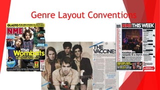
2. Cover
The layout of this NME magazine cover is made
to look fairly unorganized, perhaps this appeals
to students as they are stereotyped to be messy
and unorganised, this may also reflect the party
lifestyle that is also associated with students.
The cover layout is fairly informal compared to
most MOJO covers for example. The Wombats
band members are in unconventional poses, this
reflects the casual convention of indie music as
well as the way indie music is thought of being
detached from mainstream music.
3. Contents
NME contents pages always include a band index
on the left hand side, an image in the centre
with related text below it, the page references
on the right hand side and a subscription advert
at the bottom. This structure of contents page is
the same in every NME magazine. The structure
may appeal to their target audience as they can
simply read down the band index to see what
bands are featured and whether their favourite
band is featured. The page references on the
right hand side is easy to read and is split up
into clear categories.
4. Double Page Spread
NME double page spreads tend to have the left
hand page as an image and the writing on the
right hand page. The image tend to be on the left
hand page as it is the first place the reader looks
when they turn the page, if an image is there then
their attention is drawn to it and makes them
want to read the article included.