SlideShare a Scribd company logo
1 of 8
The contents page of NME holds brand
identity, it follows the convention using its
own style and design to identify the brand
NME as an individual brand, the logo
appears on the top left hand side
showcasingthe brand, but the colours are
repeated within each issue following
conventions, the colours seen in every issue
are red, black, white and yellow. The
design and conventions are unique to the
brand giving the brand its own identity in
which people can identify. The fonts are
always the same sticking to sans serif fonts
and the occasional use of serif in every
issue. The layout follows the same structure
where the band index is always positioned
on the left hand side with the colour red to
highlight the bands and artist reference to
each page. The Logo is always on the second left hand side followed by a strip of a
black shape. A star-burst is used in every issue as seen in the bottom-middle and
bottom right using the same colour schemes each time.
The article contents are positioned on the right hand side of the page and in the
middle a mini article is found where the text is light, but highly intriguing. And the
image above relates to the text below it. It is conventional to find the title at the top
of the page and brand index and the left hand side of the page. The magazine has
separated the articles featured into sub-genres or topics which, is always positioned
in the right hand corner. Images featured are related to the article inside, while the
colours used represent the genre of music being discussed as a topic.
The first thing readers notice is the bold title ‘NME THIS WEEK'. The font and colour
scheme follows the same concept as the front cover of magazine linking to its brand
identity being bold and a vivid shade of red to stand out in contrast to the rest of the
contents page. This title also informs the reader about the contents that would be
featured inside this magazine, this would help to reader to feel the direct mode of
address as they would havean understanding of the features inside the magazine. It
grabs the attention to show that each magazine is different each week based on
the words ‘THIS WEEK'. The presentation of the title is very sleek and simple but ,is
distinct at the same time. Another main title is “The moment that everyone got
onboard Africa Exprez” hints what will be featured within the text creating that
appeal for the readership's curiosity into wantingto know more about this concert.
The distinctivesize of the text and font makes it more noticeable towards the
readership thereforecatching their attention completely.
There are three images featured on the page keeping a very simplistic layout. The
images featured is of the band Blur promoting the new album ‘Africa Exprez' at their
recent gig and the image shows themperforming on stage, promoting their album
to their fans which what the article is based on to give fans an insight of more
detailed article inside. And another image shown is a picture of the magazine NME
being advertised for online subscription. The first and second picture are laid out
underneath the title in the middle of the page where the audiences' eyes will
centralize and notice after reading the title as the images shown are big and eye
catching. As they capture the attention of the audience it draws the audience as
the picture of the band is above the article which helps to depicts a story fromthe
pictures to the articles. The mise-en-scene shown in the images is on a stage at a
concert/gig with high-key lighting of dark flat colours as seen with the red hue in the
background. The costume is very simple, plain but also comfortable indicating that
the iconography of this brand is in the indie genre as most musicians in this genre are
very simple in terms of costume. The instruments are pieces of iconography for the
genre of indie-rock/alternative as the bands normally compose music themselves
and use the instruments when performing, so it links back to the music genre of the
magazine and the band featured.
The last image is of picture of an NME magazine placed inside a box to advertise
subscription to the magazine. The image is positioned on smaller scale down in the
bottom of the page in the middle underneath the larger images of the articles. The
images are all place relatively near each other linking themto the same brand of
NME. The position draws the audience attention as the text featured next to the
image would lose focus as the audience focuses on the images they are shown the
deals that are also offered.
The articles are presented inside the magazine through subtopics where it
categorizes where each article will feature. The articles are presented in a list that is
positioned on the right hand side of the page where it stands out if the Sell-line is
featured on the article then, they will havea black arrow pointing to the article
stating so. The topics are divided into ‘NEWS' ‘RADAR' ‘REVIEWS' LIVE!' ‘FEATURES' and
‘PLUS'. They way the topics are divided suggest that the readership have interests in
news of bands such as exclusive interviews and also reviews of each albums and
tracks so they have a strong piece of text to use as a guide whilst purchasing albums
and songs, they are quite keen on finding out the magazine's personal opinion and if
it will correlate with theirs. There is information featured about gigs as the TA is all
about gigs and its review so they are always hungry for fresh information. The TA also
enjoy being entertained which, is why the ‘PLUS' sections helps themas they feature
games and crosswords so that the TA are more intrigued by the magazine. The
mode of address is direct address the images in which the gaze is directed at the
viewers of the image create 'a visual formof direct address. Also, the use of the
pronoun ‘EVERYBODY' is use of direct address as the text is directly aiming for the
reader's attention visually. The readers also feel more notified about the magazine
due to the numbers being placed next to the text emphasizing what article is
featured on what page, so the readers feel more relaxed into being able to read
through the magazine by their own personal preference.
The layout of the contents page is consistent in every issue maintaining its brand
identity as each convention is featured in their given position each week, so regular
buyers already know the magazine inside out. As its kept the font and the masthead
the same it is more distinct to the readers, as this the layout the magazine is known
for. The layout of the features inside the contents page is the title in the top middle.
The band index is verticallygoing down on the left hand-side of the page, the sub-
topics goes down vertically on the right hand-side of the page. The first article and
pictures would be placed in the middle in between the band index and sub-topics,
the images are always positioned beforethe text.
The colours shown to be more dominantly featured inside the contents are red,
black and white, these colours reflect the genre that the magazine is celebrating
and reflects on how the readership is more drawn to simplistic colours that quite bold
rather than overly bright colours with vivid hues. The colours being used, are a
common convention as these colours identifies with the brand NME as the colours
are always used it is associated with NME giving it's brand identity.
There are no patterns featured on the magazines indicating that the readers are
more grown up and prefer something more straightforward and uncomplicated to
attract their attention, as if the contents page was overly done it would seemquite
childish as the readers are more mature so they would prefer something more basic.
The shapes used occasionally are
rectangles and arrows with is quite plain
and basic so it's quite simple to the
readership as they would not like a
shape overly creative or exaggerated.
The fonts and typefaces that always the
same typeface and same colour with
the same size to maintain its brand
identity it is used repeatedly in other
issues as well. The font is very
professional showing that the magazine
is off high quality and professional, as
this draws the reader in as they are
more drawn to fonts that are easy to
read and are simple.
The contents page follow the general
layout conventionsby featuring each
of the following, the layout of using the
conventions such as featuring the sub-
topics, main images and articles. The
layout is always similar to the other contents page featured on a different NME
magazine which creates synergy which gives the target audience a sense of
familiarisation so that the NME contents page has its own brand identity as it would
be well-known for that specific usage of layout.
The title that the readership firsts looks at is the bold and eye catching ‘NME THIS
WEEk” as the font and colour scheme follows the same concept as the front cover
of magazine linking to its brand identity being bold and a vivid shade of red to stand
out in contrast to the rest of the contents page. This title also informs the reader
about the contents that would be featured inside this magazine, this would help to
reader to feel the direct mode of address as they would have an understanding of
the features inside the magazine. It grabs the attention to show that each magazine
is different each week based on the words ‘THIS WEEK'. The presentation of the title is
very sleek and simple, but is distinct at the same time.
Another main title is “The moment that Kasabian got romantic in a church ” hints
what will be featured within the text creating that appeal for the readerships'
curiosity into wanting to know more about the gig in the picture. The distinctive size
of the text and font makes it more noticeable towards the readership therefore
catching their attention completely. The other text featured are titles to show what
will be featured under each subtopic of the magazine the font is bold and striking at
the same time making it very noticeable. The layout follows the same procedurein
every issuegiving the magazine its brand identity. The simple style of the layout of
the contents page is that the TA are young men who don't really like too much fuss
for a style of a content's page and would prefer it to be something simple and toned
down
The image that features is the main image that the text is talking about which is an
image of the band Kasabian performing inside a church, the image is positioned
within the centre of the page as that positioning will have the readership's attention
focused on the image based on the placing as the size of the image is big making it
in the view of the readerships' eyes. The image uses dark tone lighting to create a
shadowy effect but also to tone down the image which contrastsgreatly with the
rest of the contents page due to bold, but vivid colours within the image. The image
has a blue, black and brownish tone which indicates the genreof the band as indie-
rock is seen to be associated with the dimand dull colours. The iconography
featured within the image is the parka worn by one of the member and a parka
jacket stereo-typically falls into the genre as each indie-rock artists is seen to wear
them in one of their music videos. The acoustic guitar showing that it was a live
performance as indie artists are known to compose and perform their own music so
this sets the tone of the genre of music this band falls under.
The articles are presented inside the magazine through subtopics where it
categorizes where each article will feature. The articles are presented in a list that is
positioned on the right hand side of the page where it stands out if the Sell-line is
featured on the article, then they will havea black arrow pointing to the article
stating so. The topics are divided into ‘NEWS' ‘RADAR' ‘REVIEWS' LIVE!' ‘FEATURES' and
‘PLUS'. They way the topics are divided suggest that the readership have interests in
news of bands such as exclusive interviews and also reviews of each albums and
tracks so they have a strong piece of text to use as a guide whilst purchasing albums
and songs, they are quite keen on finding out the magazine's personal opinion and if
it will correlate with theirs. There is information featured about gigs as the TA is all
about gigs and its review so they are always hungry for fresh information. The TA also
enjoy being entertained, which is why the ‘PLUS' sections helps themas they feature
games and crosswords so that the TA are more intrigued by the magazine. The
mode of address is direct address as the numbers are placed next to the text
emphasizing what article is featured on what page, so the readers feel more relaxed
into being able to read through the magazine by their own personal preference.
Each issue uses the same structure and same title for the sub-topic, but the articles
featured within these sub-topic vary. The band index always change in each issue,
but is still used giving the magazine its brand identity as the readership can feel they
are receiving more for their money based on the information being provided to
them, it is also useful as it is a guide in helping readership discover new bands easily
as they can just look at the band index.
The layout of the contents page is consistent in every issue maintaining its brand
identity as each convention is featured in their given position each week, so regular
buyers already know the magazine inside out. As its kept the font and the masthead
the same it is more distinct to the readers, as this the layout the magazine is known
for. The layout of the features inside the contents page is the title in the top middle.
The band index is verticallygoing down on the left hand-side of the page, the sub-
topics goes down vertically on the right hand-side of the page. The first article and
pictures would be placed in the middle in between the band index and sub-topics,
the images are always positioned beforethe text. The choice of layout is
professional as it is put in order so everything within the contents page is easier to
find and read and it shows that the more simplistic they layout the more drawn the
readerships are in oppose to something overly complicated and busy. This shows
that the target audience of the magazine have a more a simple taste wherethey
prefer just information and less hassle of features on the contents page. The only
convention that varies on each of the issue are the articles and text featured as the
contents page will feature different bands in each article, but will always link it back
to their front cover giving linkage and identity to the magazine. The starburst are
used in an arrow shape to givea sense of instruction to the readership as to guide to
tell them whereto read next and what section of the contents page should they
focus on.
The colours that dominantly feature inside the contents are red, black and white,
these colours reflect the genre that the magazine is celebrating and reflects on how
the readership is more drawn to simplistic colours that quite bold rather than overly
bright colours with vivid hues. The colours, being used is a common convention as
these colours identifies with the brand NME as the colours are always used it is
associated with NMEgiving it is brand identity. It is also associated within the colours
of masculinity as the colour red are more prone to attracting a larger male target
audience as red is viewed to be a very masculine colour. The colour itself is very bold
and daring as it contrasts with the more darker and dull tone so it kind of sets full
facing vibe as it shows that the magazine are always daring in using bold colours to
differentiate fromother magazines making it more bold towards readers. As it follows
the same colour concept most of the readership will know the magazine just by
looking at the colour scheme showing that magazine is easily recognisable as it has
its own brand identity that follows through each issue.
There are no patterns featured on the magazines indicating that the readers are
more grown up and prefer something more straightforward and uncomplicated to
attract their attention, as if the contents page was overly done it would seemquite
childish as the readers are more mature so they would prefer something more basic.
The shapes used occasionally are rectangles and arrows with is quite plain and basic
so it's quite simple to the readership as they would not like a shape overlycreative or
exaggerated. The stylistic features are being used to show that the readerships of
the magazine prefer a much more plain and straightforward approach showing that
the readerships are more mature and lookout for texts and images rather than bright
colours and many images and puffs.
The fonts and typefaces that always the same typeface and same colour with the
same size to maintain its brand identity it is used repeatedly in other issues as well.
The font is very professional showing that the magazine is off high quality and
professionalism, as this draws the reader in as they are more drawn to fonts that are
easy to read and are simple. As the style is very professional it has a very mature,
but professional feel so the articles feature inside would havelonger lasting effect on
the readership based on their use of typefaces and font. As the fonts and type are
simple as it makes the reader feel relaxed and more interested when reading each
article.
Both of the contents page uses the rule of thirds as the reader of the magazine
would mentally divide up the page by using 2 horizontal lines and 2 vertical lines. The
idea is that an off-centre composition is more pleasing to the eye and looks more
natural than one where the subject is placed right in the middle of the frame, so the
use of this ruling is more visually pleasing to the target audience.
And fromthat the designers can determine the right positioning of each of the
conventions to place in the right position which will garner the most interest fromthe
target audience.

More Related Content

What's hot

Codes and convention
Codes and conventionCodes and convention
Codes and conventionstephanie983
 
Front covers, contents pages, double page spreads #5
Front covers, contents pages, double page spreads #5Front covers, contents pages, double page spreads #5
Front covers, contents pages, double page spreads #5QureshiSohail
 
Front covers, contents pages, double page spreads #5
Front covers, contents pages, double page spreads #5Front covers, contents pages, double page spreads #5
Front covers, contents pages, double page spreads #5QureshiSohail
 
Codes and convention
Codes and conventionCodes and convention
Codes and conventionstephanie983
 
Analysis of three music magazine contents pages
Analysis of three music magazine contents pagesAnalysis of three music magazine contents pages
Analysis of three music magazine contents pageszoewarwood
 
Task 4- Magazine Analysis
Task 4- Magazine AnalysisTask 4- Magazine Analysis
Task 4- Magazine Analysis2011karisha
 
Researching and analysing magazines
Researching and analysing magazinesResearching and analysing magazines
Researching and analysing magazinesabigailmusic
 
NME analysis
NME analysisNME analysis
NME analysisbeckyt95
 
AlexaDippold MusicMagazineResearch
AlexaDippold MusicMagazineResearchAlexaDippold MusicMagazineResearch
AlexaDippold MusicMagazineResearchAlexaDippold
 
Template for magazine analysis
Template for magazine analysisTemplate for magazine analysis
Template for magazine analysisRafaelPerezOlivan
 
Contents page analysis
Contents page analysis Contents page analysis
Contents page analysis laurenwalsh110600
 
Analysing magazine contents pages
Analysing magazine contents pagesAnalysing magazine contents pages
Analysing magazine contents pagessarah123ashcroft
 
Contents page analysis
Contents page analysisContents page analysis
Contents page analysisMina Yaqin
 
Question 1
Question 1Question 1
Question 1amydinsey
 
Contents page overview
Contents page overviewContents page overview
Contents page overviewrachaeltara
 
NME magazine analysis
NME magazine analysisNME magazine analysis
NME magazine analysiskiera0white
 
Planning Final
Planning FinalPlanning Final
Planning FinalEmilyPlenty
 

What's hot (20)

Codes and convention
Codes and conventionCodes and convention
Codes and convention
 
Front covers, contents pages, double page spreads #5
Front covers, contents pages, double page spreads #5Front covers, contents pages, double page spreads #5
Front covers, contents pages, double page spreads #5
 
Cover research
Cover researchCover research
Cover research
 
Front covers, contents pages, double page spreads #5
Front covers, contents pages, double page spreads #5Front covers, contents pages, double page spreads #5
Front covers, contents pages, double page spreads #5
 
Exam q 1
Exam q 1Exam q 1
Exam q 1
 
Codes and convention
Codes and conventionCodes and convention
Codes and convention
 
Analysis of three music magazine contents pages
Analysis of three music magazine contents pagesAnalysis of three music magazine contents pages
Analysis of three music magazine contents pages
 
Task 4- Magazine Analysis
Task 4- Magazine AnalysisTask 4- Magazine Analysis
Task 4- Magazine Analysis
 
Researching and analysing magazines
Researching and analysing magazinesResearching and analysing magazines
Researching and analysing magazines
 
NME analysis
NME analysisNME analysis
NME analysis
 
AlexaDippold MusicMagazineResearch
AlexaDippold MusicMagazineResearchAlexaDippold MusicMagazineResearch
AlexaDippold MusicMagazineResearch
 
Template for magazine analysis
Template for magazine analysisTemplate for magazine analysis
Template for magazine analysis
 
Contents page analysis
Contents page analysis Contents page analysis
Contents page analysis
 
Analysing magazine contents pages
Analysing magazine contents pagesAnalysing magazine contents pages
Analysing magazine contents pages
 
Contents page analysis
Contents page analysisContents page analysis
Contents page analysis
 
Question 1
Question 1Question 1
Question 1
 
Contents page overview
Contents page overviewContents page overview
Contents page overview
 
NME magazine analysis
NME magazine analysisNME magazine analysis
NME magazine analysis
 
Planning Final
Planning FinalPlanning Final
Planning Final
 
Planning
Planning Planning
Planning
 

Similar to NME contents page brand identity

Content Analysis
Content AnalysisContent Analysis
Content AnalysisKatieThomas17
 
Contents page overview
Contents page overviewContents page overview
Contents page overviewkathrynpalos
 
NME Music magazine analysis
NME Music magazine analysisNME Music magazine analysis
NME Music magazine analysisNajat Hachem
 
Magazine Conventions
Magazine ConventionsMagazine Conventions
Magazine Conventionslucycoates1
 
Format research of music magazines
Format research of music magazinesFormat research of music magazines
Format research of music magazinesellisputnam
 
Market Research / Magazine Analysis
Market Research / Magazine AnalysisMarket Research / Magazine Analysis
Market Research / Magazine Analysislucypywell
 
Analysing contents pages
Analysing  contents pages Analysing  contents pages
Analysing contents pages hargravee1
 
Magazine Analysis
Magazine AnalysisMagazine Analysis
Magazine AnalysisEllicia
 
Music magazine research
Music magazine researchMusic magazine research
Music magazine researchbroganl4
 
Nme case study
Nme case studyNme case study
Nme case studyAimee Deegan
 
1 table of contents analysis
1 table of contents analysis1 table of contents analysis
1 table of contents analysisHenriettaDent
 
Music magazine research
Music magazine researchMusic magazine research
Music magazine researchbroganlan
 
textual analysis
textual analysistextual analysis
textual analysisbroganl4
 
Textual analysis 3
Textual analysis 3Textual analysis 3
Textual analysis 3050127
 
Researching music magazines
Researching music magazinesResearching music magazines
Researching music magazinesjawgeenahh
 
Front Covers - Research Task
Front Covers - Research TaskFront Covers - Research Task
Front Covers - Research Taskbeckyjay26
 
Evaluation 1- In what ways does your media product use, develop or challenge ...
Evaluation 1- In what ways does your media product use, develop or challenge ...Evaluation 1- In what ways does your media product use, develop or challenge ...
Evaluation 1- In what ways does your media product use, develop or challenge ...Daisy Birchall
 

Similar to NME contents page brand identity (20)

Content Analysis
Content AnalysisContent Analysis
Content Analysis
 
Contents page overview
Contents page overviewContents page overview
Contents page overview
 
NME Music magazine analysis
NME Music magazine analysisNME Music magazine analysis
NME Music magazine analysis
 
Magazine Conventions
Magazine ConventionsMagazine Conventions
Magazine Conventions
 
Format research of music magazines
Format research of music magazinesFormat research of music magazines
Format research of music magazines
 
Market Research / Magazine Analysis
Market Research / Magazine AnalysisMarket Research / Magazine Analysis
Market Research / Magazine Analysis
 
Analysing contents pages
Analysing  contents pages Analysing  contents pages
Analysing contents pages
 
Magazine Analysis
Magazine AnalysisMagazine Analysis
Magazine Analysis
 
Music magazine research
Music magazine researchMusic magazine research
Music magazine research
 
Nme case study
Nme case studyNme case study
Nme case study
 
Contents page overview
Contents page overviewContents page overview
Contents page overview
 
1 table of contents analysis
1 table of contents analysis1 table of contents analysis
1 table of contents analysis
 
Music magazine research
Music magazine researchMusic magazine research
Music magazine research
 
textual analysis
textual analysistextual analysis
textual analysis
 
NME ANALYSIS
NME ANALYSISNME ANALYSIS
NME ANALYSIS
 
Textual analysis 3
Textual analysis 3Textual analysis 3
Textual analysis 3
 
Researching music magazines
Researching music magazinesResearching music magazines
Researching music magazines
 
Front Covers - Research Task
Front Covers - Research TaskFront Covers - Research Task
Front Covers - Research Task
 
Contents page analysis
Contents page analysisContents page analysis
Contents page analysis
 
Evaluation 1- In what ways does your media product use, develop or challenge ...
Evaluation 1- In what ways does your media product use, develop or challenge ...Evaluation 1- In what ways does your media product use, develop or challenge ...
Evaluation 1- In what ways does your media product use, develop or challenge ...
 

More from Nattayaday11

Film trailer conventions
Film trailer conventionsFilm trailer conventions
Film trailer conventionsNattayaday11
 
Horror sub genres
Horror sub genresHorror sub genres
Horror sub genresNattayaday11
 
Horror movie history timeline
Horror movie history timelineHorror movie history timeline
Horror movie history timelineNattayaday11
 
Questionnaire analysis
Questionnaire analysisQuestionnaire analysis
Questionnaire analysisNattayaday11
 
Horror final girl
Horror final girlHorror final girl
Horror final girlNattayaday11
 
Codes and coneventions
Codes and coneventionsCodes and coneventions
Codes and coneventionsNattayaday11
 
Q7 evaluation
Q7 evaluationQ7 evaluation
Q7 evaluationNattayaday11
 
Q3 evaluation
Q3 evaluation Q3 evaluation
Q3 evaluation Nattayaday11
 
Q4 evaluation
Q4 evaluationQ4 evaluation
Q4 evaluationNattayaday11
 
Double page spread analysis
Double page spread analysisDouble page spread analysis
Double page spread analysisNattayaday11
 
Nme casestudy
Nme casestudyNme casestudy
Nme casestudyNattayaday11
 
Front cover analysis
Front cover analysisFront cover analysis
Front cover analysisNattayaday11
 
Costume ideas & mise- en-scene analysis
Costume ideas & mise- en-scene analysisCostume ideas & mise- en-scene analysis
Costume ideas & mise- en-scene analysisNattayaday11
 
Front cover mock ups
Front cover mock upsFront cover mock ups
Front cover mock upsNattayaday11
 
Contents page mockups
Contents page mockupsContents page mockups
Contents page mockupsNattayaday11
 

More from Nattayaday11 (20)

Film trailer conventions
Film trailer conventionsFilm trailer conventions
Film trailer conventions
 
Horror sub genres
Horror sub genresHorror sub genres
Horror sub genres
 
Focus group
Focus groupFocus group
Focus group
 
Wes craven
Wes cravenWes craven
Wes craven
 
Horror movie history timeline
Horror movie history timelineHorror movie history timeline
Horror movie history timeline
 
Questionnaire analysis
Questionnaire analysisQuestionnaire analysis
Questionnaire analysis
 
Pitch
PitchPitch
Pitch
 
The pitch
The pitchThe pitch
The pitch
 
Horror final girl
Horror final girlHorror final girl
Horror final girl
 
Codes and coneventions
Codes and coneventionsCodes and coneventions
Codes and coneventions
 
Q7 evaluation
Q7 evaluationQ7 evaluation
Q7 evaluation
 
Q3 evaluation
Q3 evaluation Q3 evaluation
Q3 evaluation
 
Q4 evaluation
Q4 evaluationQ4 evaluation
Q4 evaluation
 
Double page spread analysis
Double page spread analysisDouble page spread analysis
Double page spread analysis
 
Nme casestudy
Nme casestudyNme casestudy
Nme casestudy
 
Front cover analysis
Front cover analysisFront cover analysis
Front cover analysis
 
Costume ideas & mise- en-scene analysis
Costume ideas & mise- en-scene analysisCostume ideas & mise- en-scene analysis
Costume ideas & mise- en-scene analysis
 
Front cover mock ups
Front cover mock upsFront cover mock ups
Front cover mock ups
 
Contents page mockups
Contents page mockupsContents page mockups
Contents page mockups
 
Dps mockups
Dps mockupsDps mockups
Dps mockups
 

Recently uploaded

FULL ENJOY - 9953040155 Call Girls in Shahdara | Delhi
FULL ENJOY - 9953040155 Call Girls in Shahdara | DelhiFULL ENJOY - 9953040155 Call Girls in Shahdara | Delhi
FULL ENJOY - 9953040155 Call Girls in Shahdara | DelhiMalviyaNagarCallGirl
 
Charbagh ! (Call Girls) in Lucknow Finest Escorts Service đŸ„— 8923113531 🏊 Avai...
Charbagh ! (Call Girls) in Lucknow Finest Escorts Service đŸ„— 8923113531 🏊 Avai...Charbagh ! (Call Girls) in Lucknow Finest Escorts Service đŸ„— 8923113531 🏊 Avai...
Charbagh ! (Call Girls) in Lucknow Finest Escorts Service đŸ„— 8923113531 🏊 Avai...gurkirankumar98700
 
FULL ENJOY - 9953040155 Call Girls in Indirapuram | Delhi
FULL ENJOY - 9953040155 Call Girls in Indirapuram | DelhiFULL ENJOY - 9953040155 Call Girls in Indirapuram | Delhi
FULL ENJOY - 9953040155 Call Girls in Indirapuram | DelhiMalviyaNagarCallGirl
 
FULL ENJOY - 9953040155 Call Girls in Uttam Nagar | Delhi
FULL ENJOY - 9953040155 Call Girls in Uttam Nagar | DelhiFULL ENJOY - 9953040155 Call Girls in Uttam Nagar | Delhi
FULL ENJOY - 9953040155 Call Girls in Uttam Nagar | DelhiMalviyaNagarCallGirl
 
Editorial sephora annual report design project
Editorial sephora annual report design projectEditorial sephora annual report design project
Editorial sephora annual report design projecttbatkhuu1
 
Roadrunner Lodge, Motel/Residence, Tucumcari NM
Roadrunner Lodge, Motel/Residence, Tucumcari NMRoadrunner Lodge, Motel/Residence, Tucumcari NM
Roadrunner Lodge, Motel/Residence, Tucumcari NMroute66connected
 
Patrakarpuram ) Cheap Call Girls In Lucknow (Adult Only) 🧈 8923113531 𓀓 Esco...
Patrakarpuram ) Cheap Call Girls In Lucknow  (Adult Only) 🧈 8923113531 𓀓 Esco...Patrakarpuram ) Cheap Call Girls In Lucknow  (Adult Only) 🧈 8923113531 𓀓 Esco...
Patrakarpuram ) Cheap Call Girls In Lucknow (Adult Only) 🧈 8923113531 𓀓 Esco...akbard9823
 
Islamabad Call Girls # 03091665556 # Call Girls in Islamabad | Islamabad Escorts
Islamabad Call Girls # 03091665556 # Call Girls in Islamabad | Islamabad EscortsIslamabad Call Girls # 03091665556 # Call Girls in Islamabad | Islamabad Escorts
Islamabad Call Girls # 03091665556 # Call Girls in Islamabad | Islamabad Escortswdefrd
 
Call girls in Kanpur - 9761072362 with room service
Call girls in Kanpur - 9761072362 with room serviceCall girls in Kanpur - 9761072362 with room service
Call girls in Kanpur - 9761072362 with room servicediscovermytutordmt
 
Gomti Nagar & High Profile Call Girls in Lucknow (Adult Only) 8923113531 Esc...
Gomti Nagar & High Profile Call Girls in Lucknow  (Adult Only) 8923113531 Esc...Gomti Nagar & High Profile Call Girls in Lucknow  (Adult Only) 8923113531 Esc...
Gomti Nagar & High Profile Call Girls in Lucknow (Adult Only) 8923113531 Esc...gurkirankumar98700
 
FULL ENJOY - 9953040155 Call Girls in Shaheen Bagh | Delhi
FULL ENJOY - 9953040155 Call Girls in Shaheen Bagh | DelhiFULL ENJOY - 9953040155 Call Girls in Shaheen Bagh | Delhi
FULL ENJOY - 9953040155 Call Girls in Shaheen Bagh | DelhiMalviyaNagarCallGirl
 
Lucknow 💋 Call Girl in Lucknow Phone No 8923113531 Elite Escort Service Avail...
Lucknow 💋 Call Girl in Lucknow Phone No 8923113531 Elite Escort Service Avail...Lucknow 💋 Call Girl in Lucknow Phone No 8923113531 Elite Escort Service Avail...
Lucknow 💋 Call Girl in Lucknow Phone No 8923113531 Elite Escort Service Avail...anilsa9823
 
Call Girl Service In Dubai #$# O56521286O #$# Dubai Call Girls
Call Girl Service In Dubai #$# O56521286O #$# Dubai Call GirlsCall Girl Service In Dubai #$# O56521286O #$# Dubai Call Girls
Call Girl Service In Dubai #$# O56521286O #$# Dubai Call Girlsparisharma5056
 
FULL ENJOY - 9953040155 Call Girls in Wazirabad | Delhi
FULL ENJOY - 9953040155 Call Girls in Wazirabad | DelhiFULL ENJOY - 9953040155 Call Girls in Wazirabad | Delhi
FULL ENJOY - 9953040155 Call Girls in Wazirabad | DelhiMalviyaNagarCallGirl
 
FULL ENJOY - 9953040155 Call Girls in Sangam Vihar | Delhi
FULL ENJOY - 9953040155 Call Girls in Sangam Vihar | DelhiFULL ENJOY - 9953040155 Call Girls in Sangam Vihar | Delhi
FULL ENJOY - 9953040155 Call Girls in Sangam Vihar | DelhiMalviyaNagarCallGirl
 
FULL ENJOY 🔝 8264348440 🔝 Call Girls in Vasant Kunj | Delhi
FULL ENJOY 🔝 8264348440 🔝 Call Girls in Vasant Kunj | DelhiFULL ENJOY 🔝 8264348440 🔝 Call Girls in Vasant Kunj | Delhi
FULL ENJOY 🔝 8264348440 🔝 Call Girls in Vasant Kunj | Delhisoniya singh
 
The First Date by Daniel Johnson (Inspired By True Events)
The First Date by Daniel Johnson (Inspired By True Events)The First Date by Daniel Johnson (Inspired By True Events)
The First Date by Daniel Johnson (Inspired By True Events)thephillipta
 
Alex and Chloe by Daniel Johnson Storyboard
Alex and Chloe by Daniel Johnson StoryboardAlex and Chloe by Daniel Johnson Storyboard
Alex and Chloe by Daniel Johnson Storyboardthephillipta
 
Deira Call Girls # 0522916705 # Call Girls In Deira Dubai || (UAE)
Deira Call Girls # 0522916705 #  Call Girls In Deira Dubai || (UAE)Deira Call Girls # 0522916705 #  Call Girls In Deira Dubai || (UAE)
Deira Call Girls # 0522916705 # Call Girls In Deira Dubai || (UAE)wdefrd
 

Recently uploaded (20)

FULL ENJOY - 9953040155 Call Girls in Shahdara | Delhi
FULL ENJOY - 9953040155 Call Girls in Shahdara | DelhiFULL ENJOY - 9953040155 Call Girls in Shahdara | Delhi
FULL ENJOY - 9953040155 Call Girls in Shahdara | Delhi
 
Charbagh ! (Call Girls) in Lucknow Finest Escorts Service đŸ„— 8923113531 🏊 Avai...
Charbagh ! (Call Girls) in Lucknow Finest Escorts Service đŸ„— 8923113531 🏊 Avai...Charbagh ! (Call Girls) in Lucknow Finest Escorts Service đŸ„— 8923113531 🏊 Avai...
Charbagh ! (Call Girls) in Lucknow Finest Escorts Service đŸ„— 8923113531 🏊 Avai...
 
FULL ENJOY - 9953040155 Call Girls in Indirapuram | Delhi
FULL ENJOY - 9953040155 Call Girls in Indirapuram | DelhiFULL ENJOY - 9953040155 Call Girls in Indirapuram | Delhi
FULL ENJOY - 9953040155 Call Girls in Indirapuram | Delhi
 
FULL ENJOY - 9953040155 Call Girls in Uttam Nagar | Delhi
FULL ENJOY - 9953040155 Call Girls in Uttam Nagar | DelhiFULL ENJOY - 9953040155 Call Girls in Uttam Nagar | Delhi
FULL ENJOY - 9953040155 Call Girls in Uttam Nagar | Delhi
 
Editorial sephora annual report design project
Editorial sephora annual report design projectEditorial sephora annual report design project
Editorial sephora annual report design project
 
Roadrunner Lodge, Motel/Residence, Tucumcari NM
Roadrunner Lodge, Motel/Residence, Tucumcari NMRoadrunner Lodge, Motel/Residence, Tucumcari NM
Roadrunner Lodge, Motel/Residence, Tucumcari NM
 
Patrakarpuram ) Cheap Call Girls In Lucknow (Adult Only) 🧈 8923113531 𓀓 Esco...
Patrakarpuram ) Cheap Call Girls In Lucknow  (Adult Only) 🧈 8923113531 𓀓 Esco...Patrakarpuram ) Cheap Call Girls In Lucknow  (Adult Only) 🧈 8923113531 𓀓 Esco...
Patrakarpuram ) Cheap Call Girls In Lucknow (Adult Only) 🧈 8923113531 𓀓 Esco...
 
Islamabad Call Girls # 03091665556 # Call Girls in Islamabad | Islamabad Escorts
Islamabad Call Girls # 03091665556 # Call Girls in Islamabad | Islamabad EscortsIslamabad Call Girls # 03091665556 # Call Girls in Islamabad | Islamabad Escorts
Islamabad Call Girls # 03091665556 # Call Girls in Islamabad | Islamabad Escorts
 
Indian Deira Call Girls # 0522916705 # Indian Call Girls In Deira Dubai || (UAE)
Indian Deira Call Girls # 0522916705 # Indian Call Girls In Deira Dubai || (UAE)Indian Deira Call Girls # 0522916705 # Indian Call Girls In Deira Dubai || (UAE)
Indian Deira Call Girls # 0522916705 # Indian Call Girls In Deira Dubai || (UAE)
 
Call girls in Kanpur - 9761072362 with room service
Call girls in Kanpur - 9761072362 with room serviceCall girls in Kanpur - 9761072362 with room service
Call girls in Kanpur - 9761072362 with room service
 
Gomti Nagar & High Profile Call Girls in Lucknow (Adult Only) 8923113531 Esc...
Gomti Nagar & High Profile Call Girls in Lucknow  (Adult Only) 8923113531 Esc...Gomti Nagar & High Profile Call Girls in Lucknow  (Adult Only) 8923113531 Esc...
Gomti Nagar & High Profile Call Girls in Lucknow (Adult Only) 8923113531 Esc...
 
FULL ENJOY - 9953040155 Call Girls in Shaheen Bagh | Delhi
FULL ENJOY - 9953040155 Call Girls in Shaheen Bagh | DelhiFULL ENJOY - 9953040155 Call Girls in Shaheen Bagh | Delhi
FULL ENJOY - 9953040155 Call Girls in Shaheen Bagh | Delhi
 
Lucknow 💋 Call Girl in Lucknow Phone No 8923113531 Elite Escort Service Avail...
Lucknow 💋 Call Girl in Lucknow Phone No 8923113531 Elite Escort Service Avail...Lucknow 💋 Call Girl in Lucknow Phone No 8923113531 Elite Escort Service Avail...
Lucknow 💋 Call Girl in Lucknow Phone No 8923113531 Elite Escort Service Avail...
 
Call Girl Service In Dubai #$# O56521286O #$# Dubai Call Girls
Call Girl Service In Dubai #$# O56521286O #$# Dubai Call GirlsCall Girl Service In Dubai #$# O56521286O #$# Dubai Call Girls
Call Girl Service In Dubai #$# O56521286O #$# Dubai Call Girls
 
FULL ENJOY - 9953040155 Call Girls in Wazirabad | Delhi
FULL ENJOY - 9953040155 Call Girls in Wazirabad | DelhiFULL ENJOY - 9953040155 Call Girls in Wazirabad | Delhi
FULL ENJOY - 9953040155 Call Girls in Wazirabad | Delhi
 
FULL ENJOY - 9953040155 Call Girls in Sangam Vihar | Delhi
FULL ENJOY - 9953040155 Call Girls in Sangam Vihar | DelhiFULL ENJOY - 9953040155 Call Girls in Sangam Vihar | Delhi
FULL ENJOY - 9953040155 Call Girls in Sangam Vihar | Delhi
 
FULL ENJOY 🔝 8264348440 🔝 Call Girls in Vasant Kunj | Delhi
FULL ENJOY 🔝 8264348440 🔝 Call Girls in Vasant Kunj | DelhiFULL ENJOY 🔝 8264348440 🔝 Call Girls in Vasant Kunj | Delhi
FULL ENJOY 🔝 8264348440 🔝 Call Girls in Vasant Kunj | Delhi
 
The First Date by Daniel Johnson (Inspired By True Events)
The First Date by Daniel Johnson (Inspired By True Events)The First Date by Daniel Johnson (Inspired By True Events)
The First Date by Daniel Johnson (Inspired By True Events)
 
Alex and Chloe by Daniel Johnson Storyboard
Alex and Chloe by Daniel Johnson StoryboardAlex and Chloe by Daniel Johnson Storyboard
Alex and Chloe by Daniel Johnson Storyboard
 
Deira Call Girls # 0522916705 # Call Girls In Deira Dubai || (UAE)
Deira Call Girls # 0522916705 #  Call Girls In Deira Dubai || (UAE)Deira Call Girls # 0522916705 #  Call Girls In Deira Dubai || (UAE)
Deira Call Girls # 0522916705 # Call Girls In Deira Dubai || (UAE)
 

NME contents page brand identity

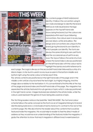
  • 1. The contents page of NME holds brand identity, it follows the convention using its own style and design to identify the brand NME as an individual brand, the logo appears on the top left hand side showcasingthe brand, but the colours are repeated within each issue following conventions, the colours seen in every issue are red, black, white and yellow. The design and conventions are unique to the brand giving the brand its own identity in which people can identify. The fonts are always the same sticking to sans serif fonts and the occasional use of serif in every issue. The layout follows the same structure where the band index is always positioned on the left hand side with the colour red to highlight the bands and artist reference to each page. The Logo is always on the second left hand side followed by a strip of a black shape. A star-burst is used in every issue as seen in the bottom-middle and bottom right using the same colour schemes each time. The article contents are positioned on the right hand side of the page and in the middle a mini article is found where the text is light, but highly intriguing. And the image above relates to the text below it. It is conventional to find the title at the top of the page and brand index and the left hand side of the page. The magazine has separated the articles featured into sub-genres or topics which, is always positioned in the right hand corner. Images featured are related to the article inside, while the colours used represent the genre of music being discussed as a topic. The first thing readers notice is the bold title ‘NME THIS WEEK'. The font and colour scheme follows the same concept as the front cover of magazine linking to its brand identity being bold and a vivid shade of red to stand out in contrast to the rest of the contents page. This title also informs the reader about the contents that would be featured inside this magazine, this would help to reader to feel the direct mode of address as they would havean understanding of the features inside the magazine. It grabs the attention to show that each magazine is different each week based on
  • 2. the words ‘THIS WEEK'. The presentation of the title is very sleek and simple but ,is distinct at the same time. Another main title is “The moment that everyone got onboard Africa Exprez” hints what will be featured within the text creating that appeal for the readership's curiosity into wantingto know more about this concert. The distinctivesize of the text and font makes it more noticeable towards the readership thereforecatching their attention completely. There are three images featured on the page keeping a very simplistic layout. The images featured is of the band Blur promoting the new album ‘Africa Exprez' at their recent gig and the image shows themperforming on stage, promoting their album to their fans which what the article is based on to give fans an insight of more detailed article inside. And another image shown is a picture of the magazine NME being advertised for online subscription. The first and second picture are laid out underneath the title in the middle of the page where the audiences' eyes will centralize and notice after reading the title as the images shown are big and eye catching. As they capture the attention of the audience it draws the audience as the picture of the band is above the article which helps to depicts a story fromthe pictures to the articles. The mise-en-scene shown in the images is on a stage at a concert/gig with high-key lighting of dark flat colours as seen with the red hue in the background. The costume is very simple, plain but also comfortable indicating that the iconography of this brand is in the indie genre as most musicians in this genre are very simple in terms of costume. The instruments are pieces of iconography for the genre of indie-rock/alternative as the bands normally compose music themselves and use the instruments when performing, so it links back to the music genre of the magazine and the band featured. The last image is of picture of an NME magazine placed inside a box to advertise subscription to the magazine. The image is positioned on smaller scale down in the bottom of the page in the middle underneath the larger images of the articles. The images are all place relatively near each other linking themto the same brand of NME. The position draws the audience attention as the text featured next to the image would lose focus as the audience focuses on the images they are shown the deals that are also offered. The articles are presented inside the magazine through subtopics where it categorizes where each article will feature. The articles are presented in a list that is positioned on the right hand side of the page where it stands out if the Sell-line is featured on the article then, they will havea black arrow pointing to the article stating so. The topics are divided into ‘NEWS' ‘RADAR' ‘REVIEWS' LIVE!' ‘FEATURES' and
  • 3. ‘PLUS'. They way the topics are divided suggest that the readership have interests in news of bands such as exclusive interviews and also reviews of each albums and tracks so they have a strong piece of text to use as a guide whilst purchasing albums and songs, they are quite keen on finding out the magazine's personal opinion and if it will correlate with theirs. There is information featured about gigs as the TA is all about gigs and its review so they are always hungry for fresh information. The TA also enjoy being entertained which, is why the ‘PLUS' sections helps themas they feature games and crosswords so that the TA are more intrigued by the magazine. The mode of address is direct address the images in which the gaze is directed at the viewers of the image create 'a visual formof direct address. Also, the use of the pronoun ‘EVERYBODY' is use of direct address as the text is directly aiming for the reader's attention visually. The readers also feel more notified about the magazine due to the numbers being placed next to the text emphasizing what article is featured on what page, so the readers feel more relaxed into being able to read through the magazine by their own personal preference. The layout of the contents page is consistent in every issue maintaining its brand identity as each convention is featured in their given position each week, so regular buyers already know the magazine inside out. As its kept the font and the masthead the same it is more distinct to the readers, as this the layout the magazine is known for. The layout of the features inside the contents page is the title in the top middle. The band index is verticallygoing down on the left hand-side of the page, the sub- topics goes down vertically on the right hand-side of the page. The first article and pictures would be placed in the middle in between the band index and sub-topics, the images are always positioned beforethe text. The colours shown to be more dominantly featured inside the contents are red, black and white, these colours reflect the genre that the magazine is celebrating and reflects on how the readership is more drawn to simplistic colours that quite bold rather than overly bright colours with vivid hues. The colours being used, are a common convention as these colours identifies with the brand NME as the colours are always used it is associated with NME giving it's brand identity.
  • 4. There are no patterns featured on the magazines indicating that the readers are more grown up and prefer something more straightforward and uncomplicated to attract their attention, as if the contents page was overly done it would seemquite childish as the readers are more mature so they would prefer something more basic. The shapes used occasionally are rectangles and arrows with is quite plain and basic so it's quite simple to the readership as they would not like a shape overly creative or exaggerated. The fonts and typefaces that always the same typeface and same colour with the same size to maintain its brand identity it is used repeatedly in other issues as well. The font is very professional showing that the magazine is off high quality and professional, as this draws the reader in as they are more drawn to fonts that are easy to read and are simple. The contents page follow the general layout conventionsby featuring each of the following, the layout of using the conventions such as featuring the sub- topics, main images and articles. The layout is always similar to the other contents page featured on a different NME magazine which creates synergy which gives the target audience a sense of familiarisation so that the NME contents page has its own brand identity as it would be well-known for that specific usage of layout. The title that the readership firsts looks at is the bold and eye catching ‘NME THIS WEEk” as the font and colour scheme follows the same concept as the front cover of magazine linking to its brand identity being bold and a vivid shade of red to stand out in contrast to the rest of the contents page. This title also informs the reader about the contents that would be featured inside this magazine, this would help to reader to feel the direct mode of address as they would have an understanding of the features inside the magazine. It grabs the attention to show that each magazine
  • 5. is different each week based on the words ‘THIS WEEK'. The presentation of the title is very sleek and simple, but is distinct at the same time. Another main title is “The moment that Kasabian got romantic in a church ” hints what will be featured within the text creating that appeal for the readerships' curiosity into wanting to know more about the gig in the picture. The distinctive size of the text and font makes it more noticeable towards the readership therefore catching their attention completely. The other text featured are titles to show what will be featured under each subtopic of the magazine the font is bold and striking at the same time making it very noticeable. The layout follows the same procedurein every issuegiving the magazine its brand identity. The simple style of the layout of the contents page is that the TA are young men who don't really like too much fuss for a style of a content's page and would prefer it to be something simple and toned down The image that features is the main image that the text is talking about which is an image of the band Kasabian performing inside a church, the image is positioned within the centre of the page as that positioning will have the readership's attention focused on the image based on the placing as the size of the image is big making it in the view of the readerships' eyes. The image uses dark tone lighting to create a shadowy effect but also to tone down the image which contrastsgreatly with the rest of the contents page due to bold, but vivid colours within the image. The image has a blue, black and brownish tone which indicates the genreof the band as indie- rock is seen to be associated with the dimand dull colours. The iconography featured within the image is the parka worn by one of the member and a parka jacket stereo-typically falls into the genre as each indie-rock artists is seen to wear them in one of their music videos. The acoustic guitar showing that it was a live performance as indie artists are known to compose and perform their own music so this sets the tone of the genre of music this band falls under. The articles are presented inside the magazine through subtopics where it categorizes where each article will feature. The articles are presented in a list that is positioned on the right hand side of the page where it stands out if the Sell-line is featured on the article, then they will havea black arrow pointing to the article stating so. The topics are divided into ‘NEWS' ‘RADAR' ‘REVIEWS' LIVE!' ‘FEATURES' and ‘PLUS'. They way the topics are divided suggest that the readership have interests in news of bands such as exclusive interviews and also reviews of each albums and tracks so they have a strong piece of text to use as a guide whilst purchasing albums and songs, they are quite keen on finding out the magazine's personal opinion and if
  • 6. it will correlate with theirs. There is information featured about gigs as the TA is all about gigs and its review so they are always hungry for fresh information. The TA also enjoy being entertained, which is why the ‘PLUS' sections helps themas they feature games and crosswords so that the TA are more intrigued by the magazine. The mode of address is direct address as the numbers are placed next to the text emphasizing what article is featured on what page, so the readers feel more relaxed into being able to read through the magazine by their own personal preference. Each issue uses the same structure and same title for the sub-topic, but the articles featured within these sub-topic vary. The band index always change in each issue, but is still used giving the magazine its brand identity as the readership can feel they are receiving more for their money based on the information being provided to them, it is also useful as it is a guide in helping readership discover new bands easily as they can just look at the band index. The layout of the contents page is consistent in every issue maintaining its brand identity as each convention is featured in their given position each week, so regular buyers already know the magazine inside out. As its kept the font and the masthead the same it is more distinct to the readers, as this the layout the magazine is known for. The layout of the features inside the contents page is the title in the top middle. The band index is verticallygoing down on the left hand-side of the page, the sub- topics goes down vertically on the right hand-side of the page. The first article and pictures would be placed in the middle in between the band index and sub-topics, the images are always positioned beforethe text. The choice of layout is professional as it is put in order so everything within the contents page is easier to find and read and it shows that the more simplistic they layout the more drawn the readerships are in oppose to something overly complicated and busy. This shows that the target audience of the magazine have a more a simple taste wherethey prefer just information and less hassle of features on the contents page. The only convention that varies on each of the issue are the articles and text featured as the contents page will feature different bands in each article, but will always link it back to their front cover giving linkage and identity to the magazine. The starburst are used in an arrow shape to givea sense of instruction to the readership as to guide to tell them whereto read next and what section of the contents page should they focus on. The colours that dominantly feature inside the contents are red, black and white, these colours reflect the genre that the magazine is celebrating and reflects on how the readership is more drawn to simplistic colours that quite bold rather than overly bright colours with vivid hues. The colours, being used is a common convention as
  • 7. these colours identifies with the brand NME as the colours are always used it is associated with NMEgiving it is brand identity. It is also associated within the colours of masculinity as the colour red are more prone to attracting a larger male target audience as red is viewed to be a very masculine colour. The colour itself is very bold and daring as it contrasts with the more darker and dull tone so it kind of sets full facing vibe as it shows that the magazine are always daring in using bold colours to differentiate fromother magazines making it more bold towards readers. As it follows the same colour concept most of the readership will know the magazine just by looking at the colour scheme showing that magazine is easily recognisable as it has its own brand identity that follows through each issue. There are no patterns featured on the magazines indicating that the readers are more grown up and prefer something more straightforward and uncomplicated to attract their attention, as if the contents page was overly done it would seemquite childish as the readers are more mature so they would prefer something more basic. The shapes used occasionally are rectangles and arrows with is quite plain and basic so it's quite simple to the readership as they would not like a shape overlycreative or exaggerated. The stylistic features are being used to show that the readerships of the magazine prefer a much more plain and straightforward approach showing that the readerships are more mature and lookout for texts and images rather than bright colours and many images and puffs. The fonts and typefaces that always the same typeface and same colour with the same size to maintain its brand identity it is used repeatedly in other issues as well. The font is very professional showing that the magazine is off high quality and professionalism, as this draws the reader in as they are more drawn to fonts that are easy to read and are simple. As the style is very professional it has a very mature, but professional feel so the articles feature inside would havelonger lasting effect on the readership based on their use of typefaces and font. As the fonts and type are simple as it makes the reader feel relaxed and more interested when reading each article. Both of the contents page uses the rule of thirds as the reader of the magazine would mentally divide up the page by using 2 horizontal lines and 2 vertical lines. The idea is that an off-centre composition is more pleasing to the eye and looks more natural than one where the subject is placed right in the middle of the frame, so the use of this ruling is more visually pleasing to the target audience.
  • 8. And fromthat the designers can determine the right positioning of each of the conventions to place in the right position which will garner the most interest fromthe target audience.