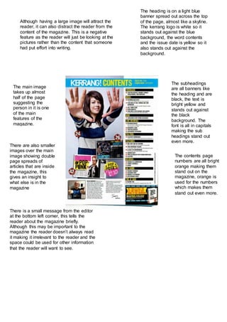
1. The heading is on a light blue
banner spread out across the top
of the page, almost like a skyline.
The kerrang logo is white so it
stands out against the blue
background, the word contents
and the issue date is yellow so it
also stands out against the
background.
The main image
takes up almost
half of the page
suggesting the
person in it is one
of the main
features of the
magazine.
There are also smaller
images over the main
image showing double
page spreads of
articles that are inside
the magazine, this
gives an insight to
what else is in the
magazine
The subheadings
are all banners like
the heading and are
black, the text is
bright yellow and
stands out against
the black
background. The
font is all in capitals
making the sub
headings stand out
even more.
There is a small message from the editor
at the bottom left corner, this tells the
reader about the magazine briefly.
Although this may be important to the
magazine the reader doesn’t always read
it making it irrelevant to the reader and the
space could be used for other information
that the reader will want to see.
Although having a large image will attract the
reader, it can also distract the reader from the
content of the magazine. This is a negative
feature as the reader will just be looking at the
pictures rather than the content that someone
had put effort into writing.
The contents page
numbers are all bright
orange making them
stand out on the
magazine, orange is
used for the numbers
which makes them
stand out even more.