
Recommended
More Related Content
What's hot
What's hot (20)
Similar to Gone Girl website analysis
Similar to Gone Girl website analysis (20)
More from katie1head
More from katie1head (12)
Recently uploaded
Recently uploaded (20)
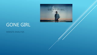
Gone Girl website analysis
- 2. NAVIGATION BAR – Displays click- through that navigate you into different sections of the website. This aids the ease for a user as it’s quick and simple to either find the specific thing you’re looking for or to have browse. This is an element that we definitely need to include on our website. Home page displays the logo of the film, thus allowing quick recognition and also aids the marketing, as audiences will be able to determine the film when they see it. (We definitely will create and include the logo of our film on our website, in aid to create an image of the film that will be widely recognised. The arrow is a click-through that moves on to a series of different flash videos, giving a sense of the film. We would like to use arrows and symbols as different click-through, as it adds a different dimension and more interactive element to the website. The graphology of the logo of a single cloud in the sky, possibly symbolises the sense of mystery and unknown in the film. Thus it gives a sense of the theme whilst also captivating a specific audience that would be interested in that element. The icons in the corner are hyperlinks that lead to the film’s different social media, again as a form of marketing by getting the film out to many different audiences. HOMEPAGE
- 3. The ‘Gone’ page on the website, is as series of flash videos, that show the different stages (i.e. days) that the female protagonist, Amy, was missing for. This aids to give the user a sense of what the film is about, and acts as a different form of a trailer by depicting some of the main events that take place. There is also evidence of the use of a rollover, for when the cursor moves over the ‘headlines’ they enlarge, and also start to move. This gives a more interactive element, thus immersing the audience into the detail of the film. I would like to incorporate a similar element into our website, of having different snippets of a main event in a interactive form. ‘GONE ‘
- 4. The video click through, leads the user to a page of all the different footage of the film that has been released prior to the release of the film. This is in aid of giving the user an idea of what they film is, and is a simplistic form of advertising all on one media platform. I think that we should include this element in our website, as firstly it connects the two mediums of a website and trailer that we are producing, but also is a very popular form of discovering a film. The use of the black background firstly makes the video easier to watch, without any distracting colours. It also symbolises the dark and morbid themes in the film by reflecting death, despair and unknown. The different titles at the bottom, act as a click-through to quickly navigate the user to the different videos available. VIDEOS
- 5. The ‘Synopsis’ page allows the user to read the ‘blurb’ of the film, to determine the themes, characters and plot line. This aids the film to entices a specific audience that would be interested in a film that incorporates elements of neo noir, thriller and horror. I think the synopsis, is a good form of enticing audiences. However I feel the trailer does the same job, thus a trailer is a more contemporary form, so possibly we won’t need to include them both. Moreover, the page also gives the information of the director, screenplay, producers and cast. This is a good motion, for film fanatics. As they may notice particular names, that will draw them into watching the film for that specific person (such as a director or actor). For Gone Girl that names of Ben Affleck (actor) and Reese Witherspoon (producer) potentially will be the marketing in this sector, as they are both globally recognised. SYNOPSIS
- 6. The ‘sign up’ page is a form of marketing by the production/distribution team being able to email customers (users) ‘updates and offers’ regarding the film. I think this a good form of advertising, as it’s very contemporary medium. I also think that we should try and incorporate connecting this form of medium to our film, as it shows a form of marketing and distributing our film to large audiences. Moreover, the option of signing up with email or Facebook, reflects how the film company wish to make it as easy, quick and accessible for the user as possible. SIGN UP
- 7. PURCHASE The image of the DVD cover, again displays the film logo. Therefore it firstly depicts to the customer what the DVD looks like but also portrays the main character (Affleck) thus again attempting to entices those film fanatics that are a fan of the actor. The click through of ‘Now on Blue ray, DVD and digital HD’ acts as a hyperlink to the website, Amazon, where the user can purchase the DVD. Amazon, is a globally recognised and popular website, thus users can trust the site to purchase the DVD. It also aids the ease for the customer of purchasing the product as Amazon is quick and easy to use. The website, Amazon, details the different prices of the DVD. Thus making it clear and concise to the customer of the best possible prices that are available. We probably won’t include this click through as the DVD wont be available to purchase yet. However we potentially could include a ‘pre-order’ section to aid the distribution of our product.