
Recommended
More Related Content
What's hot
What's hot (20)
Viewers also liked
Viewers also liked (11)
Similar to Q1. in what ways does your media product use develop or challenge forms and conventions of real media products?
Similar to Q1. in what ways does your media product use develop or challenge forms and conventions of real media products? (20)
Recently uploaded
Recently uploaded (20)
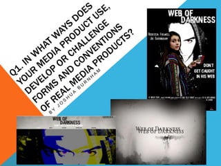
Q1. in what ways does your media product use develop or challenge forms and conventions of real media products?
- 2. MOTION PICTURE POSTER M Y C R E A T E D P R O D U C T A N E X I S T I N G P R O D U C T The actress is shown in a medium long shot, to show what she looks like. The use of extreme font to give the sense of the horror genre as horror fonts tend to stand out Dark colours and low key lighting to show that evil has surrounded the protagonist Actor and actress name Billing block – to give credit to the production team and media companies that helped produce and distribute the film. Release date of the film Media companies idents. Use of extreme font to show the sub- genre/ element of horror Actor and actress name Billing block – to give credit to the production team and media companies that helped produce and distribute the film. Use of dark colours to show that evil is surrounding the protagonist and that the antagonist has dominance over her The actress is shown in a medium long shot, to show what she looks like. Release date of the film Media companies idents.
- 3. STRUCTURE OF THE POSTER & WHAT IS TYPICAL OF ITS ARRANGEMENTS Actor and actress name These are put there because If the audience don’t remember what the actors/tress’ look like, they will be familiar with the name. Tagline This is put here because it is what sticks in the audiences head when they remember a motion picture. Important Characters These are put there so that the audience can recognise the characters (i.e. what they look like and what they wear) and generally in horror it is either/ always the protagonist and the antagonist. Motion Picture Title This is so that the audience can recognise what the motion picture is called when they go to see it and also it is placed in a eye- catching font, this is so again that the audience can recognise the title through visual remembrance and it can also link with the film’s sub-theme. Billing Block This typically placed at there because it is usually the bottom section of the poster where the details and other useful information got to. The purpose of the billing block is ti give credit to the production companies, actors, and other important individuals of the production. Company Idents This is placed in the poster because (like the title font) it gives the audience visual remembrance of the companies that were involved in the production of the motion picture. Release Date This put in the poster because the audience would want to know when the picture debuts in cinemas if they liked movie’s advertisements, and it can also lead to excitement for the films release. Website This placed in the poster because it gives that audience details of where else to go for more content of the motion picture. Colours and lighting Usually horror posters have a mixture of both light and dark colours to illuminate the characters and it is usually covered in black (dark light) because it shows the antagonists dominance over the protagonist.
- 4. OVERVIEW OF THE POSTER With the posters, I wanted to use similar conventions throughout to try and make my product as professional as possible. I wanted my poster to have the horror convention shown clearly and first I wanted to have a good photo that shows my protagonist in a situation, the reason for this is because she is the main character alongside the antagonist and is what my audience will follow with in the film, this also gives a hint of what the plot revolves around with (the mobile phone) as the story is about the dangers of technology and social media and how it shows the antagonist ‘s power of dominance as he is shown in the phone looking at her and behind her . Challenging the convention is difficult because with horror, the poster has to have certain elements that shout horror; such as; low hey lighting as it signals the unknown, more skin (to appeal to the male audience), a distinctive antagonist (one that has a sinister look that I have conveyed by giving him red, bold eyes and the use of the hood and dark colours) and a tagline (to stick into the audience’s head which I have shown by placing it in the middle right of the poster, it related to the media and the internet by making it say “don't get caught in his web”, web meaning the internet). I had my poster include the film’s title as it is the biggest font in the product in distinctive font, this is because I choose it to be pixelated to match with the sub-theme of the film and to make it visual remembered by the audience by the style and presentation that the title is shown in. I also included the release date of the film and the website link, to tell the audience of the motion picture’s debut and where to find more content of the film. I feel that the structure of my poster fits in conventionally as you have the right components of a typical motion picture poster (including the billing block, to give credits to the companies and important people involved in the production and the companies idents, to give visual remembrance to the audience.
- 5. MOTION PICTURE WEBSITE M Y C R E A T E D P R O D U C T A N E X I S T I N G P R O D U C T
- 6. CONVENTIONS OF A HOME PAGE Motion Picture Title and Taglin Usually placed at the top of the website and it is usually the first thing that the audience sees when entering the site. Content’s bar Placed underneath the title, this is because it allows the audience to click on and view the different sections of the website In which they can access for other content (i.e. Downloads and photo gallery). Picture/ Animated image Used to give the audience an uncomfortable feeling, and it is usually used to place them in the protagonists shoes, most main pictures of the website usually have the antagonist. Reviews The most typical part of the website, they act as mini advertisements to the audience by having reviews of the film by major media/ mass media companies such as; newspaper and magazine companies. News and updates Used to keep the audience up-to-date on the events of the film (i.e. premiere, when the different stages of the film (when production is starting) and other important information. Social Media Similar to the news, but is placed there so it allows the film to broaden to a wider range of audiences by having its own social pages, giving the audience content (in terms of cast roles, competitions and links to content (i.e. interviews with the stars and director of the film and clips from the motion picture and behind the scenes. Billing block and Company idents The same with the poster and the trailer, the billing block is consistent throughout because it gives thanks to the companies that helped make the motion picture and sometimes the website. As well as the company idents to give visual remembrance to the audience. Hyperlinks Allows the audience to have the freedom to go to other pages, hyperlinks can be identified by a button, different colour or underlined.
- 7. MY CREATED PRODUCT PAGES/ OVERVIEW OF THE WEBSITE With my created website, I wanted it to look professional and typical of an existing webpage product. I had created the homepage (which tells the audience everything that they can look at on the website (i.e. contents bar) including news about the film, the reviews by top media publishers (to give the audience anticipation because if they’re favourite magazine (e.g. Vogue) left a good rating on the film then they’ll go and see it). Among my website are different pages and contents for my audience to browse because I wanted to have visual content that my audience can look at (and even download). For example; the downloads page (in which I have different posters and screensavers for phones and computers), the downloads page helps to develop the convention of existing webpages because the reason for it is so that my audience can have access to content that they can have and also it acts as an advertisement because if they have it on their phones and they browse through it in public and another member of the public looks at it they will be drawn to the image and research the film (which the posters in turn leave a visual remembrance in the audiences head). Also the different pages give different content and aspects for the film (i.e. “gallery” having film stills, “about” having the synopsis of the film without spoiling it, “trailer” to show the main product of the motion picture and again the downloads page for content that the audience can