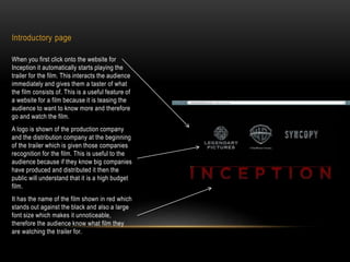
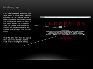
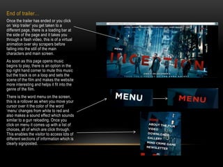
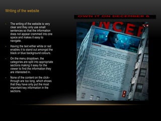
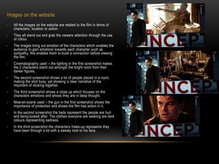
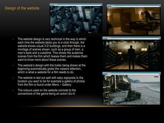
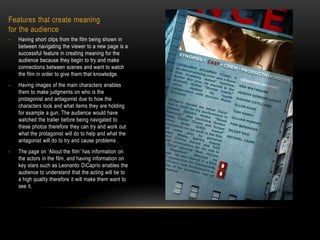
Analysis of the website for Inception (2010)
INCEPTION (2010)
Introductory page
When you first click onto the website for
Inception it automatically starts playing the
trailer for the film. This interacts the audience
immediately and gives them a taster of what
the film consists of. This is a useful feature of
a website for a film because it is teasing the
audience to want to know more and therefore
go and watch the film.
A logo is shown of the production company
and the distribution company at the beginning
of the trailer which is given those companies
recognition for the film. This is useful to the
audience because if they know big companies
have produced and distributed it then the
public will understand that it is a high budget
film.
It has the name of the film shown in red which
stands out against the black and also a large
font size which makes it unnoticeable,
therefore the audience know what film they
are watching the trailer for.
Introductory page
If you scroll down on the introductory page
under the title of the film there is the option
to share or like it on Facebook, which is a
link to social media, this means that those
who are visiting the website can share it to
their friends, who will then be interested,
which then spreads the word of the film,
meaning they will gain more visitors and
therefore more people will come and watch
the film.
Under that is the credit block, this is giving
credit to everyone involved in the film,
which gives those companies publicity.
End of trailer…
Once the trailer has ended or you click
on ‘skip trailer’ you get taken to a
different page, there is a loading bar at
the side of the page and it takes you
through a flash video, this is of a virtual
animation over sky scrapers before
falling into the still of the main
characters and main screen.
As soon as this page opens music
begins to play, there is an option in the
top right hand corner to mute this music
but the track is on a loop and sets the
scene of the film and makes the website
more interesting and helps it fit into the
genre of the film.
There is the word menu on the screen,
this is a rollover as when you move your
cursor over it the color of the word
‘menu’ changes from white to red and
also makes a sound effect which sounds
similar to a gun reloading. Once you
click on menu it comes up with a list of
choices, all of which are click through.
This enables the visitor to access lots of
different sections of information which is
clearly signposted.
Writing of the website
- The writing of the website is very
clear and they only use small
sentences so that the information
does not appear crammed into one
space and makes it easy to
navigate.
- Having the text either white or red
enables it to stand out amongst the
black or blue background colours.
- On the menu dropdown, the
categories are split into appropriate
sections making it easy for the
viewer to find the information they
are interested in.
- None of the content on the click-
through are too long, which shows
that they have only put the most
important key information in the
sections.
Images on the website
- All the images on the website are related to the film in terms of
characters, location or action.
- They all stand out and grab the viewers attention through the use
of colour.
- The images bring out emotion of the characters which enables the
audience to gain emotions towards each character such as
sympathy, this enables them to build a connection before viewing
the film.
- Cinematography used – the lighting in the first screenshot makes
the 2 characters stand out amongst the bright room from their
darker figures.
- The second screenshot shows a lot of people placed in a room,
making the shot busy, yet showing a clear narrative of the
important of sticking together.
- The third screenshot shows a close up which focuses on the
characters emotions and shows they are in deep thought.
- Mise-en-scene used – the gun in the first screenshot shows the
importance of protection and shows the film has action in it.
- In the second screenshot the beds represent the people are hurt
and being looked after. The clothes everyone are wearing are dark
colours representing sadness.
- In the third screenshot the characters make-up represents they
have been through a lot with a sweaty look to his face.
Design of the website
- The website design is very technical in the way in which
each time the website takes you to a click through, the
website shows visual 3-D buildings, and then there is a
montage of scenes shown, such as a group of men, a
man’s back and a coastline. This shows the audience
scenes from the film which teases them and makes them
want to know more about these scenes.
- The website’s design with the trailer being shown at the
beginning automatically grabs the viewers attention,
which is what a website for a film needs to do.
- The website is laid out well with easy signposts to the
location you want to be for example a gallery of photos
from the film is found under Menu – Gallery.
- The colours used on the website connote to the
conventions of the genre being an action Sci-fi.
Features that create meaning
for the audience
- Having short clips from the film being shown in
between navigating the viewer to a new page is a
successful feature in creating meaning for the
audience because they begin to try and make
connections between scenes and want to watch
the film in order to give them that knowledge.
- Having images of the main characters enables
them to make judgments on who is the
protagonist and antagonist due to how the
characters look and what items they are holding
for example a gun. The audience would have
watched the trailer before being navigated to
these photos therefore they can try and work out
what the protagonist will do to help and what the
antagonist will do to try and cause problems .
- The page on ‘About the film’ has information on
the actors in the film, and having information on
key stars such as Leonardo DiCaprio enables the
audience to understand that the acting will be to
a high quality therefore it will make them want to
see it.

Inception analysis

  • 1.
    Analysis of thewebsite for Inception (2010) INCEPTION (2010)
  • 2.
    Introductory page When youfirst click onto the website for Inception it automatically starts playing the trailer for the film. This interacts the audience immediately and gives them a taster of what the film consists of. This is a useful feature of a website for a film because it is teasing the audience to want to know more and therefore go and watch the film. A logo is shown of the production company and the distribution company at the beginning of the trailer which is given those companies recognition for the film. This is useful to the audience because if they know big companies have produced and distributed it then the public will understand that it is a high budget film. It has the name of the film shown in red which stands out against the black and also a large font size which makes it unnoticeable, therefore the audience know what film they are watching the trailer for.
  • 3.
    Introductory page If youscroll down on the introductory page under the title of the film there is the option to share or like it on Facebook, which is a link to social media, this means that those who are visiting the website can share it to their friends, who will then be interested, which then spreads the word of the film, meaning they will gain more visitors and therefore more people will come and watch the film. Under that is the credit block, this is giving credit to everyone involved in the film, which gives those companies publicity.
  • 4.
    End of trailer… Oncethe trailer has ended or you click on ‘skip trailer’ you get taken to a different page, there is a loading bar at the side of the page and it takes you through a flash video, this is of a virtual animation over sky scrapers before falling into the still of the main characters and main screen. As soon as this page opens music begins to play, there is an option in the top right hand corner to mute this music but the track is on a loop and sets the scene of the film and makes the website more interesting and helps it fit into the genre of the film. There is the word menu on the screen, this is a rollover as when you move your cursor over it the color of the word ‘menu’ changes from white to red and also makes a sound effect which sounds similar to a gun reloading. Once you click on menu it comes up with a list of choices, all of which are click through. This enables the visitor to access lots of different sections of information which is clearly signposted.
  • 5.
    Writing of thewebsite - The writing of the website is very clear and they only use small sentences so that the information does not appear crammed into one space and makes it easy to navigate. - Having the text either white or red enables it to stand out amongst the black or blue background colours. - On the menu dropdown, the categories are split into appropriate sections making it easy for the viewer to find the information they are interested in. - None of the content on the click- through are too long, which shows that they have only put the most important key information in the sections.
  • 6.
    Images on thewebsite - All the images on the website are related to the film in terms of characters, location or action. - They all stand out and grab the viewers attention through the use of colour. - The images bring out emotion of the characters which enables the audience to gain emotions towards each character such as sympathy, this enables them to build a connection before viewing the film. - Cinematography used – the lighting in the first screenshot makes the 2 characters stand out amongst the bright room from their darker figures. - The second screenshot shows a lot of people placed in a room, making the shot busy, yet showing a clear narrative of the important of sticking together. - The third screenshot shows a close up which focuses on the characters emotions and shows they are in deep thought. - Mise-en-scene used – the gun in the first screenshot shows the importance of protection and shows the film has action in it. - In the second screenshot the beds represent the people are hurt and being looked after. The clothes everyone are wearing are dark colours representing sadness. - In the third screenshot the characters make-up represents they have been through a lot with a sweaty look to his face.
  • 7.
    Design of thewebsite - The website design is very technical in the way in which each time the website takes you to a click through, the website shows visual 3-D buildings, and then there is a montage of scenes shown, such as a group of men, a man’s back and a coastline. This shows the audience scenes from the film which teases them and makes them want to know more about these scenes. - The website’s design with the trailer being shown at the beginning automatically grabs the viewers attention, which is what a website for a film needs to do. - The website is laid out well with easy signposts to the location you want to be for example a gallery of photos from the film is found under Menu – Gallery. - The colours used on the website connote to the conventions of the genre being an action Sci-fi.
  • 8.
    Features that createmeaning for the audience - Having short clips from the film being shown in between navigating the viewer to a new page is a successful feature in creating meaning for the audience because they begin to try and make connections between scenes and want to watch the film in order to give them that knowledge. - Having images of the main characters enables them to make judgments on who is the protagonist and antagonist due to how the characters look and what items they are holding for example a gun. The audience would have watched the trailer before being navigated to these photos therefore they can try and work out what the protagonist will do to help and what the antagonist will do to try and cause problems . - The page on ‘About the film’ has information on the actors in the film, and having information on key stars such as Leonardo DiCaprio enables the audience to understand that the acting will be to a high quality therefore it will make them want to see it.