
Recommended
More Related Content
What's hot
What's hot (20)
Viewers also liked
Viewers also liked (20)
Similar to Audience Feedback Insights
Similar to Audience Feedback Insights (20)
Recently uploaded
Recently uploaded (20)
Audience Feedback Insights
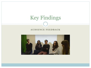
- 1. A U D I E N C E F E E D B A C K Key Findings
- 2. F E E D B A C K Teaser Trailer
- 3. What type of product do you think this is and how is its purpose communicated? Each audience member successfully identified this product to be a “teaser trailer”. “Build up of cut scenes”, reveals the audience understanding of the conventional nature of the trailer’s structure. “Social media links gives away that it’s part of a trailer”, reveals an audience understanding of a highly conventional aspect of a teaser trailer; conveying the success in conforming to convections in order to present a recognisable product, in correlation to already established ones. “The use of titles, making it professional”, the effects used convinced the audience of the trailers quality, revealing its increased chances of competing with other teaser trailers within the film market.
- 4. Can you identify the genre of this media product, if so how did you make this decision? Each audience member correctly unidentified the genre as horror. The “quick jumps between each scene” were regarded as “effective” in “building tension”. Revealing a successful build in audience anticipation. One stated the genre to belong to “Horror, bordering on psychological thriller”, this conveys the successful identification of one of our piece’s sub genres. “Gets in your head, you don’t know who’s doing scary things to the character”, revealing the audience to have been successfully intrigued and unnerved.
- 5. Do you think we have followed conventions of this media product effectively and why? Conventional because, “Not a lot of information is revealed”, however “gives you enough to be interested in watching the film”, successfully intrigued the viewer. “You don’t know which way the story’s going”, recognition of mystery and enigma codes; compelling a sense of curiosity to linger upon viewing.
- 6. When viewing the product, which emotions did it evoke within you? “Scared, fear of the unknown”, effectively incited negative emotions into the audience; conventional of horror genre. “Fear bordering on panic... [prompted by] the spikes in audio“, successful build of tension and audience anticipation regarding oncoming content. “Scared, on edge“, successful build of tension. “Tense, build of mystery, scared” Evoked “fear, became jumpy due to the music”. Successful correlation between the rise in sound and growing anticipation of events.
- 7. Did you find any aspects of the product appealing? “Liked the mystery... didn't know what was going to happen next, especially at the beginning when you don’t know what the message on the ground means”, successfully intrigued viewer, application of enigma codes (captured viewer's curiosity). “The music, contributed to the eeriness”, effective use of sound. “Expected someone to jump out of the darkness” reveals audience anticipation. I liked the scene were she found the email and then suddenly something happens (jump scared) “I liked the last scene, with the mysterious and gruesome message”, appeal of challenging mise en scene; successful explorer appeal. “I liked the jump scares”, taken in by the creepy content, found appeal in being frightened.
- 8. Was the presented narrative easy to follow? If so, how was this accomplished? “Build up of tension throughout the trailer”. “A sense of what was... going to happen was clear”. “The build up of events made the piece easy to follow”, successful identification of content chronology. “There remained a certain chronology making the narrative easy to follow”, but gaps were effectively formed, “leaving out information”, arousing audience curiosity.
- 9. Are there any aspects of the piece which you think could be improved? “Some of the jump-scares may have been slightly amusing”, not all elements, designed to scare, had their desired effect. “Could have applied more intense sound to add to the tension”, perhaps the excitement of the final scenes, could have been emphasised further with a greater build in the layers of sound. “Improved focus of camera, shot like the email scene”, the filming of a computer screen reacted with the camera, resulting in a somewhat unfocused shot.
- 10. How would you rate the application of the following technical aspects: (out of ten) -Editing -Sound “Editing and sound 8 out of 10... Editing good”, however varied in pace. “Editing and sound, 8 out of 10, effective where it coincided with the feather falling out of the sky”. “Sound and editing 7 our of 10... Editing good, very sudden... left you on edge, but sound could have been improved”, sound could have been more effectively utilised. “Sound and editing 8 out of 10.” “Sound and editing 7 out of 10.” The sound intensified the jump-scares
- 11. How do you think the main character has been presented, and is this relatable to you? “The use of social media [popular products]... like an iphone”. “Going to a park at night is not a safe thing to do” and “isn’t very relatable to how I would act”, some confusion regarding the logic of the protagonist's actions, some failure to correspond her actions with her confused and fearful state in the narrative. “Trendy clothes... experimenting with her looks”. “Student, so a similar age to us”, successful identification of similar character age.
- 12. F E E D B A C K Film Poster and Magazine Front Cover
- 13. Film Poster- Do you think the visual advertisements capture effectively our narrative? “Typical of the horror genre, colour red”, successful identification/association of a conventionally horror colour. The messages, scarred into the skin, effectively scary. “Scarring, directly links in with the end of the teaser trailer”. Scarring is important and “effective with the dark colours”.
- 14. Film Poster- When viewing each promotive product are there any strengths and weaknesses that you can identify? “Relates to the film with the scarring... a compelling poster.” “Dark colours”, emphasised eeriness, “contrast” with the bright red. “Scarring links to the teaser”, effective utilisation of imagery to link the poster with the teaser trailer (reflection of content between the products).
- 15. Magazine Front Cover- Do you think the visual advertisements capture effectively our narrative? “Links with the trailer... blood and scarring reflects the final scene, makes it more interesting.” “Features ‘It’s You’ message, links into the message at the end of the trailer”, successful identification of the revealed significance of the antagonistic messages within the film.
- 16. Magazine Front Cover- “Compelling”, “bold titles, effective layout”, “threat attracts my attention” “Appealing”, “image front and centre”, “large”, not too crowded with text Image contrasts with the dark background
- 17. All Products- Does each promotive product convey a synergistic link, if so how? “All link together”, “main character always featured” as the “main focus” in each piece. The “scarred messages are repeated” throughout each piece. All “feature the scarring and the blood”, a continuous aesthetic throughout.