![Survey 1- The Grudge
Key Points of Appeal:
- Text- “Vibrant” text that conveys a sense of
“abruptness and action”- “making it exciting”
- Image- The simplicity of the image makes “the eye
[of focus] feel more intense and piercing”.
- Composition- The title ‘The Grudge’ is in line with
the antagonist’s eye, forming a connection between
their intense and gaze and the narrative title.
- Incites a feeling of: “shock, fright a feeling of being
watched”, “a sense of unease and intimidation”-
reflective of the intention of the horror genre.
- “disturbing, scared but want to know more” and
“foreboding, chilling, fearful but interested in what
is happening”- conveys that the viewers’ interest
has been sparked.
- House Style- “It’s dark and ominous making for a
thrilling poster”](data:image/gif;base64,R0lGODlhAQABAIAAAAAAAP///yH5BAEAAAAALAAAAAABAAEAAAIBRAA7)
Recommended
More Related Content
What's hot
What's hot (20)
Viewers also liked
Viewers also liked (20)
Similar to Survey Key Findings- Film Poster
Similar to Survey Key Findings- Film Poster (20)
Recently uploaded
Recently uploaded (20)
Survey Key Findings- Film Poster
- 1. T A R G E T A U D I E N C E A P P E A L Survey Key Findings
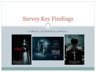
- 2. Survey 1- The Grudge Key Points of Appeal: - Text- “Vibrant” text that conveys a sense of “abruptness and action”- “making it exciting” - Image- The simplicity of the image makes “the eye [of focus] feel more intense and piercing”. - Composition- The title ‘The Grudge’ is in line with the antagonist’s eye, forming a connection between their intense and gaze and the narrative title. - Incites a feeling of: “shock, fright a feeling of being watched”, “a sense of unease and intimidation”- reflective of the intention of the horror genre. - “disturbing, scared but want to know more” and “foreboding, chilling, fearful but interested in what is happening”- conveys that the viewers’ interest has been sparked. - House Style- “It’s dark and ominous making for a thrilling poster”
- 3. Survey 1- The Grudge Specified Weaknesses: - Composition- “The top left seems very empty and almost like wasted space, maybe another image or text would help” – Conveys the need to ensure that all space is utilised and reveals the limitations of a simplistic design in creating visual appeal.
- 4. Survey 2- The Woman In Black: Angel of Darkness Key Point of Appeal: - Text- “it’s use of capital letters” seems to form excitement as it “suggest[s that] the film may have quick, heart-racing moments.”- creates the desired effect of the horror genre; to excite the viewer through fear. - Text- “It’s tall stature makes for a rather imposing font”. - Image- “the ominous black-hooded figure”- “makes the viewer seem vulnerable and defenceless”- mysterious and convinced by the eerie representation made. - Key point of focus “the figure in the doorway as their face is obscured”- mystery and enigma draws in the viewer and incites intrigue. - “the two opposing figures in a dark dingy place”- effectiveness formed through the contrast of the two characters. - Incites a feeling of: “mystery, intensity, intrigue, loneliness, stress, isolation”, also makes viewer “curious of the protagonist’s fate”.
- 5. Survey 2- The Woman In Black: Angel of Darkness Specified Weaknesses: - “Other hints as to what might happen next”- This received little criticism, however, this wish for more narrative hints suggests that the meanings within the piece are to entirely clear.
- 6. Survey 3- Insidious Text- the “unusual orientation [of the film title] makes me pay more attention to it”, however, “more attention [required] to work out what it says”, confusing the viewer as they “don’t know” whether it’s “appealing” or “irritating”.- This reveals the danger of challenging text conventions. Text- “Interesting choice of font and colouring”. Image- “Strong contrast between the dark [of the] boy’s face and front, against his bright shoulders... Making it feel almost unnatural which, in turn, makes it unnerving”. This reveals the effectiveness of contrasting light in creating for an intriguing visual aesthetic. Incites a feeling of: “unease, awkward, intrigue”- reveals that the viewer’s interest, regarding the film, has been sparked.
- 7. Survey 3- Insidious Specified Weaknesses: - ”Maybe some sort of tag-line”- despite being existent within the poster, the viewer did not see it; suggesting the text to have been too small and easily passed by. - ”The house is too bright and the sky could’ve been used to better effect”- this criticism reveals that some viewer’s weren't to satisfied with the application of different lighting and filter effects.
- 8. Conclusion Overall, this task has been useful in revealing the key points of appeal within a film poster. These being: “vibrant” colours, good use of space, “mysterious” imagery, “ strong contrast[ing]” colours and powerful font. Throughout each response these elements seemed to be key in intriguing and sparking interest amongst the audience, in which, if not conformed to, the lacking presence of these featured seemed to pose as a poster- weakness in the audience's eyes. Thus, when creating my own piece I shall attempt to address each one of these specifications, in order to create for a visually engaging and intriguing piece.
- 9. Conclusion This task has also revealed to me the methods in which these posters have been able to conform to the horror genre. This can be identified through the frequent comments regarding the “fear”, “shock”, paranoia and “unease” that these posters have been described to incite. These fearful reactions conform to the intent of the horror genre, this being to incite fear into the viewer in order to create excitement. Thus, the success of these posters in gaining such a reaction has, in turn, conveyed to me the techniques that my own piece could incorporate in order to also achieve this desired horror effect. These being: “dark colours”, a sharp contrast of colour, making for an “unnatural” and “unnerving” atmosphere, a presence that either arouses paranoia or sympathy for a character in response to the feeling of a foreboding threat. Thus, this research has also been effective in outlining some of the features that my poster should include in order to unnerve my audience members and thus conform to my film’s horror genre.