
Recommended
More Related Content
What's hot
What's hot (20)
Viewers also liked
Viewers also liked (20)
Similar to Film Poster Sketch Idea Evaluation
Similar to Film Poster Sketch Idea Evaluation (20)
Recently uploaded
Recently uploaded (20)
Film Poster Sketch Idea Evaluation
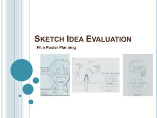
- 1. SKETCH IDEA EVALUATION Film Poster Planning
- 2. Idea 1 Composition The layout uses the rule of thirds, in which the page is split into a grid and the leading details of the piece are placed within the central grid area. This is effective in directing the viewers attention to the central image and to the film’s title, these being the leading areas of importance within the piece. Central Image The placement of the central image draws inspiration from ‘The grudge film poster , and presents an effective Medium close up shot of the film’s leading protagonist. The character’s fearful expression is effective in conveying the vulnerability of the protagonist and the surrounding emptiness f the background (of which shall be coloured in a solid black), is effective in emphasising the isolated state of this character as well as foreshadowing the demise at the hands of the antagonist. The bloodied wrist, in which the message ‘It's you’ can be read, reflects the concluding scene within my teaser trailer, thus forming synergy between the two products. The appearance of the bloodied message is also effective in signalling the form of the antagonist (this being sinister messages) as well as conveys the strong theme of threat and danger within the film; conveyed through the portrayal of a rather sinister injury. Text The title of the film is important in informing the audience of the name that they should associate with the film. Above this title is the name of the leading actor, useful in corresponding with the central focus of the image. Within the lower left corner of the piece, the presence of the tagline “Her future is written in blood” is effective in teasing the audience and producing informative hints regarding the narrative. The word “future” suggests that something of significance shall await this character, in which through the word “blood”, possessing dark connotations of violence and danger, it can be inferred that this “future” shall likely be a dark and unwelcomed one. The piece also includes the film’s release date, allowing audience’s to anticipate the films upcoming release and a social media link (allowing the audience to interact with further promotive additions to the film. The billing block shall be used to credit the leading creators and actors within the film.
- 3. EVALUATION Strengths -The piece includes conventional text elements of which are frequently applied within film posters; thus forming a media text that is identifiable as a film poster. -The tag-line is effective in foreshadowing both the dark themes within the narrative, as well as hinting towards the form that the antagonist will take (these being darkly “written” messages). -The use of the rule of thirds has resulted in a good balance of poster content throughout the composition of the piece, as each gird area shall be filled. Allowing for no areas to feel incomplete. -The use of a medium close up is effective in creating a visual impact as the character appear close to the viewer, effective in inciting a sense of unease within the audience as the protagonist’s terrified expression suggests that danger is near (effective in hinting towards the dark and eerie intent of the antagonist). -The text ‘It’s You’ upon the protagonist's forearm links directly to the concluding frame within the film’s teaser trailer (creating synergy between the products).
- 4. EVALUATION Weaknesses -The margins of this design lack consistency, and will thus need to be lined up correctly regarding each element of text if this is to be the final design choice. -A large proportion of this design shall consist of a solid black background, thus making the piece seem slightly empty in places.
- 5. Idea 2Composition The layout has taken inspiration from ‘The Woman In Black: Angel of Death’ poster in which the piece adopts a less frequently used landscape orientation; effective in providing a composition that is somewhat new and fresh for viewers. Central Image The central image features the protagonist in this characters acts as the leading focal point of the piece. This central position is effective in conveying their importance to the narrative and their lone presence is also effective in conveying their isolated and vulnerable state. The use of wide shot is effective in making the protagonist seem rather small in which this is effective in conveying their lacking strength in the face of the film’s antagonist. This antagonistic presence has been conveyed through a range of sinister texts written upon the walls of Eve’s home, and the presence of these scrawling's throughout the composition is effective in connoting a sense of restless energy as well the dominance of the dark presence within the film. The frightened expression of the protagonist is effective in conveying their vulnerable state in which by placing their hands upon their face, this is effective in conveying the pain that the antagonist inflicts upon the character's mind (reflective of their intent to torment the protagonist). Text Similar to ideas 1 and 3, this piece includes the film title (allowing the audience to associate the film with a name), social media links (allowing audiences to interact more deeply with media texts promoting the film’s release), release date (allowing audience’s to anticipate the film’s oncoming release), billing block (crediting leading creators and actors) and the tag-line “Her future is written in blood” (the effects of which are stated in idea 1). In addition to this, this design also includes the production logo and name of our group, effective in providing further credit for the creators of the piece. Also, within the central image, further pieces of text include a range of messages written upon a wall, this is effective in conveying the form that the antagonistic presence within the film shall take. The sinister style of these messages is effective in conveying their dark intent towards the protagonist. The language used within these messages includes declaratives, such as “They’re Near” and imperatives, such as “Look up”. The simplicity of these phrases is effective in inciting a sense of enigma into the piece and the intent of the messages is uncertain. The use of declaratives is effective in conveying a rather cold atmosphere in which the words are void of opinion and thus lack a sense of warmth or humanity. The use of imperatives are effective in exerting a sense of authority in which the dominance of the antagonist is conveyed through their issuing of orders for the protagonist to follow.
- 6. EVALUATION Strengths -The piece includes conventional text elements of which are frequently applied within film posters; thus forming a media text that is identifiable as a film poster. -The tag-line is effective in foreshadowing both the dark themes within the narrative, as well as hinting towards the form that the antagonist will take (these being darkly “written” messages). -The use of a wide shot effectively emphasises the dominance of the antagonistic presence over the vulnerable protagonist ; effectively foreshadowing the protagonist's dark and unfortunate end.
- 7. EVALUATION Weaknesses -The composition of the piece lacks balance in which some areas of the piece appear rather empty and lacking a purpose within the poster (i.e. The upper right corner, of which is void of content). -The central image, although effective in presenting the protagonist as small and vulnerable, lacks impact , in which the wide shot instead conveys a sense of emptiness, slightly decreasing the overall excitement of the piece; in which the terrified expression of the protagonist lacks impact as the viewer seems to be at a rather safe distance away from the dark happenings within the piece.
- 8. Idea 3 Composition This layout uses the rule of thirds, in which this piece is split into a grid and each area filled evenly with content. This is effective in creating for a poster in which the visuals are equally distributed throughout the piece, effective in establishing a satisfying balance of components within the poster. Regarding the placement of each element this has taken inspiration from the film poster for ‘Insidious’. Central Image The central image of this piece features the leading protagonist of the film, in which their lone presence conveys their significance to the narrative as well as conveys a sense of loneliness (connotative to the isolation that this character succumbs to after falling prey to the antagonist). Regarding the character's facial expression this conveys a concerned demeanour in which the character's direct gaze is effective in riling a sense of sympathy within the audience in response, emphasised by the character’s injured cheek. Regarding this injury this takes the form of the message ‘They're Near’;, of which the message is effective in inciting a sense of eeriness within the piece as this suggests that the protagonist is not truly alone. Regarding the rather hostile expression of the protagonist, this is effective in conveying the paranoia that sets within this character as they begin to fall victim to the word of the antagonist. Text This design also conforms to the conventions specified within ideas 1 and 2. Regarding text unique to this design, this includes the engraving of ‘They’re Near’ upon the cheek of the protagonist. This use of a declarative is effective in conveying a rather cold and emotionless phrase, in which the words convey a factual tone, void of expression. This is effective in conveying a sense of eeriness, in which the words used lack any sense of human opinion or warmth. This cold tone is effective in reflecting the dark will of the antagonistic messages, of which the danger this presence is conveyed through the bloodied form in which this text has been presented (in which blood possess rather negative connotations of violence, threat and pain; foreshadowing the protagonist’s fate).
- 9. EVALUATION Strengths -The piece includes conventional text elements of which are frequently applied within film posters; thus forming a media text that is identifiable as a film poster. -The central, rue of thirds layout is effective in providing a sense of equilibrium upon the page in which each area of space has been used equally; allowing for no unsatisfying areas of emptiness. -The tag-line is effective in foreshadowing both the dark themes within the narrative, as well as hinting towards the form that the antagonist will take (these being darkly “written” messages). -The focal point upon the protagonist, directly corresponds with the film title (this being the character's name) and conveys the significance of this character within the film’s narrative.
- 10. EVALUATION Weaknesses -The hostile expression of the protagonist, although effective in conveying their distrust/paranoia towards others, presents that character as misleadingly strong, in which their true vulnerability as a character lacks a coherent portrayal. -The message ‘They’re Near’ was not featured as a blood wound within the film’s teaser trailer but was instead written in blood upon paper, thus presenting a lacking consistency in reflecting the content of the film’s other promotive products.
- 11. IN CONCLUSION Within each design idea conventional text elements have be used, in which the creators/actors are credited, the film release date is granted, the title of the film is present, social media links granted and a tag line; providing a teasing hint towards the narrative's dark end and the form of the antagonistic presence within the piece has successfully been portrayed. However, regarding my choice of the most effective poster I believe this to be idea 1. This is because idea 1 possesses a strong composition, in which the rule of thirds has been conformed to in order to allow each action of the piece to be dominated with some form of poster significant content. Also the central image is the most impactful of the three, in which the medium close up is effective in inciting a sense of unease within the viewer as they are brought into close proximity of the danger of which the protagonist evidently fears. When re-creating his design however, I shall need to made sure that the margins, in which the text is placed are maintained with consistency (presenting a slight change that should be made to the design). Regarding the reasons as to why 2 and 3 were not chosen. The composition of 2 seems to be the most weak in which the landscape format resulted in a large amount of unused space resulting in a poster that appeared incomplete. Regarding idea 3, although the composition was effectively distributed with balance of the rather hostile expression of the protagonist made for a rather misleading representation of this character, in which they could be mistaken as the film’s antagonist rather than simply distrusting and paranoid (as was the intent). Thus, for these reasons idea 1 shall be the design that my horror film poster is based upon.