
Recommended
More Related Content
What's hot
What's hot (18)
Viewers also liked
Similar to Preliminary task and planning & research
Similar to Preliminary task and planning & research (20)
More from judemunday_3092
More from judemunday_3092 (6)
Recently uploaded
Recently uploaded (20)
Preliminary task and planning & research
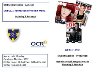
- 1. OCR Media Studies – AS Level Unit G321: Foundation Portfolio in Media Planning & Research Name: Jude Munday Candidate Number: 3092 Center Name: St. Andrew’s Catholic School Center Number: 64135 Set Brief - Print Music Magazine – Production Preliminary Task Progression and Planning & Research
- 2. Section 1) – Preliminary Task
- 3. Preliminary Task Progression– Evidence Front Cover. Step-by-step
- 4. In the first lesson on this task, I created the basic background of the page. This consists of my school logo, and then the page design which Is the two yellow lines as shown. The lines carry on out of the logo to make the page interesting, and keeps the house style consistent. To create them I used the rectangle tool and drew a the right size, the using “cmd +” to zoom in a made sure they were the perfect size to the proportions of the logo. To color the lines, I used the idropper tool to select the exact same color as the yellow on the logo, and then used the paint bucket tool clicking on the line. Additionally I created a barcode box which contains the contents of the bar code and social media logos. To do this I had to again use the rectangle tool to create the box and colored it white using the paint bucket tool. Next I found suitable logos and a image of a bar code on the internet and saved them on to my desk top then dragged them to the page. To remove the white back all I had to use was the magic wand tool, and select the white areas to remove. I made sure all the logos were the same size by again zooming in and looking closely at the details of the pixels. When re sizing the images and shapes I selected them with “cmd T” and held shift key so that they would’t become distorted. Step 1
- 5. Step 2 Secondly, I then focused on my main image, masthead, strap line, puff promotion (which I will cover on another slide) and the addition of 2 more yellow lines. To get my perfect masthead font style I went to dafont.com and browsed for the correct font. Once coming across my chosen font I saved and downloaded it. After typing In the text that I wanted ‘”ENRICHMENT” I dragged it to the page. I then resized the image so that it was lager and bold (which I later decided to make even larger), after this I used the paint bucket tool and I dropper to color the image to suit the house style (the color change being exhibited on the next slide). To type the strap line all I had to do was use the text tool, clicking where I wanted to type and wrote the strap line. Moving down the page I then again used the rectangle tool to create the further two yellow lines which will later support the cover story's, and colored them again according to the house style. As for the main image I took of one of my peers, after dragging it from my files to the page and re sizing it (which I also later changed to be larger) by using “cmd t” and holding shift which is crucial for the image not to be distorted. I removed the white back ground which to do I used the quick selection tool to select the image, I then went into quick mast mode to the brush tool. Post to this I used the phrase “white reveals black conceals” to make an accurate selection. Lastly I went to select, inverse and deselected it. Finally I also added the pricing, issue number and date to the bar code box, which was simply done like the strap line with the text tool.
- 6. Step 3 Here I re-looked at my puff promotion and decided that the yellow box was bleak and didn’t offer vibrancy to the page. Therefore considering this and the style of the magazine being to do with education, I chose to use a book as the back ground. This depicts the conventions of education and makes the magazine look fun. For the text “WIN A FREE LUNCH PASS” I went again and selected a font from da font, saving and pasting it onto the page, then after re sizing the text, I selected them again and pressed “cmd T” and then held the “cmd” key when clicking on the corners of the image so that I could use free transform so that the text looks like it belongs to the pages of the book. Furthermore, I also decided that the previous strap line didn't’t add enough variety to the page so I chose a more interesting font from da font, and followed the usual processes of saving and dragging it, then resizing it, holding shift. In conclusion for this step I added the back ground, which I took from the st-andrews catholic school website, and screen shot a perfect piece of the back ground to my desk top then dragged to to the Photoshop.
- 7. Step 4 For this step we need to first look at the cover storys. I simply used the text tool to type them. After this I chose the color for the text to be the same consistent yellow by using the swatches and the recent colors. To conclude I also added the effects by double clicking on each layer for each cover story and added “outer glow”, “inner glow”, “bevel and emboss”, “satin” and “stroke” to really make them stand out. For the information of the cover story's I just used a less extravagant style and went with a normal solid black text from the text tool. Some areas on the page need to be more monotone so that the other areas stand out more that are more important. Following this I again went to the st-andrews catholic school website, and copied an image that for the ”ace” logo, saving and dragging it to the page. It didn't’t have a back ground to remove and only needed simple resizing of “cmd shift” and holding shift. The text “an ace in every issue” I got from the text tool, and from the swatches chose colors chose the yellow house style. I then interestingly selected the simple curve effect so that the font bent around the ace logo. After this I decided to make the main image and the masthead larger so that they made more of a recognizable impact to the page. For a similar reason I put a yellow glow on to the puff promotion. To do this I added the following effects, outer glow, inner glow, bevel and emboss and satin. On the outer glow effect I changed the color to be the same color as the yellow house style saved in the swatches.
- 8. Step 5 For the final step I made the last quality control corrections, for example I made simple tweaks such as putting a black outer glow effect effect on the “AN ACE IN EVERY ISSUE” text. Also I put put the bevel and emboss effect to the barcode box, school logo and Ofsted logo (which I will later cover the creation of) to add depth to the page. Additionally I also added the all important cover story (the pull quote from Shaune Hazlehurst). I collected the font from the website da font, after saving the text and then taking a screen shot and dragging it to my front cover, I used the magic wand tool to remove the background. I then changed the color of the text to be the same navy/purple as the school logo using the paint brush tool and eye dropper to get the exact same color. All that was then left to do was to apply the following effects, outer glow (which I made white in color so that the text would stand out against the background) inner glow, bevel and emboss, satin and stroke. Finally to fill space, on the left hand side of the stage where there was a lot of empty space I decided to add a filler, this was the Ofsted stamp, with 5 stars. To do this I saved an image of the Ofsted logo and a gold star found through google images. I then went to the tool, selecting the rectangle tool and drew a box to be the background of the Ofsted stamp. After this I went to the eye dropper tool to select the exact same navy as on the st Andrews logo, and used the paint bucket to change the apply this color to the rectangle. Following this I paste one of the Ofsted logos and the gold star 5 times. I had to use “cmd +” to zoom in on my word and also utilized the “cmd ;” option so that I could use margins to ensure that all of the stars were of equal distance , look inline and not look out of place. So that the house style is consistent, using the swatches and paint bucket I decided to change the color of the stars to the same yellow found all over the page.
- 9. Preliminary Task Progression– Evidence Contents Page Step-by-step
- 10. Step 1 To start the creation of my contents page, I began with the creation of my mast head, choosing the same font as on my front cover, I typed what I had planned with my text tool and chose the appropriate font size. Furthermore, to add to the mast head I saved an image of a star from google images, and pasted it ono the document above the letter “A”. After this I used the swatches tool to get the exact same yellow color as found on my front cover and used the paint bucket tool to change the color of the masthead and star. After this I copied the logo from my front cover and paste it in the same corner, and also copied over the yellow line that underlines the mast head. Post to this, I created a new yellow line at the side of the page, instead of coming out of the logo as on the front cover to give me more space for contents. To do this I used the shape tool, and then used the paint bucket coloring with the same yellow. Finally for the creation of my subheading “contents”, I went the the website “da font” and looked for a appropriate font. I noticed the traveling type writer font which I thought had connotations of looking hand drawn/ typed, therefore giving it a feel that it had been created inside of a school, which is appropriate to the magazine style. After saving the font style I went to Photoshop where I selected the text tool and simply typed “contents” where I thought the subheading was appropriate.
- 11. Step 2 For the second step, I added in four more yellow lines, one to underline the sub heading “contents” the second to plot where my images will be placed, third to section off the editorial and final to underline the subheading “editorial”. To do this I simply copied the line already created for the left hand border and shortened it to the appropriate width with “cmd” “t”. Secondly focusing on the editorial, I dragged the image off my desk top and re sized it with “cmd” “t” so that it wouldn’t get distorted in the process, I then used the shape tool to draw a box for the writing to be held. After this I used the pen tool to wrap the text around the drop capital “H” also created using the pen tool. This was also assisted with the use of bleed lines to ensure that the text was wrapped in perfect straight lines. Finally the finishing touches consist of, adding the subheading typing in the consistent font of “travelling typewriter”, also adding in a twitter logo found off the internet, deleting the white background with the magic wand.
- 12. Step 3 After the second step I needed to flesh out my page by adding in the other images, dragging them from my desk top and resizing them with “cmd” “T” and I ensured that they were equidistant to make the page look neat. After this I used the shape tool again to draw two more shapes, filling them with the back ground from my front cover a ocean blue gradient on the shape on the left hand side. The shape created at the top right, I used a tab bar option so that the majority of the shape was hollow so that I could add an image and the other part had a small tab filled with solid dark blue. To make the shaped stand out I put a black stroke effect with a width size of 3px, I did this for the editorial box and also the contents box on the left and then for the box with the tab, changed the color of the stroke to the same dark blue used in the tab.
- 13. Step 4 Final step. This the stage where I added in the contents, with page numbers and also other small details to conclude. For example the page number in the bottom right corner of the page, typed using the travelling type writer font to keep consistency. Furthermore
- 14. Section 2) – Log Book
- 15. Music Magazine – Genre research Hip Hop originated from the Bronx in New York City in the 70s. It is the best selling genre for teen male teens in many states across America. In 2012 the music industry made 50 billion dollars, 15 billion in the USA alone “Mojo is now the biggest rock music magazine in the UK”-- https://www.greatmagazines. co.uk Graph highlights the popularity magazines as a part of the music industry. Concludes that magazines are the second most influential media form. http://canadianmags.blogspot.c o.uk/2012_03_01_archive.html -The Guardian 2006 ranking all music magazines in the UK on popularity. https://www.theguardian.com/medi a/2006/aug/17/pressandpublishing.c irculationfigures4 Q Magazine exclusives Q magazine is the UK’s biggest selling music magazine and the world’s best music guide. Q is available as a print or digital magazine. https:/ www.greatmagazines.co.uk/music- magazines?gclid=CO7HyZK1o9ICFQoB0wo dNWEDsA
- 16. Established Magazine for my Research Main image indirect stare, works well with house style of wonky/distorted text. Furthermore, the use of a full body shot is interesting as it allows the star to highlight his clothing, as Kanye is an inspirational character in the clothing and fashion industry Main Headline “Kanye” written boldly half way across the image of Kanye West. This will catch peoples eyes and encourage Kanyes fans to purchase the magazine (this is called “star appeal” by Richard Dyer). Even if people don’t recognize the artist at first then his name written in bold certainly will. Cover stories These are large and bold, so fans of the other artists being covered will notice them and be encouraged to purchase. This is a use of star appeal, and the fans of these artists will want to buy the magazine because they feel it is to do with the artist and perhaps they are interested or want to support them. More so, it also connotes the individual that there is lots of varied content in the magazine not just the main story we initially see. Strapline The use of white writing on a black background is interesting as it makes the text really stand out from the magazine, illustrating its importance. We know they have done this so that the strapline isn't lost within the cover, and can tell this because there is no other text in this stile on the hole page. Puff promotion The give away of a free CD encourages people to by the magazine, because of the exclusiveness, and the personal value that they know they wont be able to get the prize anywhere else. Also it makes the individual feel that the magazine is worth the price it is ranged at by adding extra content they wouldn't’t expect to get when buying an ordinary magazine. MastHead This magazine has a unique masthead, being just a singular letter “Q”, It is therefore punchy and easy to remember. The colour scheme is also based on Barbra Kugers propaganda, being a distinctive red back ground to compliment the striking white letter. This really catches the eye with the color red connoting alert, there fore is identifiable and pops out from the page.
- 17. Target Audience – Katz, Maslow, Hartley and/or socio-economic needs. The magazine informs (Kats- inform and educate) people on important events that Kanye has been involved in such as recent performances, or new tracks he has made him self or featured in. It also informs us in a similar way with the artists on the cover story's, for example “back stage, with Blur”. The magazine is targeted at people who are from E to roughly C1 on the socio-economic ladder. This means that the main target audience is people of lower class. This is because the issues that are covered within the magazine are about issues which people with a higher class are less likely to be interested in such as what Kanye has been doing recently. The magazine is also aimed at a Male audience due to the feature of Kanye and many other male artists as cover stories. More so the magazine is aimed at people who are between the ages of 18-30 this is suggested by the give away of a CD. This is important as CD’s are generally not used by teenagers, as they’re more up to date and digitally hold music. Further I have capped the age limit at 30 due to the style of Kanye’s (the main feature) music which is generally not appealing to people over the age of 30. According to Maslow's theory of needs the magazine is aimed at people who are caregivers, people who care about Kanye and the issues covered in the magazine. What is the USP of this magazine? YOU MUST refer to specific conventions/stories from you research From the research completed into this media product, I believe the USP is the main image of Kanye on the front. This is because Kanye is huge A list celebrity with a massive following, therefore this huge following will be encouraged to purchase the magazine. Analysis of the established magazine for my research
- 18. Publisher research “Q is the ultimate guide to modern music, distilling it down to the good stuff.” Bauer publish 89 different magazines including Q, one of the most popular music magazines in the UK. Further, Bauer publish in England and wales and are the largest publisher within them. “Your music, your life” This is one of Bauer’s slogans, which is influential as it suggests that everyone has the right to choose their own music genre to listen to, and essentially Bauer offers this with 89 diverse magazines. This goes hand in hand with another slogan from Bauer “we think popular”. This suggests that Q magazine is all you need as it only gives you the important “good stuff” and is the “ultimate guide”. They focus on modern music and what is relevant and “popular” at the time. According to Katz theory the aim of Q magazine is to keep people up to date and inform them of what's happening in the world of modern music. Additionally according the socio-economics ladder Q magazine targets its self at people from section B to C2 which is generally middle class people who are likely to listen to pop genre and modern radio music. Due to Qs popularity its available in almost all outlets that sell magazines, for example WH-smiths. Quotes and information collected from - https://www.bauermedia.co.uk
- 19. Conventions of a Music Magazine MastHead The masthead is outlined by a box, at the front (over the image) and in large bold text which connotes the important of XXL as a magazine. Main Image The main image is a close up shot of Future, the facial expression is aggressive which clearly targets younger audiences intrigued by aggression and violence. The fact there is jewlery in the artists mouth goes hand in hand with the Hip Hop genre, and the dream of wealth and prosperity, which the artist has clearly achieved. The image and connotations depict that he could possibly be an idol for the younger demographic. Cover Storys The cover stories relate to the style of Futures music, they show people that there is more to the magazine, essentially so they know that there is more good content to come. Barcode/Price The barcode is clear but in proportion, making the cover look professional. The price is “$5.99” and selects its target audience as this is a relatively expensive magazine making it more exclusive. StrapLine “Future the trap king” This is a very influential strapline, representing the artist in the main image as some kind of “king”. This inspires people to want to be like this character, highlighting the the HipHop culture as influential and inspiring. If XXL get people to have an interest in HipHop then they have done their job, hopefully to generate more sales. More so the idea of “trap” is supposed to be something illegal and therefore frowned upon, however XXL have turned it to look glamorous, this is important because XXL readers are typically excepted to be in this “trap” culture, or able to relate to it therefore the magazine seems to speak for the people who read it, captivating its audience.
- 20. Target Audience – Katz, Maslow, Hartley and/or socio-economic needs According to Katz “Uses and Gratifications” theory the magazine informs and educates people on who “Future” is as a rising star in the trap/rap genre calling him the “Trap King”. Additionally using Hartley's theory the target audience’s age range is 18-30 mainly due to the high price of $5.99 meaning only really workers would be able to afford. But further the ideology oh having a large diamond in his house represents the hustling nature people have to go through to achieve, this connotes that future has clearly achieved this idealistic goal. This is a dream for the specific target audience, money being a massive motivation for 18-30 year olds, which is in theory relevant to people who are younger than this as aren't likely to be working yet, and older ages wont be as worried in materials and money. Secondly the target audiences’ gender is prominently male due to the culture and style of Future’s music. The audience is mainly for people who are around middle class, roughly C2 on the socio-economic needs ladder. This is because we can see from the image is quite informal in the expression Future is making. However the magazine is not for the higher class as it covers a genre (Trap/Rap) which is mainly aimed for a lower class audience being about dreams of social climbing, which higher class people wont have much relation to. According to Maslow's hierarchy of needs the magazine is aimed for people who are explorers and want to read about new upcoming artists. But is more importantly for people who are social climbers, wanting to get more out of life, listening to “futures” style of music being about dreams of a better life, in a modern way. What is the USP of this magazine? YOU MUST refer to specific conventions/stories from you research The USP for this issue is the main image of Future seen on the front, because of this people who are, or even aren't fans of Future may buy the magazine out of curiosity to learn about who he is. Target Audience and USP
- 21. Publisher research XXL is an American Hip Hop magazine founded by Townsquare Media in 1997. Further XXL is aimed at people who have jobs but are explorers of hip hop which creates a relation ship with hip hop fans. This is roughly C2 on the socio economics ladder, and isn't aimed at the higher class due to the style of the artist which the magazine covers. The magazine headquarters are in New York City but are sold internationally, even in the UK in stores such as Tesco. Townsquare also produce “high-quality print and digitally integrated publications” along with other programs dedicated to creating magazine/leaflets for local tourist locations and other projects. They also provide distribution of custom designed prints, also offering digital and mobile integration. Finally Townsquare boast that they have the fastest turn-around times available in the industry. Townsquares mission statement connotes that they are “relevant” and up to date to with current affairs. – screen shot of the mission statement gathered from the official Townssquare website. This is a screen-shot taken from Facebook showing the number of likes Townsquare has. This connotes that they are popular as people go out of their way to present their interests on social media, and also support for the company.