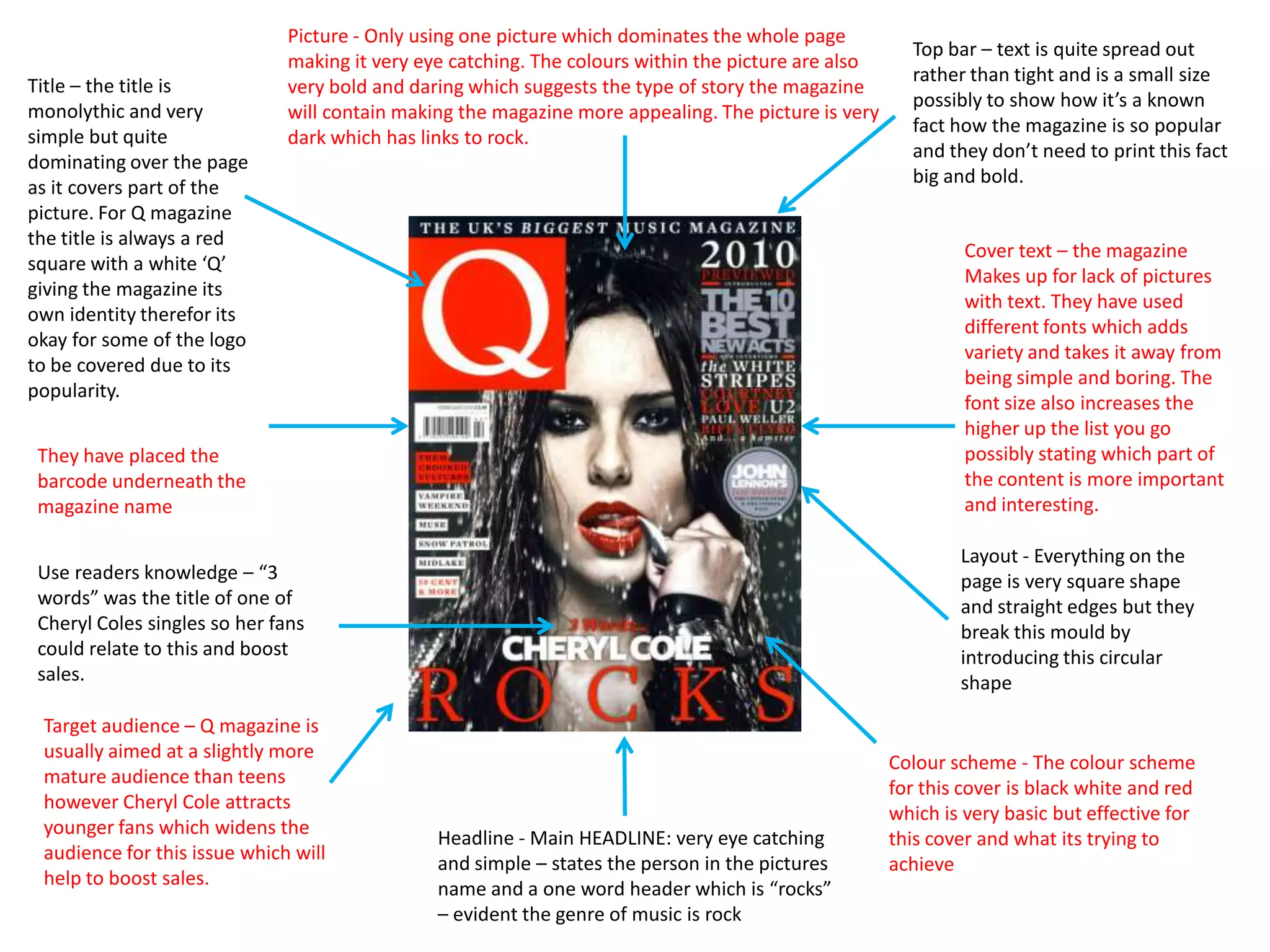
The document analyzes the cover design of a Q magazine featuring Cheryl Cole. It notes several key design elements:
- A large, bold photo dominates the cover to attract attention.
- The title is a red square with white lettering, giving the magazine a distinctive identity.
- Different fonts are used for cover text to add variety and highlight important content.
- Featuring Cheryl Cole appeals to her young fanbase and helps boost sales.
- The design uses simple and effective color, layout, and typography to showcase the featured artist and intrigue readers.


![Magazine research really official [recovered]](https://cdn.slidesharecdn.com/ss_thumbnails/magazineresearchreallyofficialrecovered-160222160255-thumbnail.jpg?width=640&height=640&fit=bounds)
![Magazine research really official [recovered]](https://cdn.slidesharecdn.com/ss_thumbnails/magazine-research-really-official-recovered-160211094822-thumbnail.jpg?width=640&height=640&fit=bounds)


