The contents page has a clean and well-balanced design with coordinated colors, fonts, and sizes. A limited color palette of red and grey is used, with red highlighting important elements like page numbers. Two pictures are featured - a large black and white image and a smaller color one linked to a magazine feature. Imagery is heavily used throughout to grab readers' attention and help them visualize the magazine's content. While one side has a large picture creating a slight imbalance, the black and white photo does not overly distract. A mix of serif and sans serif fonts in different sizes and colors helps the layout flow smoothly and avoids difficult reading.
Apidays Singapore 2024 - Building Digital Trust in a Digital Economy by Veron...
Contents page
1. Contents Page Analysis
The house style is very crisp and
clean looking very well balance
with coordinating colours, fonts
and sizes. Nothing looks out of
proportion and sections are
clear
A definite house style with a limited
range of colours (mainly red and grey)
the use of the red against the white and
images does make the feature pop and
stand out. For example page number are
in red showing where each imagine is
referring too
There are two picture's one large old
black and white picture and one smaller
colour picture. The smaller pictures are
linked to one of the features in the
magazine and are of a high profile
singer. This keeps the reader interested
in the magazine
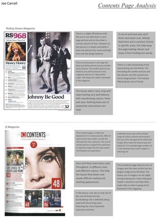
This cont4ents page features lots of
images and the main article has the
largest image (Lana Del Rey). The
heavy use of imagery can be slight
strong looking but it does help grab
reader’s attention and help them
make links to what is going to be
featured in the magazine.
There is a slight off balance with
this as on one side there is very
large picture and on the other a
narrow column of text. However as
the picture is in black and white it
does not distract too much and help
even out the design balance
This contents page is a little less
balanced is it is mostly pictures. Allot of
space at the top is taken up with the
title and the rest is pictures. This use of
mainly picture is a good trick used here
to help the reader link the main article
and features to visual items.
A mix of serif and sans serif
fonts have been uses. Mostly
black font and a contrast of pink
in specific areas, this help keep
the page looking vibrant and
stops it form looking too wordy.
Sans serif fonts have been used
throughout. In different sizes
and different colours. This help
the layout flow better and
avoids difficult reading and
clashing appearances.
There is a clear presenting of the
layout being out into thirds. The
first being the smaller picture and
the column and the second and
third a large picture. This loosely
following the rule of thirds.
In the layout i can see no real use of
the rule of thirds but the
Gurttonberg rule is defiantly being
used with the strong areas
featuring the most important
i=pictures and text.
Rolling Stones Magazine
Q Magazine
Joe Carroll