
Recommended
More Related Content
What's hot
What's hot (19)
Viewers also liked
Viewers also liked (17)
Similar to Analysing Aladdin Sane
Similar to Analysing Aladdin Sane (20)
Recently uploaded
Recently uploaded (20)
Analysing Aladdin Sane
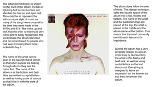
- 1. The artist (David Bowie) is shown on the front of the album. He has a lightning bolt across his face and also has his hair up and dyed red. This could be to represent the artists unique style of music as many of his songs were unusual for the time they were made in the 1970s and 80’s. The make up and look that the artist is wearing is very iconic and is easily recognised, this would make the album stand our and be remembered by people who had seen it making them more inclined to buy it. The name of the artist can be seen in the top right hand corner, so that when people are flicking through albums they see the name first. The name of the album is at the bottom and both titles are written in capital letters as well as having a mix of colours so that it fits in with the style of the album. The album does follow the rule of three. This design technique splits the square space of the album into a top, middle and bottom. The name of the artist and the publishers logo are placed at the top, the artist is placed in the middle and the album name at the bottom. This means that the mind can easily identify each item and it’s importance. Overall the album has a very simplistic design. It uses an iconic look by representing the artist in this flashy and bold look, as well as using capital letters so the text stands out. Everything is designed to leave an impression on the listener so that they remember the album.