1. Jorgie Giddings
Test Shots:
I neededtotake testshotsinorder forme to gatheran ideaof what myfront coverwouldlooklike.
To take thisphoto I wantedapinkbackgroundwiththe modelsheadpokingthroughtocreate an
illusionof it'floating'
In orderto do thisI tooka large frame andstretcheda roll of pink
paperoverthe topand cut a small line downthe middle of the
frame.I didthisto enable the headtocome throughreducingthe
rips(that will be createdmystickingthe headthrough) asmuch
as I can.
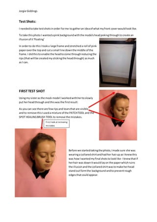
FIRSTTEST SHOT
Usingmy sisteras the mock model Iworkedwithhertoslowly
put herheadthrough and thiswas the firstresult:
As youcan see there are fewripsand tearsthat are visible
and to remove thisIuseda mixture of the PATCHTOOL and the
SPOT HEALINGBRUSH TOOL to remove the mistakes.
Before we startedtakingthe photo,Imade sure she was
wearinga collaredshirtandhadher hairup as I knew this
was how I wantedmyfinal shotstolooklike- Iknew thatif
herhair was downitwouldlayon the paperwhichruins
the illusionandthe collaredshirtwastomake herhead
standout formthe background andto preventrough
edgesthatcouldappear.
First look at removing
mistakes
2. Jorgie Giddings
Once I likedthe appearance of mytestshot image Imovedoverto InDesigntoworkon the graphics
and placementsof the frontcover.
In the meantime I hadchosenthe font stylesIwantedformymagazine andI didthis bygoingonto
dafont.comandchoosinga style thatstoodout to me:
I chose a font style calledGEOSANSLIGHT as I thoughtit
linkedwellwithmytheme andmytargetaudience (sans-
serif etc.) Ithenusedthe snippingtool onmycomputer
and savedbothstylesof fontinorderto decide what
particularstylesIwantand where onmy magazine.I
thenwentintoPhotoshopandremovedthe white
backgroundinthe textusingthe MAGIC WAND TOOL
and I changedthe colourof the fontto white asthat was
the colourI wantedfor mymagazine.(Ididthis method
for the restof the text yousee on the frontcover.)
MOVING ONTO INDESIGN (part 1):
WhenI firstplacedmyimage intoInDesignInoticedthatI forgotto adjustthe image to fill ana4
sizedpiece of paper(asthat’sthe format of the magazine) soI wentbackonto Photoshopand
duplicatedthe toppartof the image and placedinabove the image andusedthe BLUR TOOL to
blendthe twoimagestogetherinordertofill outthe a4 size andto alsocentralise the headtomake
it lookbetter.
I alreadytypedinwhatI wanted
so I can straightaway finda
style thatwouldsuit.
Notice the
difference with
the allignment
withthe head
(thisisalsoa
lookwithsome
of the text
placement)
Before After
3. Jorgie Giddings
MOVING ONTO INDESIGN (part 2):
Thispart now wasjustplacingall the textI wantedto include andjustmovingitaboutto see what
looksgoodwhere.KnowingIhadall the textthat I wantedalreadysortedoutdeemedeasierforme
as there waslessswitchingbackandforthfrom PhotoshopandInDesign.
DEVELOPMENT OF THE IMAGES:
I decidedtoaddthe white barsaroundas I feltitaddedmore to the cover.This isbecause Ihave
purposefullychosentobe anunconventional magazinebynothavinganyheadlinesandasa result
of that,the magazine coverlookedempty.