3. For the man with the fish what I had go on the internet and get one of there after that
I has to delete the background so I was left with the man sow what I used was the
selection tool and selected the parts that I wanted to get rid off. After this what I then
did was I had to resize the images to the size that I wanted for this I used control T and
resized like this.
4. Secondly with the man in the bottom left hand corner holding the fish I couldn’t find
one that was similar at all so what I did was copy the magazine and cropped the
person out of it when I did this there where still bits rom the background in it so what
I ended up using was the magic wand tool to get rid off the background that I didn't
want. Since of some of the colours being a different shade of the same colour the
magic wad was cropping the actual image that I was wanting so I had to turn the
tolerance down I had turned it down from 30 to 10 so I could get a clean picture.
5. For this text tool I had to go on dafont and I downloaded it this font was called reality check when
I did this I then had to change the size of the text so it looked as similar as I could possibly get it.
When I did this I then had to get the same colour as in the original magazine so what I then did
was I pasted the real one into Photoshop then I got the select tool so I could get the right colour
that I needed ad ten after that I then finally moved it to the right position the bottom right hand
corner of the magazine.
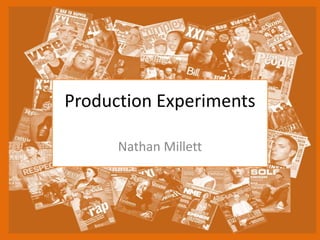
6. Reflection
• What elements of your experiments will you
include in your final product?
I will be including a similar layout to this one and then similar colour scheme but I
will be using slightly darker colours then this one apart from that I will be trying to
base my main design from this one t make it look as professional as I can possibly
make it.
Editor's Notes
Discuss the tools and processes used in your experiments